
Buscar pacotes, repositórios e categorias de apps

Capa de custom_date_range_picker
Detalhes do pacotev1.2.0

custom_date_range_picker

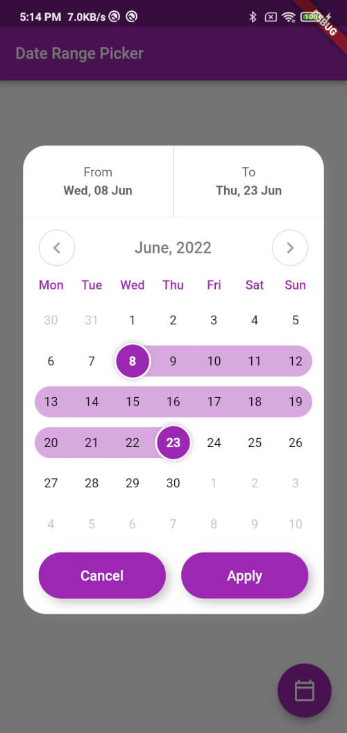
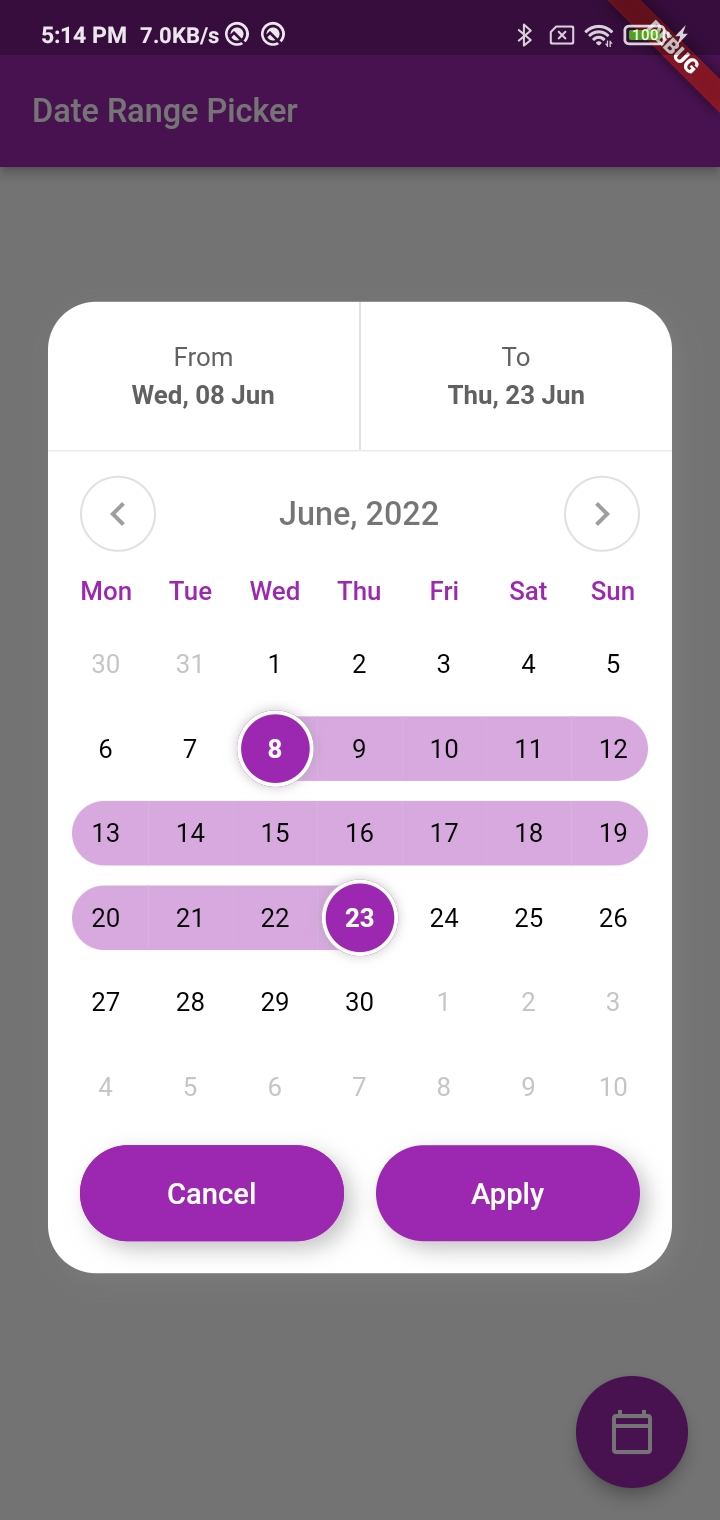
Um pacote Flutter para Android e iOS que oferece um seletor de intervalo de datas personalizável com interface elegante e animações suaves.

AndroidiOSWebmacOSWindowsLinux
Downloads em 30 dias
5,5 mil
Curtidas
85
Pontos Pub
160

Instalar pacote

flutter pub add custom_date_range_picker

Visão geral do pacote

Orientação gerada a partir de informações públicas. Apenas para referência.

Um pacote Flutter que oferece um seletor de intervalo de datas altamente personalizável para Android, iOS, Web, macOS, Windows e Linux. Ele apresenta uma interface elegante com animações suaves, permitindo que desenvolvedores personalizem a aparência e o comportamento do seletor para corresponder ao design do seu aplicativo. O seletor suporta seleção intuitiva de datas com feedback visual, sendo ideal para sistemas de reserva, aplicativos de agendamento e interfaces de filtragem de dados. Desenvolvido com compatibilidade entre plataformas em mente, garante uma experiência consistente de usuário em todos os dispositivos.

Casos de uso

  • Sistemas de reserva e reservas
  • Filtragem de dados por intervalo de datas
  • Aplicativos de agendamento de eventos
  • Ferramentas de planejamento de viagem
  • Integrações personalizadas de calendário

Principais recursos

  • Suporte multiplataforma
  • Animações suaves
  • Interface do usuário altamente personalizável
  • Seleção intuitiva de data
  • Feedback visual para faixas selecionadas

Indicado para

  • Desenvolvedores construindo aplicativos de viagem ou reserva
  • Equipes que precisam de seletores de data consistentes entre plataformas
  • Aplicativos que exigem designs personalizados de calendário
  • Projetos focados na experiência do usuário e na estética

Considerações

  • Requer integração com a lógica existente de manipulação de datas
  • Pode ser necessário estilos adicionais para temas complexos
  • Seleção limitada a intervalo de datas (sem componente de hora)
  • Depende da compatibilidade com a versão do SDK do Flutter
README original

Snapshot do README original do repositório-fonte vinculado. Consulte o repositório para o conteúdo mais recente.

custom_date_range_picker

custom_date_range_picker

Usage

...
  floatingActionButton: FloatingActionButton(
        onPressed: () {
          showCustomDateRangePicker(
            context,
            dismissible: true,
            minimumDate: DateTime.now().subtract(const Duration(days: 30)),
            maximumDate: DateTime.now().add(const Duration(days: 30)),
            endDate: endDate,
            startDate: startDate,
            backgroundColor: Colors.white,
            primaryColor: Colors.green,
            onApplyClick: (start, end) {
              setState(() {
                endDate = end;
                startDate = start;
              });
            },
            onCancelClick: () {
              setState(() {
                endDate = null;
                startDate = null;
              });
            },
          );
        },
        tooltip: 'choose date Range',
        child: const Icon(Icons.calendar_today_outlined, color: Colors.white),
      ),

Function: showCustomDateRangePicker

This function displays a custom date range picker dialog box.

Parameters

  • context (required): The context in which to show the dialog.
  • dismissible (required): A boolean value indicating whether the dialog can be dismissed by tapping outside of it.
  • minimumDate (required): A DateTime object representing the minimum allowable date that can be selected in the date range picker.
  • maximumDate (required): A DateTime object representing the maximum allowable date that can be selected in the date range picker.
  • startDate (optional): A nullable DateTime object representing the initial start date of the date range selection.
  • endDate (optional): A nullable DateTime object representing the initial end date of the date range selection.
  • onApplyClick (required): A function that takes two DateTime parameters representing the selected start and end dates, respectively, and is called when the user taps the "Apply" button.
  • onCancelClick (required): A function that is called when the user taps the "Cancel" button.
  • backgroundColor (required): The background color of the dialog.
  • primaryColor (required): The primary color of the dialog.
  • fontFamily (optional): The font family to use for the text in the dialog.

Usage

Inside the function, a FocusNode is requested to take focus away from any input field that might be in focus. A showDialog function is then called to show the CustomDateRangePicker dialog box. The CustomDateRangePicker widget is built with the parameters passed to showCustomDateRangePicker, and then passed as the builder parameter of the showDialog function.

When the user interacts with the CustomDateRangePicker dialog box, the onApplyClick and onCancelClick functions are called accordingly.

Many Thanks to the creator of this Repo https://github.com/mitesh77/Best-Flutter-UI-Templates

Getting Started

For help getting started with Flutter, view our online documentation.

For help on editing package code, view the documentation.

Categorias

Dependências

Lista de dependências 1 itens

Repositório-fonte

Projetos que usam este pacote