Orientação gerada a partir de informações públicas. Apenas para referência.
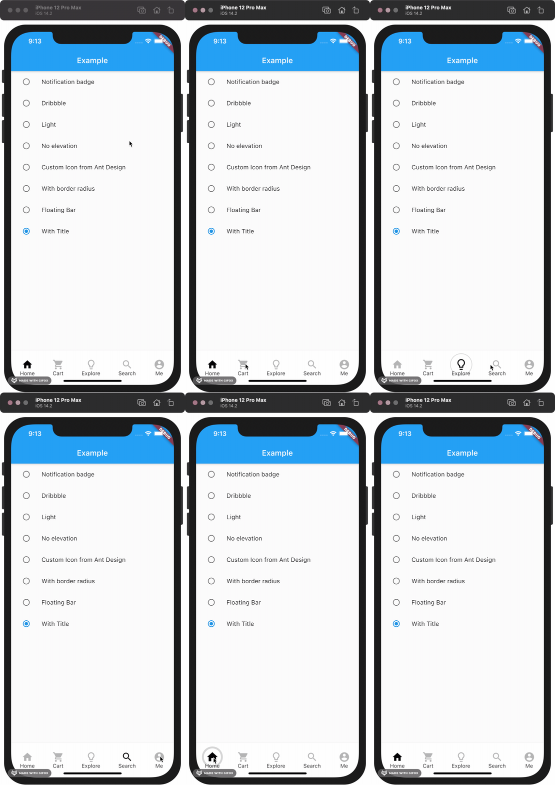
Uma barra de navegação inferior personalizável com efeito de bolha ao clicar, inspirada no episódio 35 do The Boring Flutter Development Show. Ela melhora a interação do usuário com animações suaves e feedback visual ao tocar. O pacote oferece suporte a múltiplas plataformas, incluindo Android, iOS, Web, macOS, Windows e Linux, tornando-o ideal para aplicativos multiplataforma. Os desenvolvedores podem facilmente adaptar aparência e comportamento para combinar com a linguagem de design do seu aplicativo.
Casos de uso
Aplicativos móveis e web multiplataforma
Aplicativos que precisam de feedback animado de navegação
Designs de UI personalizados com elementos interativos
Melhorando a experiência do usuário na navegação inferior
Integrando animações lúdicas nas barras de navegação
Principais recursos
Efeito de animação de clique de bolha
Aparência altamente personalizável
Suporta múltiplas plataformas
Integração fácil com o Flutter
Feedback tátil suave
Espaçamento e tamanho de item configuráveis
Indicado para
Desenvolvedores Flutter procurando barras de navegação animadas
Aplicações focadas no design
Projetos que exigem componentes de interface interativa
Desenvolvedores inspirados pelo The Boring Flutter Development Show
Aplicativos destinados à implantação multiplataforma
Considerações
Pode afetar o desempenho em dispositivos de baixa potência
Requer planejamento cuidadoso de cor e tamanho para visuais ideais
Recursos limitados de acessibilidade embutidos
A animação pode não se adequar a todas as estéticas de design
Não adequado para temas de design minimalista ou plano
README original
Snapshot do README original do repositório-fonte vinculado. Consulte o repositório para o conteúdo mais recente.
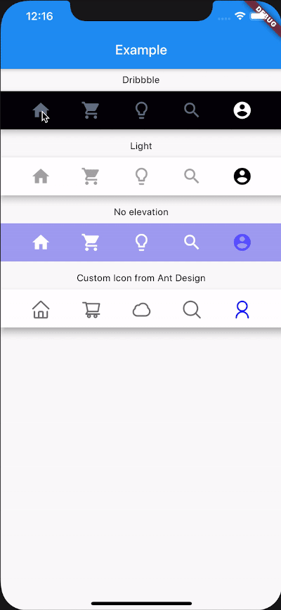
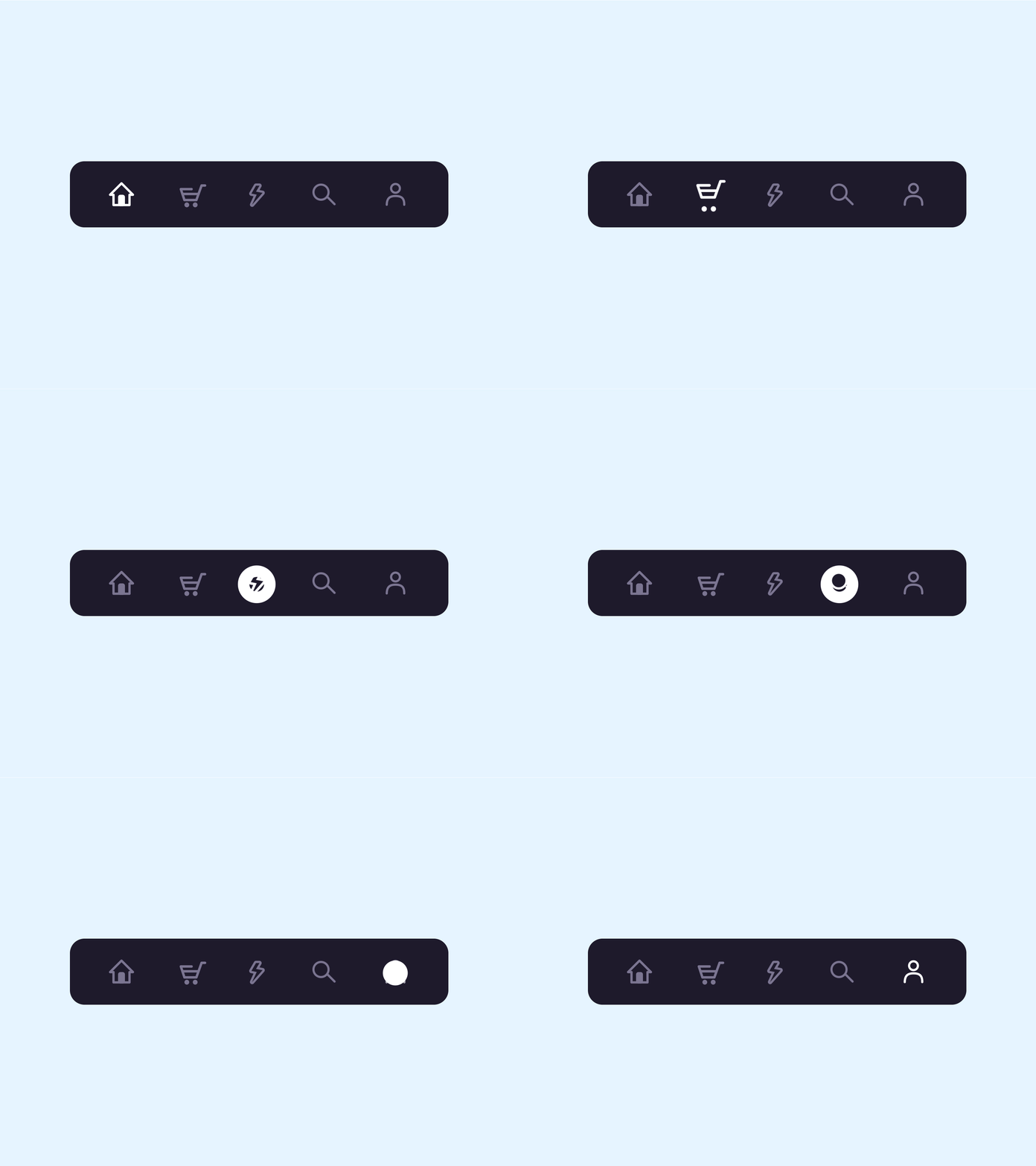
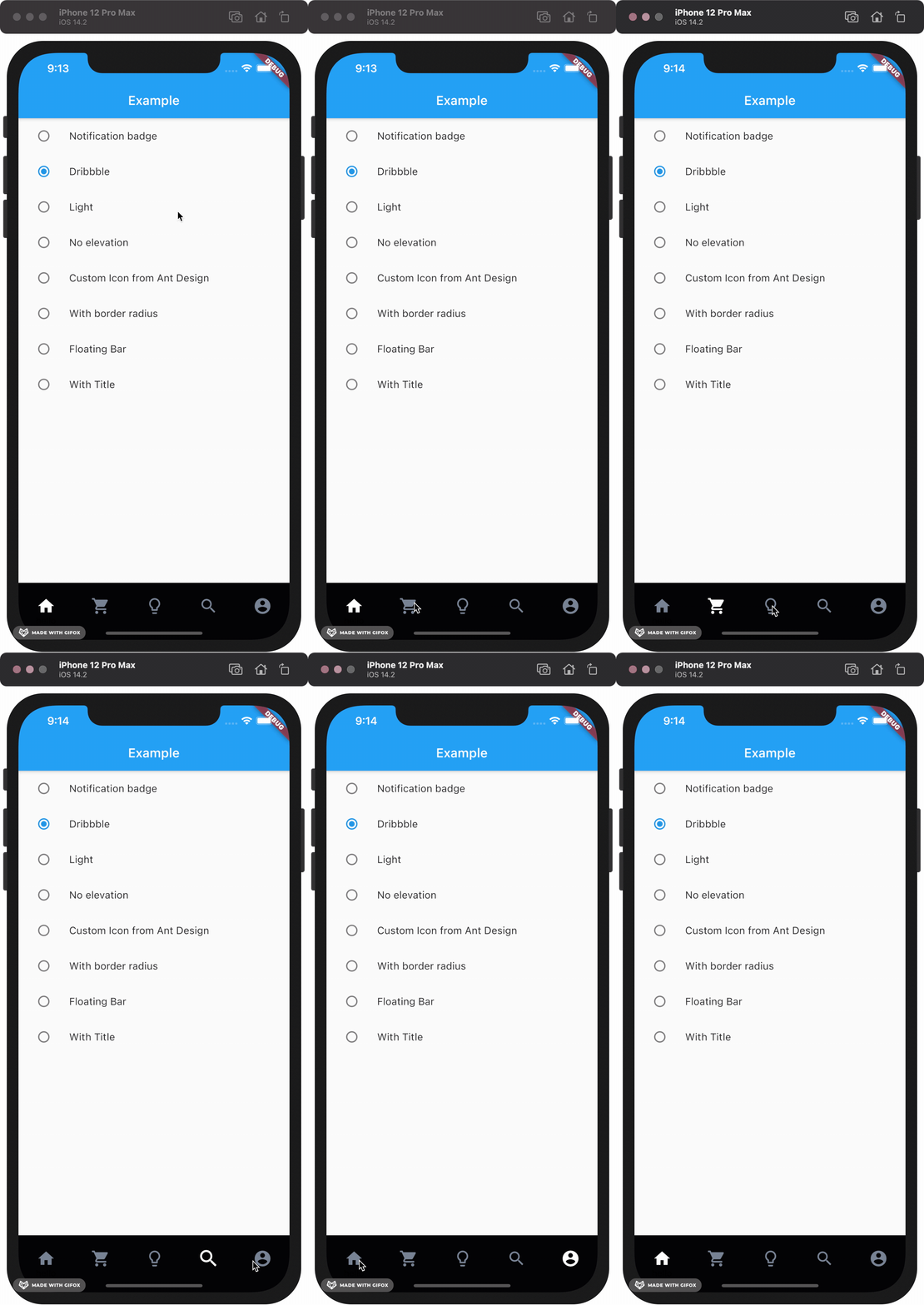
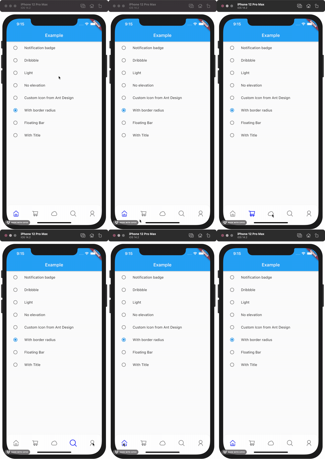
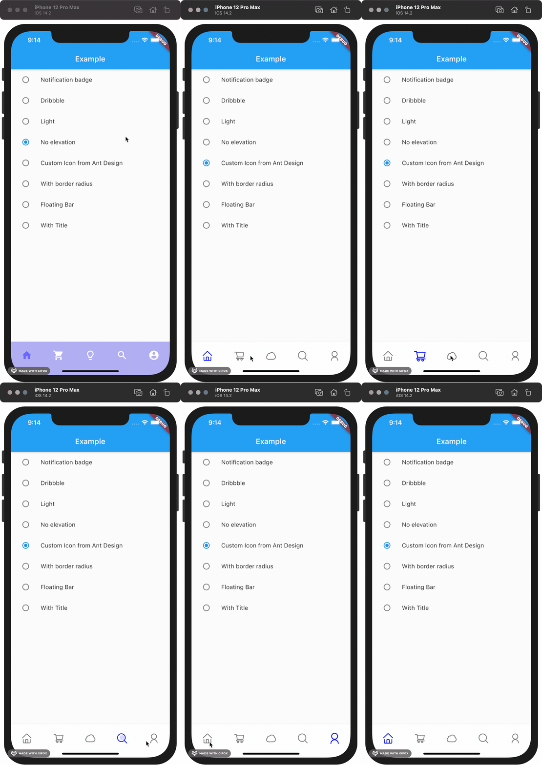
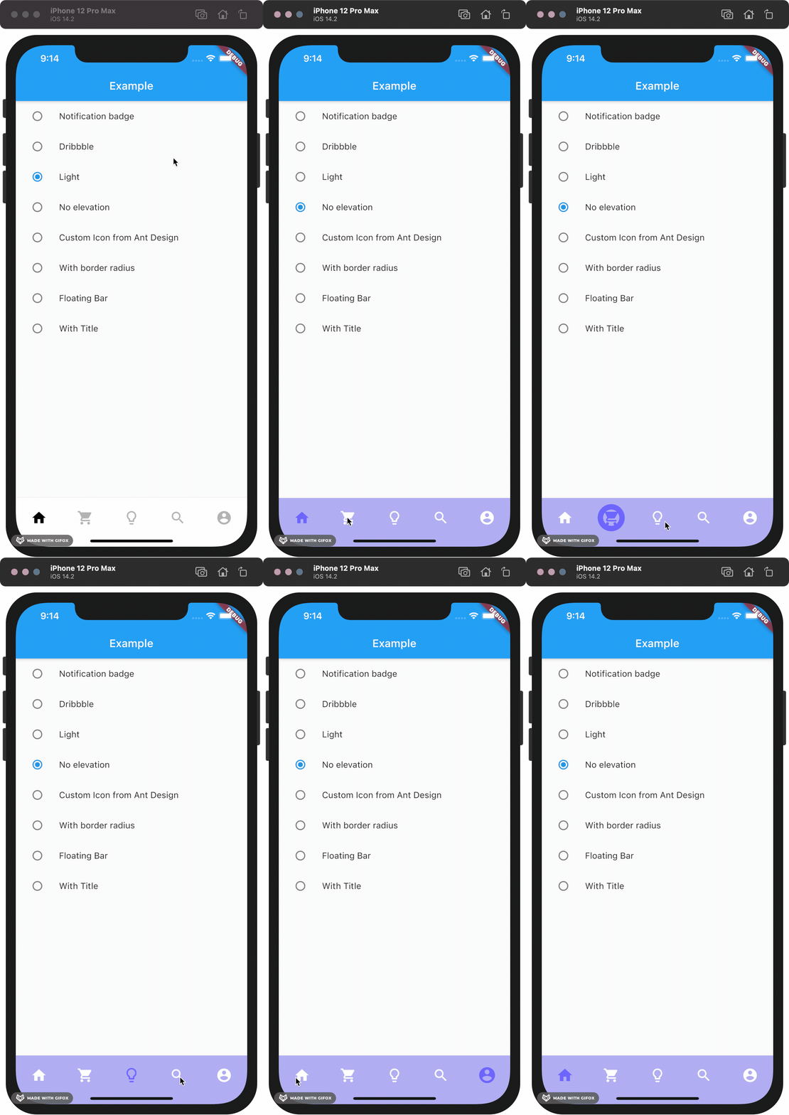
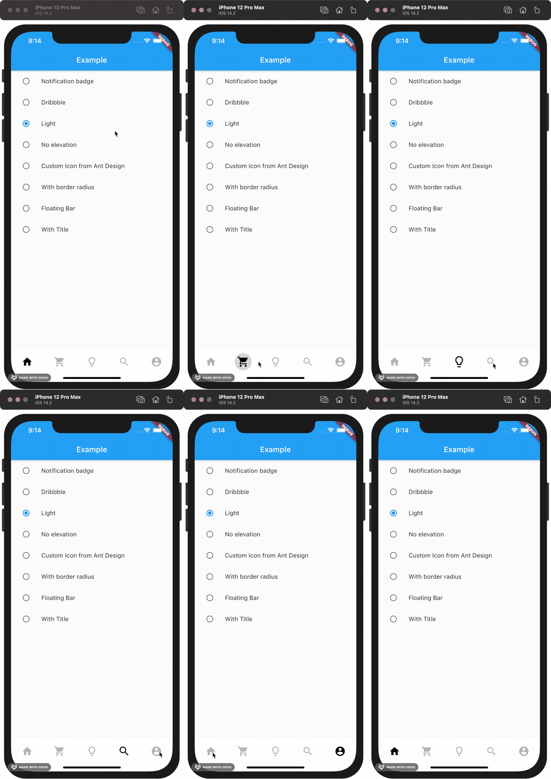
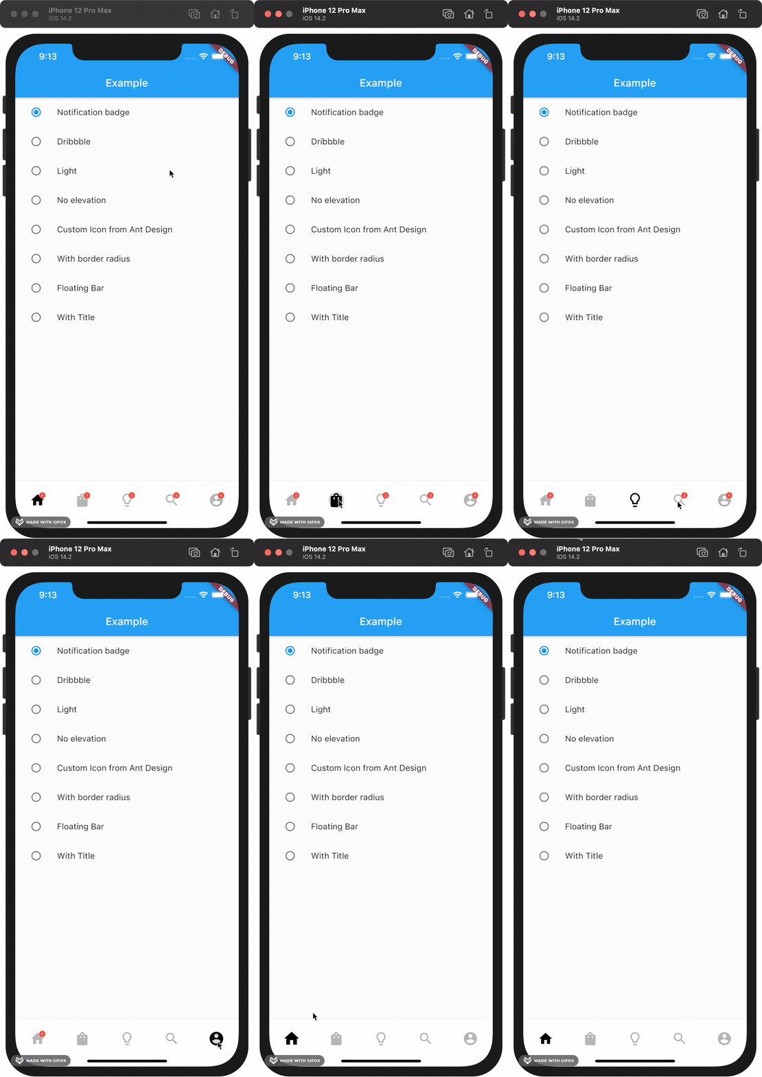
This package gives you a cute bubble effect when you click on the navigation bar.
Dribbble:
Implemented:
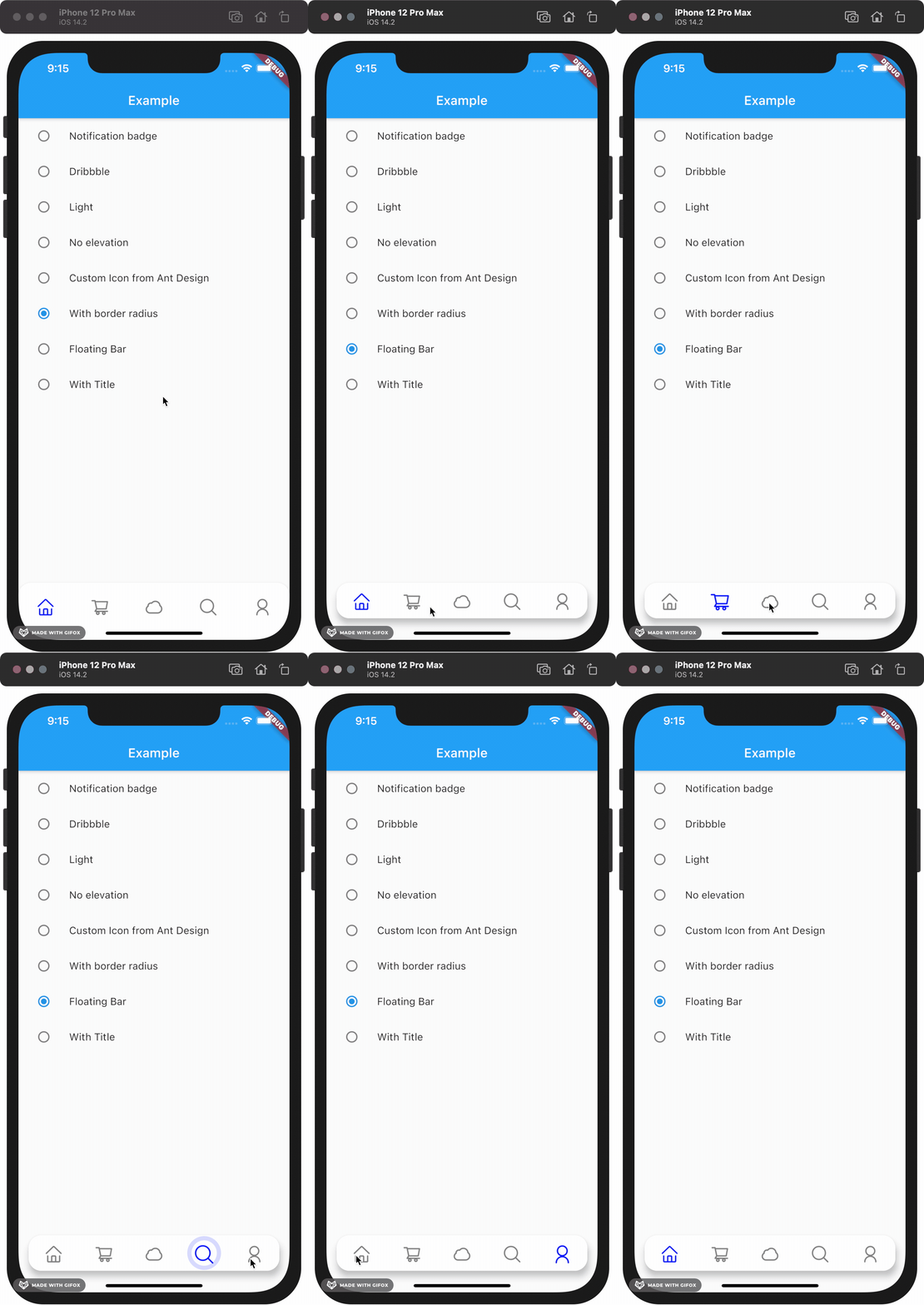
Gallery
How to install
Add this to your package's pubspec.yaml file:
dependencies:custom_navigation_bar:lastestversion
Documentation
Attention
If you update from version under 0.6.0, there are some breaking changes in the version 0.6.0. The icon in CustomNavigationBarItem has changed from IconData to Widget.
old version
CustomNavigationBarItem(
{@requiredthis.icon,
IconData selectedIcon,
this.selectedTitle,
this.unSelectedTitle,
this.badgeCount = 0,
this.showBadge = true})
: selectedIcon = selectedIcon ?? icon;
////// The icon of the item/// Typically the icon is an [Icon].///finalIconData icon;
new version
CustomNavigationBarItem(
{@requiredthis.icon,
Widget selectedIcon,
this.title,
Text selectedTitle,
this.badgeCount = 0,
this.showBadge = false})
: selectedIcon = selectedIcon ?? icon,
selectedTitle = selectedTitle ?? title;
////// The icon of the item/// Typically the icon is an [Icon].///finalWidget icon;
You can customize these attributes in the navigation bar.
Attributes
Type
Description
Default
scaleFactor
double
scale factor for the icon scale animation.
0.2
elevation
double
The z-coordinate of this CustomNavigationBar
8.0
items
List
item data in CustomNavigationBar
required
selectedColor
Color
[Color] when [CustomNavigationBarItem] is selected
[blueAccent]
unSelectedColor
Color
[Color] when [CustomNavigationBarItem] is not selected.
grey[600]
onTap
Function(int)
callback function when item tapped
null
currentIndex
int
current index of navigation bar.
0
iconSize
double
size of icon. also represent the max radius of bubble effect animation.
24.0
backgroundColor
Color
Background color of [CustomNavigationBar]
Colors.white
strokeColor
Color
stroke color
blueAccent
bubbleCurve
Curve
animation curve of bubble effect
linear
scaleCurve
Curve
animation curve of scale effect
linear
borderRadius
Radius
border radius of navigation bar
Radius.zero
isFloating
bool
control if CustomNavigationBar is floating
false
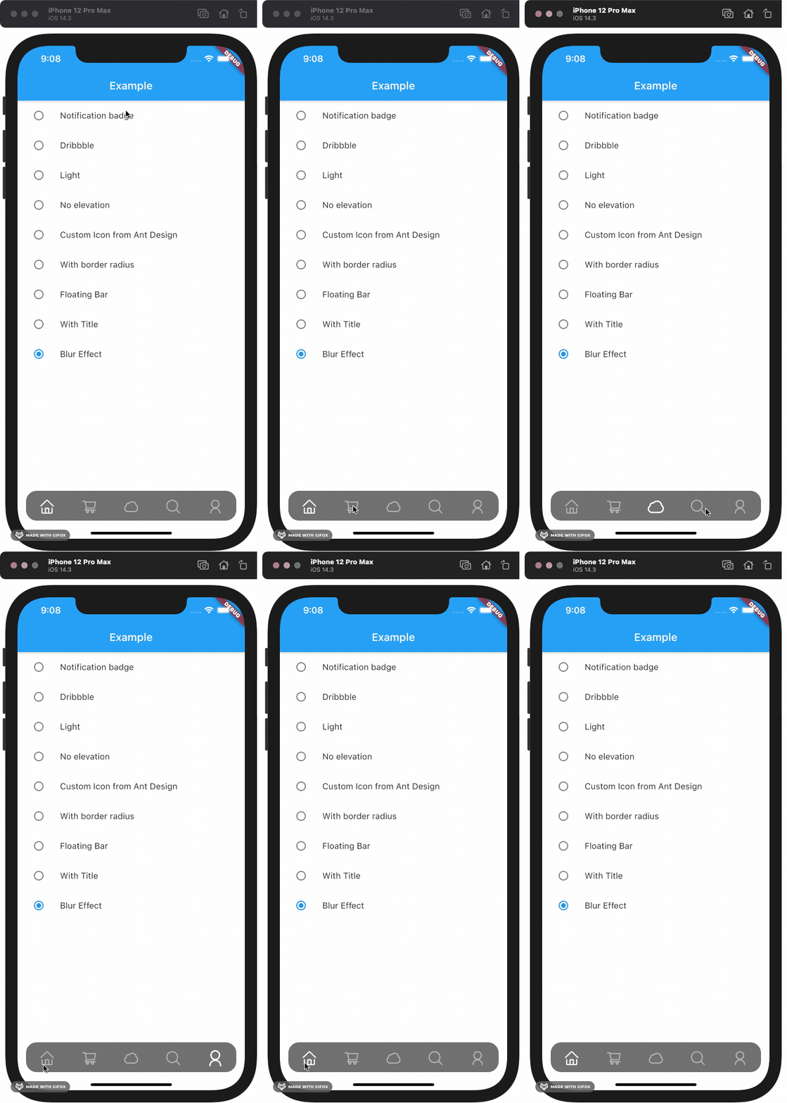
blurEffect
bool
control if CustomNavigationBar show blur effect
false
opacity
double
control CustomNavigationBar blur effect opacity when blurEffect is true
0.8
brightness
Brightness
describes the contrast of a theme or color palette. If you want adaptive system display setting like iOS dark mode , you should set Brightness.dark or Brightness.light . if this attribute be set , other attributes with "*Color" (like selectedColor) will not take effect , should use lightThemeData or darkThemeData
null
lightThemeData
CustomNavigationBarThemeData
when brightnessis light,you can custom the light theme color if you want it
null
darkThemeData
CustomNavigationBarThemeData
when brightnessis dark,you can custom the dark theme color if you want it
null
Attention: If you set isFloating to true, I would recommand you to set extendBody to true in Scaffold for a better performance.
And for customize icon in the navigation bar, just put the icons you want in the CustomNavigationBarItem like this.