Buscar pacotes, repositórios e categorias de apps

Capa de dotted_line_flutter
Detalhes do pacotev2.1.8

dotted_line_flutter

Este pacote permite que você desenhe linhas pontilhadas com o Flutter. Você pode desenhar uma linha pontilhada bonita.

AndroidiOSWebmacOSWindowsLinux
Downloads em 30 dias
1,7 mil
Curtidas
16
Pontos Pub
160

Instalar pacote

flutter pub add dotted_line_flutter

Visão geral do pacote

Orientação gerada a partir de informações públicas. Apenas para referência.

O pacote dotted_line_flutter permite aos desenvolvedores desenhar linhas pontilhadas personalizáveis de forma fácil em aplicativos Flutter. Oferece uma maneira simples e eficiente de adicionar linhas pontilhadas decorativas ou funcionais em diversos elementos da interface. Com suporte a diferentes tamanhos de pontos, espaçamentos e cores, ele melhora o design visual sem exigir pintura personalizada complexa. O pacote é leve e se integra perfeitamente em projetos Flutter em múltiplas plataformas.

Casos de uso

  • Adicionando divisórias decorativas em layouts
  • Criando bordas tracejadas para cartões ou contêineres
  • Projetando indicadores de progresso com caminhos pontilhados
  • Melhorando campos de formulário com separação visual
  • Construindo componentes de interface personalizados com acentos pontilhados

Principais recursos

  • Tamanho e espaçamento de ponto personalizáveis
  • Suporte para diferentes cores de linha
  • Integração fácil com widgets existentes
  • Compatibilidade multiplataforma
  • Leve e eficiente
  • Opções flexíveis de alinhamento

Indicado para

  • Designers de UI procurando melhorias visuais
  • Desenvolvedores construindo formulários ou painéis
  • Projetos que exigem pistas visuais sutis
  • Aplicativos com estética de design minimalista ou moderno
  • Iniciantes do Flutter explorando widgets de decoração

Considerações

  • Limitado a padrões básicos de linha pontilhada
  • Sem suporte embutido para animação
  • Requer manipulação manual de atualizações dinâmicas de linhas
  • Não adequado para padrões de traço complexos
  • Depende do desempenho de renderização do Flutter

README original

Snapshot do README original do repositório-fonte vinculado. Consulte o repositório para o conteúdo mais recente.

Dotted Line Flutter Package

Logo

A highly customizable Flutter package for drawing dotted, dashed, and gradient lines in both horizontal and vertical directions. It also supports shadow effects and multiple shapes.

✨ Features

✅ Dotted and Dashed Lines
✅ Gradient Color Support
✅ Customizable Dash Width & Gap
✅ Horizontal & Vertical Orientation
✅ Shadow Effect for Depth
✅ More Shapes (Star, Circle, etc.)
✅ Star Shape
✅ Circle Dotted Line
✅ Custom Dash Shapes
✅ Patterned Dashes (Short-Long)

📦 Installation

Add this to your pubspec.yaml file:

dependencies:
  dotted_line_flutter: latest_version

Then run:

flutter pub get

🛠 Usage

Basic Dotted Line
DottedLine(
axis: Axis.horizontal,
lineThickness: 2,
dashGap: 4,
dashWidth: 6,
colors: [Colors.red, Colors.blue], // Gradient Support
);
Vertical Dotted Line
DottedLine(
axis: Axis.vertical,
lineThickness: 3,
dashGap: 5,
colors: [Colors.green], // Single color
);
Shadow Effect
DottedLine(
axis: Axis.horizontal,
lineThickness: 3,
dashGap: 6,
colors: [Colors.orange, Colors.purple],
shadowColor: Colors.black,
shadowBlurRadius: 10.0,
);

🖼 Screenshot 1

App Screenshot 1

🖼 Screenshot 2

App Screenshot 2

🖼 Screenshot 3

App Screenshot 3

🖼 Screenshot 4

App Screenshot 4

DottedCube Widget

Usage

Parameters
Parameter Default Description
size 100.0 The overall size of the cube.
dotSize 4.0 The size of each individual dot.
dotSpacing 8.0 The spacing between dots.
scaleFactor 1.0 The scale factor to resize the widget.
angle 0.0 The rotation angle of the cube.
gradientColors [Colors.blue, Colors.purple] The gradient colors used for the dots.

The DottedCube widget can be used without parameters.

import 'package:flutter/material.dart';

DottedCube()

You can also customize it by specifying parameters.

import 'package:flutter/material.dart';

DottedCube(
  size: 120.0,
  dotSize: 5.0,
  dotSpacing: 10.0,
  scaleFactor: 1.2,
  angle: 0.5,
  gradientColors: [Colors.red, Colors.orange],
)

DottedLine Widget

A Flutter widget to create a customizable dotted line with gradient colors, shadow effects, and adjustable spacing.

Features

  • Supports horizontal and vertical orientation.
  • Customizable dash width, gap size, and line thickness.
  • Gradient color support.
  • Shadow effects for a better visual appearance.

Usage

Default Usage

This widget can be used without parameters for a simple dotted line.

import 'package:dotted_line_flutter/dotted_line.dart';

DottedLine()
Custom Usage

You can customize the dotted line by specifying various parameters:

import 'package:dotted_line_flutter/dotted_line.dart';

DottedLine(
  colors: [Colors.blue, Colors.green],
  lineThickness: 2.0,
  dashGap: 6.0,
  dashWidth: 8.0,
  height: 3.0,
  axis: Axis.horizontal,
  shadowColor: Colors.black38,
  shadowBlurRadius: 5.0,
)

Parameters

Parameter Default Description
colors [Colors.purple] The gradient colors for the dotted line.
lineThickness 2.0 The thickness of the line.
dashGap 5.0 The space between dashes.
dashWidth 5.0 The width of each dash.
height 2.0 The height of the dotted line.
axis Axis.horizontal The direction of the dotted line (horizontal/vertical).
shadowColor Colors.black54 The color of the shadow.
shadowBlurRadius 4.0 The blur radius of the shadow.

Example

Here's how you can use DottedLine inside a Column or Row widget:

Column(
  children: [
    Text("Above the line"),
    DottedLine(
      colors: [Colors.red, Colors.orange],
      dashWidth: 6.0,
      dashGap: 4.0,
    ),
    Text("Below the line"),
  ],
)

This will create a colorful dotted line between two text widgets.

DottedStar Widget

Overview

DottedStar is a customizable Flutter widget that renders a star shape with a dotted outline using a gradient color effect. It is built using CustomPaint and provides various customization options.

Features

  • Supports gradient colors for the dots.
  • Configurable size and number of star points.
  • Adjustable dot size and spacing.
  • Scalable and rotatable star shape.

Usage

Basic Usage
import 'package:flutter/material.dart';
import 'dotted_star.dart';

class MyApp extends StatelessWidget {
  @override
  Widget build(BuildContext context) {
    return MaterialApp(
      home: Scaffold(
        backgroundColor: Colors.black,
        body: Center(
          child: DottedStar(),
        ),
      ),
    );
  }
}
Customization

You can customize the DottedStar widget by specifying various parameters.

DottedStar(
  gradientColors: [Colors.purple, Colors.pink],
  size: 80.0,
  points: 6,
  dotSize: 4.0,
  dotSpacing: 6.0,
  scaleFactor: 1.5,
  angle: 0.5, // Rotation in radians
)

Parameters

Parameter Default Value Description
gradientColors [Colors.yellow, Colors.orange] List of colors for the gradient effect.
size 50.0 The size of the star.
points 5 Number of points in the star.
dotSize 3.0 The size of each dot in the outline.
dotSpacing 5.0 The spacing between each dot.
scaleFactor 1.0 Scaling factor for resizing the star.
angle 0.0 Rotation angle in radians.

Implementation Details

The DottedStar widget uses a CustomPainter class (StarPainter) to draw the dotted outline of a star. It follows these steps:

  1. Creates a star shape using _createStarPath.
  2. Applies a radial gradient to the dots.
  3. Iterates over the path using PathMetrics to place dots at equal intervals.
  4. Draws each dot on the canvas at calculated positions.

DottedText Widget

The DottedText widget is a custom Flutter widget that renders text using dots instead of solid strokes. It provides customization options for dot size, spacing, colors, and text styling.

Features

  • Render text with a dotted effect
  • Customizable dot size and spacing
  • Supports gradient colors
  • Uses Flutter's CustomPainter for efficient rendering

Installation

To use DottedText, simply add the Dart file to your Flutter project and import it.

import 'package:dotted_line_flutter/dotted_line_flutter.dart';

Usage

Basic Usage
DottedText(
  text: "Hello, World!",
)
Customizing Properties
DottedText(
  text: "Flutter Dots",
  textStyle: TextStyle(fontSize: 50, fontWeight: FontWeight.bold, color: Colors.black),
  dotSize: 3.0,
  dotSpacing: 4.0,
  colors: [Colors.red, Colors.orange],
)

Parameters

Parameter Default Value Description
text Required The text to be displayed in dotted style.
textStyle TextStyle(fontSize: 40, fontWeight: FontWeight.bold, color: Colors.black) The style of the text.
dotSize 2.0 The size of each individual dot.
dotSpacing 3.0 The spacing between dots.
colors [Colors.purple, Colors.blue] A list of colors for gradient effect.

DottedWidget

DottedWidget is a Flutter custom widget that allows you to create a widget with a customizable dotted border. It supports different shapes, colors, and shadow effects, making it a versatile component for UI design.

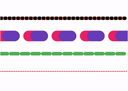
Features

  • Customizable dotted border
  • Supports both rectangular and circular shapes
  • Adjustable dash width, gap, and thickness
  • Gradient border colors
  • Shadow effect for better appearance

Usage

DottedWidget(
            width: 150.0,
            height: 80.0,
            borderRadius: 12.0,
            colors: [Colors.blue, Colors.green],
            lineThickness: 2.0,
            dashWidth: 6.0,
            dashGap: 4.0,
            shadowBlurRadius: 6.0,
            shape: BoxShape.rectangle,
            child: const Text("Dotted Box", style: TextStyle(fontSize: 16)),
          ),

Properties

Property Type Default Value Description
child Widget? null Child widget inside the dotted container.
borderRadius double 10.0 Border radius for rectangle shapes.
colors List<Color> [Colors.purple] Gradient colors for the border.
lineThickness double 2.0 Thickness of the dotted border.
dashGap double 5.0 Gap between each dot in the border.
dashWidth double 5.0 Width of each individual dot.
axis Axis Axis.horizontal Axis along which dots are drawn.
shadowColor Color Colors.black54 Color of the shadow effect.
shadowBlurRadius double 4.0 Blur radius of the shadow.
width double 100.0 Width of the dotted widget.
height double 50.0 Height of the dotted widget.
shape BoxShape BoxShape.rectangle Shape of the dotted widget (rectangle or circle).

DottedShape Widget

A Flutter widget for rendering various shapes with a dotted outline. This can be used to display creative and visually appealing shapes in your app.

Features

  • Supports multiple shapes:
    • Cone
    • Cylinder
    • Oval
    • Triangle
    • Hexagon
    • Pentagon
    • Hexagram
    • Rhombus
    • Heart
    • Triquetra
    • Semicircle
    • Crescent
  • Fully customizable dot size, spacing, and color.

Usage

DottedShape(
shapeType: ShapeType.hexagon,
size: 150.0,
dotSize: 5.0,
dotSpacing: 8.0,
dotColor: Colors.blue,
),

Customization

Property Description Default Value
shapeType The type of shape to render ShapeType.triangle
size The width and height of the shape 100.0
dotSize The size of each individual dot 4.0
dotSpacing The spacing between each dot 6.0
dotColor The color of the dots Colors.black

Feedback

If you have any feedback, please reach out to me at puneetsharma5525@gmail.com.


👋 Hi, I'm Puneet!

🚀 About Me

I'm a flutter and spring boot java developer .

🔗 Links

Portfolio
LinkedIn
Twitter

License

This package is licensed under the MIT License.

MIT

Categorias

Repositório-fonte

Projetos que usam este pacote

Ainda não há dados.