Buscar pacotes, repositórios e categorias de apps

Capa de dropdown_textfield
Detalhes do pacotev1.2.0

dropdown_textfield

Um DropdownTextField é um TextField com design material. O DropdownButton é um widget que podemos usar para selecionar um valor único ou múltiplos valores de um conjunto de valores.

AndroidiOSWebmacOSWindowsLinux
Downloads em 30 dias
6 mil
Curtidas
181
Pontos Pub
140

Instalar pacote

flutter pub add dropdown_textfield

Visão geral do pacote

Orientação gerada a partir de informações públicas. Apenas para referência.

DropdownTextfield é um pacote Flutter que combina um TextField com um DropdownButton, permitindo que os usuários selecionem um ou vários valores de uma lista em uma interface de design material. Ele aprimora as entradas de formulário fornecendo uma experiência intuitiva de seleção em menu suspenso dentro de um campo de texto. O widget suporta seleção única e múltipla, tornando-o adequado para cenários de entrada de dados dinâmicos. É compatível com todas as principais plataformas, incluindo Android, iOS, Web, macOS, Windows e Linux.

Casos de uso

  • Entradas de formulário com opções selecionáveis
  • Menus suspensores multi-seleção em formulários
  • Campos de seleção compatíveis com o Material Design
  • Filtragem dinâmica de dados
  • Interfaces de seleção de valor amigáveis ao usuário

Principais recursos

  • Seleção de valor único e múltiplo
  • Integração com o Material Design
  • Compatibilidade multiplataforma
  • Itens de dropdown personalizáveis
  • Integração fácil com formulários existentes

Indicado para

  • Desenvolvedores de aplicativos com formulários intensos
  • Designers procurando widgets compatíveis com o material
  • Aplicativos que exigem entradas de seleção flexíveis
  • Projetos Flutter multiplataforma
  • Componentes da interface do usuário que precisam de funcionalidade de menu suspenso

Considerações

  • Requer gerenciamento de estado adequado para seleção múltipla
  • Pode ser necessário ajustes de estilo para temas personalizados
  • Limitado a conjuntos de valores pré-definidos
  • Não ideal para conjuntos de dados muito grandes
  • Depende das restrições de layout do widget pai
README original

Snapshot do README original do repositório-fonte vinculado. Consulte o repositório para o conteúdo mais recente.

Flutter DropdownTextfield

A DropdownTextfield is a Material Design TextField. The DropDownButton is a widget that can be used to select one unique value or multiple values from a set of options.

Key Features

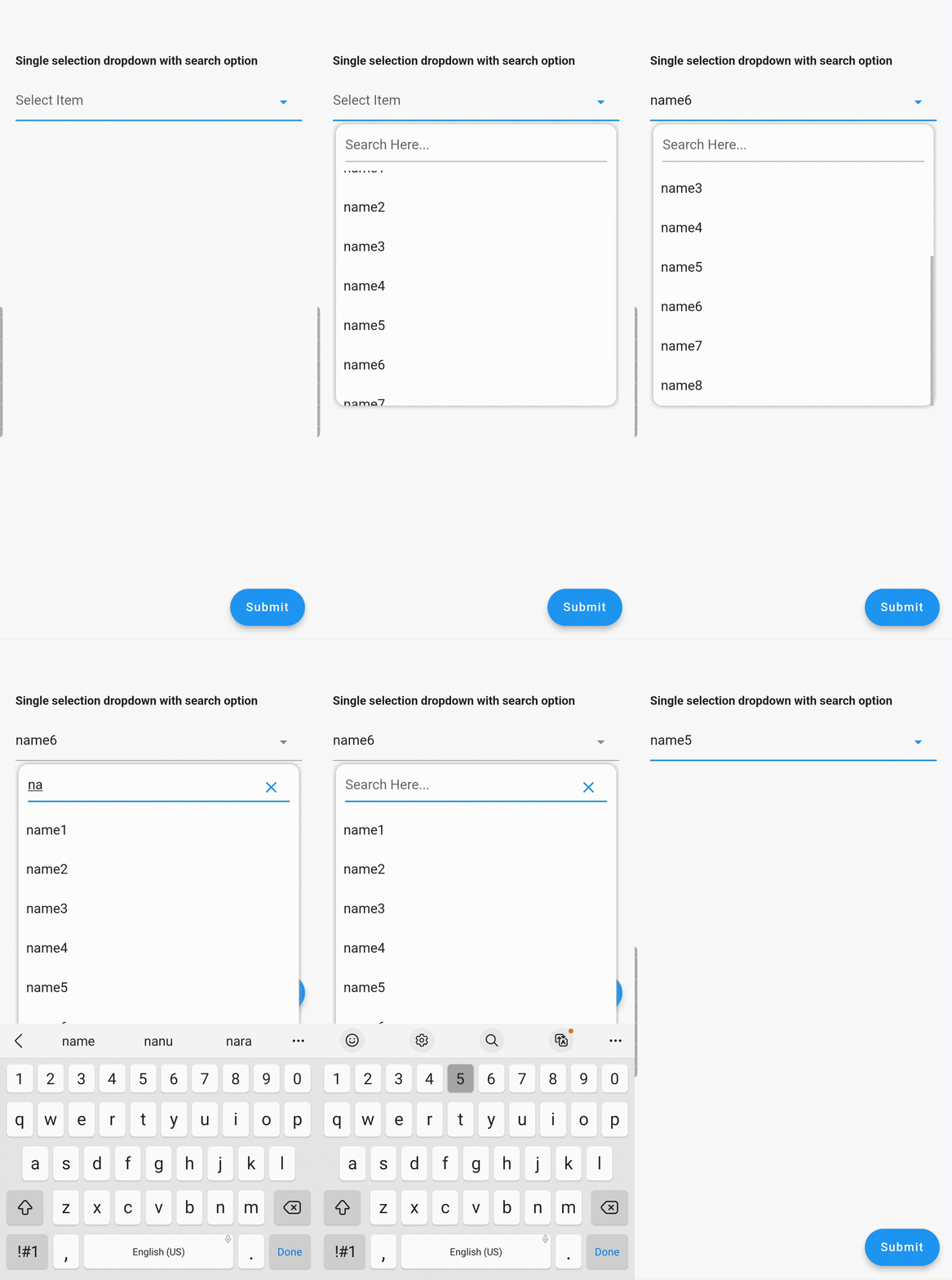
  1. Searchable dropdown
  2. Single & multi-selection
  3. Material dropdown
  4. Easily customizable UI
  5. Easy implementation into StatelessWidget
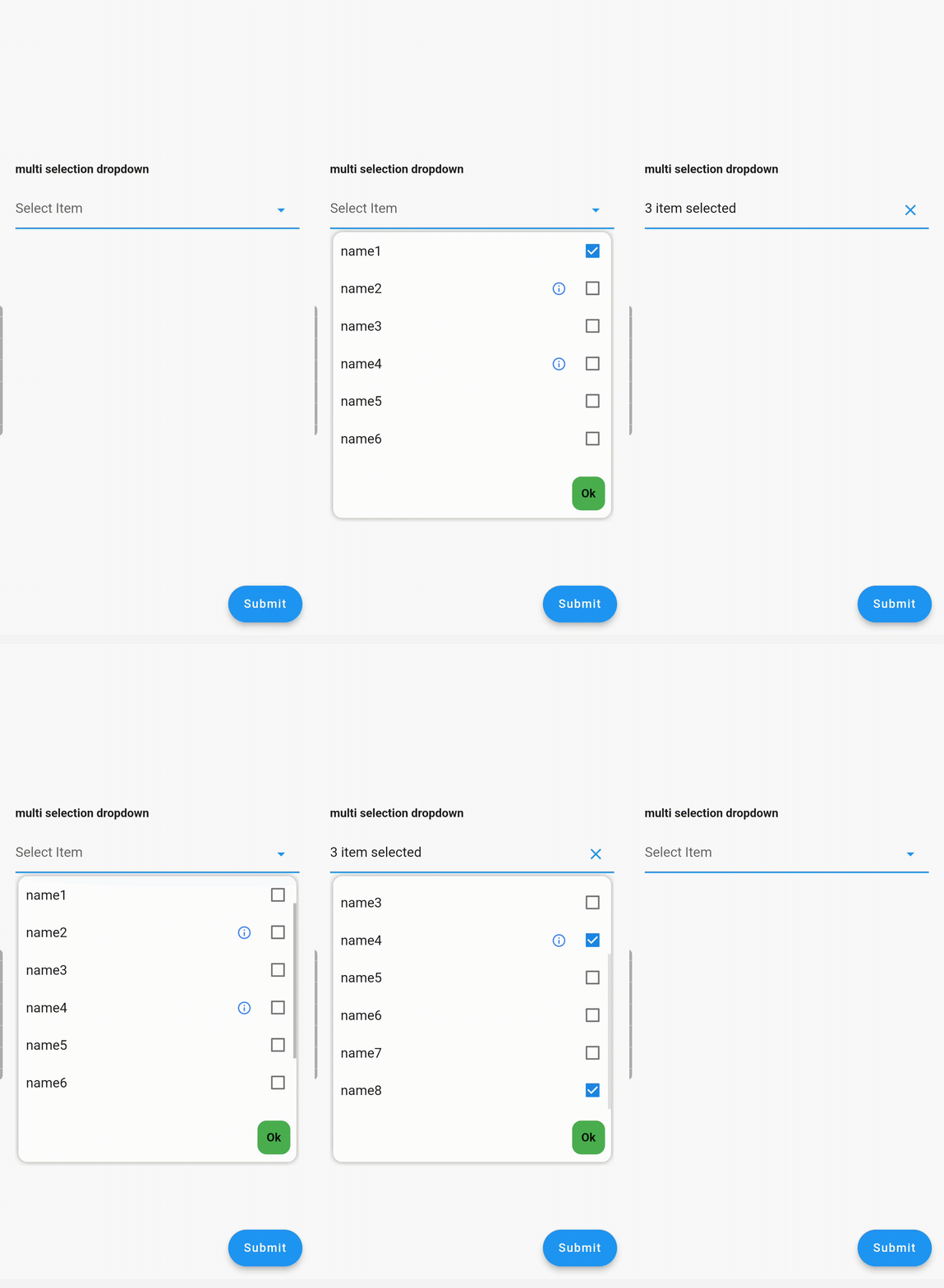
  6. ToolTip dialogue for multi-selection dropdown items

Examples

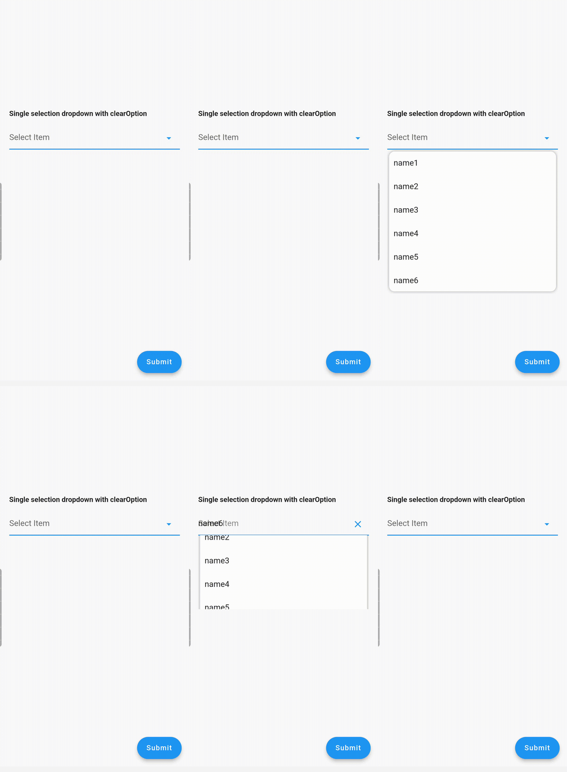
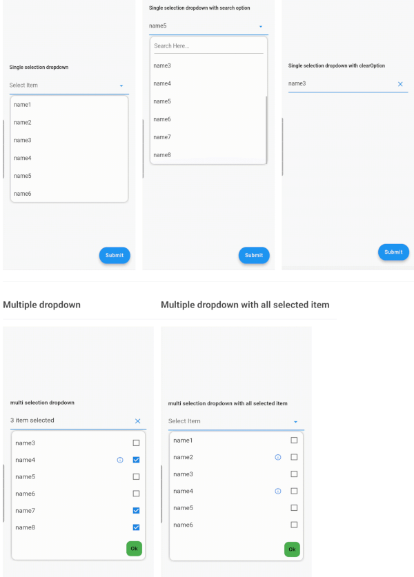
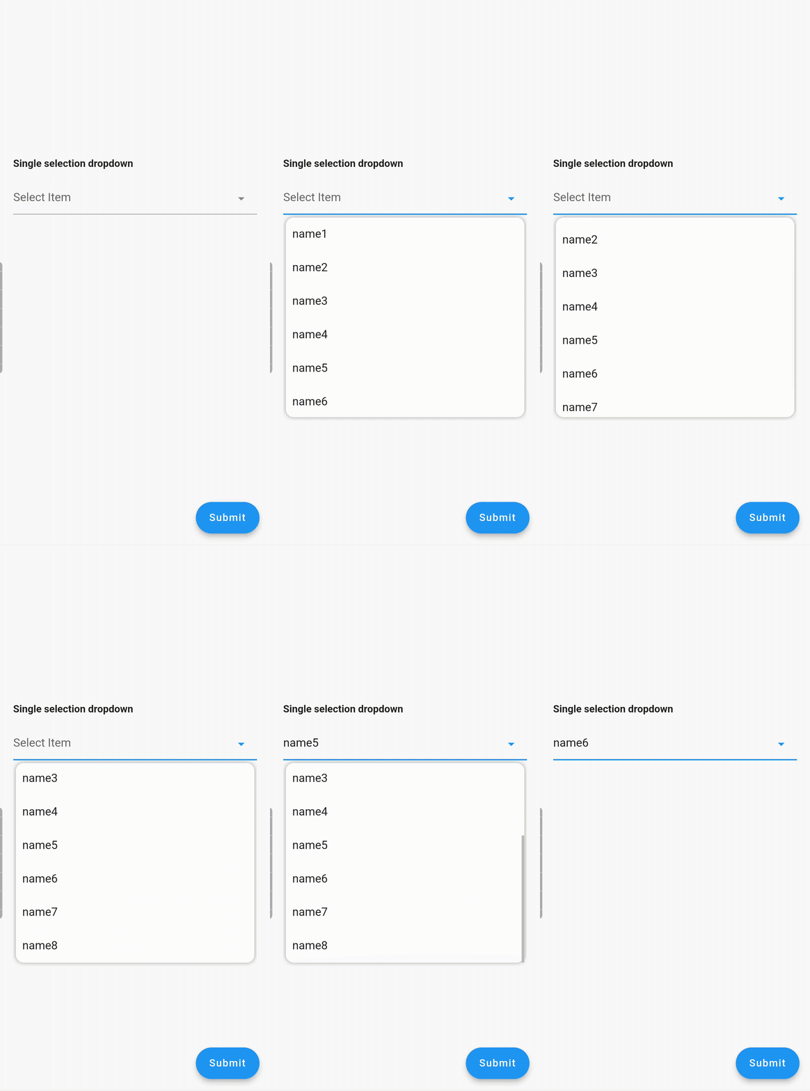
Single Dropdown Single Dropdown with Search Option Single Dropdown with Clear Option
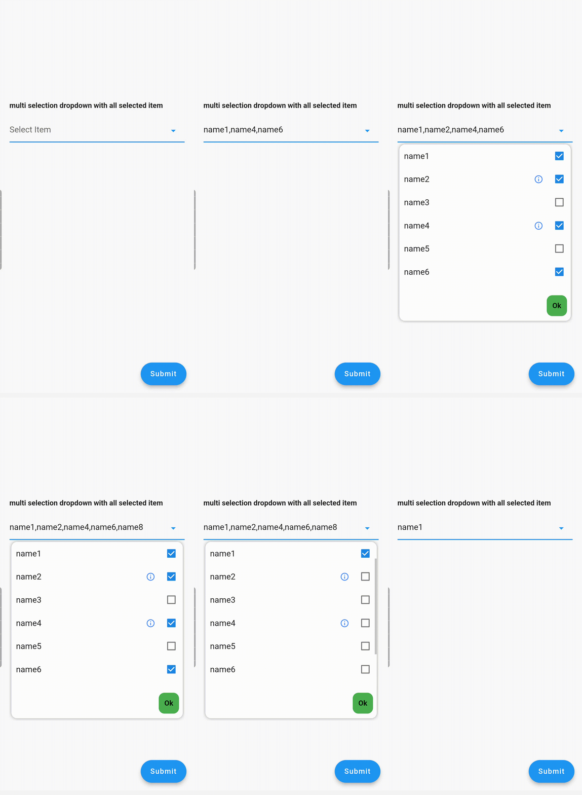
Multiple Dropdown Multiple Dropdown with All Selected Items

Usage

Controllers

You need to use SingleValueDropDownController for single dropdown and MultiValueDropDownController for multiple dropdown.

Properties
  • dropdownRadius: Defines the radius of the dropdown list. Default value is 12.
  • boxDecoration: Add custom BoxDecoration to decorate the dropdown container styling
  • boxMargin: Add custom margins to the dropdown container and override the default vertical: 5, horizontal: 4 margins
  • initialValue: Sets the initial value. If null or not in the dropDownList, it will not display any value.
  • dropDownList: A list of dropdown values of type <DropDownValueModel>.
  • onChanged: Listens for item selection changes. Returns a single DropDownValueModel object for single selection dropdown, and a list of DropDownValueModel objects for multi-selection dropdown.
  • textFieldDecoration: Overrides the default text field decoration.
  • dropDownIconProperty: Customizes the dropdown icon size and color.
  • isEnabled: Set to false to disable the text field. Default value is true.
  • enableSearch: Set to true to enable the search option in the dropdown. Currently available only for single selection dropdown.
  • displayCompleteItem: Set to true to display the complete list of selected items in the text field. Otherwise, it will display as "number_of_items selected".
  • dropDownItemCount: Maximum number of dropdown items to display. Default value is 6.
  • searchKeyboardType: Overrides the default search keyboard type. Applicable only if enableSearch=true.
  • searchTextStyle: Text style for the search text field.
  • searchAutofocus: Set to true to autofocus the search text field. Applicable only if enableSearch=true. Default value is false.
  • searchShowCursor: Set to false to hide the cursor from the search text field. Applicable only if enableSearch=true.
  • clearOption: Set to false to hide the clear suffix icon button from the text field.
  • clearIconProperty: Customizes the clear icon size and color.
  • listSpace: Space between the text field and the list. Default value is 0.
  • listPadding: Padding for dropdown list items.
  • submitButtonText: Text for the multi-dropdown submit button.
  • submitButtonColor: Color of the multi-dropdown submit button.
  • submitButtonTextStyle: Text style for the multi-dropdown submit button.
  • listTextStyle: Text style for dropdown list items.
  • checkBoxProperty: Customizes the properties of multiple checkboxes.

Contributing

Seeking contributions to improve the DropdownTextfield! If you have ideas for new features, optimizations, or bug fixes, please feel free to open a pull request or issue on our GitHub repository. Your contributions are greatly appreciated and will help make this package even better.

Categorias

Dependências

Lista de dependências 2 itens

Repositório-fonte

Projetos que usam este pacote

Ainda não há dados.