Buscar pacotes, repositórios e categorias de apps

Capa de easy_loading_button
Detalhes do pacotev0.4.0

easy_loading_button

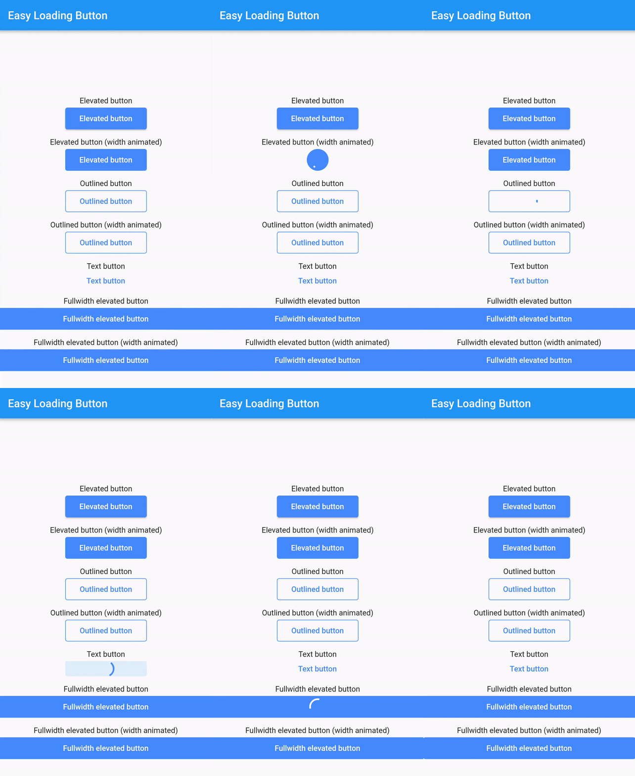
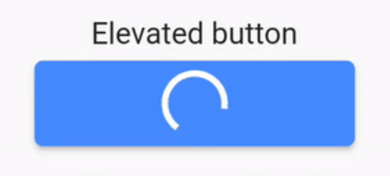
Um botão _Material Flutter_ simples, fácil de usar e personalizável para progresso/carregamento que suporta uma variedade de estilos de botões (elevado, contornado, texto).

AndroidiOSWebmacOSWindowsLinux
Downloads em 30 dias
787
Curtidas
70
Pontos Pub
150

Instalar pacote

flutter pub add easy_loading_button

Visão geral do pacote

Orientação gerada a partir de informações públicas. Apenas para referência.

EasyLoadingButton é um pacote Flutter que fornece um botão de progresso/carregamento simples e personalizável, com suporte para vários estilos, incluindo elevados, contornados e textos. Ele melhora a experiência do usuário exibindo estados de carregamento de forma fluida durante operações assíncronas. O botão é fácil de integrar e configurar, oferecendo transições suaves entre os estados normais e de carregamento. Ideal para formulários, ações e quaisquer elementos da interface que precisem de feedback durante o processamento.

Casos de uso

  • Envios de formulários
  • Gatilhos de ação assíncrona
  • Botões de login/cadastro
  • Processamento de pagamento
  • Operações de salvamento de dados

Principais recursos

  • Vários estilos de botão
  • Indicadores de carregamento personalizáveis
  • Transições de estado suaves
  • Integração fácil
  • Suporta todas as plataformas do Flutter
  • Cores e tamanhos configuráveis

Indicado para

  • Desenvolvedores iniciantes do Flutter
  • Interfaces de aplicativos simples
  • Prototipagem rápida
  • Formulários amigáveis ao usuário
  • Aplicativos que precisam de feedback claro durante tarefas assíncronas

Considerações

  • Opções avançadas de personalização limitadas
  • Pode exigir estilos adicionais para designs complexos
  • Não adequado para botões altamente dinâmicos ou animados
  • Depende dos princípios de design Material
  • Melhor usado em aplicativos padrão baseados em Material

README original

Snapshot do README original do repositório-fonte vinculado. Consulte o repositório para o conteúdo mais recente.

easy_loading_button

GitHub repo size GitHub code size in bytes GitHub top language GitHub issues GitHub license

easy_loading_button is a simple, easy to use, and customizeable progress/loading Material Flutter Button that supports variety of button styles (elevated, outlined, text).

Or try the demo on DartPad

Get started

Depend on it

Add this to your package's pubspec.yaml file:

easy_loading_button: ^0.3.2
Install it

You can install packages from the command line:

$ flutter pub get

Alternatively, your editor might support flutter pub get.

Import it

Now in your Dart code, you can use:

import 'package:easy_loading_button/easy_loading_button.dart';

How to use

Add EasyButton to your widget tree:

EasyButton(
  type: EasyButtonType.elevated,

  // Content inside the button when the button state is idle.
  idleStateWidget: const Text(
    'Elevated Button',
    style: TextStyle(
      color: Colors.white,
    ),
  ),

  // Content inside of the button when the button state is loading.
  loadingStateWidget: const CircularProgressIndicator(
    strokeWidth: 3.0,
    valueColor: AlwaysStoppedAnimation<Color>(
      Colors.white,
    ),
  ),

  // Whether or not to animate the width of the button. Default is `true`.
  // If this is set to `false`, you might want to set the `useEqualLoadingStateWidgetDimension` parameter to `true`.
  useWidthAnimation: true,

  // Whether or not to force the `loadingStateWidget` to have equal dimension. Default is `true`.
  // This is useful when you are using `CircularProgressIndicator` as the `loadingStateWidget`.
  // This parameter might also be useful when you set the `useWidthAnimation` parameter to `true` combined with `CircularProgressIndicator` as the value for `loadingStateWidget`.
  useEqualLoadingStateWidgetDimension: true,

  // If you want a fullwidth size, set this to double.infinity
  width: 150.0,

  height: 40.0,
  borderRadius: 4.0,

  // The elevation of the button.
  // This will only be applied when the type parameter value is EasyButtonType.elevated
  elevation: 0.0,

  // The gap between button and it's content.
  // This will be ignored when the `type` parameter value is set to `EasyButtonType.text`
  contentGap: 6.0,

  // Color for the button.
  // For [EasyButtonType.elevated]: This will be the background color.
  // For [EasyButtonType.outlined]: This will be the border color.
  // For [EasyButtonType.text]: This will be the text color.
  buttonColor: Colors.blueAccent,

  onPressed: () {},
),

More parameters:

const EasyButton({
  Key? key,
  required this.idleStateWidget,
  required this.loadingStateWidget,
  this.type = EasyButtonType.elevated,
  this.useWidthAnimation = true,
  this.useEqualLoadingStateWidgetDimension = true,
  this.width = double.infinity,
  this.height = 40.0,
  this.contentGap = 0.0,
  this.borderRadius = 0.0,
  this.elevation = 0.0,
  this.buttonColor = Colors.blueAccent,
  this.onPressed,
}) : super(key: key);

Three types supported:

enum EasyButtonType {
    elevated,
    outlined,
    text,
}

Source

Source code and example of this library can be found in git:

$ git clone https://github.com/usefulteam/easy_loading_button.git

License

MIT License

Credits

Thanks to Yang JIANG for the flutter_progress_button package.

My package was based on it. You can also visit their package pub.dev page.

Categorias

Repositório-fonte

Projetos que usam este pacote

Ainda não há dados.