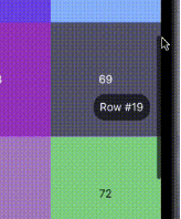
Uma barra de rolagem flexível para Flutter. Com este pacote, você pode criar barras de rolagem personalizadas com diferentes comportamentos predefinidos.
Orientação gerada a partir de informações públicas. Apenas para referência.
Um pacote Flutter que permite aos desenvolvedores criar barras de rolagem personalizáveis com comportamentos pré-definidos. Oferece flexibilidade em estilo e funcionalidade, permitindo designs únicos de barras de rolagem em diferentes plataformas. Ideal para aplicativos que exigem experiências de rolagem personalizadas, suporta todas as principais plataformas, incluindo Android, iOS, Web, macOS, Windows e Linux. O pacote melhora a interação do usuário fornecendo feedback visual durante a rolagem, mantendo uma interface limpa e responsiva.
Casos de uso
Design de rolagem personalizado em aplicações web
Melhorando a experiência do usuário em listas roláveis no celular
Personalizando indicadores de rolagem para aplicativos de desktop
Melhorando a acessibilidade em telas com conteúdo longo
Criando estilos de barra de rolagem específicos para plataforma
Adicionando feedback visual em widgets roláveis
Principais recursos
Aparência personalizável da barra de rolagem
Modos de comportamento pré-definidos
Compatibilidade multiplataforma
Suporte para animações personalizadas
Integração fácil com ScrollViews
Design responsivo em dispositivos
Indicado para
Designers de UI procurando personalização visual
Desenvolvedores criando interfaces com muita rolagem
Aplicativos direcionados a múltiplas plataformas
Projetos que exigem rolagem acessível
Equipes focadas na experiência do usuário refinada
Considerações
Pode exigir estilos adicionais para desempenho ótimo
A personalização de comportamento exige conhecimento do ScrollController
Não adequado para designs minimalistas sem feedback de rolagem
Conflitos potenciais de layout em visualizações de rolagem aninhadas
Temas internos limitados em comparação com as barras de rolagem nativas
README original
Snapshot do README original do repositório-fonte vinculado. Consulte o repositório para o conteúdo mais recente.
A Flexible Scrollbar for Flutter
A flexible solution for custom scroll bars.
Foreword
A package has been designed to allow the creation of complex scroll bars. You can customize the scroll thumb, scroll line and add a label, that is positioned by the center of the scroll thumb by default, but you can customize its position as well. As those three things are created by builders called every time the scroll state is changed, you can add custom animations.
How to use
The usage is as simple as a built-in Scrollbar, only you can customize it a lot more.
Install
To install this package simply add the flexible_scrollbar to your dependencies in pubspec.yaml
To get a scrollbar simply wrap a scrollable widget with FlexibleScrollbar and pass a ScrollController to both FlexibleScrollbar and a scrollable widget:
But it's very simple and we are here to make complex scroll bars so let's see how.
Customization
For the main customization the FlexibleScrollbar widget has three builders: scrollThumbBuilder, scrollLineBuilder and scrollLabelBuilder. Each one of them has a ScrollbarInfo as a parameter and rebuild each time any of the fields of the ScrollbarInfo model has changed.
ScrollbarInfo model has the following properties:
Properties
Description
bool isScrolling
Changes when the user starts/strops the scroll body scrolling. The isDragging is not affected by it.
bool isDragging
Changes when the user starts/strops to drag the scroll thumb. The isScrolling is not affected by it.
double thumbMainAxisSize
Contains the calculated depending on the scroll body size thumb length.
double thumbMainAxisOffset
Contains the offset in pixels of the scroll thumb from the starting position.
AxisDirection scrollDirection
Has the scroll body scroll direction in it (up/down/left/right)
Using those builders you can make custom scrollbars such as the one shown in the example at the beginning. The scroll thumb from the example has been created with the following code: