Buscar pacotes, repositórios e categorias de apps

Capa de floating_bottom_bar
Detalhes do pacotev0.0.4

floating_bottom_bar

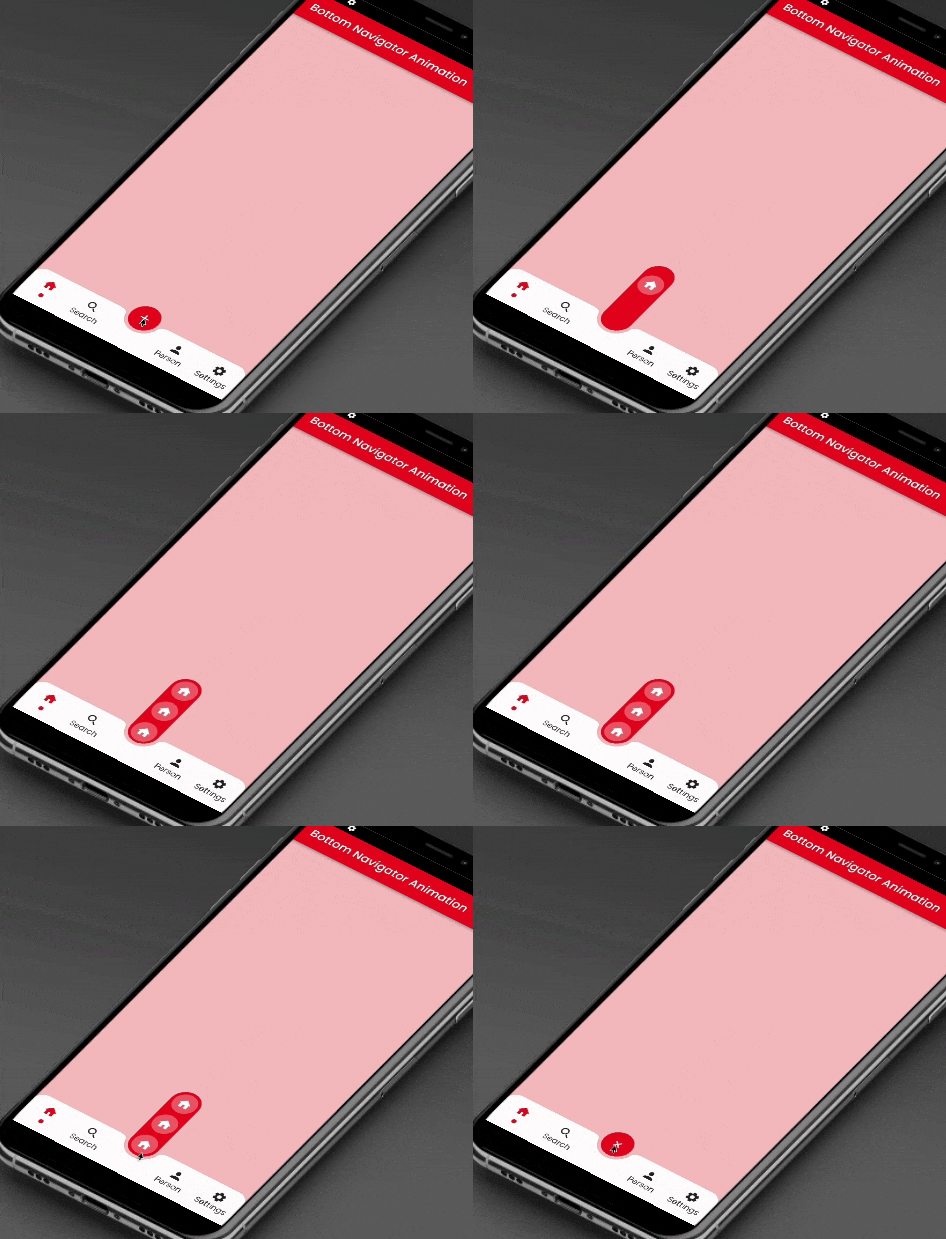
Este pacote fornece animação de deslizamento para o botão de ação flutuante localizado no centro e no botão da aba inferior.

AndroidiOSWebmacOSWindowsLinux
Downloads em 30 dias
1,4 mil
Curtidas
115
Pontos Pub
150

Instalar pacote

flutter pub add floating_bottom_bar

Visão geral do pacote

Orientação gerada a partir de informações públicas. Apenas para referência.

O pacote floating_bottom_bar aprimora as interfaces do usuário ao adicionar animações suaves de deslizamento a um botão flutuante de ação posicionado no centro e nos botões da aba inferior. Projetado para aplicativos Flutter, integra-se perfeitamente com barras de navegação inferior, oferecendo uma experiência envolvente e interativa em plataformas como Android, iOS, Web, macOS, Windows e Linux. O pacote suporta transições personalizáveis e layouts responsivos, tornando-o ideal para designs modernos de aplicativos que priorizam navegação intuitiva e apelo visual.

Casos de uso

  • Melhorando a navegação do aplicativo móvel
  • Criando botões flutuantes animados
  • Melhorando o engajamento do usuário em painéis
  • Design de navegação inferior responsiva
  • Adicionando elementos de interface dinâmicos a aplicativos da web
  • Apoia o desenvolvimento de aplicativos multiplataforma

Principais recursos

  • Animação suave de deslizamento para FAB
  • Botão de ação flutuante alinhado ao centro
  • Integração de guia inferior
  • Compatibilidade multiplataforma
  • Efeitos de transição personalizáveis
  • Suporte a layout responsivo

Indicado para

  • Desenvolvedores Flutter procurando interfaces animadas
  • Aplicativos que exigem navegação inferior intuitiva
  • Designers focados em componentes interativos
  • Construtores de aplicativos multiplataforma
  • Melhoria da experiência do usuário em aplicativos móveis e web

Considerações

  • Requer Flutter SDK 2.0 ou superior
  • Pode afetar o desempenho em dispositivos de baixa potência
  • Personalização limitada além da animação
  • Mais adequado para padrões de navegação simples
  • Dependente da renderização específica da plataforma
  • Não ideal para hierarquias de navegação complexas

README original

Snapshot do README original do repositório-fonte vinculado. Consulte o repositório para o conteúdo mais recente.

floating_bottom_bar

This package will animate a floating action button at the center and icons at the bottomNavigationBar using AnimatedContainer and SlideTransition respectively.

Floating Bottom Bar

Floating Bottom Bar

Usage

Example
    bottomNavigationBar: AnimatedBottomNavigationBar(
      barColor: Colors.white,
      controller: FloatingBottomBarController(initialIndex: 1),
      bottomBar: [
        BottomBarItem(
          icon: const Icon(Icons.home, size: example.Dimens.iconNormal),
          iconSelected: const Icon(Icons.home,
              color: example.AppColors.cherryRed,
              size: example.Dimens.iconNormal),
          title: example.Strings.home,
          dotColor: example.AppColors.cherryRed,
          onTap: (value) {
            setState(() {
              index = value;
            });
            log('Home $value');
          },
        ),
        BottomBarItem(
          icon:
              const Icon(Icons.photo, size: example.Dimens.iconNormal),
          iconSelected: const Icon(Icons.photo,
              color: example.AppColors.cherryRed,
              size: example.Dimens.iconNormal),
          title: example.Strings.search,
          dotColor: example.AppColors.cherryRed,
          onTap: (value) {
            setState(() {
              index = value;
            });
            log('Search $value');
          },
        ),
        BottomBarItem(
          icon:
              const Icon(Icons.person, size: example.Dimens.iconNormal),
          iconSelected: const Icon(Icons.person,
              color: example.AppColors.cherryRed,
              size: example.Dimens.iconNormal),
          title: example.Strings.person,
          dotColor: example.AppColors.cherryRed,
          onTap: (value) {
            setState(() {
              index = value;
            });
            log('Profile $value');
          },
        ),
        BottomBarItem(
          icon: const Icon(Icons.settings,
              size: example.Dimens.iconNormal),
          iconSelected: const Icon(Icons.settings,
              color: example.AppColors.cherryRed,
              size: example.Dimens.iconNormal),
          title: example.Strings.settings,
          dotColor: example.AppColors.cherryRed,
          onTap: (value) {
            setState(() {
              index = value;
            });
            log('Settings $value');
          },
        ),
      ],
      bottomBarCenterModel: BottomBarCenterModel(
        centerBackgroundColor: example.AppColors.cherryRed,
        centerIcon: const FloatingCenterButton(
          child: Icon(
            Icons.add,
            color: AppColors.white,
          ),
        ),
        centerIconChild: [
          FloatingCenterButtonChild(
            child: const Icon(
              Icons.home,
              color: AppColors.white,
            ),
            onTap: () => log('Item1'),
          ),
          FloatingCenterButtonChild(
            child: const Icon(
              Icons.access_alarm,
              color: AppColors.white,
            ),
            onTap: () => log('Item2'),
          ),
          FloatingCenterButtonChild(
            child: const Icon(
              Icons.ac_unit_outlined,
              color: AppColors.white,
            ),
            onTap: () => log('Item3'),
          ),
        ],
      ),
    ),
Required parameters
bottomBar:

This property takes List as a parameter which are use to show the icons in the bottomNavigationBar.

bottomBarCenterModel:

BottomBarCenterModel class is model class for bottom menu. It takes icon, iconSelected, title, titleStyle as parameters.

controller:

FloatingBottomBarController is used to give the initial index to the bottom bar to have the pre selected item form the bottom bar.

Guideline for contributors

Contribution towards our repository is always welcome, we request contributors to create a pull request to the develop branch only.

Guideline to report an issue/feature request

It would be great for us if the reporter can share the below things to understand the root cause of the issue.

  • Library version
  • Code snippet
  • Logs if applicable
  • Device specification like (Manufacturer, OS version, etc)
  • Screenshot/video with steps to reproduce the issue

LICENSE!

Animated Segment is MIT-licensed.

Let us know!

We’d be really happy if you send us links to your projects where you use our component. Just send an email to sales@mindinventory.com And do let us know if you have any questions or suggestion regarding our work.

Categorias

Dependências

Lista de dependências 1 itens

Repositório-fonte

Projetos que usam este pacote

Ainda não há dados.