Orientação gerada a partir de informações públicas. Apenas para referência.
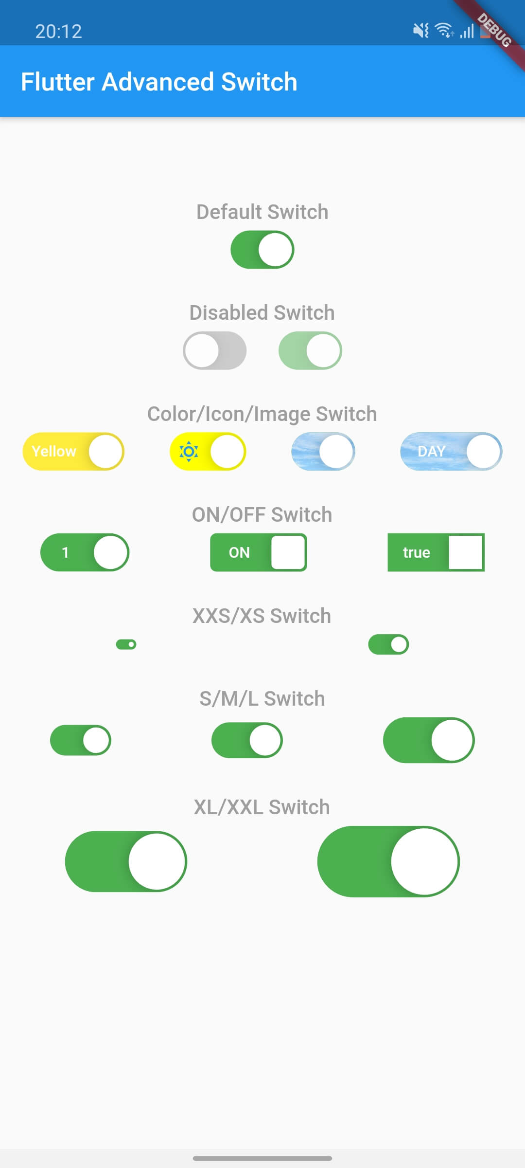
O Flutter Advanced Switch é um widget de interruptor personalizável que oferece uma API rica para personalização extensiva de estilo e comportamento. Permite aos desenvolvedores criar interruptores visualmente distintos com animações suaves, designs personalizados para trilho e botão, e interações responsivas em todas as principais plataformas. Ideal para interfaces modernas que exigem controles de alternância únicos, ele melhora a experiência do usuário com elementos interativos refinados. O pacote suporta Android, iOS, Web, macOS, Windows e Linux, garantindo consistência entre plataformas.
Casos de uso
Interfaces de alternância personalizadas
Feedback de usuário aprimorado em formulários
Design de interface de aplicativo moderno
Painéis de configuração interativos
Componentes de interruptor multiplataforma
Diferenciação visual em painéis
Principais recursos
Faixa e alavanca altamente personalizáveis
Transições de animação suaves
Compatibilidade multiplataforma
Opções extensas de estilo
Feedback de toque responsivo
Estados e comportamentos configuráveis
Indicado para
Designers de UI procurando flexibilidade visual
Desenvolvedores de aplicativos modernos
Equipes que exigem experiência do usuário de alternância consistente
Aplicativos com interações de formulário complexas
Projetos direcionados para múltiplas plataformas
Considerações
Requer conhecimento sobre personalização de widgets do Flutter
Pode aumentar levemente o tamanho do pacote
A complexidade de estilo pode afetar a velocidade do desenvolvimento
Temas internos limitados
Não é ideal para alternadores simples de ligar/desligar sem personalização
README original
Snapshot do README original do repositório-fonte vinculado. Consulte o repositório para o conteúdo mais recente.
flutter_advanced_switch
A highly customizable switch widget for Flutter with support for custom colors, text, icons, images, and more.
Switch Light
Switch Dark
Features
✅ Fully customizable colors, sizes, and shapes
✅ Support for text labels and icons
✅ Background images for active/inactive states
✅ Custom thumb widget support
✅ Smooth animations
✅ Enabled/disabled states
✅ Controller-based or callback-based state management
✅ Customizable thumb padding
✅ Null-safe
Getting Started
In the pubspec.yaml of your flutter project, add the following dependency:
class_MyWidgetStateextendsState<MyWidget> {
final _controller = ValueNotifier<bool>(false);
@overridevoidinitState() {
super.initState();
_controller.addListener(() {
setState(() {
// React to state changesprint('Switch is now: ${_controller.value}');
});
});
}
@overridevoiddispose() {
_controller.dispose();
super.dispose();
}
@overrideWidgetbuild(BuildContext context) {
returnColumn(
children: [
AdvancedSwitch(controller: _controller),
Text('Switch is ${_controller.value ? "ON" : "OFF"}'),
],
);
}
}
Parameters
Parameter
Description
Type
Default
controller
Controls the state of the switch. If provided, the switch will use this controller to manage its state.
ValueNotifier<bool>?
null
activeColor
The background color when the switch is in the active (on) state.
Color
Color(0xFF4CAF50)
inactiveColor
The background color when the switch is in the inactive (off) state.
Color
Color(0xFF9E9E9E)
activeChild
A widget to display on the left side when the switch is active.
Widget?
null
inactiveChild
A widget to display on the right side when the switch is inactive.
Widget?
null
activeImage
An optional background image to display when the switch is active.
ImageProvider?
null
inactiveImage
An optional background image to display when the switch is inactive.
ImageProvider?
null
decoration
The decoration to apply to the switch container. Typically used to set the border radius and shape.
BoxDecoration
BorderRadius.circular(15)
width
The width of the switch.
double
50.0
height
The height of the switch. The thumb size is automatically calculated based on this value.
double
30.0
enabled
Whether the switch is enabled. If false, the switch will be displayed with reduced opacity and will not respond to user interactions.
bool
true
disabledOpacity
The opacity to apply when the switch is disabled.
double
0.5
thumb
A custom widget to use as the thumb (the sliding part of the switch). If null, a default white rounded rectangle with a shadow will be used.
Widget?
null
thumbPadding
The padding around the thumb. This creates space between the thumb and the switch edges.
double
1.0
initialValue
The initial state of the switch when controller is not provided. This value is only used when controller is null.
bool
false
onChanged
Called when the user toggles the switch. The switch will call this callback with the new value. If null and no controller is provided, the switch will be disabled.