Orientação gerada a partir de informações públicas. Apenas para referência.
Flutter Bootstrap5 é um pacote Flutter que traz muitos componentes e utilitários do Bootstrap 5 para aplicativos Flutter. Ele permite que desenvolvedores implementem designs responsivos e voltados para dispositivos móveis usando a sintaxe e classes familiares do Bootstrap 5. O pacote suporta todas as principais plataformas, incluindo Android, iOS, Web, macOS, Windows e Linux, tornando-o ideal para projetos multiplataforma. Ao aproveitar o sistema de grade, tipografia, botões, formulários e muito mais do Bootstrap, os desenvolvedores podem acelerar o desenvolvimento da interface com estilos consistentes em todos os dispositivos.
Casos de uso
Construindo aplicativos web e móveis responsivos
Prototipagem rápida de UI com padrões do Bootstrap
Desenvolvimento de aplicativos multiplataforma
Criando sistemas de design consistentes
Implementando layouts baseados em Bootstrap no Flutter
Principais recursos
Compatibilidade de componentes do Bootstrap 5
Sistema de grade responsivo
Suporte de plataforma em todos os alvos
Estilo baseado em classes semelhante ao CSS
Integração fácil com projetos Flutter existentes
Indicado para
Desenvolvedores familiarizados com o Bootstrap
Equipes que priorizam a consistência do design
Projetos que exigem desenvolvimento rápido de UI
Construtores de aplicativos multiplataforma
Desenvolvedores Flutter voltados para o frontend
Considerações
Pode aumentar o tamanho do pacote
Personalização limitada além das classes do Bootstrap
Depende da lógica CSS externa
Não é um substituto completo do Bootstrap
Requer conhecimento dos conceitos do Bootstrap
README original
Snapshot do README original do repositório-fonte vinculado. Consulte o repositório para o conteúdo mais recente.
FlutterBootstrap5 🚀
This package is used to support the creation of responsive web applications with Flutter.
It is based on the well-known CSS framework Bootstrap 5 and offers many features that can also be found in Bootstrap.
If you like this package it would be nice if you would give a Like ❤️ and a Star ⭐ to support the project!
If you want to have a quick overview of the most important functions and test them directly, you can do so here
You have various possibilities to customize Flutter Bootstrap5 for your needs.
You can also leave it at the default values to get the default behavior of a Bootstrap5 app.
Currently the following customization options are supported:
BreakPoints
To set your own BreakPoints, you can simply pass the BreakPoints class to the [FlutterBootstrap5] widget.
By default the current BreakPoints of Bootstrap5 CSS are used
Beside the normal BreakPoints you can also define your own BreakPoints for the [FB5Container].
These determine which width a [FB5Container] should have at a certain BreakPoint.
By default the current Container BreakPoints of Bootstrap5 CSS are used
With the parameter defaultFontSize you can specify the default font size to be used for the calculation of "rem" values.
Bootstrap CSS uses rem to calculate margins, paddings and also font size.
Similarly, these values are also calculated in Flutter Bootstrap5 depending on the defaultFontSize.
The default value is 16.0
Typography
Flutter Bootstrap5 uses a font size calculation mechanism based on Bootstrap CSS.
So font sizes change dynamically depending on the screen size.
To customize this behavior you can pass the [FB5Typography] class to FlutterBootstrap5.
Use the theme in your MaterialApp
After configuring [FlutterBootstrap5] to your liking,
you can now pass the theme to your MaterialApp to take full advantage of Flutter Bootstrap 5.
MaterialApp(
title: 'Flutter Bootstrap5 Demo',
theme: BootstrapTheme.of(ctx).toTheme( [PASS YOUR THEME TO OVERRIDE BOOTSTRAP THEME IF YOU WANT TO] ),
home: constHome(),
),
So now let's talk about the features
Currently supported Bootstrap classes
NOTE! Responsive support indicates whether the use of -xs, -sm, -md, -lg, -xl, and-xxl is supported
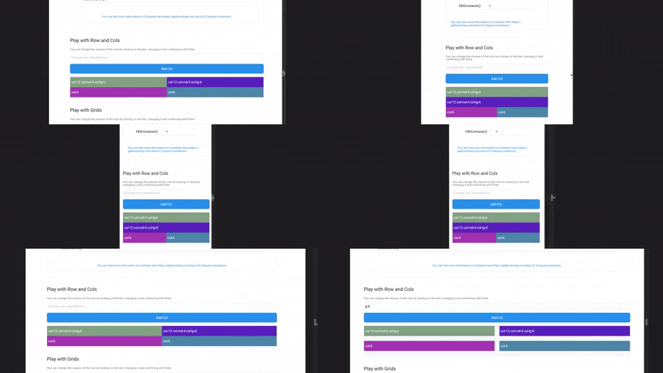
FB5Col are the flutter implementation of the Bootstrap Col. They should be used inside a FB5Row and change their representation according to the classNames.
FB5Grid are used to represent a grid system of your children. They should not contain FB5Cols. FB5Grid automatically adjusts the size of the children so that a row of children always has the same height.
Information about the current screen size and breakpoint is returned by the BootstrapTheme.
For this, nothing more is necessary than to execute the following function.
final screenData = BootstrapTheme.of(context);
It also offers useful functions. For example, the query whether the current breakpoint is larger or smaller than a certain breakpoint.
    final screenData = BootstrapTheme.of(context);
    screenData.currentBreakPoint.isBreakPointOrSmaller(screenData.breakPoints.xl);

    screenData.currentBreakPoint.isBreakPointOrLarger(screenData.breakPoints.xl);
Functions
There are some helper functions to add bootstrap functionality to Flutter widgets:
// e.g. add a 4rem margin-top to a ContainerContainer(
margin: margin(context, 'mt-4'),
);
// e.g. add a 2rem padding to a ContainerContainer(
margin: padding(context, 'p-2'),
);
// add a borderRadius to a ContainerContainer(
decoration: BoxDecoration(
borderRadius: rounded(context), // rounded1 rounded2 rounded3 rounded4 rounded5 roundedPill
),
);
// add a border to a ContainerContainer(
decoration: BoxDecoration(
border: borderPrimary(context), // borderSecondary, borderSuccess, borderDanger, etc...
),
);
// responsiveValue & responsiveValueOrNull// if you need different values for different breakPointsfinal width = responsiveValue<double>(context, defaultValue: 300.0, md: 350.0, xl: 400.0);