Orientação gerada a partir de informações públicas. Apenas para referência.
Flutter Inner Drawer é um pacote leve que permite aos desenvolvedores implementar um painel lateral interno (esquerdo ou direito) em um aplicativo Flutter. Ele oferece uma maneira simples e personalizável de adicionar menus de navegação ou áreas de conteúdo adicionais sem interromper o fluxo principal da interface. O painel desliza da borda da tela, proporcionando uma experiência de usuário limpa e moderna. Suporta gestos horizontais e verticais para abrir e fechar, e integra-se perfeitamente com widgets existentes. Ideal para aplicativos que precisam de um painel de navegação compacto e acessível.
Casos de uso
Adicionando menus de navegação colapsáveis
Criando painéis de ação contextuais
Implementando filtros ou configurações baseados em lados
Melhorando layouts de aplicativos móveis com conteúdo oculto
Projetando interfaces responsivas com gavetas aninhadas
Principais recursos
Integração fácil com widgets existentes
Suporta posições de gaveta esquerda e direita
Interações abertas/fechadas baseadas em gestos
Animação e estilização personalizáveis
Leve e eficiente
Largura e alinhamento do armário configuráveis
Indicado para
Desenvolvedores de aplicativos móveis em busca de navegação intuitiva
Designers que querem painéis laterais elegantes
Aplicativos que exigem interfaces minimalistas, mas funcionais
Projetos usando princípios de design material
Desenvolvedores visando interações suaves baseadas em gestos
Considerações
Pode exigir manipulação cuidadosa de conteúdo sobreposto
Suporte interno limitado para gavetas aninhadas complexas
Não ideal para cenários de sobreposição de tela cheia
Requer atenção à acessibilidade em gestos de toque
Mais adequado para estruturas de navegação de nível único
README original
Snapshot do README original do repositório-fonte vinculado. Consulte o repositório para o conteúdo mais recente.
flutter_inner_drawer
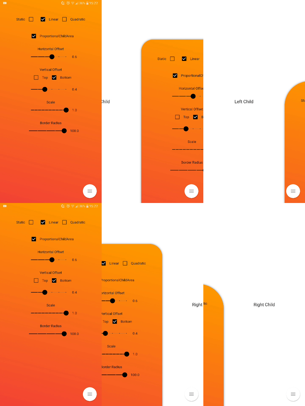
Inner Drawer is an easy way to create an internal side section (left/right) where you can insert a list menu or other.
Installing
Add this to your package's pubspec.yaml file:
dependencies:
  flutter_inner_drawer: "^1.0.0+1"
Demo
Simple usage
import'package:flutter_inner_drawer/inner_drawer.dart';
.
.
.
@overrideWidgetbuild(BuildContext context)
{
returnInnerDrawer(
key: _innerDrawerKey,
onTapClose: true, // default false
swipe: true, // default true
colorTransitionChild: Color.red, // default Color.black54
colorTransitionScaffold: Color.black54, // default Color.black54//When setting the vertical offset, be sure to use only top or bottom
offset: IDOffset.only(bottom: 0.05, right: 0.0, left: 0.0),
scale: IDOffset.horizontal( 0.8 ), // set the offset in both directions
proportionalChildArea : true, // default true
borderRadius: 50, // default 0
leftAnimationType: InnerDrawerAnimation.static, // default static
rightAnimationType: InnerDrawerAnimation.quadratic,
backgroundDecoration: BoxDecoration(color: Colors.red ), // default Theme.of(context).backgroundColor//when a pointer that is in contact with the screen and moves to the right or left
onDragUpdate: (double val, InnerDrawerDirection direction) {
// return values between 1 and 0print(val);
// check if the swipe is to the right or to the leftprint(direction==InnerDrawerDirection.start);
},
innerDrawerCallback: (a) => print(a), // return true (open) or false (close)
leftChild: Container(), // required if rightChild is not set
rightChild: Container(), // required if leftChild is not set// A Scaffold is generally used but you are free to use other widgets// Note: use "automaticallyImplyLeading: false" if you do not personalize "leading" of Bar
scaffold: Scaffold(
appBar: AppBar(
automaticallyImplyLeading: false
),
)
/* OR
CupertinoPageScaffold(
navigationBar: CupertinoNavigationBar(
automaticallyImplyLeading: false
),
),
*/
)
}
// Current State of InnerDrawerStatefinalGlobalKey<InnerDrawerState> _innerDrawerKey = GlobalKey<InnerDrawerState>();
void_toggle()
{
_innerDrawerKey.currentState.toggle(
// direction is optional // if not set, the last direction will be used//InnerDrawerDirection.start OR InnerDrawerDirection.end
direction: InnerDrawerDirection.end
);
}
InnerDrawer Parameters
PropName
Description
default value
scaffold
A Scaffold is generally used but you are free to use other widgets
required
leftChild
Inner Widget
required if rightChild is not set
rightChild
Inner Widget
required if leftChild is not set
leftOffset(deprecated)
Offset drawer width
0.4
rightOffset(deprecated)
Offset drawer width
0.4
leftScale(deprecated)
Left scaffold scaling
1
rightScale(deprecated)
Right scaffold scaling
1
offset
Offset InnerDrawer width
IDOffset.horizontal(0.4)
scale
Scaffold scaling
IDOffset.horizontal(1)
proportionalChildArea
If true, dynamically sets the width based on the selected offset, otherwise it leaves the width at 100% of the screen.
true
borderRadius
For scaffold border
0
onTapClose
Tap on the Scaffold closes it
false
swipe
activate or deactivate the swipe
true
swipeChild
activate or deactivate the swipeChild
false
duration
Animation Controller duration
Duration(milliseconds: 246)
velocity
Allows you to set the opening and closing velocity when using the open/close methods
Optional callback that is called when a InnerDrawer is opened or closed
onDragUpdate
When a pointer that is in contact with the screen and moves to the right or left
_innerDrawerKey.currentState.open
Current State of GlobalKey(check example) - OPEN
_innerDrawerKey.currentState.close
Current State of GlobalKey(check example) - CLOSE
_innerDrawerKey.currentState.toggle
Current State of GlobalKey(check example) - OPEN or CLOSE
Donate
It takes time to carry on this project. If you found it useful or learned something from the source code please consider the idea of donating 5, 20, 50 € or whatever you can to support the project.
Issues
If you encounter problems, open an issue. Pull request are also welcome.