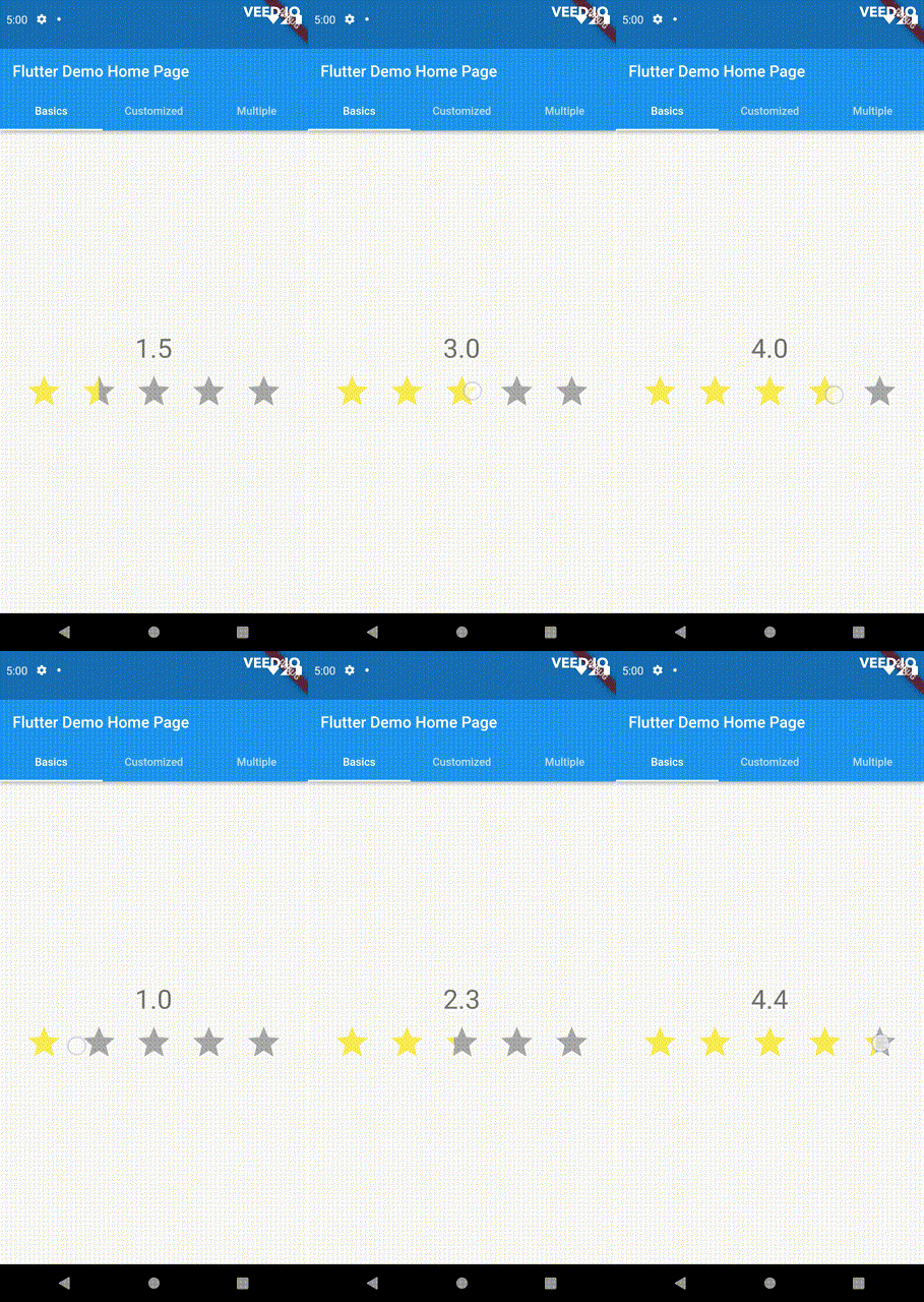
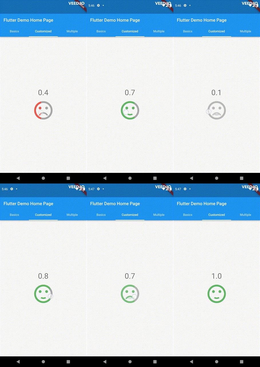
Uma barra de classificação versátil e personalizável para Flutter. Esta barra se destaca das demais por sua capacidade de selecionar quaisquer valores fracionários. Todos os eventos de arrasto, toque e passagem do mouse são suportados.
Orientação gerada a partir de informações públicas. Apenas para referência.
Uma barra de classificação altamente personalizável para Flutter que permite selecionar qualquer valor fracionário de avaliação. Diferentemente das barras de classificação tradicionais, ela oferece interação suave por meio de eventos de arrasto, toque e hover, proporcionando uma experiência do usuário responsiva e intuitiva em todos os dispositivos. Ideal para aplicativos que exigem entrada de feedback precisa, como avaliações ou pesquisas. O pacote é compatível com todas as principais plataformas, incluindo Android, iOS, Web, macOS, Windows e Linux.
Casos de uso
Avaliações de usuários com classificações granulares
Interfaces de pesquisa interativas
Coleta de feedback em aplicativos
Ajustes de classificação em tempo real
Componentes de interface do usuário amigáveis ao toque
Principais recursos
Suporta classificações fracionárias
Interações de arrastar, tocar e passar o mouse
Design altamente personalizável
Compatibilidade multiplataforma
Transições de animação suaves
Tamanho de passo configurável
Indicado para
Desenvolvedores construindo sistemas interativos de feedback
Aplicativos que precisam de entradas de classificação precisas
Designers que querem interfaces otimizadas para toque
Projetos direcionados para múltiplas plataformas
Protótipos que exigem controles dinâmicos de classificação
Considerações
Pode exigir estilos adicionais para temas complexos
Impacto no desempenho em grandes listas de barras de avaliação
Requer um tratamento cuidadoso de conflitos de gestos
Documentação limitada além do uso básico
Não otimizado para atualizações de muito alta frequência
README original
Snapshot do README original do repositório-fonte vinculado. Consulte o repositório para o conteúdo mais recente.
PannableRatingBar
Introducing a new and improved rating bar for Flutter, offering versatility and full customization.
Unlike other rating bars, this one allows for any value to be selected, not just full or half
ratings when interacted. Tap, drag and hover gestures are seamlessly supported, providing a smooth
user experience.
Features
Offers fractional values for rating
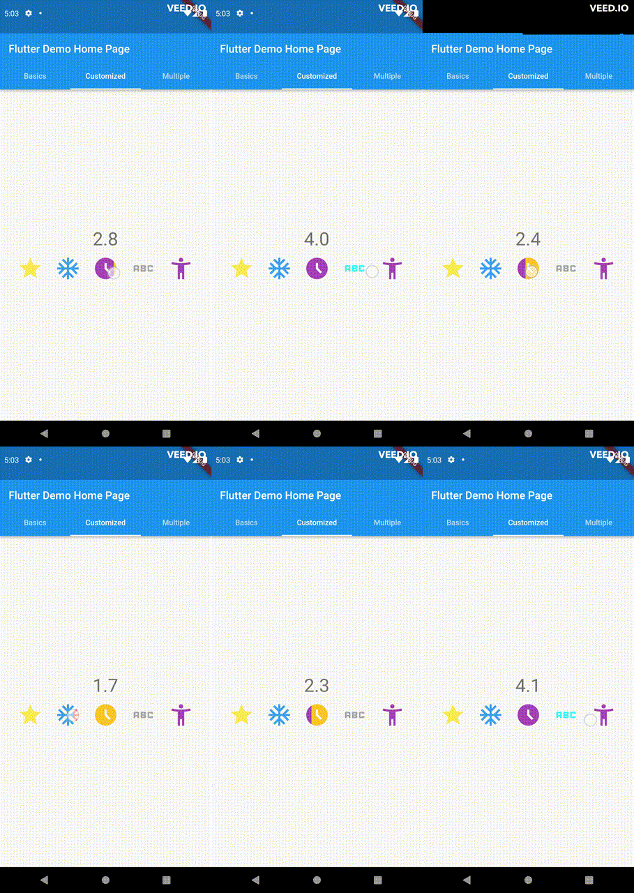
High degree of customization for the rating widgets, which can be of different sizes, shapes, and colors.
Precise hit testing, as the child widget's render object is utilized to determine the results.
Allows for filtering gestures with either tapOnly, dragOnly or tapAndDrag options.
Rating reports on cursor hovering supported.
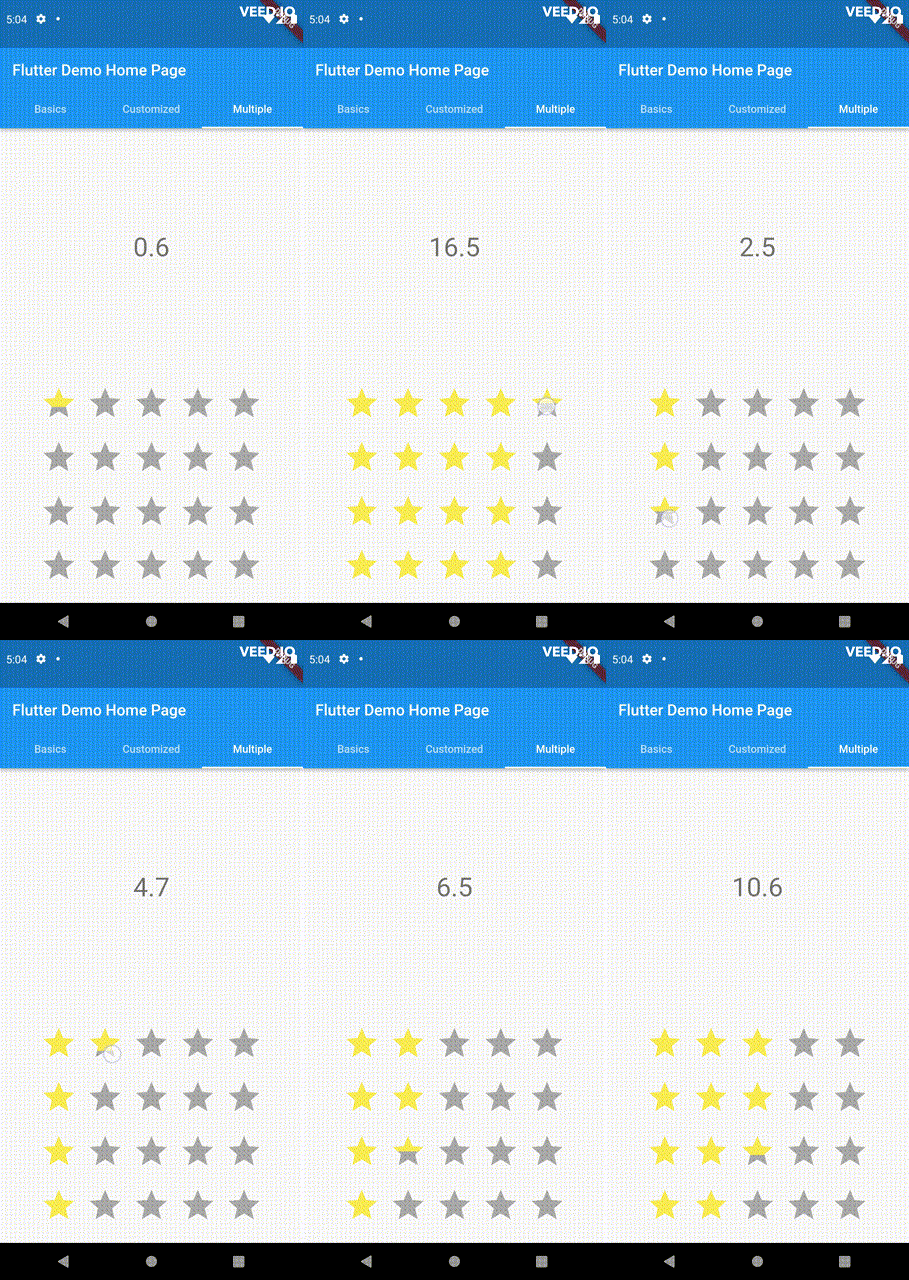
Built on Flutter's Wrap widget, offering a variety of supported layouts, including consideration
of Wrap properties such as textDirection and verticalDirection when painting the indicators.
This widget is stateless and highly flexible, allowing you to easily manipulate values and
customize the display of the PannableRatingBar. Simply rebuild the widget with the value provided
in the onChanged callback or onHover callback and the widget will automatically adjust the
rating distribution across each rating widget.
double rating = 0.0;
PannableRatingBar(
rate: rating,
items: List.generate(5, (index) =>
constRatingWidget(
selectedColor: Colors.yellow,
unSelectedColor: Colors.grey,
child: Icon(
Icons.star,
size: 48,
),
)),
onChanged: (value) { // the rating value is updated on tap or drag.setState(() {
rating = value;
});
},
)
The widget also supports getting the rate value by hovering with the onHover callback. It works
best on devices that support a mouse cursor, including desktop web browsers.
double rating = 0.0;
PannableRatingBar(
rate: rating,
items: List.generate(5, (index) =>
constRatingWidget(
selectedColor: Colors.yellow,
unSelectedColor: Colors.grey,
child: Icon(
Icons.star,
size: 48,
),
)),
onHover: (value) { // the rating value is updated every time the cursor moves over a new item.setState(() {
rating = value;
});
},
)
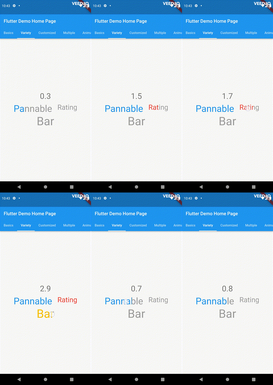
Utilize your own custom widgets as the rating indicators. With complete customization freedom, they
don't have to be uniform in size, color, or any other aspect.
This widget utilizes the layout capabilities of Flutter's built-in Wrap widget, allowing for a wide
range of possible layouts to be achieved. The properties of the Wrap widget, such as textDirection
and verticalDirection, are also considered when painting the indicators, giving you even greater
control over the final look and feel of the rating bar.
Some of the pre-built RatingValueTransformers available are:
// Rounding to nearest single fractional digit. This is also the default one that // `PannableRatingBar` used.doublesingleFractionalValueTransformer(double value);
// Rounding to nearest .5.doublehalfFractionalValueTransformer(double value);
// Leave the rating as is.doublerawValueTransformer(double value);
Additional information
For more, checkout and play with the example file.
If you have any suggestions for improvement, simply create an issue in the repository!