Buscar pacotes, repositórios e categorias de apps

Capa de flutter_scrolling_fab_animated
Detalhes do pacotev0.1.5

flutter_scrolling_fab_animated

Pacote para adicionar um botão flutuante cujo tamanho muda ao rolar para baixo

AndroidiOSWebmacOSWindowsLinux
Downloads em 30 dias
484
Curtidas
68
Pontos Pub
160

Instalar pacote

flutter pub add flutter_scrolling_fab_animated

Visão geral do pacote

Orientação gerada a partir de informações públicas. Apenas para referência.

Um pacote Flutter que melhora a experiência do usuário animando um botão de ação flutuante (FAB) em resposta a eventos de rolagem. À medida que o usuário rola para baixo, o FAB diminui ou desaparece, e expande-se ou reaparece ao rolar para cima. Esse comportamento ajuda a manter a limpeza da interface enquanto mantém a ação principal acessível. O pacote oferece suporte a todas as principais plataformas, incluindo Android, iOS, Web, macOS, Windows e Linux, tornando-o ideal para designs consistentes entre plataformas.

Casos de uso

  • Animações de FAB acionadas por rolagem
  • Melhorando a UX de aplicativos móveis com FABs dinâmicos
  • Criando interfaces limpas com FABs ocultos ao rolar
  • Comportamento consistente do FAB em múltiplas plataformas
  • Melhorando a hierarquia visual em listas roláveis

Principais recursos

  • Animação automática de tamanho do FAB ao rolar
  • Compatibilidade multiplataforma
  • Integração simples com visualizações de rolagem existentes
  • curvas de animação configuráveis
  • Suporta FABs com redução e expansão

Indicado para

  • Desenvolvedores de aplicativos móveis e web
  • Designers focados em interfaces de usuário interativas
  • Aplicativos com conteúdo longo e rolável
  • Desenvolvedores em busca de melhorias leves para o FAB
  • Projetos que exigem componentes independentes de plataforma

Considerações

  • Pode exigir ajustes finos para o tempo de animação ideal
  • Mais adequado para telas de rolagem única
  • Personalização limitada além do tamanho e visibilidade
  • Não ideal para cenários complexos de rolagem aninhada
  • Depende do comportamento do widget de rolagem pai

README original

Snapshot do README original do repositório-fonte vinculado. Consulte o repositório para o conteúdo mais recente.

Flutter Scrolling Fab Animated

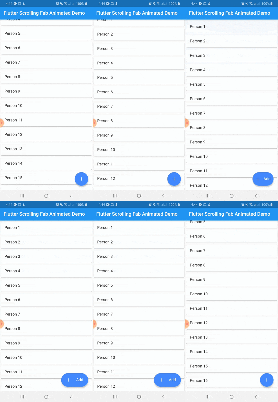
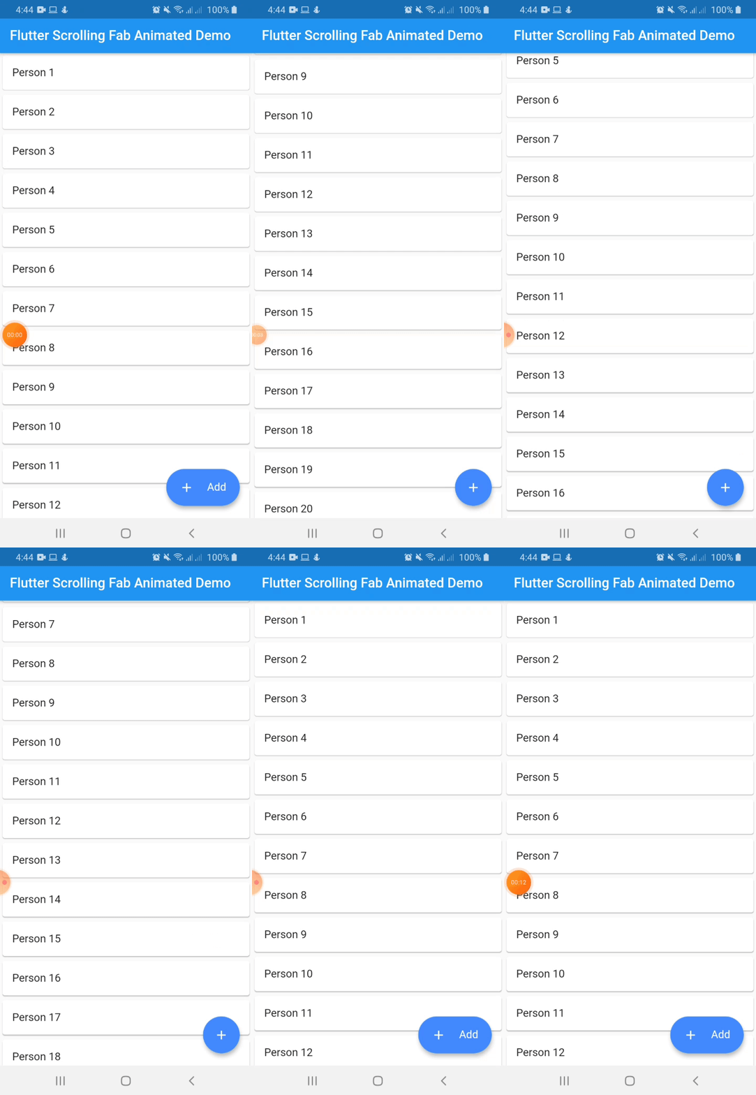
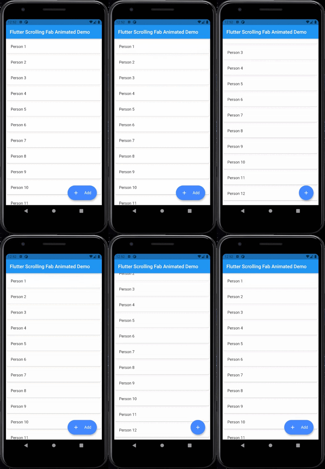
This package is a floating button whose change of size when scroll down and return to its original size when on top again. It's useful with ListView widget and other scrollable widgets.

With animated icon

New Features 💥

  • Adding on long press support
  • Adding ripple effect for the button
  • Removing square shadow around the button when pressing it
  • Added gradient background

Instalation

Include flutter_scrolling_fab_animated in your pubspec.yaml file:

dependencies:
  flutter:
    sdk: flutter
  flutter_scrolling_fab_animated: version

Usage

To use this package, just import it into your file and enjoy it.

import 'package:bottom_sheet_expandable_bar/bottom_sheet_bar_icon.dart';
import 'package:flutter_scrolling_fab_animated/flutter_scrolling_fab_animated.dart';

...

  @override
  Widget build(BuildContext context) {
    return Scaffold(
      appBar: AppBar(
        title: Text('Flutter Scrolling Fab Animated Demo'),
      ),
      body: Container(
        child: new ListView.builder(
          controller: _scrollController,
          itemCount: items.length,
          itemBuilder: (BuildContext ctxt, int index) {
            return new Card(
              child: ListTile(
                title: Text(items[index]),
              )
            );
          }
        ),
      ),
      floatingActionButton: ScrollingFabAnimated(
        icon: Icon(Icons.add, color: Colors.white,),
        text: Text('Add', style: TextStyle(color: Colors.white, fontSize: 16.0),),
        onPress: (){},
        scrollController: _scrollController,
        gradient: const LinearGradient(colors: [Color(0xff0CA2E6),Color(0xff2E3D97),],begin: Alignment.topCenter, end: Alignment.bottomCenter),
        animateIcon: true,
        inverted: false,
        radius: 10.0,
      )
    );
  }

...

Example with a GridView

import 'package:bottom_sheet_expandable_bar/bottom_sheet_bar_icon.dart';
import 'package:flutter_scrolling_fab_animated/flutter_scrolling_fab_animated.dart';

...

  @override
  Widget build(BuildContext context) {
    return Scaffold(
      appBar: AppBar(
        title: Text('Flutter Scrolling Fab Animated Demo'),
      ),
      body: Container(
        child: new GridView.builder(
          gridDelegate: SliverGridDelegateWithFixedCrossAxisCount(crossAxisCount: 2),
          controller: _scrollController,
          itemCount: items.length,
          itemBuilder: (BuildContext ctxt, int index) {
            return new Card(
              child: ListTile(
                title: Center(child: Text(items[index])),
              )
            );
          }),
      ),
      floatingActionButton: ScrollingFabAnimated(
        icon: Icon(Icons.add, color: Colors.white,),
        text: Text('Add', style: TextStyle(color: Colors.white, fontSize: 16.0),),
        onPress: (){},
        scrollController: _scrollController,
        animateIcon: true,
        inverted: false,
        radius: 10.0,
      )
    );
  }

...

Properties
Name Description Required Default
icon Widget to use as button icon True
text Widget to use as button text when button is expanded True
onPress Function to use when press the button True
scrollController ScrollController to use to determine when user is on top or not True
elevation Double value to set the button elevation False 5.0
shadowColor Color value to set the button shadow color False ThemeData.shadowColor
width Double value to set the button width when is expanded False 120.0
height Double value to set the button height False 60.0
duration Value to set the duration for animation False 250 milliseconds
curve Value to set the curve for animation False Curves.easeInOut
limitIndicator Double value to set the boundary value when scroll animation is triggered False 10.0
color Color to set the button background color False Colors.blueAccent
gradient Color to set the button background gradient False null
animateIcon Value to indicate if animate or not the icon False true
inverted Value to inverte the behavior of the animation False false
radius Double value to set the button radius False null

Categorias

Repositório-fonte

Projetos que usam este pacote

Ainda não há dados.