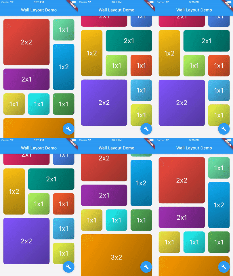
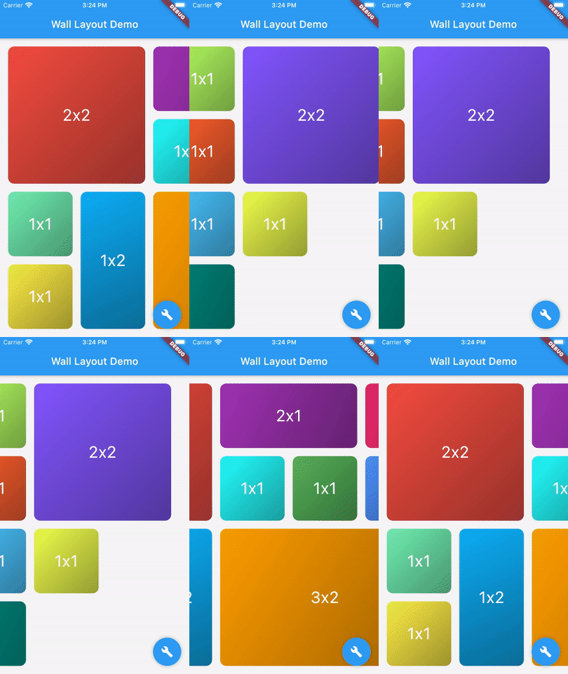
Orientação gerada a partir de informações públicas. Apenas para referência.
Um pacote Flutter que fornece um widget de layout flexível para organizar tijolos (widgets de diferentes formas) em uma lista vertical ou horizontal, semelhante a uma parede. Suporta dimensionamento e posicionamento dinâmicos, sendo ideal para criar grades visualmente atrativas com elementos de formato irregular. O layout se adapta a diferentes tamanhos de tela e orientações, garantindo design responsivo em todas as plataformas. É particularmente útil para galerias de fotos, painéis de controle e interfaces criativas onde layouts não uniformes são desejados.
Casos de uso
Galerias de fotos com proporções mistas
Widgets do painel com tamanhos variados
Layouts de UI criativos com formas irregulares
Grade responsivo exibe em múltiplas plataformas
Interfaces semelhantes a paredes interativas
Principais recursos
Suporta tijolos de diferentes formas e tamanhos
Opções de orientação vertical e horizontal
Layout responsivo e adaptativo
Compatibilidade multiplataforma
Integração fácil com widgets existentes do Flutter
Indicado para
Designers em busca de variedade visual
Desenvolvedores construindo grades dinâmicas
Aplicativos que exigem layouts não uniformes
Projetos direcionados para múltiplas plataformas
aplicações com interface intensiva e arranjos complexos
Considerações
O desempenho pode variar com grandes quantidades de tijolos
Requer manipulação cuidadosa das restrições de tamanho do tijolo
animações internas limitadas
Mais adequado para conteúdo estático ou de baixa dinamicidade
Pode ser necessário lógica personalizada para interações complexas
README original
Snapshot do README original do repositório-fonte vinculado. Consulte o repositório para o conteúdo mais recente.
flutter_wall_layout - Layout child having different shape into a vertical or horizontal list
This library provides a unique widget, WallLayout, rendering into a list children having different shapes.
There is two main classes: WallLayout and Stone.
A wall is composed by a set of stones, arranged in a certain way.
A stone is a component defining its shape by a width and a height.
Wall Layout Widget
This component has been inspired by the ListView widget, in which you can choose scroll direction and the way.
Added to that, you can also define how many rows or column have the wall, if you want to create a responsive design.
List of Stone widgets, representing wall layout's children.
-
layersCount
Define the number of layers the wall have. Must be higher or equal to 2. When direction is Axis.vertical, it defines the number of columns the wall has. When direction is Axis.horizontal, it defines the number of rows.
-
wallBuilder
Define how the wall is built: where each stone is positioned within the wall.The wall builder is allowed to use less stones than provided, and can create new stones (see ./example for more details).
WallBuilder.standard()
stonePadding
Padding between stones.
16.0
primaryAxisStoneSize
Optional. If specified, indicates the exact size of each stone in the direction of the primary scroll axis. If not specified, each stone will be exactly square.
-
scrollController
Same as [ListView.scrollController]: "control the position to which this scroll view is scrolled".
-
physics
Same as [ListView.physics]: "How the scroll view should respond to user input".
-
restorationId
Same as [ListView.restorationId]: used "to save and restore the scroll offset of the scrollable".
-
dragStartBehavior
Same as [ListView.dragStartBehavior]: "Determines the way that drag start behavior is handled".
DragStartBehavior.start
clipBehavior
Same as [ListView.clipBehavior]: "ways to clip a widget's content".
Clip.hardEdge
primary
Same as [ListView.primary]: "Whether this is the primary scroll view associated with the parent [PrimaryScrollController]"
false
scrollDirection
Same as [ListView.scrollDirection]: "axis along which the scroll view scrolls".
Axis.vertical
reverse
Same as [ListView.reverse property]: "whether the scroll view scrolls in the reading direction".
false
Stone Widget
A Stone Widget is a widget proxy defining stone's size (width and height).
It's rendered object is optimized thanks to it's id property.