Orientação gerada a partir de informações públicas. Apenas para referência.
Um pacote de medidor linear personalizável para Flutter, projetado para representar visualmente o progresso ou valores de dados. Suporta várias opções de estilização para aparência e comportamento, tornando-o ideal para painéis, rastreadores de saúde ou indicadores de desempenho. O medidor é responsivo em diversas plataformas, incluindo Android, iOS, Web, macOS, Windows e Linux. Com configuração intuitiva, os desenvolvedores podem integrar facilmente exibições animadas e suaves de progresso em seus aplicativos.
Casos de uso
Widgets do painel
Rastreamento de progresso
Monitoramento de desempenho
Aplicativos de saúde e condicionamento físico
Visualização de dados em painéis
Principais recursos
Aparência personalizável
Exibição animada de progresso
Suporte multiplataforma
Faixa e rótulos configuráveis
design responsivo
Suporta múltiplos temas
Indicado para
Desenvolvedores de painéis de dados
Aplicativos que exigem indicadores visuais de progresso
Projetos com necessidades de plataforma cruzada
Designers de UI procurando componentes reutilizáveis
Considerações
Limitado a medidores lineares (sem variantes circulares)
Requer manipulação manual de atualizações dinâmicas
Pode ser necessário estilização adicional para layouts complexos
README original
Snapshot do README original do repositório-fonte vinculado. Consulte o repositório para o conteúdo mais recente.
Gauges
A gauge, in science and engineering, is a device used to make measurements or in order to display certain dimensional information. A wide variety of tools exist which serve such functions, ranging from simple pieces of material against which sizes can be measured to complex pieces of machinery.Here in Flutter you can use this package to plot a machinery information effortlessly.
Demo Application
To fully explore the capabilities of our Linear Gauge, we recommend checking out our Demo Application which consists of Use Cases and Playgrounds for Linear Gauge
DEMO APPLICATION
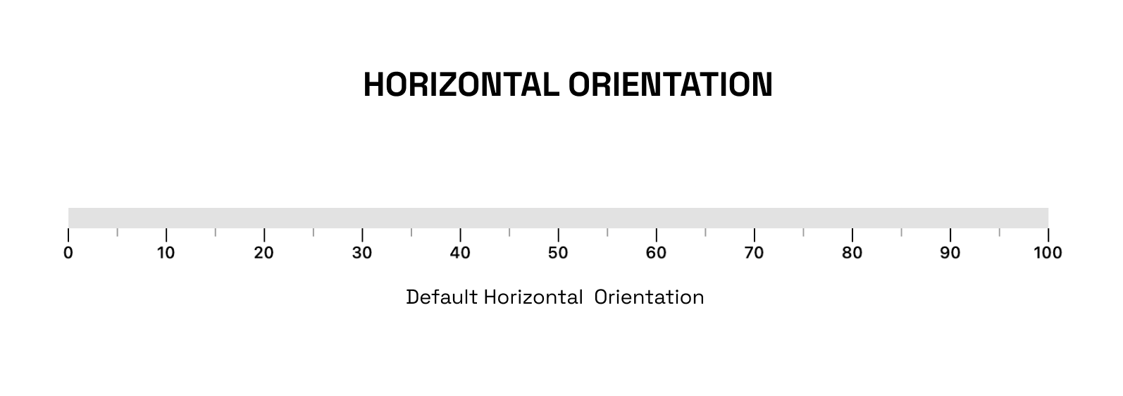
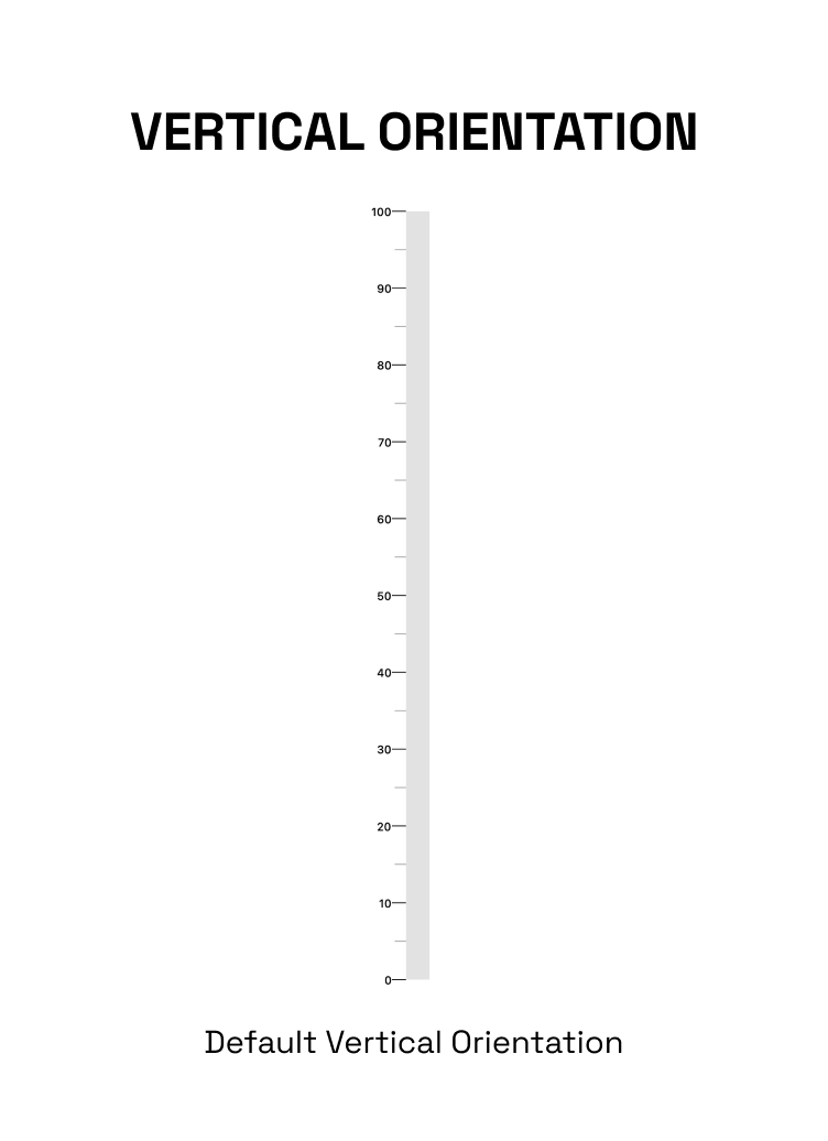
The linearGauge can be oriented vertically or horizontally. The orientation can be set using the Gaugeorientation property in the Linear Gauge. The possible values for the orientation property are:
GaugeOrientation.horizontal: The gauge will be oriented horizontally, with the minimum value on the left and the maximum value on the right.
GaugeOrientation.vertical: The gauge will be oriented vertically, with the minimum value at the bottom and the maximum value at the top.
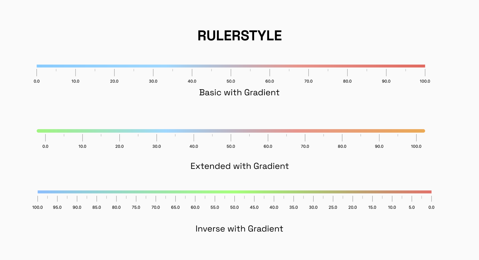
RulerStyle:
The RulerStyle class allows you to customize the appearance of the ruler used in the LinearGauge. With properties such as RulerPosition, showLabel, inverseRuler, and many more, you can customize the ruler in various ways to suit your needs.
Pointer:
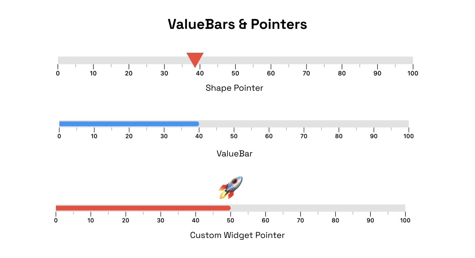
The Pointer is used to indicate a specific value on the gauge. The gauge can have multiple pointers with various shapes and values
ValueBar
The ValueBar in the LinearGauge is the component that displays the actual value of the gauge. It has properties such as color, offset, and thickness that can be customized to fit your needs.
There are different customization options available for pointers and value bar.
RangeLinearGauge
The RangeLinearGauge class enables you to customize the ruler appearance in the LinearGauge. You can display multiple ranges by providing a list of RangeLinearGauge values, and customize the color, start, and end values to match your requirements.
CustomCurve
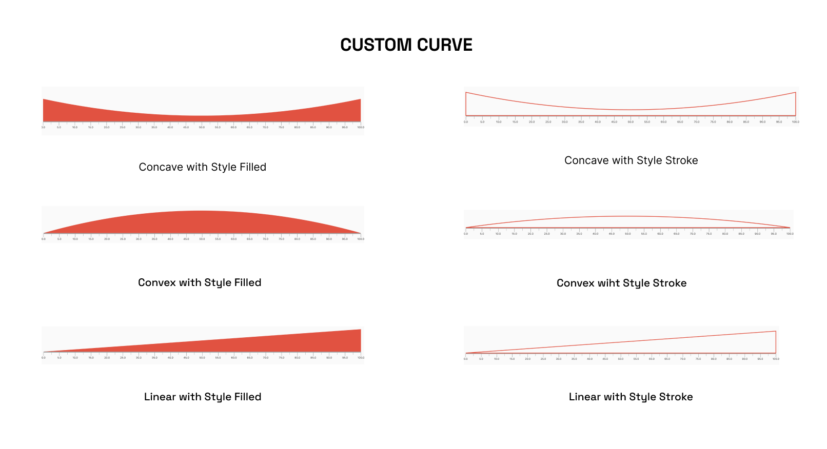
The CustomCurve class allows you to draw Bezier and Straight curves on the LinearGauge, providing a high degree of customization for visualizing data.
Animations
The LinearGauge class includes pre-made animations that can be applied to its pointers, value bars, or the gauge's overall visibility. These animations can help to make the gauge more visually engaging and dynamic.
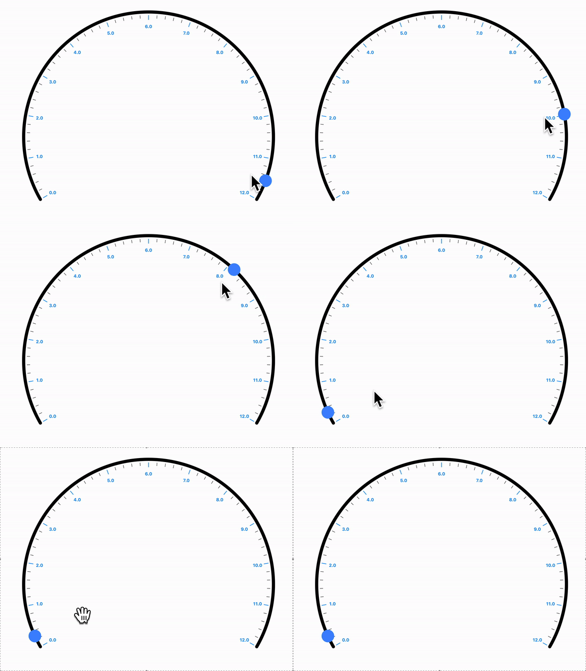
Interactivity
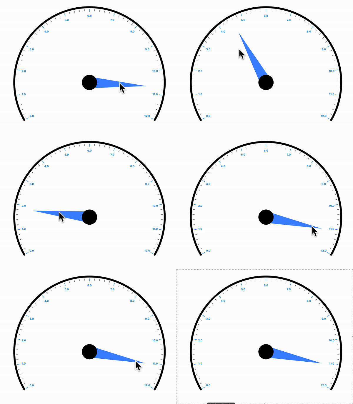
The Pointer is interactive , it responds to user horizontal & vertical drag.
Radial Gauge
A Radial Gauge is a graphical representation used to visualize and display a value within a circular format. It consists of several components, including a radial track, a needle pointer, and a value bar. The radial track represents the range or scale of values that the gauge can display, with the ability for users to set the start and end points of the track.
Position:
Angles
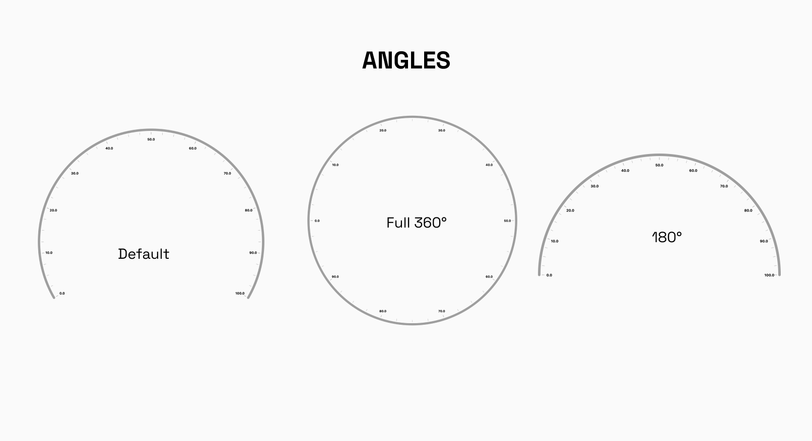
The RadialGauge can be easily laid out at different angles around its center. You have the freedom to specify the starting and ending angles, defining the arc over which the gauge will be displayed. This feature is particularly useful when you want to display multiple gauges side by side or need to emphasize a specific range on the gauge.
Default startAngle : -30°
Default endAngle`: 210°
Custom Track Labels
The labels displayed on the RadialGauge track can easily be formated to your need.
Radii Customization
radiusFactor can be used to size the adjust the scaling factor of the radius and change the radius of the gauge accordingly.
X and Y Coordinates
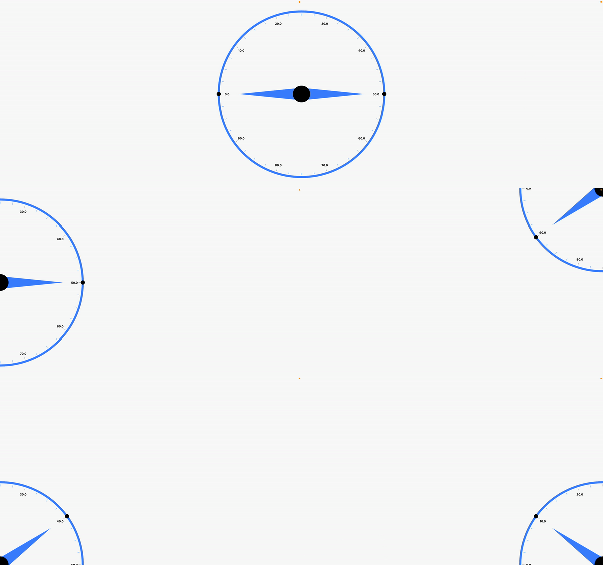
To precisely position the RadialGauge on your canvas or user interface, you can set the x and y coordinates of its center. This way, you can easily integrate the gauge into your existing layout or place it at specific locations as per your application's design requirements.
By combining these layout options, you can create stunning and interactive radial gauges that effectively present data to your users, whether it's for monitoring, analytics, or any other visualization needs.
Default xCoordinate : 0.5
Default yCoordinate`: 0.5
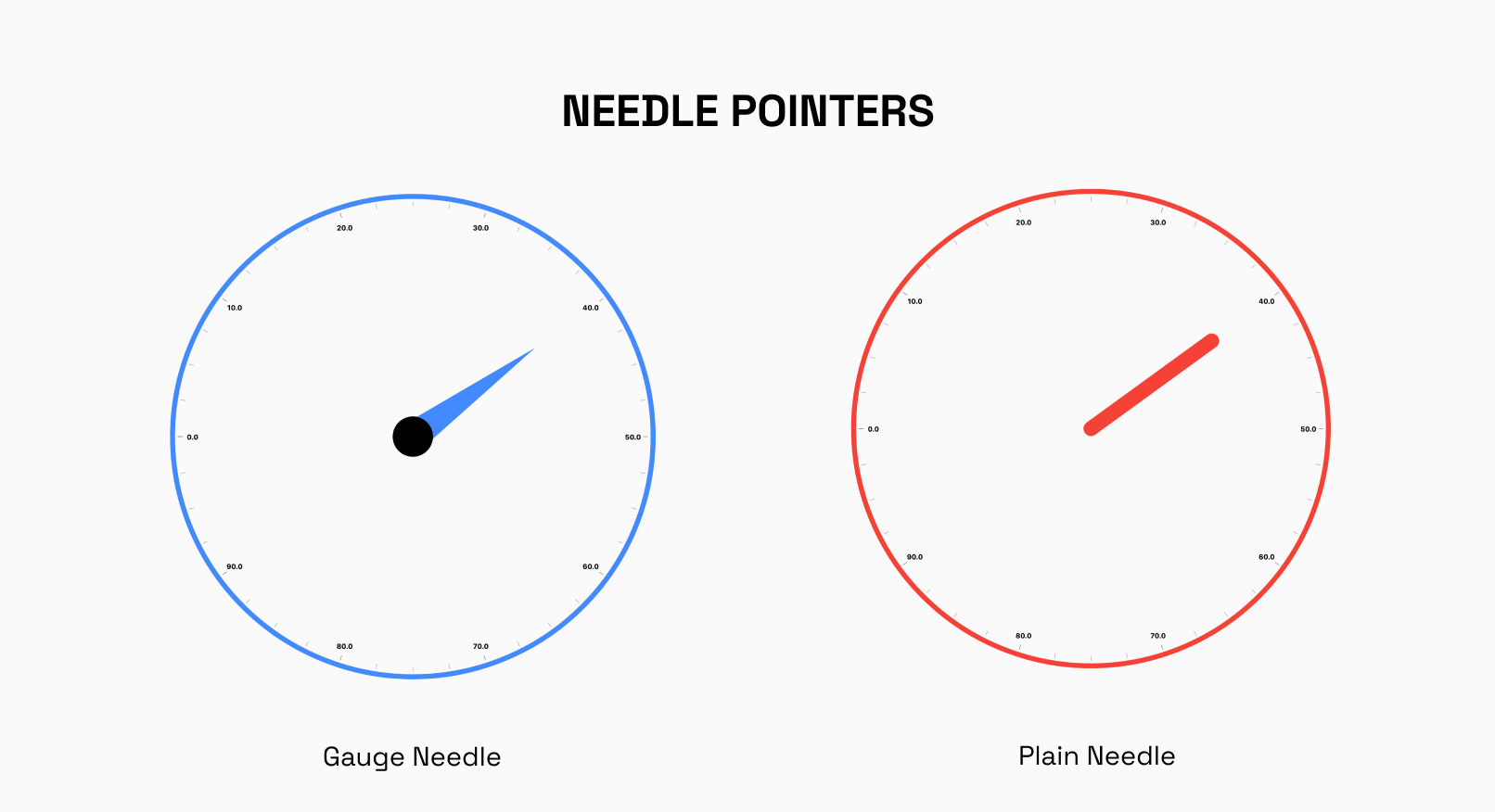
Needle Pointer
The NeedlePointer is a powerful component that enables you to create and customize Needle Pointers for your gauges. With this widget, you have the flexibility to design multiple Needle Pointers and adjust their styles using the gaugeNeedle and plainneedle enums.
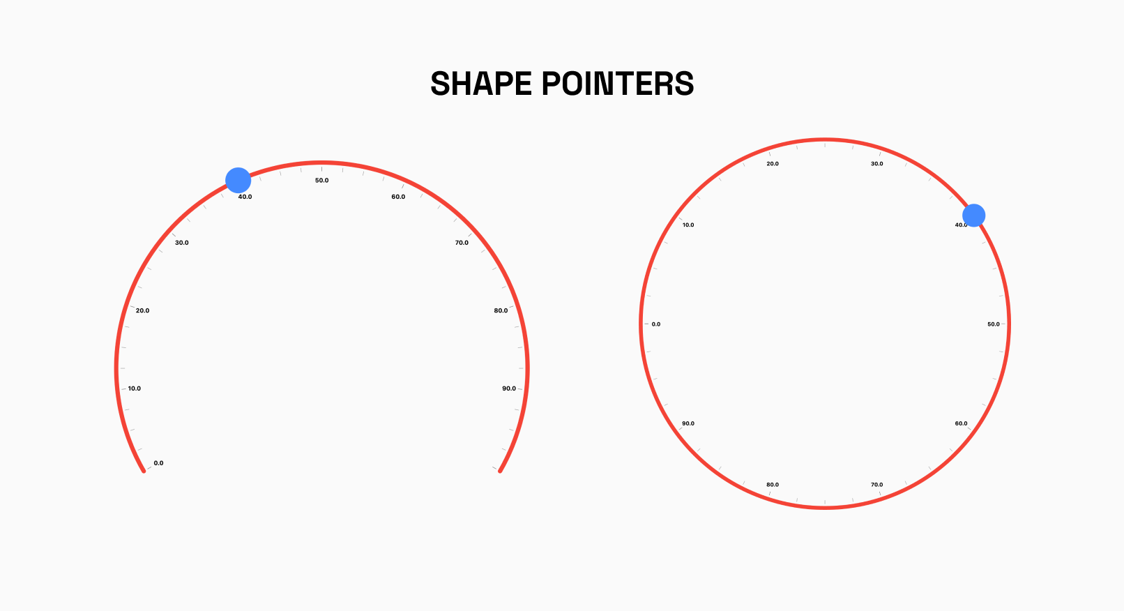
Shape Pointer
The RadialShapePointer allows you to add Shape Pointer to your Gauge.The shape can be customized using properties such as color, width and height.
Currently, Only Circle Shape is supported
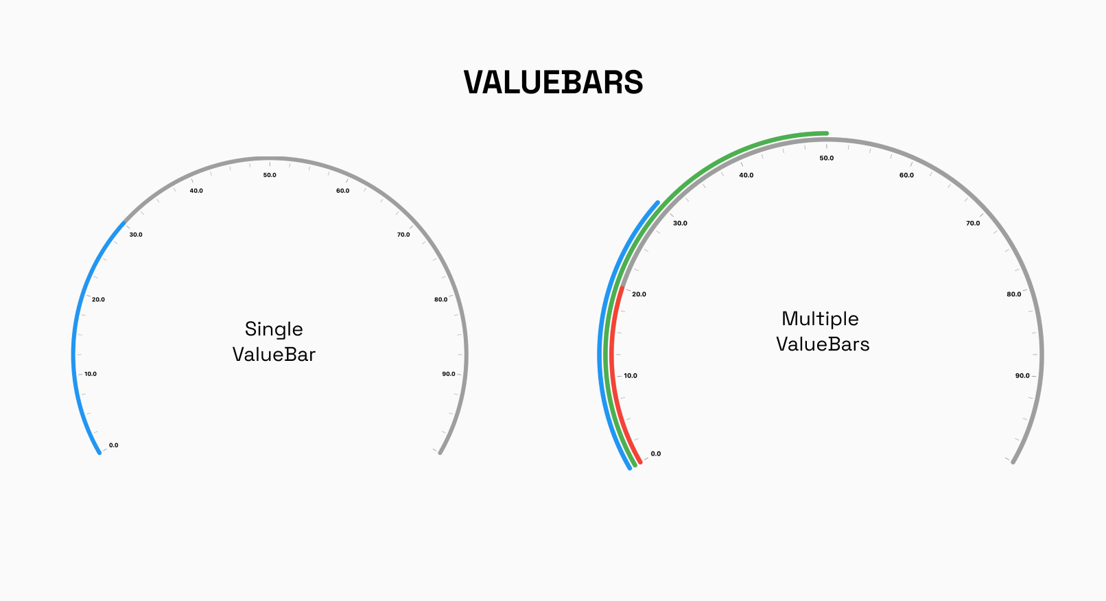
Radial Value Bar
The RadialValueBar is a crucial component used within the RadialGauge to visually represent a specific value on the gauge using a bar. This bar provides users with a clear and intuitive indication of the current value within the defined range of the radial track.
Interactivity Radial
In the Radial Gauge, the NeedlePointer and RadialShapePointer can be set to interactive, making them respond to user's horizontal and vertical drag.