Orientação gerada a partir de informações públicas. Apenas para referência.
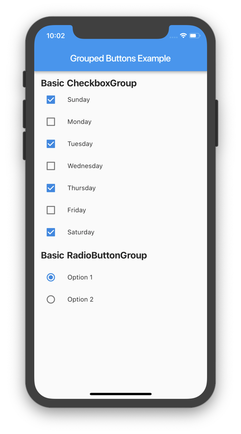
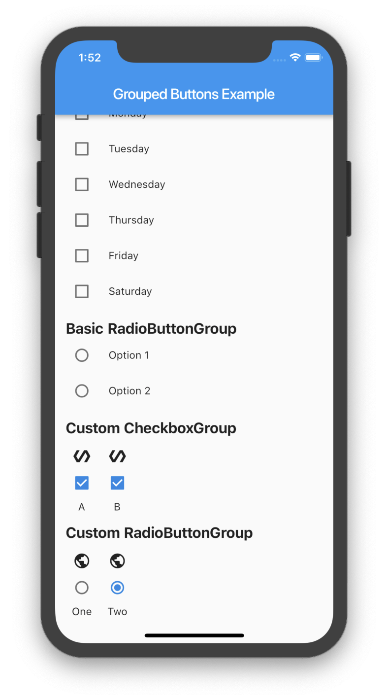
Um pacote leve do Flutter que simplifica a criação e gestão de checkboxes e botões de rádio agrupados. Oferece uma maneira limpa e reutilizável de lidar com múltiplas opções de seleção com estilos e gerenciamento de estado consistentes. Ideal para formulários ou configurações onde os usuários precisam selecionar um ou mais itens de um conjunto pré-definido. O pacote reduz o código repetitivo e aumenta a produtividade dos desenvolvedores ao abstrair padrões comuns.
Casos de uso
Entradas de formulário com múltiplas opções
Configurações de preferência do usuário
Interfaces de pesquisa ou questionário
Seleção dinâmica de opções
Manipulação simplificada de estado para grupos
Interface de usuário consistente para opções alternáveis
Principais recursos
Facilidade na agrupamento de caixas de seleção e botões de opção
Gerenciamento de estado embutido
Aparência personalizável
Boilerplate mínimo
Suporta seleções simples e múltiplas
API limpa e legível
Indicado para
Desenvolvedores criando formulários com grupos de opções
Designers de interface buscando componentes de alternância consistentes
Projetos que exigem widgets de seleção simples, mas escaláveis
Equipes que priorizam a manutenibilidade do código
Iniciantes do Flutter aprendendo manipulação de formulários
Considerações
Limitado a tipos de caixa de seleção e botão de opção
Nenhuma validação embutida
Não suporta grupos aninhados
Requer estilização manual para designs complexos
Não adequado para lógica de formulário avançada além da seleção
README original
Snapshot do README original do repositório-fonte vinculado. Consulte o repositório para o conteúdo mais recente.
grouped_buttons
A set of Flutter widgets that makes grouping Checkboxes and Radio Buttons much easier!
There are several options that allow for more control.
Custom CheckboxGroup
Properties
Description
activeColor
The color to use when a Checkbox is checked.
checkColor
The color to use for the check icon when a Checkbox is checked.
checked
Specifies which boxes to be automatically checked. Every element must match a label. This is useful for clearing all selections (set it to []). If this is non-null, then the user must handle updating this list; otherwise, the state of the CheckboxGroup won't change.
disabled
Specifies which boxes should be disabled. If this is non-null, no boxes will be disabled. The strings passed to this must match the labels.
itemBuilder
Called when needed to build a CheckboxGroup element.
labels
(required) A list of strings that describes each Checkbox. Each label must be distinct.
labelStyle
The style to use for the labels.
margin
Empty space surrounding the CheckboxGroup.
onChange
Called when the value of the CheckboxGroup changes.
onSelected
Called when the user makes a selection.
orientation
Specifies the orientation to display elements. Either GroupedButtonsOrientation.HORIZONTAL or GroupedButtonsOrientation.VERTICAL.
padding
Empty space in which to inset the CheckboxGroup.
tristate
If true the checkbox's value can be true, false, or null.
Specifies which buttons should be disabled. If this is non-null, no buttons will be disabled. The strings passed to this must match the labels.
itemBuilder
Called when needed to build a RadioButtonGroup element.
labels
(required) A list of strings that describes each Radio button. Each label must be distinct.
labelStyle
The style to use for the labels.
margin
Empty space surrounding the RadioButtonGroup.
onChange
Called when the value of the RadioButtonGroup changes.
onSelected
Called when the user makes a selection.
orientation
Specifies the orientation to display elements. Either GroupedButtonsOrientation.HORIZONTAL or GroupedButtonsOrientation.VERTICAL.
padding
Empty space in which to inset the RadioButtonGroup.
picked
Specifies which Radio button to automatically pick. Every element must match a label. This is useful for clearing what is picked (set it to ""). If this is non-null, then the user must handle updating this; otherwise, the state of the RadioButtonGroup won't change.