Buscar pacotes, repositórios e categorias de apps

Capa de info_popup
Detalhes do pacotev4.3.2

info_popup

A maneira simples de mostrar algumas informações ao usuário em seu widget selecionado.

AndroidiOSWebmacOSWindowsLinux
Downloads em 30 dias
46,2 mil
Curtidas
165
Pontos Pub
150

Instalar pacote

flutter pub add info_popup

Visão geral do pacote

Orientação gerada a partir de informações públicas. Apenas para referência.

InfoPopup é um pacote leve do Flutter que permite aos desenvolvedores exibir facilmente popups informativos em qualquer widget com configuração mínima. Ele oferece uma maneira limpa e personalizável de mostrar informações contextuais aos usuários, melhorando a experiência do usuário ao fornecer dicas ou orientações diretamente nos elementos da interface. O pacote suporta múltiplas plataformas, incluindo Android, iOS, Web, macOS, Windows e Linux, garantindo comportamento consistente entre dispositivos. Com integração simples por meio de um único comando, é ideal para adicionar mecanismos sutis mas eficazes de feedback do usuário.

Casos de uso

  • Exibindo dicas de ferramenta em botões
  • Fornecendo ajuda sensível ao contexto
  • Melhorando a orientação dos campos do formulário
  • Melhorando experiências de onboarding
  • Adicionar dicas interativas
  • Mostrando explicações de status

Principais recursos

  • Integração simples em uma linha
  • Conteúdo de pop-up personalizável
  • Compatibilidade multiplataforma
  • Suporta vários alvos de widget
  • Posicionamento configurável
  • Leve e rápido

Indicado para

  • Designers de UI/UX procurando ferramentas de feedback rápido
  • Desenvolvedores de aplicativos educacionais
  • Equipes focadas na acessibilidade
  • Aplicativos que exigem orientação intuitiva do usuário
  • Projetos com prazos de desenvolvimento apertados

Considerações

  • Limitado ao estilo básico de pop-up
  • Sem personalização de animação embutida
  • Mais indicado para conteúdo de texto pequeno
  • Pode exigir ajustes manuais de posicionamento
  • Não ideal para interações modais complexas

README original

Snapshot do README original do repositório-fonte vinculado. Consulte o repositório para o conteúdo mais recente.

Introduction

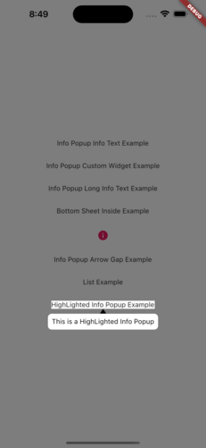
The info_popup package allows you to easily show a simple, customizable popup on your wrapped widget. The highlight feature, which can be activated at will, helps draw the user's attention to the desired location.

You can test it now on the Info Popup preview page. Note that the website experience may be different.

Features

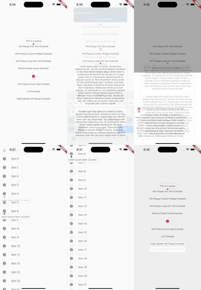
  • Display a customizable popup on your wrapped widget
  • Activate the highlight feature to draw the user's attention to the desired location
  • Fully customize the content of the popup
  • Add margins to the popup from any side

MainPresentation HighlightExample

Getting Started

To use this package, add info_popup as a dependency in your pubspec.yaml file.

dependencies:
  info_popup: ^3.0.0

Alternatively, you can add it to your project by running the following commands in your terminal:

with Dart:

$ dart pub add info_popup

with Flutter:

$ flutter pub add info_popup

Usage

To show a popup, wrap the widget that you want to display the popup on with the InfoPopupWidget widget. All you have to do is wrap it in the widget you want to show information with the InfoPopupWidget widget. With the InfoPopupController, you can customize it as you wish, and turn it on and off.

import 'package:info_popup/info_popup.dart';
	InfoPopupWidget(
		contentTitle: 'Info Popup Details',
		child: Icon(
			Icons.info,
			color: Colors.pink,
		),
	),

Example

This is a normal info text displayed using the InfoPopupWidget widget with several optional parameters.

              InfoPopupWidget(
                contentTitle: 'Info Popup Details',
                arrowTheme: InfoPopupArrowTheme(
                  color: Colors.pink,
                  arrowDirection: ArrowDirection.up,
                ),
                contentTheme: InfoPopupContentTheme(
                  infoContainerBackgroundColor: Colors.black,
                  infoTextStyle: TextStyle(color: Colors.white),
                  contentPadding: const EdgeInsets.all(8),
                  contentBorderRadius: BorderRadius.all(Radius.circular(10)),
                  infoTextAlign: TextAlign.center,
                ),
                dismissTriggerBehavior: PopupDismissTriggerBehavior.onTapArea,
                areaBackgroundColor: Colors.transparent,
                indicatorOffset: Offset.zero,
                contentOffset: Offset.zero,
                onControllerCreated: (controller) {
                  print('Info Popup Controller Created');
                },
                onAreaPressed: (InfoPopupController controller) {
                  print('Area Pressed');
                },
                infoPopupDismissed: () {
                  print('Info Popup Dismissed');
                },
                onLayoutMounted: (Size size) {
                  print('Info Popup Layout Mounted');
                },
                child: Icon(
                  Icons.info,
                  color: Colors.pink,
                ),
              ),

"This is a custom popup example created using the InfoPopupWidget widget.

Custom Popup Widget
              InfoPopupWidget(
                customContent: Container(
                  decoration: BoxDecoration(
                    color: Colors.blueGrey,
                    borderRadius: BorderRadius.circular(10),
                  ),
                  padding: const EdgeInsets.all(10),
                  child: Column(
                    children: const <Widget>[
                      TextField(
                        decoration: InputDecoration(
                          hintText: 'Enter your name',
                          hintStyle: TextStyle(color: Colors.white),
                          enabledBorder: OutlineInputBorder(
                            borderSide: BorderSide(color: Colors.white),
                          ),
                        ),
                      ),
                      SizedBox(height: 10),
                      Center(
                        child: Text(
                          'Example of Info Popup inside a Bottom Sheet',
                          style: TextStyle(
                            color: Colors.white,
                          ),
                        ),
                      ),
                    ],
                  ),
                ),
                arrowTheme: const InfoPopupArrowTheme(
                  color: Colors.pink,
                  arrowDirection: ArrowDirection.up,
                ),
                dismissTriggerBehavior: PopupDismissTriggerBehavior.onTapArea,
                areaBackgroundColor: Colors.transparent,
                indicatorOffset: Offset.zero,
                contentOffset: Offset.zero,
                onControllerCreated: (controller) {
                  print('Info Popup Controller Created');
                },
                onAreaPressed: (InfoPopupController controller) {
                  print('Area Pressed');
                },
                infoPopupDismissed: () {
                  print('Info Popup Dismissed');
                },
                onLayoutMounted: (Size size) {
                  print('Info Popup Layout Mounted');
                },
                child: Icon(
                  Icons.info,
                  color: Colors.pink,
                ),
              ),

Conclusion

The info_popup package provides a simple and effective way to show a customizable popup on your wrapped widget. With the highlight feature, you can draw the user's attention to the desired location.

License

This project is licensed under the MIT License - see the LICENSE file for details.

Categorias

Repositório-fonte

Projetos que usam este pacote

Ainda não há dados.