Buscar pacotes, repositórios e categorias de apps

Capa de kf_drawer
Detalhes do pacotev2.1.0

kf_drawer

Menu lateral (Drawer)

AndroidiOSWebmacOSWindowsLinux
Downloads em 30 dias
817
Curtidas
144
Pontos Pub
160

Instalar pacote

flutter pub add kf_drawer

Visão geral do pacote

Orientação gerada a partir de informações públicas. Apenas para referência.

kf_drawer é um pacote Flutter que fornece um menu lateral personalizável (Drawer) para aplicativos em múltiplas plataformas. Oferece uma implementação limpa e leve para navegação com suporte a várias opções de personalização, como largura, animações e estilos de itens. Projetado para facilitar o uso, integra-se perfeitamente em aplicativos Flutter para Android, iOS, Web, macOS, Windows e Linux. O pacote é ideal para aplicativos que exigem uma experiência consistente e responsiva com o menu de navegação.

Casos de uso

  • Navegação de aplicativo móvel
  • barra lateral do painel da web
  • menus de aplicativos de desktop
  • Navegação multiplataforma
  • Layouts de gavetas personalizáveis

Principais recursos

  • Compatibilidade multiplataforma
  • Largura do painel personalizável
  • Animações suaves
  • Integração fácil
  • Suporte a widgets personalizados

Indicado para

  • Desenvolvedores construindo aplicativos multiplataforma
  • Equipes que precisam de navegação consistente
  • Aplicativos com requisitos complexos de barra lateral
  • Projetos focados em interface do usuário
  • Prototipagem rápida

Considerações

  • Temas embutidos limitados
  • Requer estilização manual para designs avançados
  • Sem suporte a modo escuro embutido
  • Depende da API do Drawer do Flutter
  • Pode ser necessário gerenciamento adicional de estado

README original

Snapshot do README original do repositório-fonte vinculado. Consulte o repositório para o conteúdo mais recente.

KFDrawer

pub package CI

A dependency-free animated side drawer for Flutter. KFDrawer supports controller and context-based control, gestures, pinned or centered menus, page history, right-side drawers, and RTL layouts on every Flutter platform.

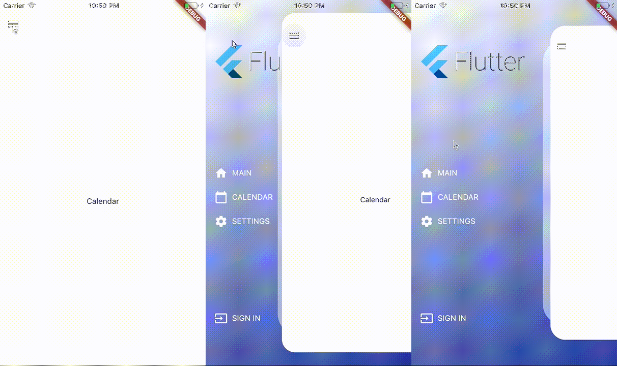
KFDrawer demo

Install

dependencies:
  kf_drawer: ^2.1.0

KFDrawer 2.1 supports Dart 3 and Flutter 3.10 or newer. The package is tested against both its compatibility floor and the current Flutter stable release.

Quick start

Create a controller, give each page item a widget, and place KFDrawer in your Scaffold body:

late final KFDrawerController drawerController;

@override
void initState() {
  super.initState();
  drawerController = KFDrawerController(
    initialPage: const HomePage(),
    items: <KFDrawerItem>[
      KFDrawerItem.withPage(
        alias: 'home',
        icon: const Icon(Icons.home, color: Colors.white),
        text: const Text('HOME', style: TextStyle(color: Colors.white)),
        page: const HomePage(),
      ),
      KFDrawerItem.withPage(
        alias: 'settings',
        icon: const Icon(Icons.settings, color: Colors.white),
        text: const Text('SETTINGS', style: TextStyle(color: Colors.white)),
        page: const SettingsPage(),
      ),
    ],
  );
}

@override
Widget build(BuildContext context) {
  return Scaffold(
    body: KFDrawer(
      controller: drawerController,
      decoration: const BoxDecoration(
        gradient: LinearGradient(
          colors: <Color>[Colors.white, Color(0xFF2C48AB)],
        ),
      ),
    ),
  );
}

@override
void dispose() {
  drawerController.dispose();
  super.dispose();
}

The page widgets do not need to extend a KFDrawer-specific base class. Open or close the nearest drawer directly from a descendant page:

IconButton(
  tooltip: 'Open navigation menu',
  icon: const Icon(Icons.menu),
  onPressed: () => KFDrawer.of(context)?.toggle(),
)

The controller callbacks remain available for existing integrations:

drawerController.open?.call();
drawerController.close?.call();
drawerController.toggle?.call();

Custom content without a controller

Use content when your application manages navigation elsewhere, such as with a bottom navigation bar:

KFDrawer(
  content: Scaffold(
    body: pages[currentIndex],
    bottomNavigationBar: BottomNavigationBar(
      currentIndex: currentIndex,
      onTap: onBottomNavigationTap,
      items: const <BottomNavigationBarItem>[
        BottomNavigationBarItem(icon: Icon(Icons.home), label: 'Home'),
        BottomNavigationBarItem(icon: Icon(Icons.person), label: 'Profile'),
      ],
    ),
  ),
  items: <KFDrawerItem>[
    KFDrawerItem(
      text: const Text('Open profile'),
      onPressed: openProfile,
    ),
  ],
)

Menu layout

By default, header, items, and footer use the original scrollable layout. Two opt-in properties cover fixed-footer and centered-menu use cases:

KFDrawer(
  controller: drawerController,
  header: const MyDrawerHeader(),
  footer: const MyDrawerFooter(),
  footerPinned: true,
  centerScrollableItems: true,
)
  • footerPinned keeps the footer outside the scrolling item list.
  • centerScrollableItems centers a shrink-wrapped item list between a fixed header and footer.
  • scrollable: false retains the non-scrolling centered column layout.

Right-side and RTL drawers

KFDrawerDirection is logical, so start automatically follows the ambient text direction:

// Left in LTR, right in RTL (default).
KFDrawer(direction: KFDrawerDirection.start)

// Right in LTR, left in RTL.
KFDrawer(direction: KFDrawerDirection.end)

Translation, edge dragging, content tap regions, shadow offset, icon padding, and menu alignment all follow the resolved side.

Dynamic items

Controller changes rebuild the drawer automatically:

drawerController.items = <KFDrawerItem>[...newItems];
drawerController.addItem(newItem);
drawerController.removeItem(oldItem);
drawerController.clearItems();

// If you mutate drawerController.items directly:
drawerController.items.add(newItem);
drawerController.refreshItems();

drawerController.selectItem('settings');

Optional page history and Back handling

KFDrawer swaps page widgets; it does not push Navigator routes. Enable the lightweight controller history only if this is the behavior your app needs:

final drawerController = KFDrawerController(
  initialPage: const HomePage(),
  maintainPageHistory: true,
);

AnimatedBuilder(
  animation: drawerController,
  builder: (context, child) {
    return PopScope<Object?>(
      canPop: !drawerController.canGoBack,
      onPopInvokedWithResult: (didPop, result) {
        if (!didPop) drawerController.goBack();
      },
      child: child,
    );
  },
  child: KFDrawer(controller: drawerController),
)

Use replacePage to change the current page without adding a history entry and clearHistory after a navigation reset.

Page item callbacks

When an item has both page and onPressed, KFDrawer now performs both actions: it selects the page, optionally closes the drawer, and invokes the callback.

KFDrawerItem.withPage(
  page: const ProfilePage(),
  text: const Text('PROFILE'),
  onPressed: logProfileSelection,
  closeOnTap: true,
)

Use an item without page when the callback should fully own navigation.

Useful options

Property Default Purpose
drawerWidth 0.66 Revealed fraction of available width
minScale 0.86 Content scale while open
borderRadius 32 Open content corner radius
shadowColor translucent white Decorative layer color; use transparent to hide it
disableContentTap true Absorb content interaction and close it on tap
dragEnabled true Enable pointer dragging
edgeDragWidth 8 Edge gesture activation width
animationDuration 280 ms Programmatic animation duration
slideCurve easeInOutCubic Translation curve
scaleCurve easeInOutBack Scale curve
onDrawerChanged null Observe open-state targets
semanticLabel localized drawer label Accessibility label

See the runnable example for a complete integration.

Support

If KFDrawer saves you time, you can support its ongoing maintenance on Buy Me a Coffee.

License

KFDrawer is released under the MIT License.

Categorias

Repositório-fonte

Projetos que usam este pacote