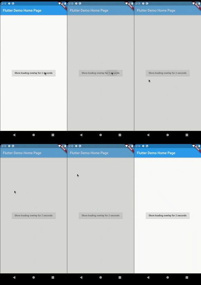
Um pacote simples para simplificar a gestão de telas. Ao carregar qualquer tarefa assíncrona, este pacote impede que o usuário interaja com a tela até que a tarefa assíncrona termine.
Orientação gerada a partir de informações públicas. Apenas para referência.
LoaderOverlay é um pacote Flutter que simplifica o gerenciamento de tela durante operações assíncronas. Ele exibe uma sobreposição de carregamento para impedir a interação do usuário enquanto tarefas como chamadas de API ou processamento de dados estão em andamento. A sobreposição pode ser facilmente ativada e desativada, garantindo uma experiência do usuário suave ao bloquear a entrada até que a tarefa seja concluída. Suporta todas as principais plataformas, incluindo Android, iOS, Web, macOS, Windows e Linux. Ideal para melhorar a UX durante estados de carregamento sem exigir implementações personalizadas complexas.
Casos de uso
Bloqueando a IU durante operações assíncronas
Evitando toques acidentais durante o carregamento
Mostrando indicadores de carregamento em formulários
Gerenciando tarefas em segundo plano de longa duração
Melhorar a responsividade do aplicativo
Simplificando o tratamento do estado de carregamento
Principais recursos
Ativação de sobreposição simples
Bloqueio automático da interface
Suporte multiplataforma
Integração fácil com tarefas assíncronas
Aparência de carregamento personalizável
Design não intrusivo
Indicado para
Desenvolvedores procurando sobreposições de carregamento rápido
Aplicativos com operações assíncronas frequentes
UIs que exigem feedback claro de carregamento
Equipes priorizando consistência da UX
Projetos que precisam de mínimo boilerplate
Considerações
Pode ser necessário fechar manualmente o overlay
Opções limitadas de personalização
Impacto potencial no desempenho com alternância frequente
Não adequado para animações de carregamento complexas
Depende da coordenação adequada de tarefas assíncronas
README original
Snapshot do README original do repositório-fonte vinculado. Consulte o repositório para o conteúdo mais recente.
Introduction
Have you ever found yourself in the situation of doing some async processing your screen and wanting
to prevent the user from interacting with the screen while the application is loading? If so, this
package was made just for you.
Basic Usage
The most simple usage is just wrap the widget that you want an overlay on LoaderOverlay. Default
loader will be shown.
This simple step will already configure the loader overlay for use.
After that configuration you can just call:
context.loaderOverlay.show();
This will show the overlay with the default loading indicator. The default loading configured is to
just show a centered CircularProgressIndicator
To hide the overlay (after the async processing, for example), just call:
context.loaderOverlay.hide();
You can check if overlay is visible:
final isVisible = context.loaderOverlay.visible;
*Note: You will always need the context to show or hide the loader overlay
Basic Usage on Navigation
To use this package with named routes you can just wrap your MaterialApp with GlobalLoaderOverlay.
This widget has all the features of LoaderOverlay but it is provided for all the routes of the app.
Your overlay loader widget can be any widget you want. For example you can import the
package flutter_spinkit and customise your widget like this.
To do that just pass your widget to overlayWidget and set useDefaultLoading to false.
Another customisation you can do is configure the color and opacity of the overlay.
The default opacity is grey with 0.4 opacity, but you can change it with
the overlayColor: Colors.yellow.withValues(alpha: 0.8).
If you pass widget to context.loaderOverlay.show, then defaultLoader and widgetOverlay will be
ignored;
Progress
If you want to show some progress while the loader overlay is visible, you can do it with the
context.loaderOverlay.show(progress: 'Doing progress #0',) for an initial progress, and with
context.loaderOverlay.progress('Doing progress #1'); every time the progress need to change.
Both this methods pass the progress to the current widgetBuilder on every call.
You can also remove by complete the overlayColor (set to transparent), set the useDefaultLoading to false,
and use a fully personalized overlayWidgetBuilder to make your own 100% customizable overlay.
By default, the overlay does not animate in or out. You can enable animations by passing the
appropriate parameters to LoaderOverlay. Internally, an AnimatedSwitcher is used to manage
animations, so the parameters are passed directly to the AnimatedSwitcher. By specifying
a duration and reverseDuration, the overlay will animate in and out using a fade (the default
transition used by AnimatedSwitcher). You can also pass curves, a transition builder and a layout
builder for further customisation.