Orientação gerada a partir de informações públicas. Apenas para referência.
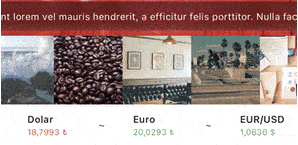
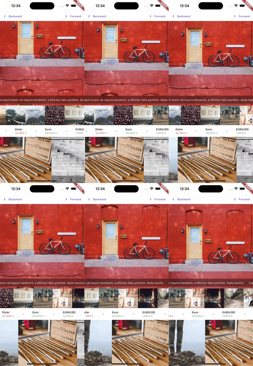
MarqueeR é um widget personalizável do Flutter que permite rolagem suave e multidirecional de texto com suporte para interações do usuário e controle programático. Ideal para exibir conteúdo de texto longo em espaço limitado, oferece opções flexíveis de animação e comportamento responsivo em várias plataformas. O widget foi projetado para ser intuitivo e altamente configurável, permitindo que desenvolvedores ajustem a velocidade de rolagem, direção e manipulação de interações. Funciona perfeitamente em Android, iOS, Web, macOS, Windows e Linux, tornando-se adequado para aplicações multiplataforma que exigem exibição dinâmica de texto.
Casos de uso
Exibindo títulos ou notificações longos
Criando banners animados
Implementando legendas rolantes
Melhorando a interface com elementos de texto dinâmicos
Designers de UI que precisam de efeitos dinâmicos de texto
Aplicativos que exigem conteúdo rolagem acessível
Projetos com espaço limitado para exibição de texto
Painéis interativos e quiosques
Considerações
Pode afetar o desempenho com textos muito longos
Requer ajuste cuidadoso da velocidade de rolagem para legibilidade
Limitado ao conteúdo de texto (não imagens ou widgets)
Não ideal para texto estático ou não rolagem
Mais adequado para strings curtas a médias
README original
Snapshot do README original do repositório-fonte vinculado. Consulte o repositório para o conteúdo mais recente.
The Marqueer package is a versatile Flutter widget designed to create smooth and customizable marquee effects. Whether you're building a news ticker, scrolling advertisements, or any animated content display, Marqueer offers flexibility, performance, and user interaction controls.
With support for infinite scrolling, dynamic item generation, and highly customizable animation behavior, Marqueer ensures an engaging and fluid user experience.
Package Features
Directional Scrolling: Scroll content in any direction—right-to-left, left-to-right, top-to-bottom, or bottom-to-top.
Infinite or Finite Scrolling: Display unlimited content or stop after a specific item count.
Customizable Speed: Control scroll speed with a pps (pixels per second) parameter.
Interactive Control: Pause and resume scrolling based on user interactions.
Dynamic Content: Use the builder constructor for generating items dynamically.
Responsive: Automatically adapts to screen size changes and other layout updates.
Stable Animation: Animation continues smoothly even when parent widget rebuilds via setState. Only restarts when pps, direction, or infinity parameters change.
Updated Infinity Behavior
infinity: When true, the widget creates an endless loop by either:
Duplicating the content after the original list ends and continuing seamlessly.
Reversing the animation direction when the list ends.
By adjusting the infinity parameter, you can control how the marquee behaves at its boundaries, ensuring a smooth experience regardless of content length.
Constructor Parameters
Core Parameters
direction: Defines the scroll direction. Options include:
rtl (Right-to-Left)
ltr (Left-to-Right)
ttb (Top-to-Bottom)
btt (Bottom-to-Top)
pps: Pixels per second, controlling the speed of the scroll animation. For instance, pps: 15.0 means 15 pixels are scrolled every second.
infinity: A bool determining how the scroll behaves after reaching the end of the list. When enabled, it either duplicates the content or reverses the animation.
autoStart: A bool controlling whether the marquee starts automatically when the widget is built.
Interactivity
interaction: If true, pauses the animation on user touch.
restartAfterInteraction: Automatically restarts scrolling after user interaction if enabled.
restartAfterInteractionDuration: Specifies the delay before restarting, e.g., Duration(seconds: 3).
Content Customization
separatorBuilder: Adds a separator widget between items in the marquee.
padding: Adds padding around the scrolling content.
Callbacks
onStarted: Triggered when the animation starts.
onStopped: Triggered when the animation stops.
onInteraction: Called when a user interacts with the marquee.
onChangeItemInViewPort: Invoked when a new item enters the viewport.
Advanced Control
controller: An optional MarqueerController to programmatically control the marquee (e.g., start, stop, change direction, or animate to position).
edgeDuration: Adds a delay when the marquee reaches the edges, useful in finite scrolling scenarios.
clipBehavior: Controls how the content is clipped. Default is Clip.hardEdge.
intrinsicCrossAxisSize: Auto-sizes the cross axis based on child widget. No need for SizedBox wrapper. Default is false.
Controller Methods
start(): Starts the marquee animation
stop(): Stops the marquee animation
forward(): Starts forward animation (left to right or bottom to top)
backward(): Starts backward animation (right to left or top to bottom)
animateTo(position, duration, curve): Animates to a specific scroll position
interactionEnabled(enabled): Enables or disables user interaction
recalculateIntrinsicSize(): Recalculates intrinsic size when child content changes
isAnimating: Returns the animation status (requires single attached widget)
scrollablePointerIgnoring
The scrollablePointerIgnoring parameter is a boolean that resolves gesture-related issues caused by Flutter's default IgnorePointer behavior within Scrollable widgets. When set to true, it ensures that the IgnorePointer behavior in nested scrollable elements is bypassed, allowing gestures to propagate correctly.
Why Use This?
Flutter's Scrollable widget applies an IgnorePointer by default to prevent unintended interactions during animations. However, this can interfere with custom gestures or user interactions in certain scenarios. Enabling scrollablePointerIgnoring ensures smooth and predictable gesture handling.
Default Behavior
false: The default IgnorePointer behavior remains active.
true: Disables the default IgnorePointer behavior, allowing gestures to work as expected.
final controller = MarqueerController();
/// controller.start()/// controller.stop()/// controller.forward()/// controller.backward()/// controller.animateTo(position, duration: duration, curve: curve)/// controller.interactionEnabled(false)SizedBox(
height: 30,
child: Marqueer(
pps: 100,
/// optional
controller: controller,
/// optional
direction: .rtl,
/// optional
restartAfterInteractionDuration: constDuration(seconds: 6),
/// optional
restartAfterInteraction: false,
/// optional
onChangeItemInViewPort: (index) {
print('item index: $index');
},
onInteraction: () {
print('on interaction callback');
},
onStarted: () {
print('on started callback');
},
onStopped: () {
print('on stopped callback');
},
child: constText(
'Lorem ipsum dolor sit amet, consectetur adipiscing elit. Integer pretium massa mollis lorem blandit imperdiet. Nulla mattis vitae mauris vel condimentum. Nam posuere, augue vitae lobortis consequat, odio ante condimentum est, at maximus augue purus id metus. Curabitur condimentum aliquet ante at aliquet. Quisque vel massa congue, bibendum leo sodales, malesuada ante. Maecenas sed tortor quis ipsum dictum sollicitudin.',
),
),
);