Buscar pacotes, repositórios e categorias de apps

Capa de menu_button
Detalhes do pacotev1.4.2+1

menu_button

Um botão de menu widget para selecionar um item em uma lista suspensa facilmente personalizável

Downloads em 30 dias
72
Curtidas
134
Pontos Pub
70

Instalar pacote

flutter pub add menu_button

Visão geral do pacote

Orientação gerada a partir de informações públicas. Apenas para referência.

O pacote menu_button fornece um widget de botão de menu suspenso personalizável para o Flutter, permitindo que os usuários selecionem facilmente um item de uma lista. Oferece uma interface limpa e intuitiva para apresentar opções em formato compacto, ideal para formulários ou configurações onde o espaço é limitado. O widget suporta personalização de aparência, comportamento e animação, tornando-o adaptável às diversas necessidades de design. Integra-se perfeitamente a aplicativos existentes do Flutter e melhora a interação do usuário sem exigir implementação complexa.

Casos de uso

  • Entradas de formulário com opções de menu suspenso
  • Painéis de configuração com seleção de opções
  • Menus de navegação personalizáveis
  • Interfaces de menu suspenso amigáveis ao mobile
  • Fluxos de trabalho de entrada de dados simplificados

Principais recursos

  • Aparência altamente personalizável
  • Animações de transição suave
  • Integração fácil com a interface do Flutter
  • Suporta construtores de itens personalizados
  • Design acessível e responsivo

Indicado para

  • Desenvolvedores construindo formulários interativos
  • Designers procurando componentes de menu suspenso flexíveis
  • Aplicativos que precisam de soluções leves de menu
  • Projetos que priorizam a experiência do usuário
  • Equipes usando Flutter para aplicativos multiplataforma

Considerações

  • Opções limitadas de estilização específicas da plataforma
  • Sem suporte de validação embutido
  • Requer manipulação manual de callbacks de seleção
  • Não otimizado para listas muito longas
  • Depende de dependências externas para recursos avançados

README original

Snapshot do README original do repositório-fonte vinculado. Consulte o repositório para o conteúdo mais recente.

menu_button

Pub Package License

Flutter widget to display a popup menu button very simply and easily customizable.

Resources

Installations

Add menu_button: ^1.4.2+1 in your pubspec.yaml dependencies. And import it:

import 'package:menu_button/menu_button.dart';

Usage

The widget has a lot of properties to customize it, we will see here the ones needed to get a "basic" menu button.

Firstly we have to declare a variable to keep the selected item (selectedKey) and a list that contains all the items we want to display in this menu button.

Here we will make a list of strings that we will call keys and that contains the values Low, Medium & High.

String selectedKey;

List<String> keys = <String>[
  'Low',
  'Medium',
  'High',
];

Now that we have these two elements we can start using the MenuButton<T> widget.

MenuButton<String>(
  child: normalChildButton,
  items: keys,
  itemBuilder: (String value) => Container(
   height: 40,
   alignment: Alignment.centerLeft,
   padding: const EdgeInsets.symmetric(vertical: 0.0, horizontal: 16),
   child: Text(value),
  ),
  toggledChild: Container(
    child: normalChildButton,
  ),
  onItemSelected: (String value) {
    setState(() {
      selectedKey = value;
    });
  },
  onMenuButtonToggle: (bool isToggle) {
    print(isToggle);
  },
)

And finally here is an example of the child widget used for the MenuButton above:

final Widget normalChildButton = SizedBox(
  width: 93,
  height: 40,
  child: Padding(
    padding: const EdgeInsets.only(left: 16, right: 11),
    child: Row(
      mainAxisAlignment: MainAxisAlignment.spaceBetween,
      children: <Widget>[
        Flexible(
          child: Text(selectedKey, overflow: TextOverflow.ellipsis)
        ),
        const SizedBox(
          width: 12,
          height: 17,
          child: FittedBox(
            fit: BoxFit.fill,
            child: Icon(
              Icons.arrow_drop_down,
              color: Colors.grey,
            ),
          ),
        ),
      ],
    ),
  ),
);

Of course you can make your own according to your needs.

Basic Parameters

Parameter Description
child A widget to display the default button to trigger the menu button
items The list that contains all values that you want to display on the menu button
itemBuilder A widget to design each item of the menu button
onItemSelected Function triggered when an item is selected
onMenuButtonToggle Function triggered when menu button is triggered (true if displayed, false if not)
toggledChild Same as child but when the menu button is opened

More Parameters

Parameter Description
crossTheEdge By default false you can set it to true if you want the button to expand
divider A custom divider between each items
decoration A custom decoration for menu button
edgeMargin By default 0 add a custom value to prevent the button to not touch the edge, check the example edge_menu_button.dart for more information
itemBackgroundColor By default Colors.white add custom Colors to customize the background of every items
label Add a widget to display a custom label as MaterialDesign on top of the button, check label_menu_button.dart for more information
labelDecoration If you use a label you can set a custom LabelDecoration
menuButtonBackgroundColor By default Colors.white add custom Colors to customize the background of the menu button
popupHeight By default popupHeight is automatically calculated but if you need a custom height use this property
scrollPhysics By default items are not scrollable (NeverScrollableScrollPhysics), add a ScrollPhysics to enable it, for instance AlwaysScrollableScrollPhysics
showSelectedItemOnList By default true, set it to false if you don't want the selected items in the list

For a more detail example please take a look at the example folder.

Example

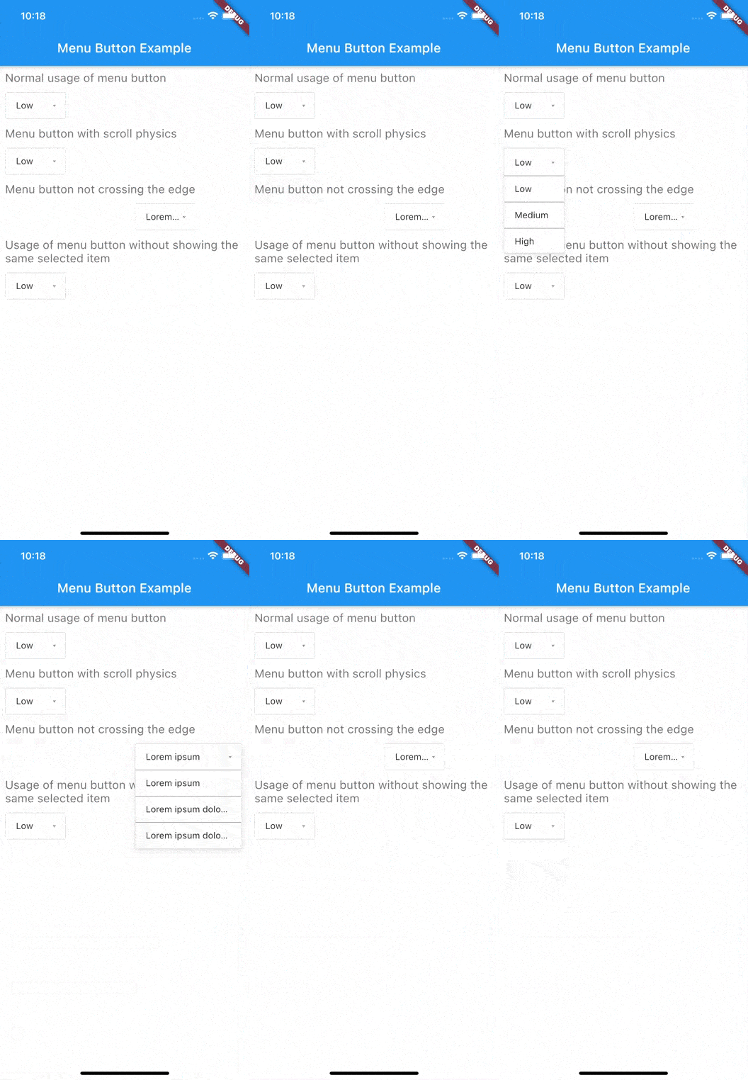
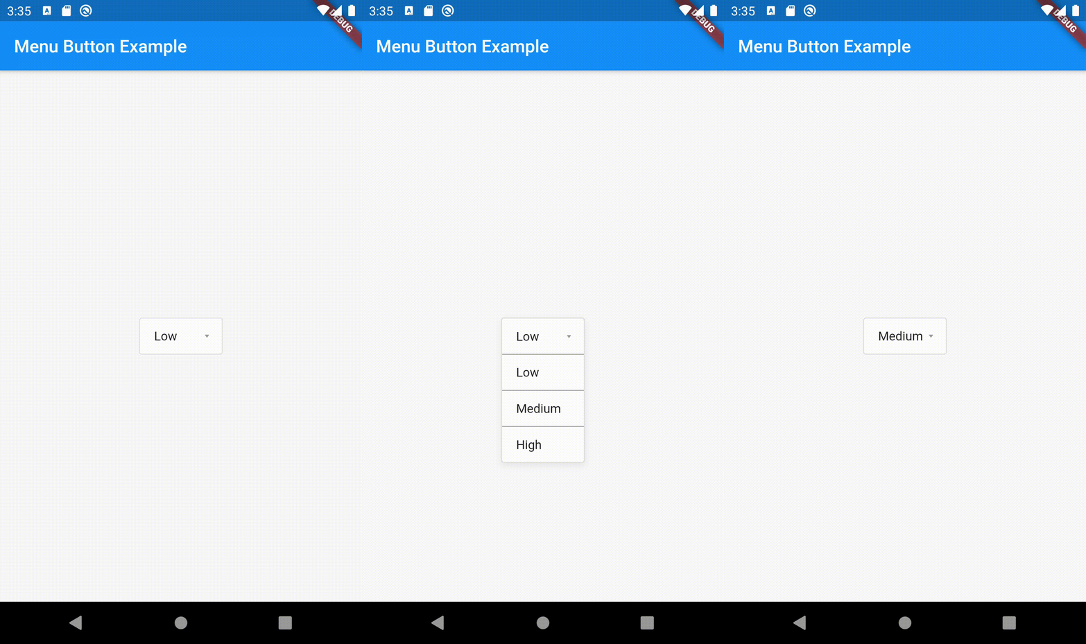
Menu button with 3 items:


If something is missing, feel free to open a ticket or contribute!

Categorias

Repositório-fonte

Projetos que usam este pacote