Buscar pacotes, repositórios e categorias de apps

Capa de neopop
Detalhes do pacotev1.0.2

neopop

NeoPop é a biblioteca embutida do CRED para usar componentes NeoPop em seu aplicativo.

AndroidiOSWebmacOSWindowsLinux
Downloads em 30 dias
864
Curtidas
336
Pontos Pub
150

Instalar pacote

flutter pub add neopop

Visão geral do pacote

Orientação gerada a partir de informações públicas. Apenas para referência.

NeoPop é um pacote Flutter desenvolvido pela CRED.club que fornece componentes personalizáveis e visualmente atraentes para criar interfaces modernas. Permite aos desenvolvedores integrar facilmente elementos animados e interativos, como botões e indicadores de progresso, com uma linguagem de design elegante e contemporânea. A biblioteca foi projetada para melhorar a experiência do usuário por meio de animações sutis e feedback responsivo, tornando-a ideal para aplicativos que buscam uma interface refinada e dinâmica. O NeoPop suporta múltiplas plataformas, incluindo Android, iOS, Web, macOS, Windows e Linux, garantindo desempenho consistente em diferentes dispositivos.

Casos de uso

  • Criando botões animados em aplicativos móveis
  • Implementando indicadores de progresso interativos
  • Melhorando a IU com efeitos visuais modernos
  • Criando telas de onboarding envolventes
  • Criando protótipos de alta fidelidade
  • Adicionando microinterações a formulários

Principais recursos

  • componentes NeoPop pré-construídos e personalizáveis
  • Animações suaves e feedback háptico
  • Compatibilidade multiplataforma
  • Integração fácil por meio do pub add
  • Leve e eficiente
  • Suporte para modo escuro

Indicado para

  • Designers de UI procurando componentes modernos
  • Desenvolvedores criando aplicativos interativos no Flutter
  • Equipes focadas no engajamento do usuário
  • Startups criando MVPs polidos
  • Engenheiros de frontend trabalhando em projetos multiplataforma

Considerações

  • Pode exigir estilos adicionais para temas complexos
  • Documentação limitada além do uso básico
  • Mais adequado para aplicativos com objetivos estéticos modernos
  • Não é ideal para designs de interface minimalistas ou tradicionais
  • Impacto no desempenho com uso excessivo de animações

README original

Snapshot do README original do repositório-fonte vinculado. Consulte o repositório para o conteúdo mais recente.

NeoPOP

NeoPOP is CRED's inbuilt library for using NeoPOP components in your app.

What really is NeoPOP?

NeoPOP was created with one simple goal; to create the next generation of a beautiful, affirmative design system. NeoPOP stays true to everything that design at CRED stands for.

NeoPOP is built for Android, iOS, Flutter and Web

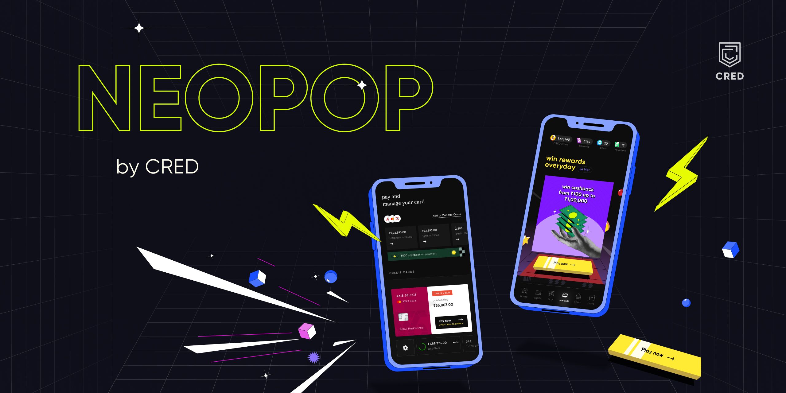
NeoPOP Banner

Installation

Add neopop as a dependency in your pubspec.yaml file.

dependencies:
    neopop: ^1.0.2

NeoPopButton

Configs NeoPopButton render 5 surfaces, top, left, right, bottom and center. NeoPopButton widget gives you mutliple configs that you can use for your widget.

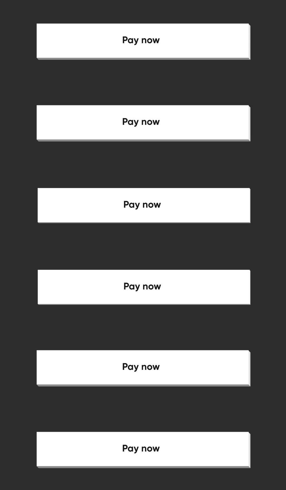
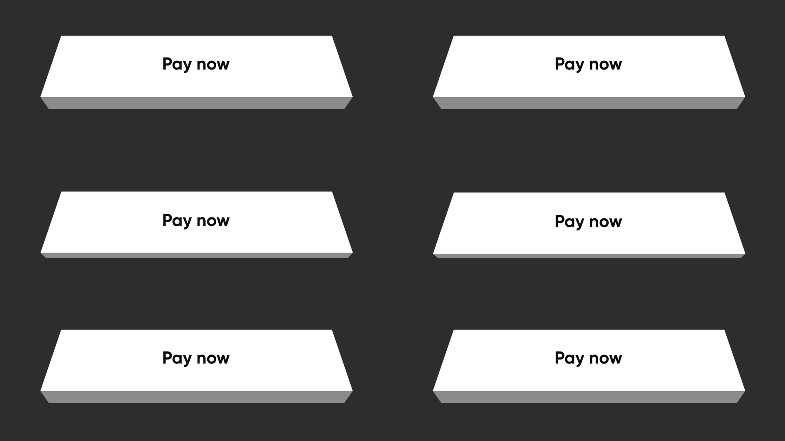
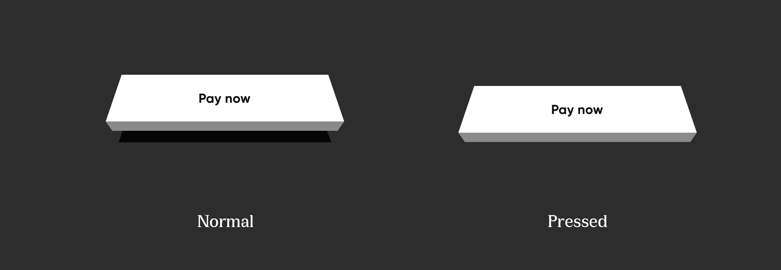
Elevated

Elevated elevated

NeoPopButton(
    color: Colors.white,
    onTapUp: () => HapticFeedback.vibrate(),
    onTapDown: () => HapticFeedback.vibrate(),
    child: Padding(
        padding: EdgeInsets.symmetric(horizontal: 20, vertical: 15),
        child: Row(
            mainAxisAlignment: MainAxisAlignment.center,
            children: [
                Text("Pay now"),
            ],
        ),
    ),
),

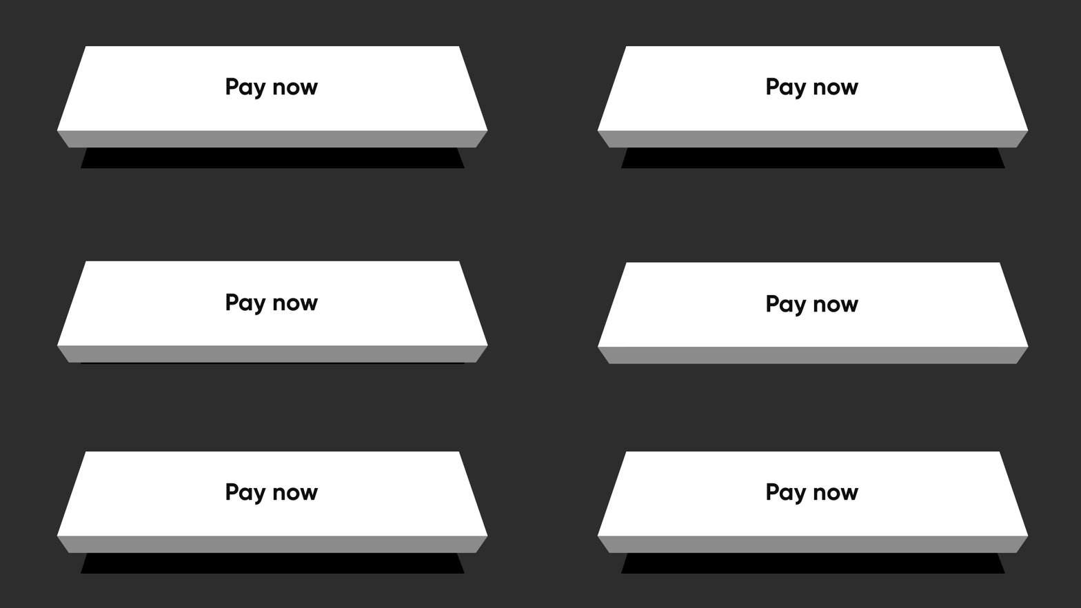
Flat

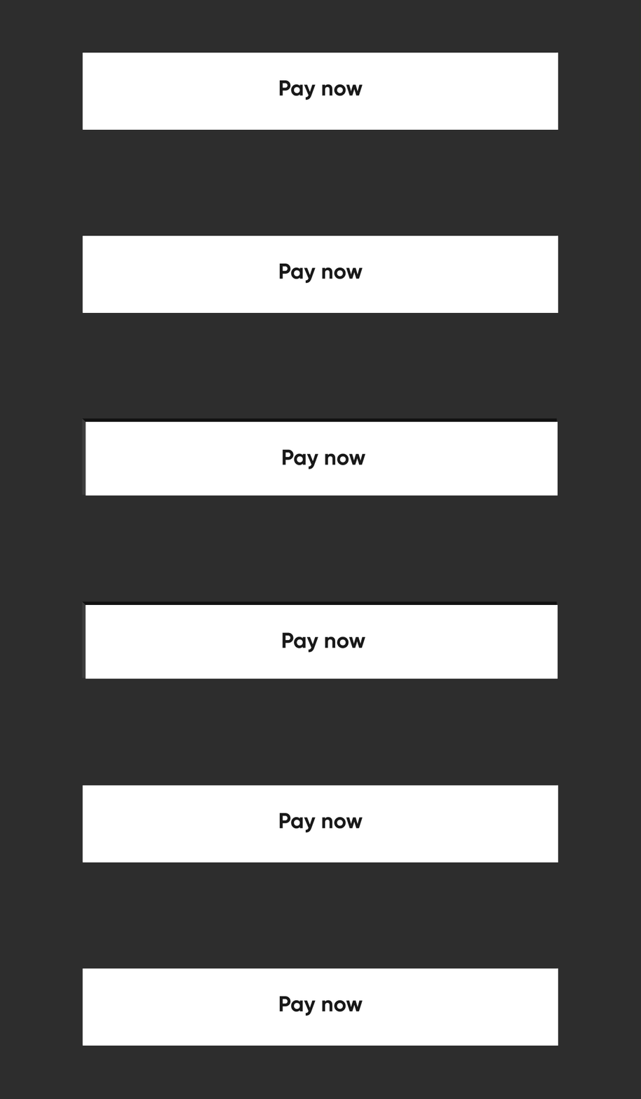
Flat flatButton

By specifying the buttonPosition as Position.center, NeoPOP will compute right and bottom surface's color according to color. Top and left surface's color is computed w.r.t parentColor and grandparentColor

NeoPopButton(
    color: Colors.white,
    onTapUp: () => HapticFeedback.vibrate(),
    onTapDown: () => HapticFeedback.vibrate(),
    parentColor: Colors.transparent,
    buttonPosition: Position.center,
    child: Padding(
        padding: const EdgeInsets.symmetric(horizontal: 20, vertical: 15),
        child: Row(
            mainAxisAlignment: MainAxisAlignment.center,
            children: const [
                Text("Pay Now"),
            ],
        ),
    ),
),

Shimmer

const NeoPopShimmer(
    shimmerColor: Colors.yellow,
    child: Padding(
        padding: const EdgeInsets.symmetric(horizontal: 100, vertical: 15),
        child: Text("Hello"),
    ),
),

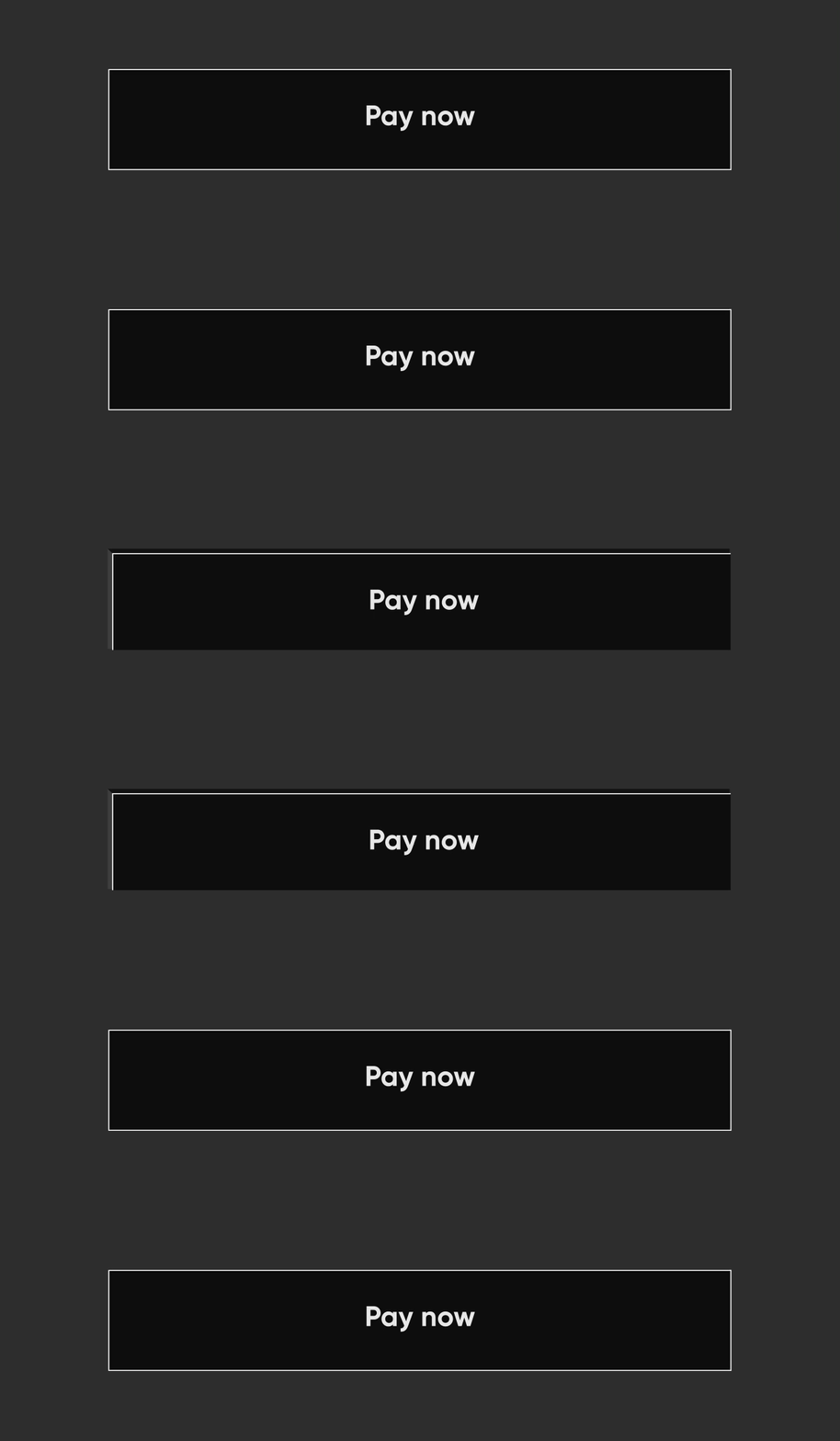
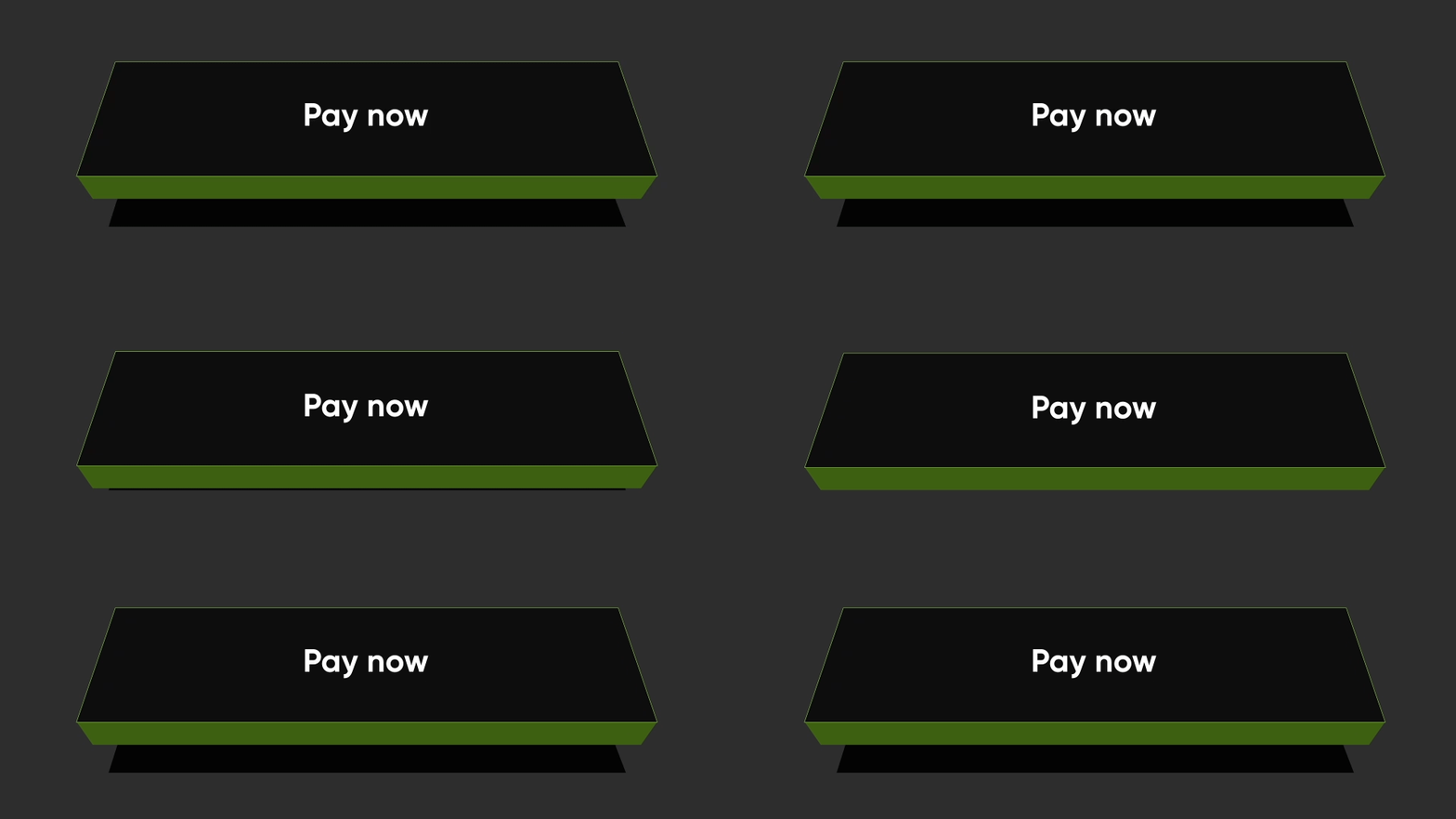
Flat Strokes

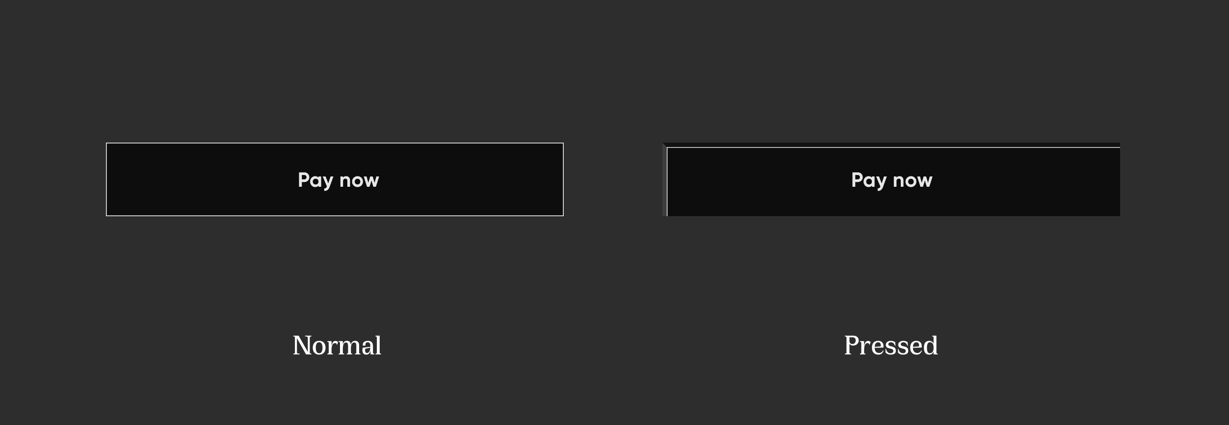
Flat Strokes flatStroked

To add border on a flat button, add border

NeoPopButton(
    color: const Color.fromRGBO(0, 0, 0, 1),
    buttonPosition: Position.center,
    onTapUp: () {},
    border: const Border.fromBorderSide(
        BorderSide(color: kBorderColorWhite, width: kButtonBorderWidth),
    ),
    child: Padding(
        padding: const EdgeInsets.symmetric(horizontal: 20, vertical: 15),
        child: Row(
            mainAxisAlignment: MainAxisAlignment.center,
            children: const [
                Text("Pay Now", style: TextStyle(color: Colors.white)),
            ],
        ),
    ),
),

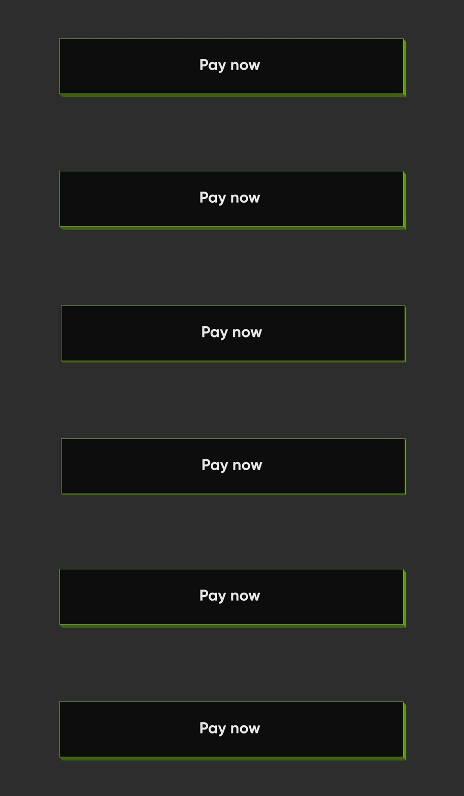
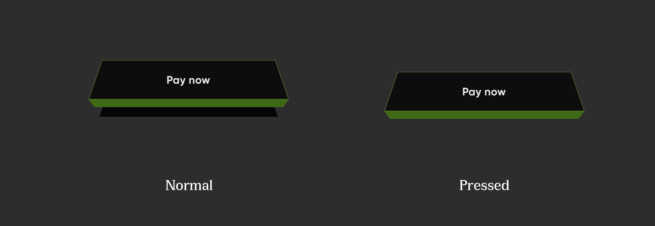
Elevated Strokes

Elevated Strokes elevatedStroked

NeoPopButton(
    color: kSecondaryButtonLightColor,
    bottomShadowColor: ColorUtils.getVerticalShadow(kBorderColorGreen).toColor(),
    rightShadowColor: ColorUtils.getHorizontalShadow(kBorderColorGreen).toColor(),
    animationDuration: kButtonAnimationDuration,
    depth: kButtonDepth,
    onTapUp: () {},
    border: Border.all(
        color: kBorderColorGreen,
        width: kButtonBorderWidth,
    ),
    child: Padding(
        padding: const EdgeInsets.symmetric(horizontal: 20, vertical: 15),
        child: Row(
            mainAxisAlignment: MainAxisAlignment.center,
            children: const [
                Text("Scan & Pay", style: TextStyle(color: Colors.white)),
            ],
        ),
    ),
),

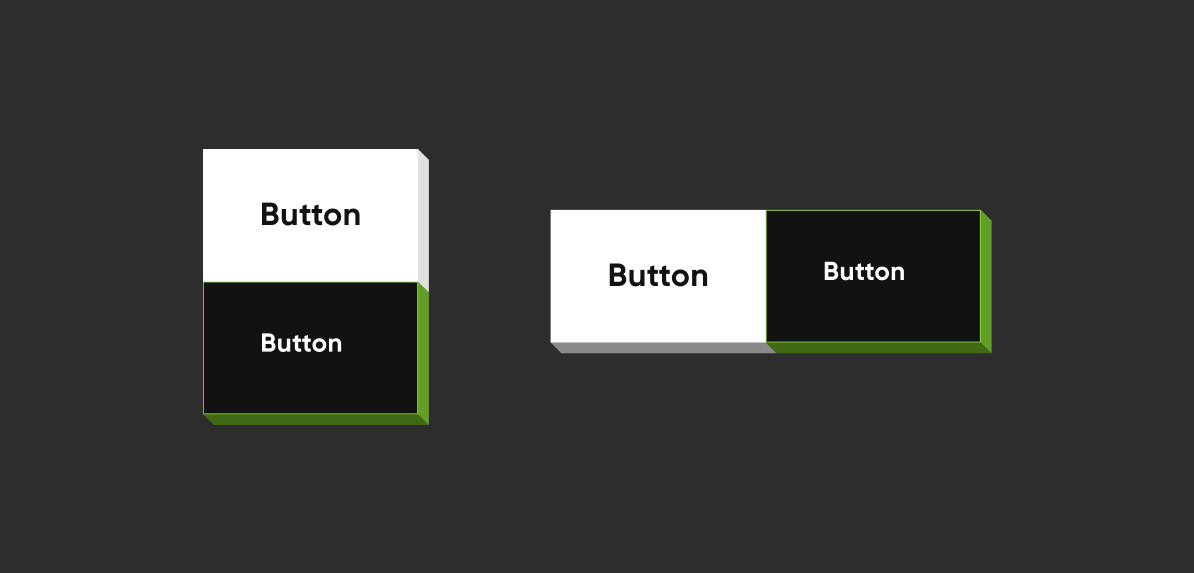
Adjacent Buttons

Adjacent Buttons

Vertically Aligned Buttons
Column(
    mainAxisSize: MainAxisSize.min,
    children: [
        NeoPopButton(
        color: kSecondaryButtonLightColor,
        bottomShadowColor: kShadowColorDarkGreen,
        rightShadowColor: kShadowColorGreen,
        buttonPosition: Position.fullBottom,
        onTapUp: () {},
        border: Border.all(
            color: kBorderColorGreen, width: kButtonBorderWidth,
        ),
        child:  const Padding(
                    padding: EdgeInsets.symmetric(horizontal: 8.0, vertical: 15.0),
                    child: Text(
                    "Button",
                    style: TextStyle(color: Colors.white),
                ),
            ),
        ),
        NeoPopButton(
            color: kPrimaryButtonColor,
            buttonPosition: Position.fullBottom,
            onTapUp: () {},
            child:  const Padding(
                padding: EdgeInsets.symmetric(horizontal: 8.0, vertical: 15.0),
                child: Text("Button"),
            ),
        ),
    ],
),
Horizontally Aligned Buttons
Row(
    mainAxisSize: MainAxisSize.min,
    children: [
        Expanded(
        child: NeoPopButton(
            color: kPrimaryButtonColor,
            buttonPosition: Position.fullBottom,
            depth: kButtonDepth,
            onTapUp: () {},
            child: const Center(
            child:  Padding(
                    padding: EdgeInsets.symmetric(
                        horizontal: 8.0, vertical: 15.0),
                    child: Text("Button"),
                    ),
                ),
            ),
        ),
        Expanded(
            child: NeoPopButton(
                color: kSecondaryButtonLightColor,
                bottomShadowColor: kShadowColorDarkGreen,
                rightShadowColor: kShadowColorGreen,
                buttonPosition: Position.fullBottom,
                depth: kButtonDepth,
                onTapUp: () {},
                border: Border.all(
                    color: kBorderColorGreen, width: kButtonBorderWidth,
                ),
                child: const Center(
                child: Padding(
                    padding: EdgeInsets.symmetric( horizontal: 8.0, vertical: 15.0),
                    child: Text(
                            "Button",
                            style: TextStyle(color: Colors.white),
                        ),
                    ),
                ),
            ),
        ),
    ],
),

NeoPopButton Attributes

Attribute Type Description
child Widget The child of button widget
color Color Color of the button
depth double The depth of the button if it is elevated
onTapUp VoidCallback? Callback triggered when the forward & reverse button animation is finished
onTapDown VoidCallback? Callback triggered as soon as the user clicks the enabled button
onLongPress VoidCallback? Callback triggered when user has long pressed the cta
disabledColor Color Color of the button when it is disabled
parentColor Color Button's immediate ancestor's color
grandparentColor Color Button's second level ancestor's color
buttonPosition Position The position of button in reference to parent view. default - Position.fullBottom
animationDuration Duration Animation duration of the button click. default - const Duration(milliseconds: 50)
forwardDuration Duration? If you want different forward duration for button click, use forwardDuration
reverseDuration Duration? If you want different reverse duration for button click, use reverseDuration
border Border? The border to be painted around the button
enabled bool If set to false, the button will be disabled. default - true
shadowColor Color? The base color of the shadow. The shadow colors will be derived from this
rightShadowColor Color? The color of the right shadow.
leftShadowColor Color? The color of the left shadow.
topShadowColor Color? The color of the top shadow.
bottomShadowColor Color? The color of the bottom shadow.

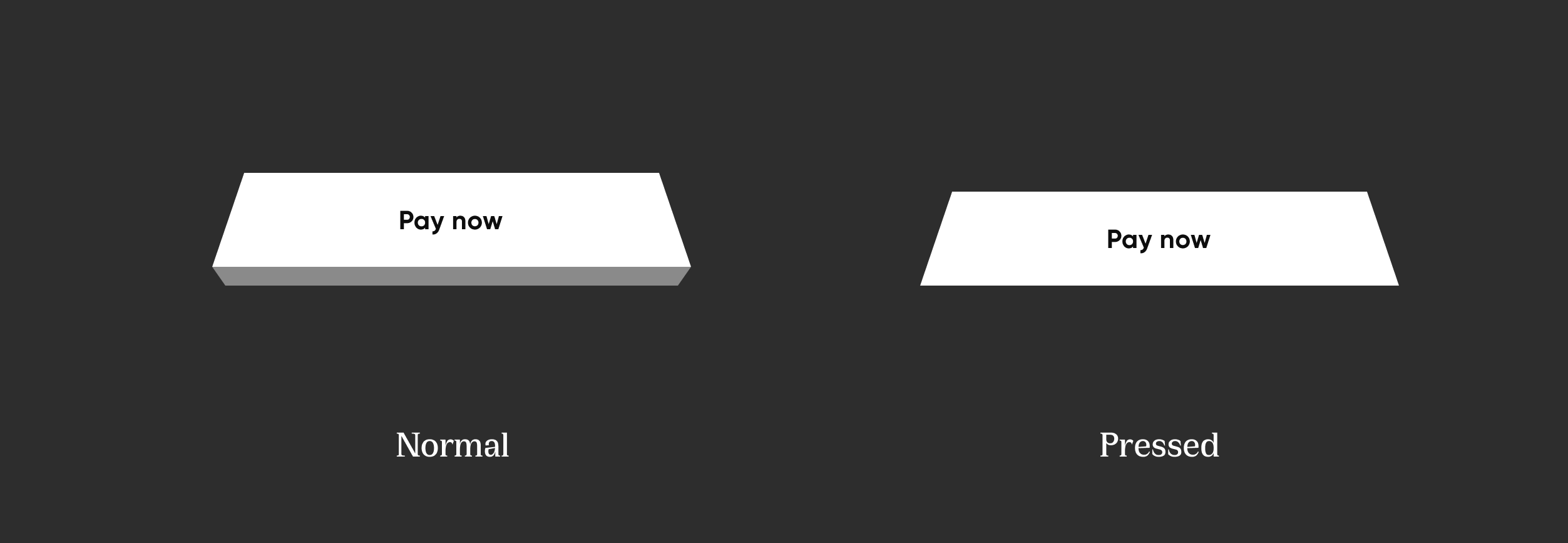
NeoPopTiltedButton

NeoPopTiltedButton

Non Floating

Non Floating tiltNonFloating

 NeoPopTiltedButton(
    color: kPrimaryButtonColor,
    onTapUp: () {},
    child: Padding(
        padding: const EdgeInsets.symmetric(
        horizontal: 80.0,
        vertical: 15,
        ),
        child: SvgPicture.asset('assets/svg/cta_text_view.svg'),
    ),
),

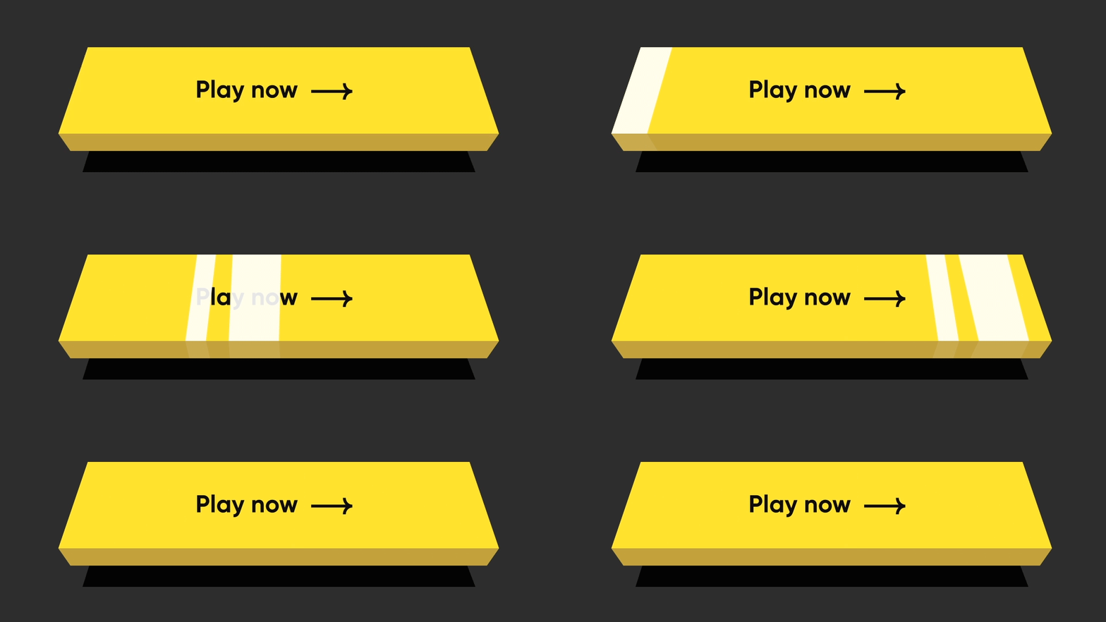
Floating

Floating tiltFloating

NeoPopTiltedButton(
    isFloating: true,
    onTapUp: () => HapticFeedback.vibrate(),
    onTapDown: () => HapticFeedback.vibrate(),
    decoration: const NeoPopTiltedButtonDecoration(
        color: kPopYellowColor,
        plunkColor: kPlunkColorYellow,
        shadowColor: kTiltedButtonShadowColor,
    ),
    child: Padding(
        padding: const EdgeInsets.symmetric(
        horizontal: 70.0,
        vertical: 15,
        ),
        child: SvgPicture.asset('assets/svg/cta_text_play_now.svg'),
    ),
),

Strokes

Strokes TiltStroked

NeoPopTiltedButton(
    isFloating: true,
    onTapUp: () {},
    decoration: const NeoPopTiltedButtonDecoration(
        color: Color(0xFF0D0D0D),
        plunkColor: Color(0xFF3F6915),
        shadowColor: Colors.black,
        border: Border.fromBorderSide(
        BorderSide(color: Color(0xFF8DD04A), width: 1),
        ),
    ),
    child: const Padding(
        padding: EdgeInsets.symmetric(horizontal: 70.0, vertical: 15),
        child: Text('Play Now', style: TextStyle(color: Colors.white)),
    ),
),

Shimmer

shimmer

NeoPopTiltedButton(
    isFloating: true,
    onTapUp: () {},
    decoration: const NeoPopTiltedButtonDecoration(
        color: Color.fromRGBO(255, 235, 52, 1),
        plunkColor: Color.fromRGBO(255, 235, 52, 1),
        shadowColor: Color.fromRGBO(36, 36, 36, 1),
        showShimmer: true,
    ),
    child: const Padding(
        padding: EdgeInsets.symmetric(
        horizontal: 70.0,
        vertical: 15,
        ),
        child: Text('Play Now'),
    ),
),

NeoPopTiltedButton Attributes

Attribute Type Description
child Widget The child of the button
color Color? Color of the button
decoration NeoPopTiltedButtonDecoration? The decoration to paint the button. The color and decoration arguments cannot both be supplied, since it would potentially result in the decoration drawing over the background color. To supply a decoration with a color, use decoration.
buttonDepth double? The depth of the tilted button. default: 8.0
onTapUp VoidCallback? A callback triggered when a pointer that will trigger a tap with button has stopped contacting the screen
onTapDown VoidCallback? A callback triggered when a pointer that might cause a tap with button has contacted the screen
shadowDistance double? The maximum distance from the button at which the shadow is painted. default: 20
yPosFactor double? Factor that defines the floating positions of buttons and shadow along vertical-axis. default: 5
isFloating bool Whether the button is floating. default: false
floatingDuration Duration? The duration of the floating animation. One floating cycle i.e to-and-fro movement of the button and shadow accounts for two floating durations. default: Duration(milliseconds: 1500)
floatingDelay Duration? The delay between two floating cycles. default: Duration(milliseconds: 750)
tapDuration Duration? The duration of the animation when button is pressed or released. default: Duration(milliseconds: 100)
enabled bool Whether the button is enabled. default: true

Contributing

Pull requests are welcome! We'd love help improving this library. Feel free to browse through open issues to look for things that need work. If you have a feature request or bug, please open a new issue so we can track it.

License

Copyright 2022 Dreamplug Technologies Private Limited.  
  
Licensed under the Apache License, Version 2.0 (the "License");  
you may not use this file except in compliance with the License.  
You may obtain a copy of the License at  
  
 http://www.apache.org/licenses/LICENSE-2.0  
Unless required by applicable law or agreed to in writing, software  
distributed under the License is distributed on an "AS IS" BASIS,  
WITHOUT WARRANTIES OR CONDITIONS OF ANY KIND, either express or implied.  
See the License for the specific language governing permissions and  
limitations under the License.  

Categorias

Repositório-fonte

Projetos que usam este pacote