Orientação gerada a partir de informações públicas. Apenas para referência.
Um pacote Flutter que fornece um framework simples e paginado para calendário vertical, ideal para criar interfaces baseadas em calendário. Permite navegação suave entre datas com suporte embutido à paginação em múltiplas plataformas. Projetado para desenvolvedores que buscam uma solução leve para exibir e interagir com intervalos de data em um layout verticalmente rolável. O pacote é ideal para aplicativos de agendamento, planejadores ou qualquer aplicativo que exija navegação intuitiva por datas.
Casos de uso
Aplicações de agendamento
Interfaces de planejamento diário
Widgets de seleção de data
Painéis de controle de gerenciamento de eventos
Ferramentas de rastreamento de tempo
Principais recursos
Paginação vertical por data
Compatibilidade multiplataforma
Integração simples
Renderização de data personalizável
Manipulação de rolagem embutida
Indicado para
Desenvolvedores construindo interfaces de calendário
Aplicativos que precisam de navegação de data
Soluções leves de calendário
Iniciantes do Flutter aprendendo padrões de interface
Aplicativos de calendário multiplataforma
Considerações
Opções limitadas de estilos pré-construídos
Requer implementação personalizada para layouts complexos
Sem gerenciamento de eventos embutido
Não otimizado para calendários horizontais
Configuração mínima para casos de uso avançados
README original
Snapshot do README original do repositório-fonte vinculado. Consulte o repositório para o conteúdo mais recente.
:calendar: Paged Vertical Calendar :calendar:
A simple paginated framework for implementing calendar based interfaces.
:hammer: How it works
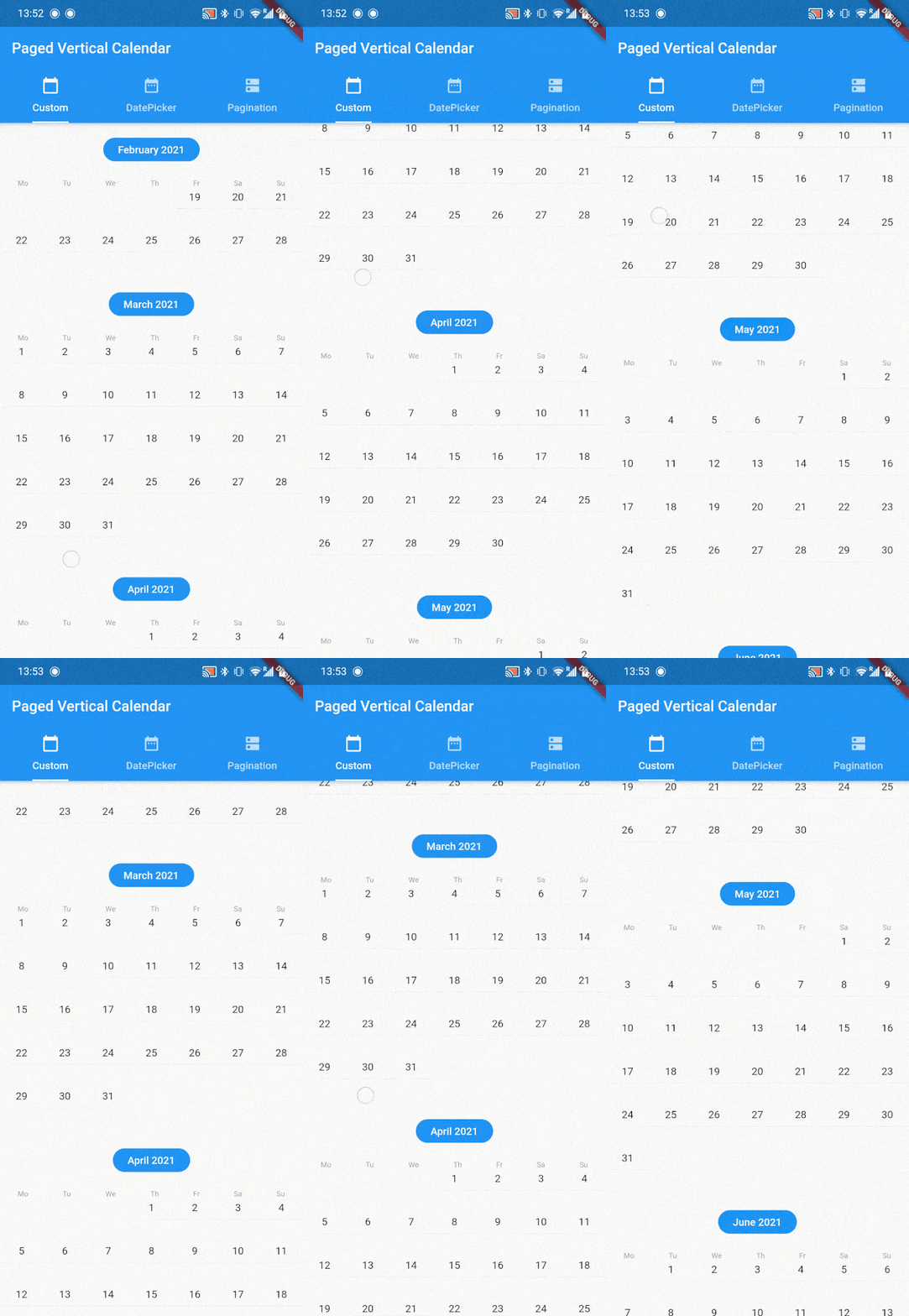
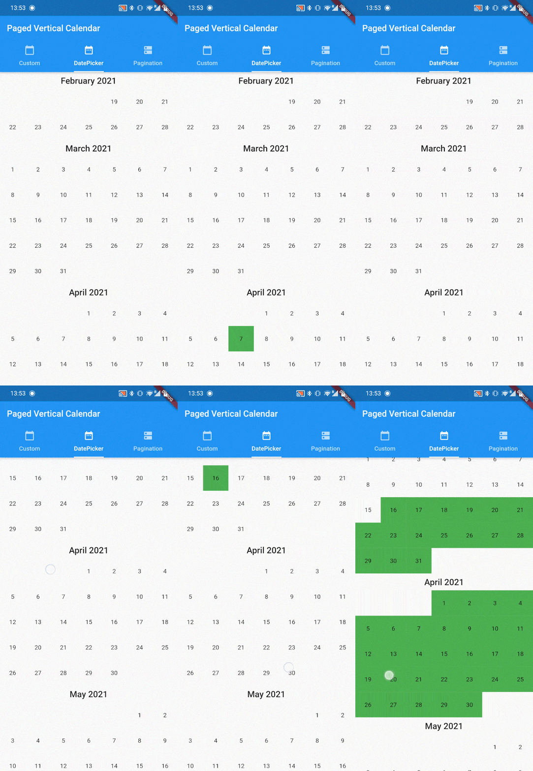
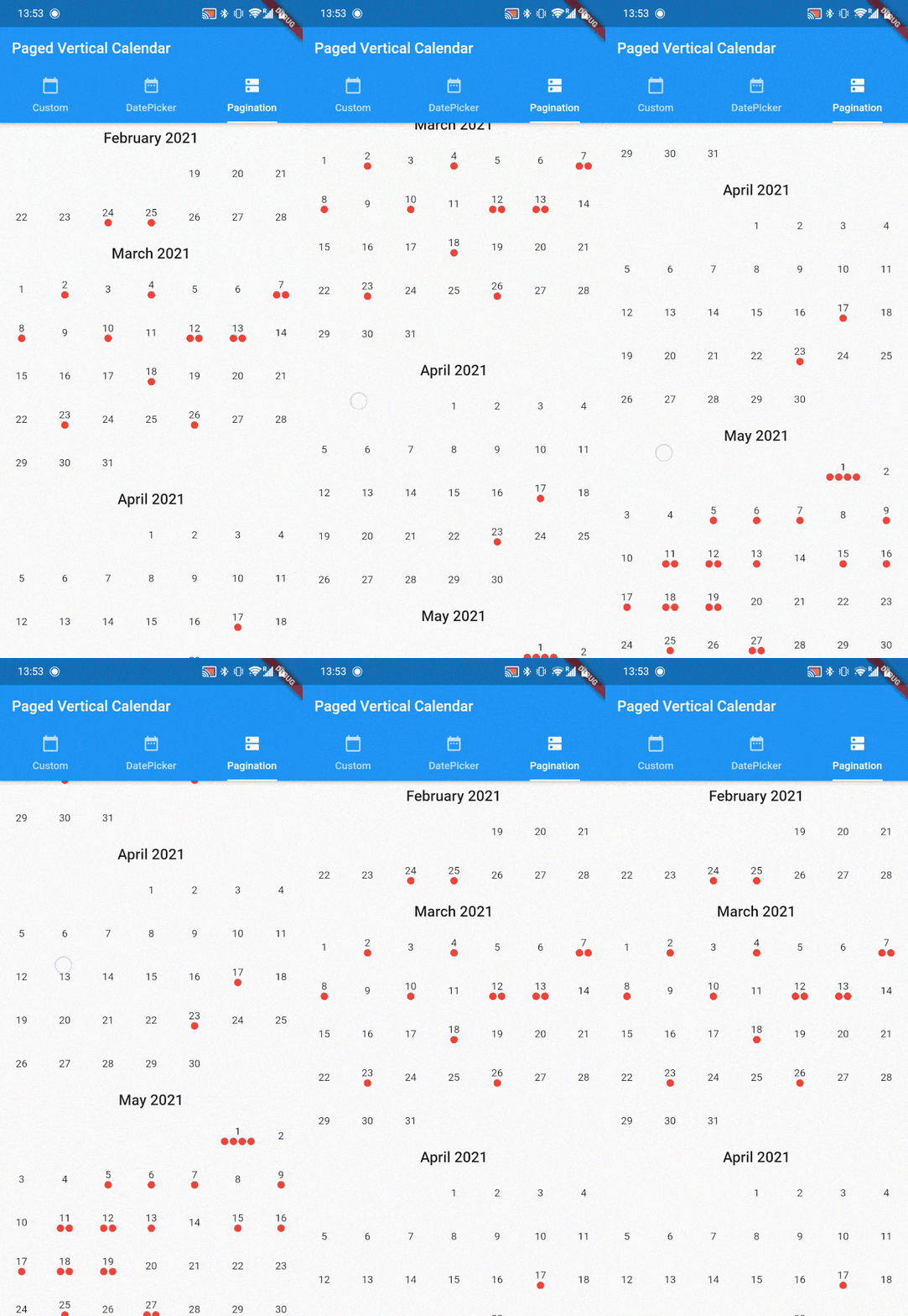
paged_vertical_calendar is a very minimalistic framework that automatically loads months based on scoll behavior. It provides many useful callbacks to implement your own calendar interactions and builders to customize the calendar as much as you want. Check the example for several implementations like date range selection and paginated data visualisation.
PagedVerticalCalendar has no required parameters and can be dropped in anywhere providing it has a fixed height.
Scaffold(
  body: PagedVerticalCalendar(),
);
:loudspeaker: functionality
Several callback are provided to facilitate easy implementation of any calendar interactions
onMonthLoaded is a callback that fires for every month added to the list. When this function fires can be altered by setting the invisibleMonthsThreshold pararamter.
invisibleMonthsThreshold decides how many months outside of the widgets view should be loaded. In other words, how many months should be preloaded before the user reaches that scroll position. It defaults to 1.
onDayPressed Is a simple onPressed callback but also provides the DateTime of the day that has been pressed.
If your app is localized for countries where the week starts on Sunday, you can flip startWeekWithSundayto true.
If a minDate is provided the calendar will stop scrolling up at that date. make sure minDate < maxDate.
If a maxDate is provided the calendar will stop scrolling down at that date. make sure maxDate > minDate.
If an initialDate is provided the calendar start by displaying this date (otherwise DateTime.now()). make sure minDate < initialData < maxDate.
Finally when a minDate or maxDate is provided to the PagedVerticalCalendar, the onPaginationCompleted callback can be used. it will return a PaginationDirection to indicate what side of the calendar has been reached.
and many many more, see the docs!!!
:art: Customization
PagedVerticalCalendar provides default calendar styling, but these can be fully customized. To do so, several builders are provided:
PagedVerticalCalendar(
  monthBuilder: (context, month, year) {
    // provide a month header widget
  },
  dayBuilder: (context, date) {
    // provide a day widget
  },
  listPadding: // provide EdgeInset value
);
monthBuilder provides the year and month as integers. this builder has to return a widget that will form the header of ever month. the intl package works well here for date formatting.
dayBuilder provides the day as a DateTime. this builder wil be called for every day. You usually want to provide at least a text widget with the current day number.
listPadding can be provided in case you need the list to have padding.
:wave: Get Involved
If this package is useful to you please :thumbsup: on pub.dev and :star: on github. If you have any Issues, recommendations or pull requests I'd love to see them!