Buscar pacotes, repositórios e categorias de apps

Capa de pal_widgets
Detalhes do pacotev0.4.0

pal_widgets

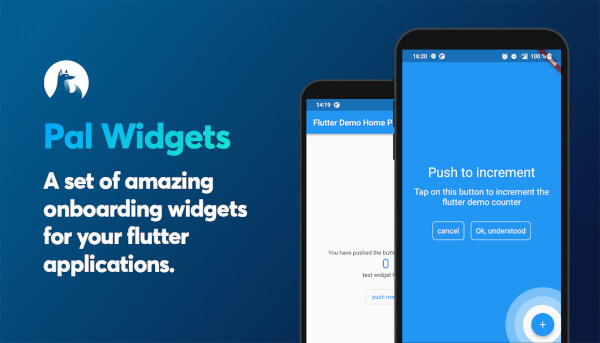
Um conjunto de widgets incríveis para o onboarding em seus aplicativos Flutter.

AndroidiOSWebmacOSWindowsLinux
Downloads em 30 dias
52
Curtidas
80
Pontos Pub
150

Instalar pacote

flutter pub add pal_widgets

Visão geral do pacote

Orientação gerada a partir de informações públicas. Apenas para referência.

pal_widgets é um pacote Flutter que oferece uma coleção de widgets de onboarding visualmente atraentes projetados para melhorar a experiência do usuário por meio de tours guiados e marcas de treinamento. Ajuda os desenvolvedores a apresentar recursos do aplicativo passo a passo, aumentando o engajamento e a compreensão do usuário. O pacote suporta múltiplas plataformas, incluindo Android, iOS, Web, macOS, Windows e Linux, garantindo uma experiência de onboarding consistente em todos os dispositivos. Com animações personalizáveis e APIs intuitivas, simplifica a implementação de caminhadas interativas. Ideal para aplicativos que buscam reduzir a fricção do usuário durante o onboarding.

Casos de uso

  • Onboarding de novos usuários
  • Destacando os principais recursos do aplicativo
  • Tutoriais guiados
  • Melhorar a retenção de usuários
  • Apresentando interfaces complexas
  • Melhorando a experiência do usuário pela primeira vez

Principais recursos

  • widgets de onboarding pré-construídos
  • Suporte multiplataforma
  • animações personalizáveis
  • Integração fácil
  • Marcas de treinador interativas
  • Design responsivo

Indicado para

  • Aplicações móveis e web
  • Equipes de produto
  • designers de UX
  • Desenvolvedores procurando soluções de onboarding rápido
  • Aplicativos com fluxos de trabalho complexos
  • Startups focadas na onboarding do usuário

Considerações

  • Requer conhecimento sobre layout do Flutter
  • Pode ser necessário personalização para alinhamento da marca
  • Impacto no desempenho com muitos passos
  • Limitado a casos de uso de onboarding
  • Depende de dependências externas
  • Não adequado para fluxos de interface do usuário não guiados
README original

Snapshot do README original do repositório-fonte vinculado. Consulte o repositório para o conteúdo mais recente.

flutter anchored onboarding screen


build License: MIT Pal widgets pubdev


Pal widgets

A flutter package for better onboarding.

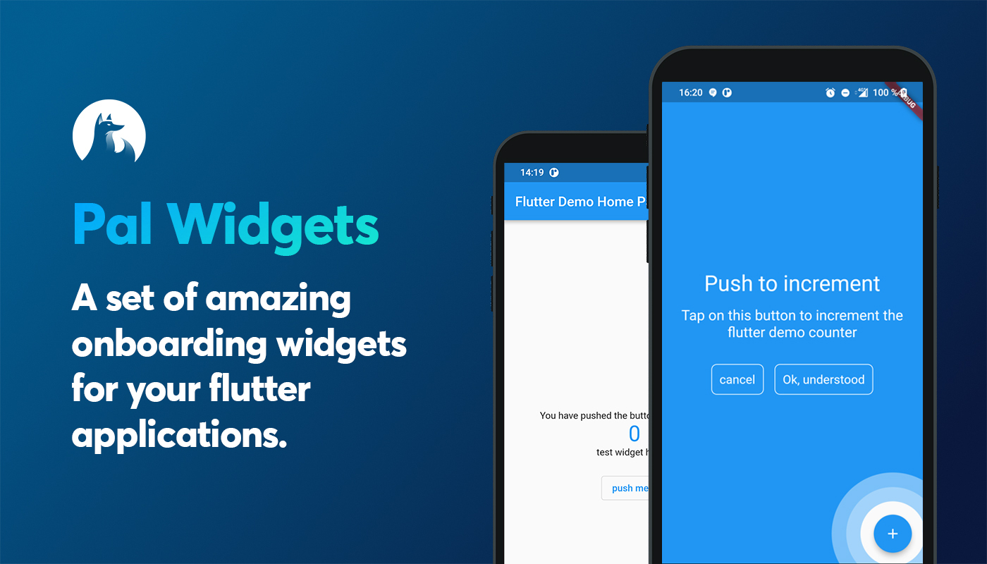
A set of amazing onboarding widgets for your flutter applications.

Install package

add in your pubspec.yaml dependencies

pal-widgets: 0.3.0


List of helpers

Name description status
AnchoredHelper An helper do describe another widget of your page. This creates an overlay above your page :white_check_mark:

Anchored helper

This widgets is highly inspired by google onboardings. This shows a circle around any widgets you want and add an overlay were you can add a message.

First embbed you page or your app with a HelperOrchestrator widget.

HelperOrchestrator(
    child: Scaffold(
        appBar: AppBar(
            title: Text(widget.title),
        ),
        body: ...
    ),
)

You now have to get a key text1 for the widget you want to reference using

Text(
    '$_counter',
    key: HelperOrchestrator.of(context).generateKey('text1'),
),
Example

You can now show an anchored helper using

final helper = AnchoredHelper(
    title: const Text('Title lorem pitume'),
    description: const Text('Lorem ipsum lorem ipsum lorem ipsum lorem ipsum lorem ipsum'),,
    bgColor: Colors.blue,
    leftBtnText: const Text('cancel'),
    rightBtnText: const Text('Ok, understood'),
    onError: () => print("widget not found"),
    positivBtnStyle: helperOutlineBtnStyle,
    negativeBtnStyle: helperOutlineBtnStyle,
    onLeftBtnTap: () => HelperOrchestrator.of(context).hideHelper(),
    onRightTap: () => HelperOrchestrator.of(context).hideHelper(),
    onTapAnchor: () => HelperOrchestrator.of(context).hideHelper(),
);

// this will show an overlayed anchored widget using the key text1
HelperOrchestrator.of(context).showAnchoredHelper('text1', helper);
properties
Property description Required
title A Text widget to show as title
description A Text widget to show as description
bgColor A Color as Overlayed background :white_check_mark:
leftBtnText A [Text] widget to show within the left button
rightBtnText A [Text] widget to show within the right button
onLeftBtnTap Action on tap left button
onRightTap Action on tap right button
onError Functions to call when widgets encounters any errors
leftBtnStyle Material style to put on negativ button
rightBtnStyle Material style to put on positiv button
onTapAnchor Action to call when user tap on anchor
widgetFactory The Widget factory to create the anchored helper. Default to AnchoredCircleHoleHelper.anchorFactory which creates a full overlay with an animated hole

There is two Hole Anchor widget factories :

  • AnchoredCircleHoleHelper.anchorFactory: creates a circle hole (default value)
  • AnchoredRectHoleHelper.anchorFactory : creates a rectangle hole on strict widget bounds

Any question?

Contact us on our twitter

Categorias

Dependências

Lista de dependências 1 itens

Repositório-fonte

Projetos que usam este pacote

Ainda não há dados.