Orientação gerada a partir de informações públicas. Apenas para referência.
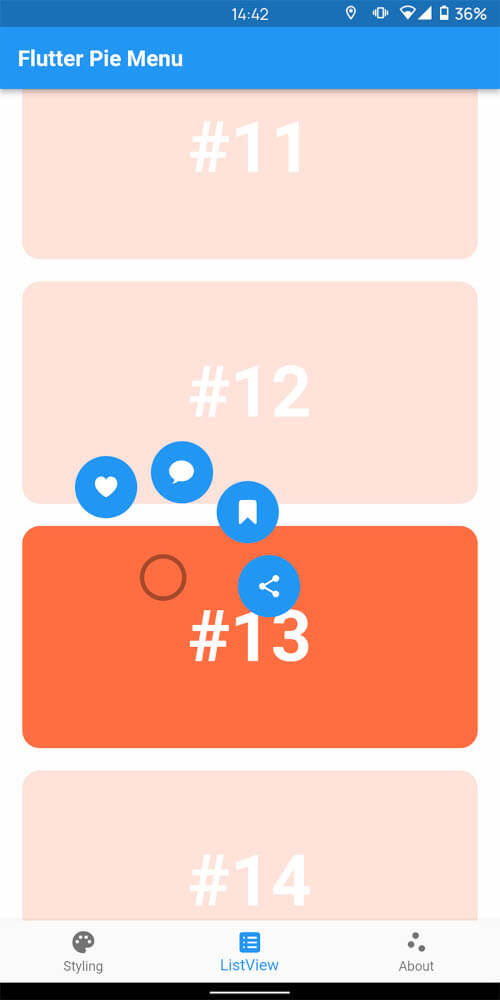
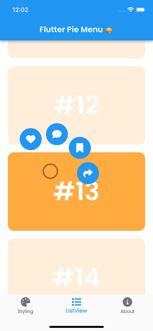
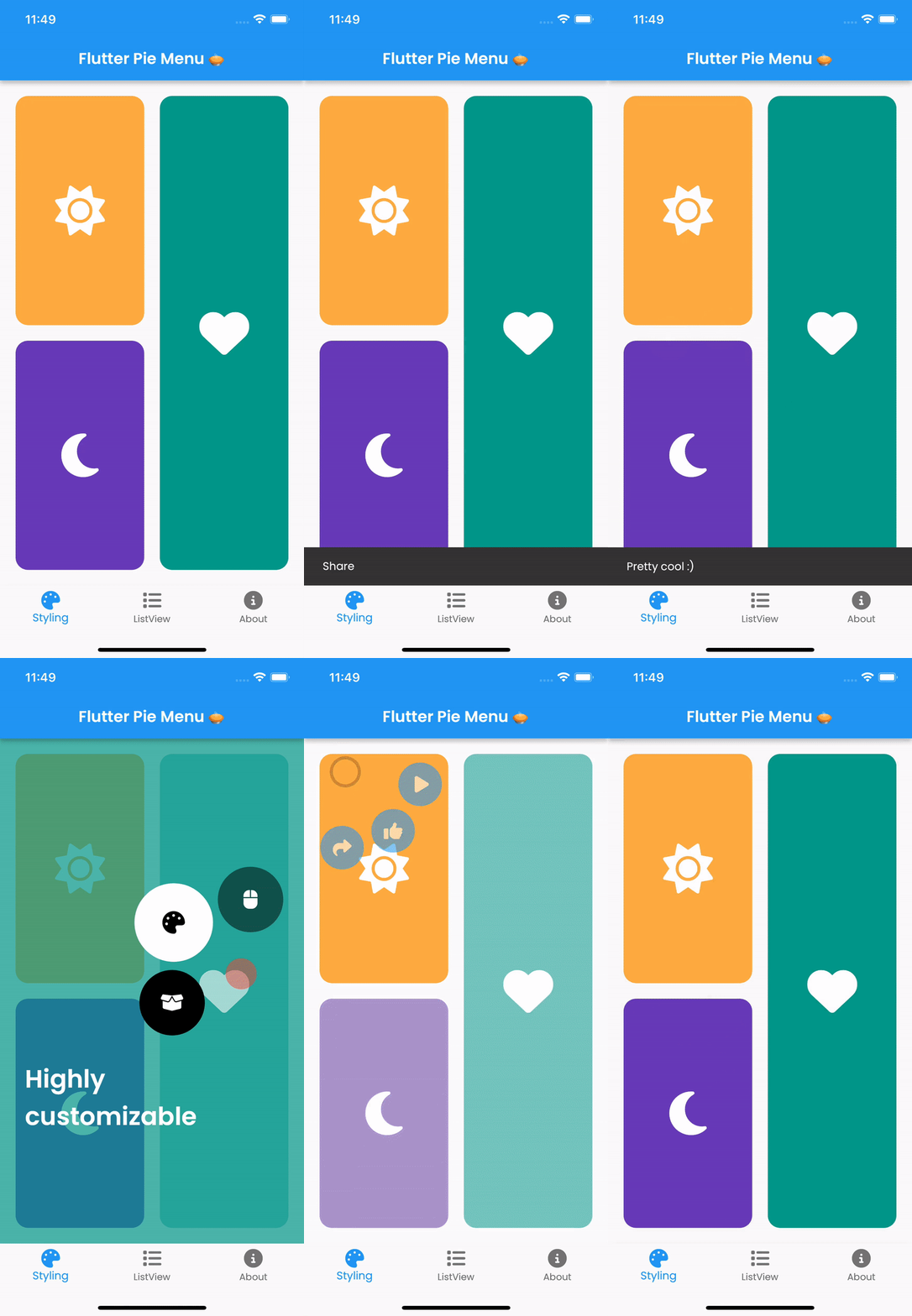
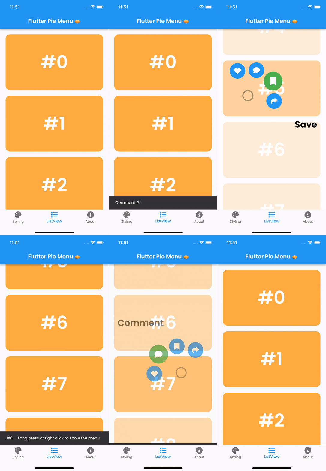
Pie_menu é um pacote Flutter que oferece um menu contextual circular ou radial personalizável, ideal para interações intuitivas e eficientes em espaço. Permite aos desenvolvedores criar menus em formato de pizza com fatias configuráveis, animações e gestos. O pacote suporta múltiplas plataformas, incluindo Android, iOS, Web, macOS, Windows e Linux, garantindo comportamento consistente entre dispositivos. Com opções extensas de personalização de cores, tamanhos e comportamentos, ele aprimora o design da interface em aplicativos que exigem acesso rápido a várias ações.
Casos de uso
Seleção de ação rápida em aplicativos móveis
Navegação intuitiva em ferramentas criativas
Melhorando a IU em interfaces de jogos
Simplificando fluxos de trabalho em aplicativos de produtividade
Fornecendo controles baseados em gestos em aplicativos de AR/VR
Principais recursos
Layout radial altamente personalizável
Suporte para gestos de toque, toque e arrasto
Animações e transições suaves
Compatibilidade multiplataforma
Tamanho e espaçamento de fatia configuráveis
Tratamento de eventos extensível
Indicado para
Desenvolvedores construindo interfaces ricas em gestos
Designers de interface buscando alternativas modernas de menu
Aplicativos que exigem painéis de ação compactos
Aplicações interativas educacionais ou de jogos
Projetos direcionados para múltiplas plataformas de dispositivos
Considerações
Pode exigir testes cuidadosos de UX para acessibilidade
Impacto no desempenho com muitos itens de menu
Curva de aprendizado potencial para configurações complexas
Não é ideal para menus lineares simples
Requer atenção ao tamanho do alvo de toque em telas pequenas
README original
Snapshot do README original do repositório-fonte vinculado. Consulte o repositório para o conteúdo mais recente.
Flutter Pie Menu 🥧
A Flutter package providing a highly customizable circular/radial context menu, similar to Pinterest's.
Wrap the widget that should respond to gestures with the PieMenu widget, and provide the menu with a list of PieActions to display as circular buttons.
PieMenu(
onPressed: () => print('pressed'),
actions: [
PieAction(
tooltip: constText('like'),
onSelect: () => print('liked'),
child: constIcon(Icons.favorite), // Can be any widget
),
],
child: ChildWidget(),
),
💡 Note that PieMenu must be a descendant of a PieCanvas widget.
Wrap your page, or any other desired widget for drawing the menu and the background overlay, with the PieCanvas widget.
For instance, if you want the menu to be displayed at the forefront, wrap your Scaffold with a PieCanvas as follows:
Button background and icon colors are defined by the theme's buttonTheme and buttonThemeHovered properties. You can create custom PieButtonTheme instances for your canvas and menu themes.
To disable dynamic angle calculation and have the menu appear at a fixed angle, set the customAngle and customAngleAnchor attributes of PieTheme.
PieTheme(
  customAngle: 90, // In degrees
  customAngleAnchor: PieAnchor.center, // start, center, end
),
You can also use customAngleDiff or spacing to adjust the angle between buttons, and angleOffset to rotate the menu.
Specific menu position
Use the menuAlignment attribute of PieTheme to make the menu appear at a specific position regardless of the press location. Combine it with menuDisplacement to fine-tune the position.
To open, close, or toggle a menu programmatically, assign a PieMenuController to it.
// Create a controller inside a stateful widget.final _pieMenuController = PieMenuController();
// Assign the controller to a PieMenu.PieMenu(
controller: _pieMenuController,
...
),
// Control the menu using the controller.
_pieMenuController.open(
menuAlignment: Alignment.center,
);
If you need to perform actions when the menu is toggled, use the onToggle callback of PieMenu or the onMenuToggle callback of PieCanvas.