Snapshot do README original do repositório-fonte vinculado. Consulte o repositório para o conteúdo mais recente.
progressive_time_picker








A Customizable Progressive Time Picker for Flutter. This package allow us to customize time picker
based on our requirements for selecting a specific range from time picker and it's supports multiple
platforms.
Key Features
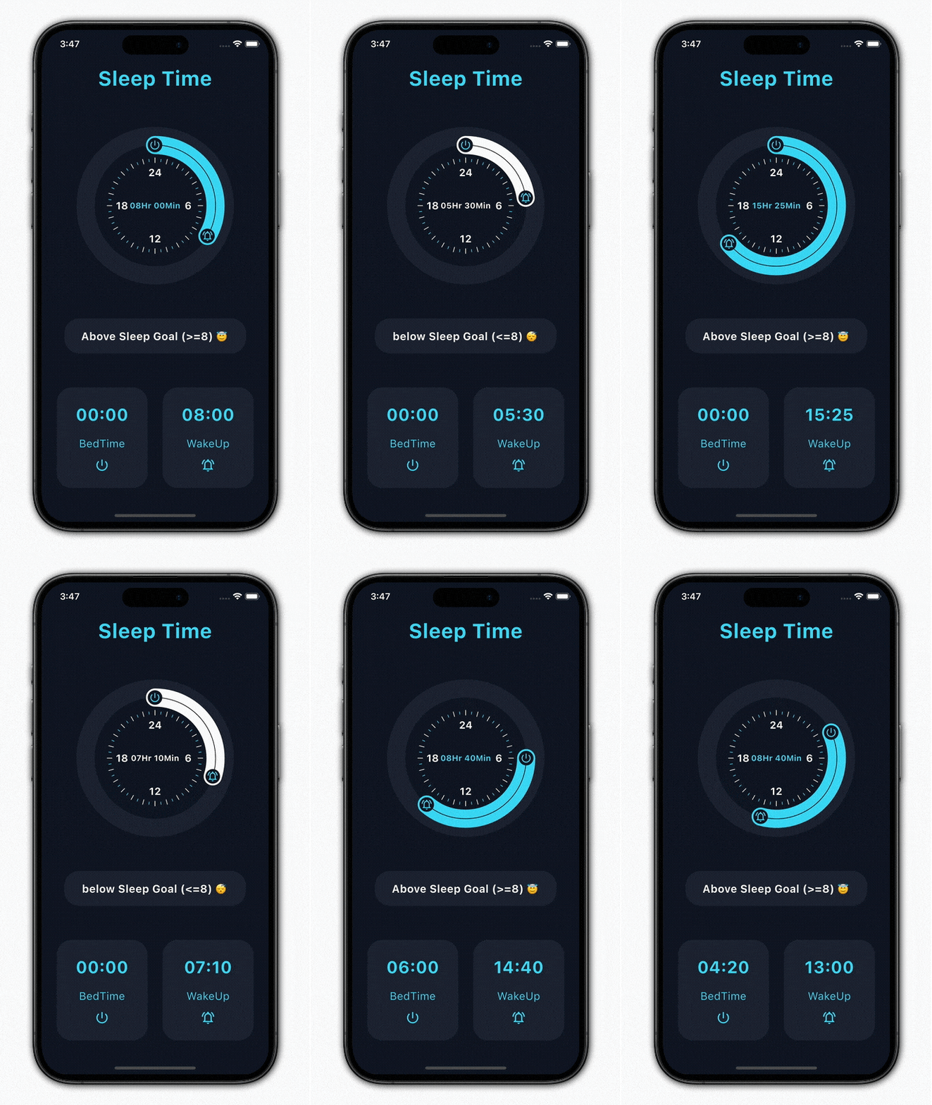
- Supports selecting either a single picker handler or both simultaneously.
- Provides easy customization options for decorating the time picker.
- Offers the ability to display clock numbers in both 12-hour and 24-hour formats, with full customization support.
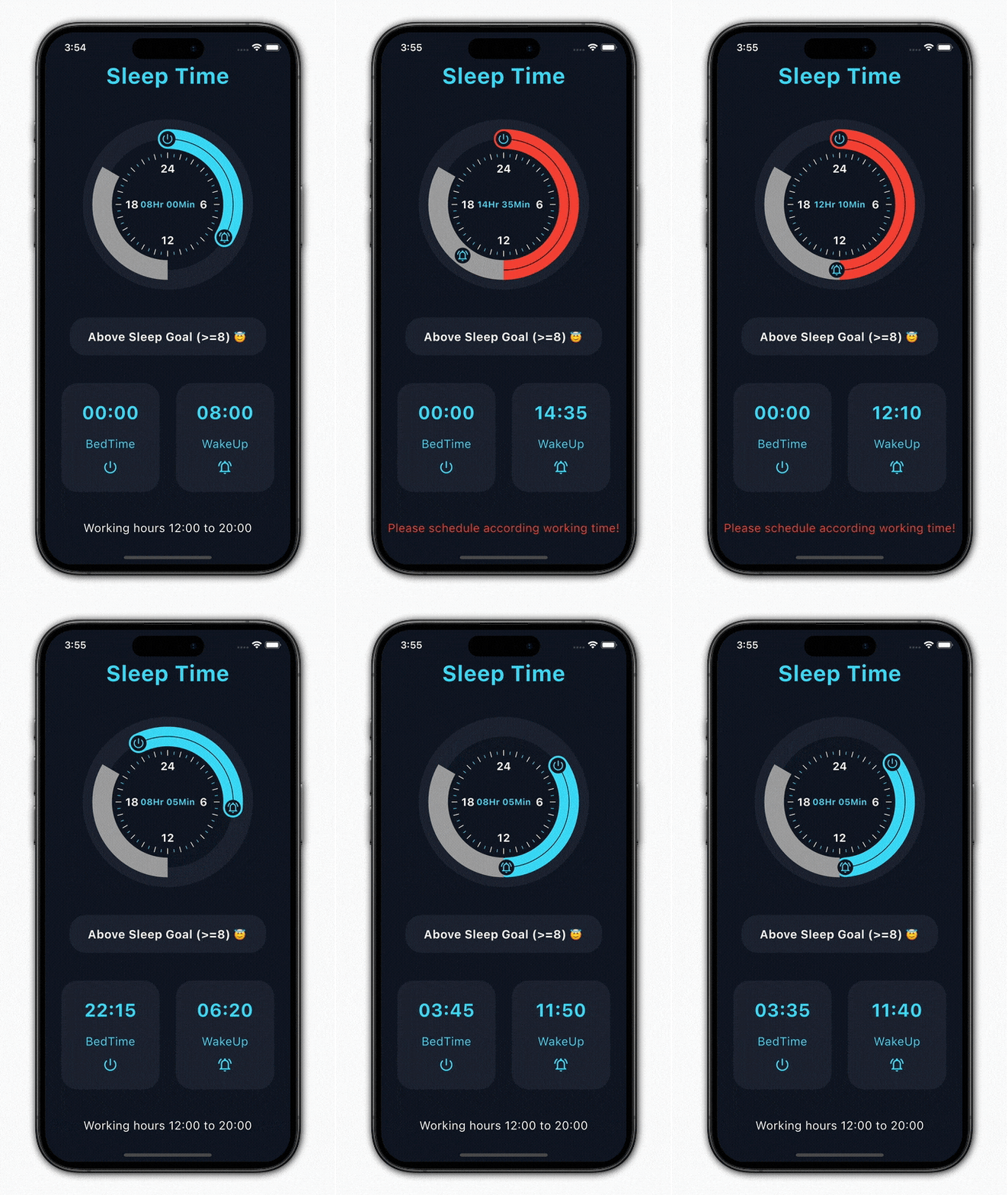
- Allows disabling specific time ranges for more control.
Preview
progressive time picker
progressive time picker with disabled ranges
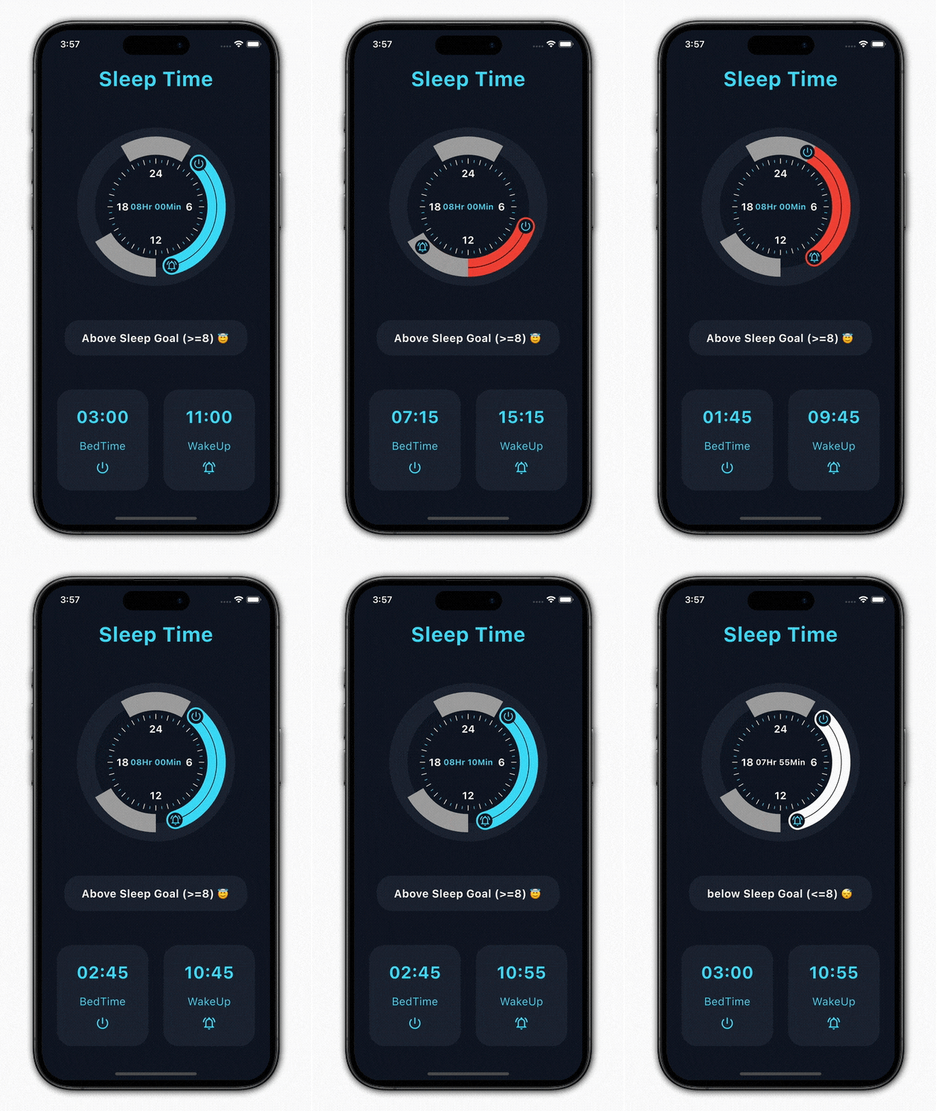
Basic Usage
Import it to your project file
import 'package:progressive_time_picker/progressive_time_picker.dart';
And add it in its most basic form like it:
  TimePicker(
    initTime: PickedTime(h: 0, m: 0),
    endTime: PickedTime(h: 8, m: 0),
    onSelectionChange: (start, end, isDisableRange) =>
        print(
            'onSelectionChange => init : ${start.h}:${start.m}, end : ${end.h}:${end.m}, isDisableRangeRange: $isDisableRange'),
    onSelectionEnd: (start, end, isDisableRange) =>
        print(
            'onSelectionEnd => init : ${start.h}:${start.m}, end : ${end.h}:${end.m},, isDisableRangeRange: $isDisableRange'),
  );
And for the DisabledRanges:
TimePicker(
    initTime: PickedTime(h: 0, m: 0),
    endTime: PickedTime(h: 8, m: 0),
    disabledRanges: [
      DisabledRange(
        initTime: PickedTime(h: 12, m: 0),
        endTime: PickedTime(h: 20, m: 0),
      ),
    ],
    disabledRangesColor: Colors.grey,
    disabledRangesErrorColor: Colors.red,
    onSelectionChange: (start, end, isDisableRange) => print(
      'onSelectionChange => init : ${start.h}:${start.m}, end : ${end.h}:${end.m}, isDisableRangeRange: $isDisableRange'),
    onSelectionEnd: (start, end, isDisableRange) => print(
      'onSelectionEnd => init : ${start.h}:${start.m}, end : ${end.h}:${end.m},, isDisableRangeRange: $isDisableRange'),
);
Required parameters of TimePicker
| Parameter |
Description |
| PickedTime initTime |
the init PickedTime value in the selection |
| PickedTime endTime |
the end PickedTime value in the selection |
| onSelectionChange |
callback function when init and end PickedTime change |
| onSelectionEnd |
callback function when init and end PickedTime finish |
Optional parameters of TimePicker
| Parameter |
Default |
Description |
| double height |
220 |
height of the canvas |
| double width |
220 |
width of the canvas |
| int primarySectors |
0 |
the number of primary sectors to be painted |
| int secondarySectors |
0 |
the number of secondary sectors to be painted |
| Widget child |
Container |
widget that would be mounted inside the circle |
| TimePickerDecoration decoration |
- |
used to decorate our TimePicker widget |
| bool isInitHandlerSelectable |
true |
used to enabled or disabled Selection of Init Handler |
| bool isEndHandlerSelectable |
true |
used to enabled or disabled Selection of End Handler |
| bool isSelectableHandlerMoveAble |
true |
used to enabled or disabled the Movement of Init and End Handler when its not Selectable (disable the dragging of both handlers) |
| List disabledRanges |
null |
used to disable Selection ranges, If null so there is no disable time ranges |
| Color disabledRangesColor |
Colors.grey |
defines the color for the disabled range |
| Color disabledRangesErrorColor |
Colors.red |
defines the color for the error in disabled range |
| bool drawInitHandlerOnTop |
false |
used to set priority to draw init or end handler on the top |
Required parameters of TimePickerDecoration
| Parameter |
Description |
| TimePickerSweepDecoration sweepDecoration |
used to decorate our sweep part or a part between our init and end point with various options |
| TimePickerHandlerDecoration initHandlerDecoration |
used to decorate our init or end handler of time picker |
| TimePickerHandlerDecoration endHandlerDecoration |
used to decorate our init or end handler of time picker |
Optional parameters of TimePickerDecoration
| Parameter |
Default |
Description |
| Color baseColor |
cyanAccent |
defines the background color of the picker |
| double pickerBaseCirclePadding |
0.0 |
to add extra padding for picker base or outer circle |
| TimePickerSectorDecoration primarySectorsDecoration |
- |
used to decorate the primary sectors of out time picker |
| TimePickerSectorDecoration secondarySectorsDecoration |
- |
used to decorate the secondary of out time picker |
| TimePickerClockNumberDecoration clockNumberDecoration |
- |
Provides decoration options which will get applied to the internal clock's numbers when enable |
| SystemMouseCursor mouseCursor |
- |
Used to set SystemMouseCursor for PanGestureRecognizer |
Guideline for contributors
- Contribution towards our repository is always welcome, we request contributors to create a pull
request for development.
Guideline to report an issue/feature request
It would be great for us if the reporter can share the below things to understand the root cause of
the issue.
- Library version
- Code snippet
- Logs if applicable
- Device specification like (Manufacturer, OS version, etc)
- Screenshot/video with steps to reproduce the issue
- Library used
LICENSE!
progressive_time_picker
is MIT-licensed.
Let us know!
We’d be really happy if you send us links to your projects where you use our open-source libraries.
Just send an email to [sales@mindinventory.com](mailto:sales@mindinventory.com) And do let us know
if you have any questions or suggestion regarding our work.
Visit our website mindinventory.com
Let us know if you are interested to building Apps or Designing Products.