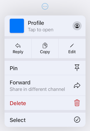
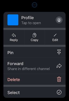
Orientação gerada a partir de informações públicas. Apenas para referência.
Um pacote Flutter que replica o componente da interface do botão de puxar do iOS 14, oferecendo um botão estilo dropdown personalizável para interfaces de aplicativos. Permite que os usuários revelem opções ou ações puxando para baixo a partir de um botão, melhorando a consistência de interação com padrões de design do iOS. O pacote suporta múltiplas plataformas e fornece personalização extensa para aparência e comportamento.
Casos de uso
Implementando menus de puxar estilo iOS
Criando menus suspensores personalizados em aplicativos Flutter
Melhorando a interação do usuário com controles baseados em gestos
Adicionando elementos de interface do usuário específicos da plataforma a aplicativos multiplataforma
Criando seletores de ação intuitivos
Principais recursos
animação de puxar para baixo inspirada no iOS 14
Aparência e comportamento altamente personalizáveis
Suporte para todas as principais plataformas Flutter
Interação baseada em gestos
Estrutura de widget extensível
Indicado para
Desenvolvedores direcionados à consistência de design do iOS
Aplicativos que precisam de menus suspensores baseados em gestos
Aplicativos multiplataforma que exigem componentes semelhantes aos nativos
Designers de UI procurando widgets modernos do Flutter
Considerações
Requer entendimento sobre manipulação de gestos
Pode ser necessário estilização adicional para plataformas não iOS
Limitado ao padrão de interação por puxar para baixo
Não adequado para hierarquias de menu complexas
Melhor usado em contextos onde o espaço é limitado
README original
Snapshot do README original do repositório-fonte vinculado. Consulte o repositório para o conteúdo mais recente.
Pull-Down Button from iOS 14-18 for Flutter
[!CAUTION]
This package is discontinued and will no longer receive any updates. Replacement is available in Flutter since stable version 3.44 - CupertinoMenuAnchor
pull_down_button is an attempt to bring
Pop-Up and
Pull-Down
Buttons from iOS 14-18 to Flutter with some additional customisation options.
This package only tries to visually replicate the native counterpart, some parts might be somewhat different.
[!IMPORTANT]
This package is no longer actively maintained and will most likely be deprecated and unlisted some time after Flutter finally supports iOS menus out of the box to give some time for migration. You can follow the progress here - #60298.
One of the core features of this package is an extensive customizability, which, most likely, will not be present in Flutter's pull-down menus. If there won't be any plans to add customizability to Flutter's menus, but there will be a big interest in it, this package might migrate most of the code to use Flutter's more advanced implementation with customisation options present right now. You can post your feedback on this topic here.
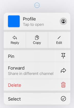
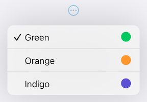
PullDownMenuItem.selectable uses all of PullDownMenuItem properties as well as a boolean value selected, to indicate whether the menu item is selected or not.
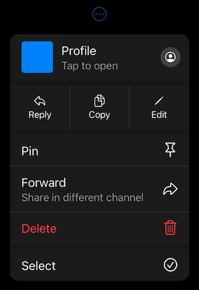
PullDownMenuActionsRow
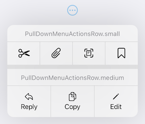
PullDownMenuActionsRow is a widget used to create cupertino-style pull-down menu row of actions
(small or medium size).
PullDownMenuItem is used to populate PullDownMenuActionsRow.items.
Depending on PullDownMenuActionsRows size, PullDownMenuItem might be either icon only or icon and title in a vertical array.
Properties
Description
items
List of PullDownMenuItem.
PullDownMenuDivider
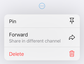
PullDownMenuDivider.large is a widget used to create cupertino-style pull-down menu large divider.
There is no need in adding PullDownMenuDivider by hand, pull-down menu does it automatically!
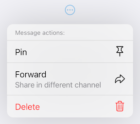
PullDownMenuTitle
PullDownMenuTitle is a widget used to create cupertino-style pull-down menu title (usually at the top of menu).
An alternative way of displaying pull-down menu via a function call.
onPressed: () async {
/* get tap position and / or do something before opening menu */awaitshowPullDownMenu(
context: context,
items: [...],
position: position,
);
}
Properties table
Properties
Description
context
For looking up Navigator for the menu.
items
List of PullDownMenuEntry widgets.
position
The Rect is used to align the top of the menu with the top of the position rectangle.
itemsOrder
Whether the popup menu orders its items from itemBuilder in a downward or upwards way.
menuOffset
Additional offset for the pull-down menu if the menu's desired position.
scrollController
A custom menu scroll controller.
onCanceled
Called when the user dismisses the pull-down menu.
routeTheme
The theme of the pull-down menu box.
useRootNavigator
Whether to use the root navigator to show the pull-down menu.
routeSettings
Optional route settings for the pull-down menu.
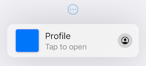
PullDownMenu
Another alternative way of displaying the pull-down menu as a simple widget, with no animations or adding routes to the navigation stack.
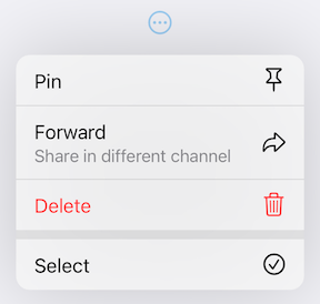
This package also provides additional customization. By default, the iOS 16 theme is used, but it is also possible to override defaults with widget properties (see above) or with PullDownButtonTheme theme extension.
Light Theme
Dark Theme
PullDownButtonTheme
To use PullDownButtonTheme define it in your ThemeData as follows:
PullDownButtonTheme uses a set of sub-themes (for items, dividers, the menu itself, etc.) to define the needed theme. See below for every property each sub-theme provides.
backgroundColor usually has opacity in the range of 0.7-0.8 so that menu has a blur effect.
If backgroundColor is fully opaque (opacity set to 1), no blur effect will be applied.
PullDownMenuItemTheme
Properties
Description
destructiveColor
Color for destructive action.
checkmark
Checkmark icon.
textStyle
PullDownMenuItem text style.
subtitleStyle
PullDownMenuItem subtitle text style.
iconActionTextStyle
PullDownMenuItem text style inside of PullDownMenuActionsRow.
onHoverBackgroundColor
On hover color of PullDownMenuItem.
onPressedBackgroundColor
On pressed color of PullDownMenuItem.
onHoverTextColor
On hover color of text of PullDownMenuItem.
PullDownMenuDividerTheme
Properties
Description
dividerColor
Small divider color.
largeDividerColor
Large divider color.
largeDividerColor is usually lighter than dividerColor.
PullDownMenuTitleTheme
Properties
Description
style
PullDownMenuTitle text style.
PullDownButtonInheritedTheme
If defining PullDownButtonTheme in ThemeData is not possible, for example, if you are using CupertinoApp, you can use PullDownButtonInheritedTheme:
Here is an example of using PullDownButtonTheme with Material 3 color scheme colors
(generated from CupertinoColors.systemBlue with ColorScheme.fromSeed) from Material 3 Menu specs.
Custom Material 3 light theme
Custom Material 3 dark theme
Contributions
Feel free to contribute to this project.
Please file feature requests and bugs at the issue tracker.
If you fixed a bug or implemented a feature by yourself, feel free to send a pull request.