Orientação gerada a partir de informações públicas. Apenas para referência.
Um pacote personalizável do Flutter para coletar avaliações e feedbacks de usuários com suporte a emojis, ícones e imagens personalizadas. Permite seleção de avaliações parciais e completas, alertas dinâmicos de feedback e design responsivo em todas as plataformas. Ideal para aplicativos que buscam engajamento intuitivo dos usuários por meio de mecanismos visuais de feedback. O pacote é fácil de integrar e suporta múltiplas plataformas, incluindo mobile, web e desktop. Desenvolvedores podem adaptar aparência e comportamento conforme a identidade visual e requisitos de experiência do usuário do aplicativo.
Casos de uso
Melhoria da experiência do usuário
coleta de classificação da loja de aplicativos
Pesquisas de satisfação do cliente
Formulários de feedback no aplicativo
Avaliação de recurso do produto
Alertas de feedback em tempo real
Principais recursos
Indicadores de classificação baseados em emojis
Suporte a imagem e ícone personalizados
Precisão de classificação de meio-pontos
Sistema dinâmico de alerta de feedback
Compatibilidade multiplataforma
Temas de interface do usuário configuráveis
Indicado para
Aplicações móveis e web
Ferramentas de pesquisa em UX
Desenvolvimento de produtos orientado por feedback
Integração de atendimento ao cliente
Componentes interativos de pesquisa
Considerações
Requer personalização para alinhamento da marca
Pode ser necessário estilização adicional para layouts complexos
Limitado a interações específicas de classificação
Depende da consistência de renderização específica da plataforma
Mais adequado para aplicativos com interação frequente do usuário
README original
Snapshot do README original do repositório-fonte vinculado. Consulte o repositório para o conteúdo mais recente.
Customizable rating bars with emojis, icons, custom images with half/full rating and dynamic feedback alerts.
Features
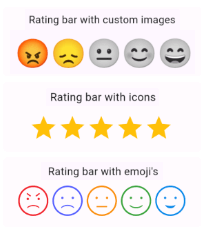
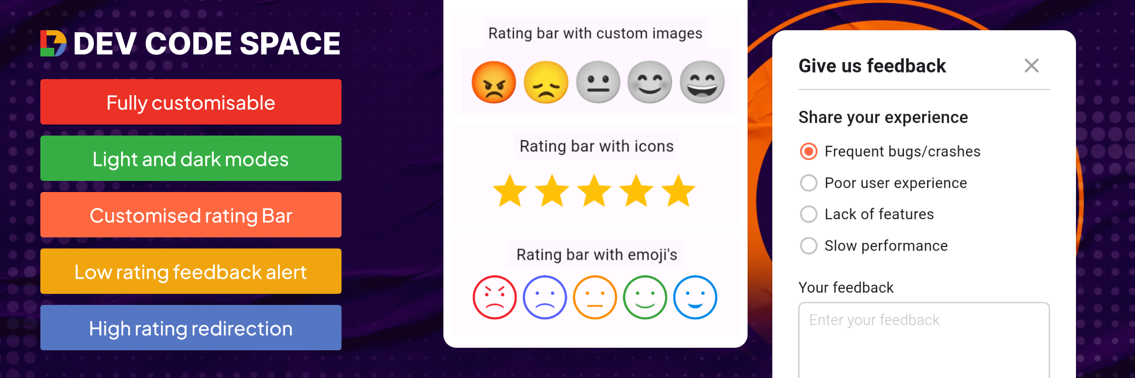
Custom icon rating
Smiley emojis rating
Custom image rating
Feedback alert box for low ratings
Redirect to store for high ratings
Customizable UI & contents
Submission callback
Getting started
Add dependency to your pubspec.yaml file & run Pub get
Rating Bar with Icons (with full & half rating option)
RatingBar(
iconSize: 40, // Size of the rating icons
allowHalfRating: true, // Allows selection of half ratings
filledIcon: Icons.star, // Icon to display for a filled rating unit
halfFilledIcon: Icons.star_half, // Icon to display for a half-filled rating unit
emptyIcon: Icons.star_border, // Icon to display for an empty rating units
filledColor: Colors.amber, // Color of filled rating units
emptyColor: Colors.grey, // Color of empty rating units
currentRating: _rating, // Set initial rating value
onRatingChanged: (rating) { // Callback triggered when the rating is changedsetState(() { _rating = rating; });
},
),
Rating bar default emoji images
RatingBarEmoji(
imageSize: 45, // Size of image in the rating bar.
currentRating: _rating, // Set initial rating value
onRatingChanged: (rating) { // Callback triggered when the rating is changedsetState(() { _rating = rating; });
},
),
Rating Bar with Custom Image
RatingBarCustomImage(
imageSize: 45, // Size of image in the rating bar.
currentRating: _rating, // Set initial rating value
activeImages: const [
AssetImage('assets/Images/ic_angry.png'),
AssetImage('assets/Images/ic_sad.png'),
AssetImage('assets/Images/ic_neutral.png'),
AssetImage('assets/Images/ic_happy.png'),
AssetImage('assets/Images/ic_excellent.png'), ],
deActiveImages: const [
AssetImage('assets/Images/ic_angryDisable.png'),
AssetImage('assets/Images/ic_sadDisable.png'),
AssetImage('assets/Images/ic_neutralDisable.png'),
AssetImage('assets/Images/ic_happyDisable.png'),
AssetImage('assets/Images/ic_excellentDisable.png'), ],
onRatingChanged: (rating) { // Callback triggered when the rating is changedsetState(() { _rating = rating; });
},
),
Properties
Property
Types
Description
currentRating
double
set initial rating value
filledIcon (only for RatingBar)
IconData?
Icon to display for a filled rating unit
halfFilledIcon (only for RatingBar)
IconData?
Icon to display for a half-filled rating unit.
emptyIcon (only for RatingBar)
IconData?
Icon to display for an empty rating units.
filledColor (only for RatingBar)
Color?
Color of filled rating units.
emptyColor (only for RatingBar)
Color?
Color of empty rating units.
iconSize
double?
Size of the rating icons.
onRatingChanged
return double
Callback triggered when the rating is changed.
allowHalfRating (only for RatingBar)
bool?
Allows selection of half ratings.
isGoogleFont
bool?
set it true if you want to use google fonts else false
fontFamilyName
String?
set your custom font family name or google font family name
feedbackUIType
FeedbackUIType?
want to show feedback box in alert view or in bottom sheet
showFeedbackForRatingsLessThan
double?
Threshold rating value below which feedback box is shown.
feedbackBoxTitle
String?
Title for the feedback box
lowRatingFeedbackTitle
String?
Title for feedback options in the low rating feedback box.
lowRatingFeedback
List<String>?
List of feedback strings for low ratings.
showDescriptionInput
bool?
Option to show input box for user descriptions in the feedback dialog.
descriptionTitle
String?
Title for the description input box in the feedback dialog.
descriptionPlaceHolder
String?
Placeholder text for the description input box.
descriptionCharacterLimit
int?
Character limit for the description input.
submitButtonTitle
String?
Title for the submit button in the feedback dialog.
onSubmitTap
returns selectedFeedback(with index & text) & description
Callback function triggered on submission of feedback.
showRedirectToStoreForRatingsGreaterThan
double?
Threshold rating value above which the app redirects to the store for a review.
androidPackageName
String?
Android package name for the app, used in the store redirect.
iosBundleId
String?
iOS bundle ID for the app, used in the store redirect.