Buscar pacotes, repositórios e categorias de apps

Capa de rounded_background_text
Detalhes do pacotev0.6.0

rounded_background_text

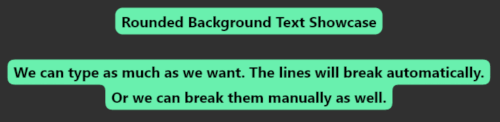
Text, TextField e TextSpan destacados com cantos arredondados

AndroidiOSWebmacOSWindowsLinux
Downloads em 30 dias
2,7 mil
Curtidas
101
Pontos Pub
150

Instalar pacote

flutter pub add rounded_background_text

Visão geral do pacote

Orientação gerada a partir de informações públicas. Apenas para referência.

Um pacote Flutter que adiciona fundos com cantos arredondados a elementos de texto, incluindo Text, TextField e TextSpan. Permite realçar visualmente o texto com cores personalizáveis, raios de borda e preenchimento. Ideal para criar interfaces modernas com foco na legibilidade do texto e no estilo visual. O pacote suporta todas as principais plataformas — Android, iOS, Web, macOS, Windows e Linux — garantindo estilos consistentes entre dispositivos. Integração simples por meio de um único comando pub add torna-o acessível para desenvolvedores que buscam efeitos elegantes em texto sem pintura personalizada complexa.

Casos de uso

  • Destacando texto-chave em aplicativos
  • Criando campos de entrada estilizados
  • Adicionando ênfase visual aos rótulos
  • Projetando componentes de interface modernos
  • Melhorando a acessibilidade por meio de contraste
  • Construindo elementos de texto interativos

Principais recursos

  • Fundo com cantos arredondados para Texto
  • Suporte para TextField com fundo arredondado
  • Raio de borda e preenchimento personalizáveis
  • Compatível com TextSpan
  • Suporte multiplataforma
  • Integração fácil por meio do pub.dev

Indicado para

  • Designers de interface procurando acabamento visual
  • Desenvolvedores de aplicativos modernos em Flutter
  • Aplicativos que exigem elementos de texto destacados
  • Projetos focados na acessibilidade e legibilidade
  • Equipes que desejam implementar efeitos rapidamente

Considerações

  • Pode afetar o desempenho com muitas instâncias
  • Requer contraste de cor cuidadoso para acessibilidade
  • Limitado a casos de uso de decoração de texto
  • Não adequado para layouts complexos
  • Depende da consistência de renderização entre plataformas
  • Melhor usado com moderação para evitar aglomeração visual

README original

Snapshot do README original do repositório-fonte vinculado. Consulte o repositório para o conteúdo mais recente.

rounded_background_text

Highlight text with rounded corners

Content

Features

  • ✅ Highlight Text
  • ✅ Highlight Text Field
  • ✅ Highlight Text Span

Getting started

Import the package:

import 'package:rounded_background_text/rounded_background_text.dart';

Usage

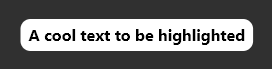
Highlight a simple text:
RoundedBackgroundText(
  'A cool text to be highlighted',
  style: const TextStyle(fontWeight: FontWeight.bold),
  backgroundColor: Colors.white,
),

Simple Text

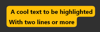
Multiline text is also supported

RoundedBackgroundText(
  'A cool text to be highlighted\nWith two lines or more',
  style: const TextStyle(fontWeight: FontWeight.bold),
  backgroundColor: Colors.amber,
),

Two Lines Text

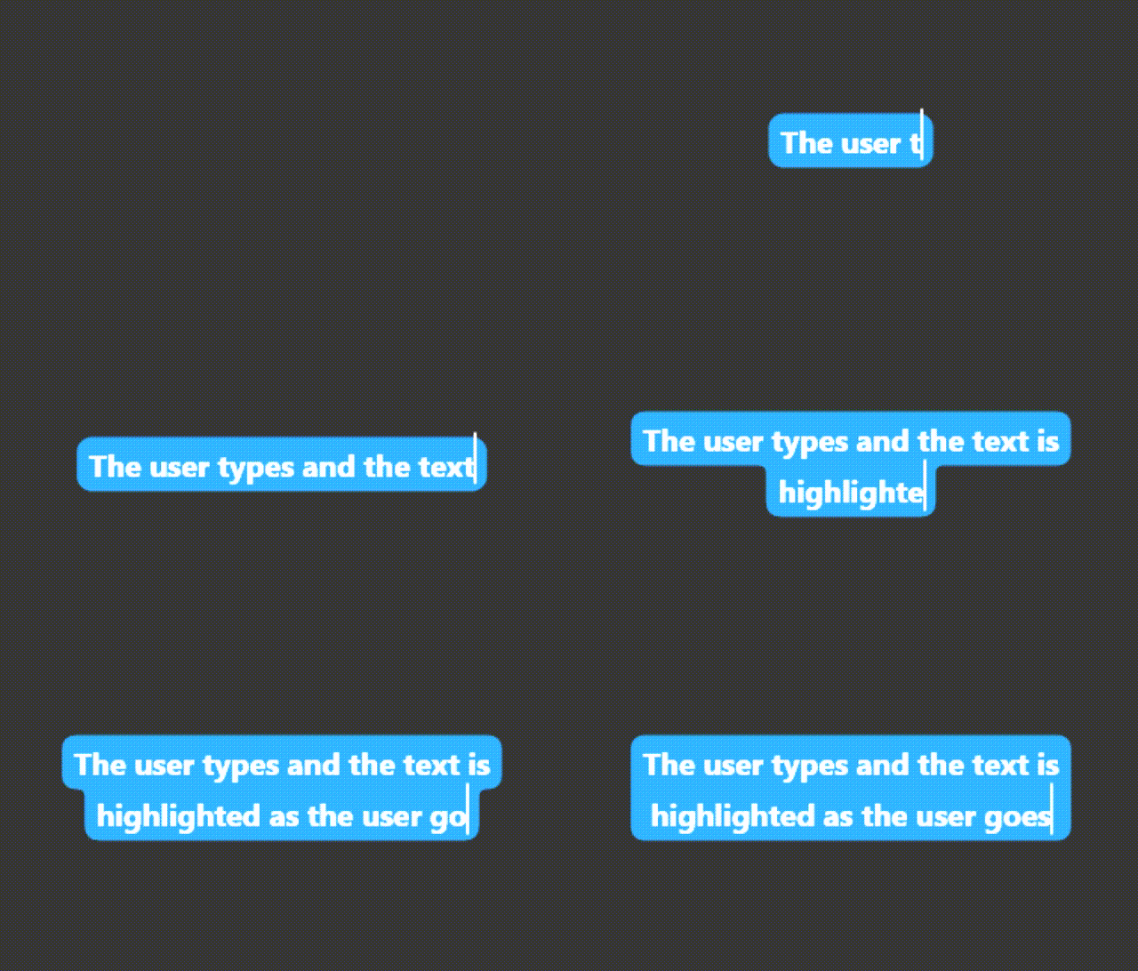
Highlight a text field:

You must use a TextEditingController

RoundedBackgroundTextField(
  backgroundColor: Colors.blue,
  style: const TextStyle(fontWeight: FontWeight.bold),
  textAlign: TextAlign.center,
),

The text will be highlighted as the user types

TextField Preview

The text highlight will follow the text field scroll position.

Highlight a text span:

Highlight a small part of a text

RichText(
  text: TextSpan(
    text: 'Start your text and ',
    children: [
      RoundedBackgroundTextSpan(
        text: 'highlight something',
        backgroundColor: Colors.blue,
      ),
      const TextSpan(text: ' when necessary'),
    ],
  ),
),

TextSpan Highlight Preview

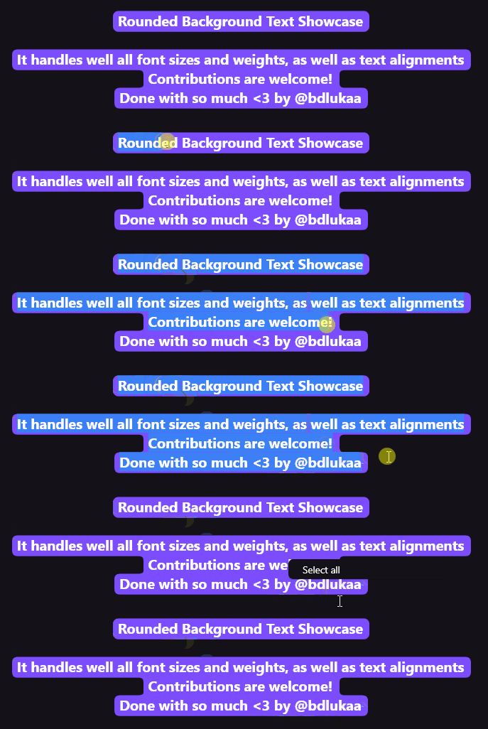
Select a highlighted text:

Use RoundedBackgroundText.selectable to make the text selectable:

RoundedBackgroundText.selectable(
  'A cool highlighted text to be selected',
  style: const TextStyle(fontWeight: FontWeight.bold),
  backgroundColor: Colors.white,
),

Selectable Text Preview

You may like to know:

Change the corner radius

You can change the radius of the corners by setting innerRadius and outerRadius:

RoundedBackgroundText(
  'A cool text to be highlighted',
  style: const TextStyle(fontWeight: FontWeight.bold),
  backgroundColor: Colors.white,
  innerRadius: 15.0,
  outerRadius: 10.0,
),

The max allowed value is 20.0. The min is 0.0

Deep dive

This section explains, with details, how the background painting works.

RoundedBackgroundText doesn't use a Text widget under the hood. Instead, it uses a custom text painter to paint the text above the background. As soon as the RoundedBackgroundText widget is initialized, the line metrics for the text is calculated (See computeLineMetrics), and is recalculated when the text changes or when the parent width changes. This is done at built time, resulting in a smooth experience for the user.

To paint the background, the line metrics generated before is used. Each line has 4 properties:

  • x - where the line starts horizontally within the size
  • y - where the line starts vertically within the size
  • width - the horizontal size of the line
  • height - the vertical size of the line

With these values, we can generate the background for each line. The background is generated around the whole text: from top-left to bottom-left to bottom-right to top-right to top-left. This makes it easy to calculate when there is a corner, either outer or inner.

The inner and outer radius are dynamically calculated based on the line height, provided by the line metrics, and the given innerRadius and outerRadius, respectively. By default, innerRadius is 10.0 and outerRadius is 10.0. For safety, in order to keep the roundnesses correct, these values must be in the bounds of 0.0 (min) and 20.0 max, otherwise the painting would be out the line.

Contribution

Feel free to file an issue if you find a problem or make pull requests.

All contributions are welcome!

Categorias

Repositório-fonte

Projetos que usam este pacote