Orientação gerada a partir de informações públicas. Apenas para referência.
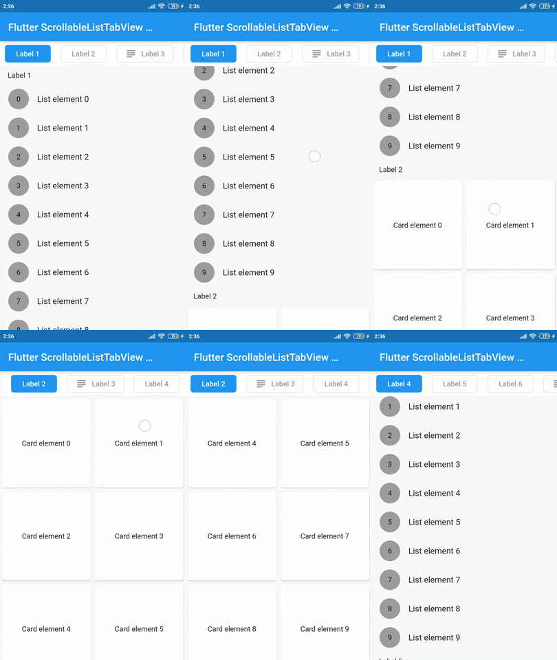
Um widget Flutter que sincroniza uma lista rolável com uma visualização de guias personalizada, garantindo alinhamento suave entre os dois componentes. Permite que os usuários naveguem pelo conteúdo por meio da rolagem, atualizando simultaneamente a guia selecionada, e vice-versa. Ideal para criar interfaces coesas e interativas onde itens da lista e guias estão estreitamente relacionados. O pacote é leve e projetado para integração perfeita em projetos existentes do Flutter.
Casos de uso
Navegação sincronizada de lista e guia
Criando painéis com conteúdo pesado
Criando fluxos de onboarding guiados
Implementando interfaces com guias roláveis
Principais recursos
Sincronização em tempo real entre rolagem e guias
Estilo de guia personalizável
Suporta conteúdo dinâmico
Integração simples com widgets existentes
Comportamento responsivo entre dispositivos
Indicado para
Desenvolvedores criando layouts de conteúdo com abas
Aplicativos que exigem rolagem sincronizada e seleção de guias
Designers de UI procurando padrões de navegação interativos
Considerações
Requer manipulação manual dos dados do item de aba
Otimizações específicas de plataforma limitadas
Sem animações embutidas
Não adequado para navegações aninhadas altamente complexas
README original
Snapshot do README original do repositório-fonte vinculado. Consulte o repositório para o conteúdo mais recente.
scrollable_list_tabview
A Flutter widget which synchronize a ScrollView and a custom tab view.
The main idea is to create a custom tab view synchronizing with inner ScrollView. The scroll activity will trigger custom tab view at the top to follow the index of the inner scroll view widget.
Installation
Add dependency for package on your pubspec.yaml:
dependencies:
    scrollable_list_tabview: <latest>
Usage
To use this widget we must first define how our tabs will look like.
ListTab
Parameter
Definition
Widget icon
Trailing widget for a tab, typically an Icon.
Widget label
Label to be shown in the tab, must be non-null.
BorderRadiusGeometry borderRadius
BorderRadius value for a single tab.
Color activeBackgroundColor
Color to be used when the tab is selected.
Color inactiveBackgroundColor
Color to be used when the tab isn't selected.
bool showIconInList
Decide whether show icon widget in the scrollable view.
Color borderColor
Color of the border of tab when its not selected
Then we can use LisTab in ScrollableListTab.
ScrollableListTab
Parameter
Definition
ListTab tab
Data model used for rendering tab widgets.
ScrollView body
An individual inner scrollable widget.
Then ScrollableListTabView will take a list of ScrollableListTab as an argument.
ScrollableListTabView
Parameter
Definition
List<ScrollableListTab> tabs
List of tabs to be built.
double height
Height of the tab at the top of the view.
Duration tabAnimationDuration
Duration of tab change animation.
Duration bodyAnimationDuration
Duration of inner scroll view animation.
Curve tabAnimationCurve
Animation curve used when animating tab change.
Curve bodyAnimationCurve
Animation curve used when changing index of inner ScrollView(s).
There are some limitations on this package. For example we only support ScrollView to be the body. Also, we could have used builder pattern to build the widgets.
I would like to thank Google developers for creating awesome package called ScrollablePositionedList.
Contribution
Contributions are accepted via pull requests. For more information about how to contribute to this package, please check the contribution guide.
License
This project is licensed under the MIT license, additional knowledge about the license can be found here.