Buscar pacotes, repositórios e categorias de apps

Capa de selector_wheel
Detalhes do pacotev1.1.2

selector_wheel

Um pacote Flutter para criar uma roda seletora de valor personalizável.

AndroidiOSWebmacOSWindowsLinux
Downloads em 30 dias
174
Curtidas
30
Pontos Pub
130

Instalar pacote

flutter pub add selector_wheel

Visão geral do pacote

Orientação gerada a partir de informações públicas. Apenas para referência.

Um pacote Flutter que permite a criação de rodas de seleção de valores personalizáveis e interativas para entrada de usuário. Oferece uma maneira visualmente envolvente de selecionar valores em uma roda giratória, ideal para configurações, cronômetros ou qualquer cenário que exija seleção numérica ou categórica intuitiva. A roda suporta animações suaves, estilos personalizados e comportamento responsivo entre plataformas. É projetado para desenvolvedores que buscam uma alternativa aos campos de texto tradicionais ou menus suspenso com experiência do usuário aprimorada.

Casos de uso

  • Entradas de formulário com feedback visual
  • Seletor de tempo ou quantidade
  • Interfaces de usuário gamificadas
  • Configurações com parâmetros ajustáveis
  • Ferramentas educacionais interativas

Principais recursos

  • Aparência personalizável da roda
  • Animações de rotação suave
  • Suporte a toque e arrasto responsivo
  • Suporte para valores discretos e contínuos
  • Compatibilidade multiplataforma

Indicado para

  • Desenvolvedores de interfaces de usuário interativas
  • Aplicativos que precisam de seleção intuitiva de valor
  • Designers que desejam elementos de formulário únicos
  • Projetos direcionados para múltiplas plataformas

Considerações

  • Pode exigir ajuste de desempenho em dispositivos de baixa potência
  • Validação interna limitada
  • Não otimizado para faixas de valores muito grandes
  • Requer um design cuidadoso para acessibilidade

README original

Snapshot do README original do repositório-fonte vinculado. Consulte o repositório para o conteúdo mais recente.

Selector Wheel

pub package codecov

A Flutter package for creating customizable selector wheel widgets.

Table of Contents

Features

  • Customizable selector wheel widget
  • Supports variable wheel size, item width, item height, and more
  • Built with Flutter's best practices for optimal performance
  • Supports haptic feedback, fade-out effect, and more
  • Can be used with any data type

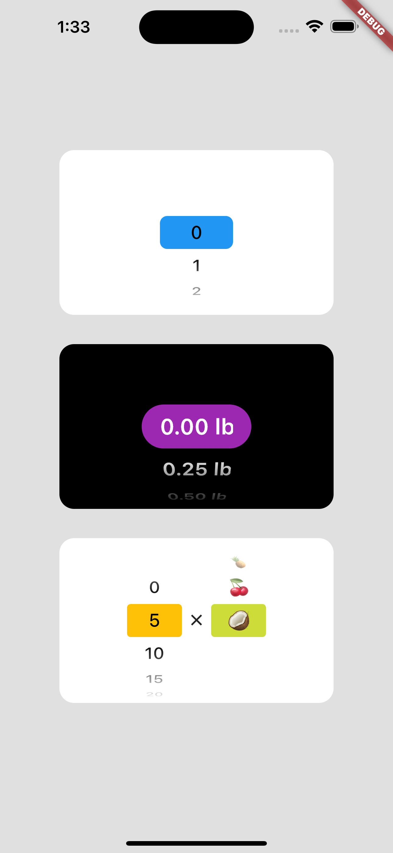
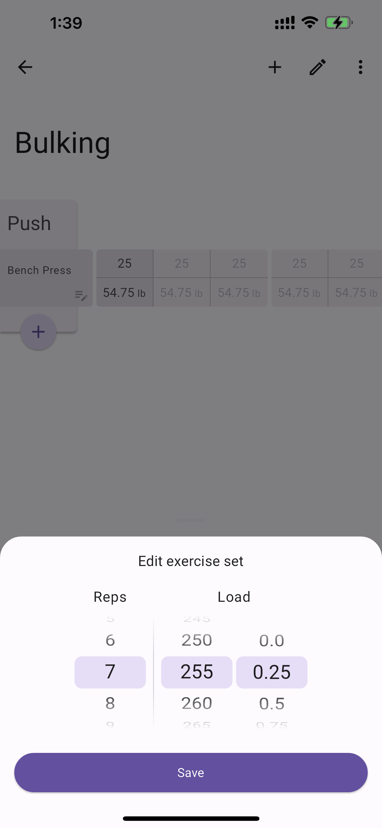
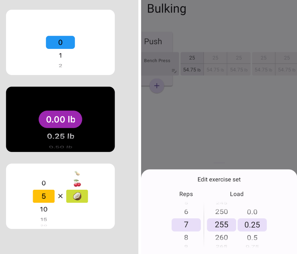
Usage example regular Usage example with bottom sheet

Getting started

Add selector_wheel to your pubspec.yaml by running the following command:

flutter pub add selector_wheel

Usage

Import the package:

import 'package:selector_wheel/selector_wheel.dart';
Basic usage

Use the SelectorWheel widget in your app:

SizedBox(
  width: 200,
  height: 200,
  child: SelectorWheel(
    childCount: 10,
    // convertIndexToValue is a function that converts the index of the
    // child to a value that is displayed on the selector wheel. In this
    // case, we are converting the index to a string. I.e we'll have
    // 0, 1, 2, 3, 4, 5, 6, 7, 8, 9 on the selector wheel.
    convertIndexToValue: (int index) {
      return SelectorWheelValue(
        label: index.toString(),
        value: index,
        index: index,
      );
    },
    onValueChanged: (SelectorWheelValue<int> value) {
      // print the value that was selected
      print(value);
    },
  ),
)
Customizing the selector wheel

Keep in mind, that the convertIndexToValue function can be used to convert the index to any value. In the example below, we are converting the index to a double value to represent quarter lbs.

SizedBox(
  width: 200,
  height: 200,
  child: SelectorWheel(
    childCount: 10,
    convertIndexToValue: (int index) {
      // This is just to illustrate, that the index can be converted
      // to any value. In this case, we are converting the index to
      // a quarter of a pound.
      final quarter = index / 4;

      return SelectorWheelValue(
        // The label is what is displayed on the selector wheel
        label: '${quarter.toString()} lb',
        value: quarter,
        index: index,
      );
    },
    onValueChanged: (SelectorWheelValue<double> value) {
      // print the value that was selected
      print(value);
    },
  ),
)

The colors of the selector wheel can be customized by overriding the ThemeData in the following way:

// Overriding the colors of the selector wheel
Theme(
  data: ThemeData(
    textTheme: Theme.of(context).textTheme.copyWith(
      titleLarge: Theme.of(context).textTheme.titleLarge?.copyWith(
        fontSize: 24.0,
        fontWeight: FontWeight.w600,
      ),
    ),
    colorScheme: Theme.of(context).colorScheme.copyWith(
      surface: Colors.black,
      onSurface: Colors.white,
      secondaryContainer: Colors.amber,
    ),
  ),
  child: SizedBox(
    width: 200,
    height: 200,
    child: SelectorWheel(
      childCount: 10,
      highlightBorderRadius: 16.0,
      highlightHeight: 40.0,
      highlightWidth: 100.0,
      convertIndexToValue: (int index) {
        return SelectorWheelValue(
          label: index.toString(),
          value: index,
          index: index,
        );
      },
      onValueChanged: (value) {
        // print the value that was selected
        print(value);
      },
    ),
  ),
)

Notice, that we're also customizing the "highlighted" item's border radius, height, and width. To see all the customizable properties, check out the SelectorWheel class.

Contributing

Contributions are welcome! If you find a bug or have a feature request, please open an issue on the GitHub repository.

License

This package is licensed under the MIT License. For more details, please refer to the LICENSE file included in the repository.

Categorias

Dependências

Lista de dependências 3 itens

Repositório-fonte

Projetos que usam este pacote

Ainda não há dados.