Buscar pacotes, repositórios e categorias de apps

Detalhes do pacotev0.2.9

slide_button

Um widget deslizante do Flutter, baseado na função de deslizar para desbloquear de vários dispositivos. Altamente personalizável e flexível.

Downloads em 30 dias
36
Curtidas
33
Pontos Pub
40

Instalar pacote

flutter pub add slide_button

Visão geral do pacote

Orientação gerada a partir de informações públicas. Apenas para referência.

SlideButton é um widget personalizável do Flutter inspirado na funcionalidade 'deslize para desbloquear' encontrada em diversos dispositivos. Oferece uma experiência suave e interativa de deslize com opções extensas de estilização para cores, formas e animações. Os desenvolvedores podem adaptar sua aparência e comportamento para atender a diversas necessidades de interface, tornando-o ideal para solicitações de autenticação, interruptores ou interações envolventes com o usuário. O widget é leve e fácil de integrar em projetos existentes do Flutter.

Casos de uso

  • Prompts de autenticação
  • Elementos de interface do usuário interativos
  • Interruptores de alternância personalizados
  • Telas de onboarding
  • Diálogos de confirmação do usuário

Principais recursos

  • Aparência altamente personalizável
  • Animação de deslizamento suave
  • Estilos configuráveis de trilho e alavanca
  • Suporte a callbacks na conclusão do deslize
  • Leve e eficiente

Indicado para

  • Desenvolvedores criando interfaces intuitivas de desbloqueio
  • Designers procurando widgets interativos
  • Aplicativos que exigem gestos de confirmação do usuário
  • Projetos com requisitos personalizados de controle deslizante

Considerações

  • Comportamentos específicos de plataforma limitados
  • Nenhuma funcionalidade de acessibilidade embutida
  • Requer tratamento manual de casos de borda
  • Não otimizado para reconhecimento de gestos complexos
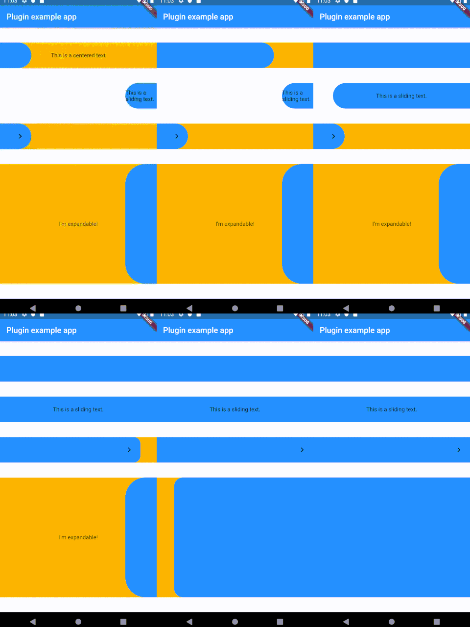
README original

Snapshot do README original do repositório-fonte vinculado. Consulte o repositório para o conteúdo mais recente.

Sliding Button

A sliding Flutter widget, based on the slide to unlock function from multiple devices. Heavily customizable and flexible.

pls don't be a giant-ass gif

Installing

Add the following to your pubspec.yaml:

dependencies:
slide_button: ^0.2.8

Usage

  1. Install
  2. Use the SlideButton widget anywhere
  3. ???
  4. Profit

Properties

Several properties are present and can be customized:

| Properties              	| Description                                                                                                                                                            	|
|-------------------------	|------------------------------------------------------------------------------------------------------------------------------------------------------------------------	|
| height                  	| Height of the Widget, leave blank to get the parent constraints.                                                                                                       	|
| backgroundChild         	| A child to be put on the background bar, NOT centered by default.                                                                                                      	|
| slidingChild            	| A child tobe put on the sliding bar, NOT centered by default.                                                                                                          	|
| backgroundColor         	| The color of the background bar.                                                                                                                                       	|
| slidingBarColor         	| The color of the sliding bar.                                                                                                                                          	|
| confirmPercentage       	| How much of the bar width have to be slided to confirm the action.                                                                                                     	|
| initialSliderPercentage 	| The initial (and resting) percentage of the sliding bar.                                                                                                               	|
| isDraggable             	| Is this widget draggable?                                                                                                                                              	|
| onButtonSlide           	| Callback that returns a `Double` value containing the drag percentage.                                                                                                 	|
| onButtonOpened          	| Callback called when the button is slided all the way.                                                                                                                 	|
| onButtonClosed          	| Callback called when the button is back to the initialSliderPercentage.                                                                                                	|
| slideDirection          	| Either SlideDirection.RIGHT or SlideDirection.LEFT, sets the sliding direction of the sliding bar.                                                                     	|
| shouldCloseBorders      	| This updates the borders when the button reaches 0.9 percent dragged, and set the borderRadius to zero, giving the impression of a "closed" button. Defaults to `true` 	|
| shouldCloseBorders      	| BorderRadius for the sliding bar, default is 50. 	                                                                                                                        |

TODO

  • [x] Create the repo
  • [x] Make it work
  • [ ] Fix text on the sliding bar
  • [ ] Find a better activation function capable of activating between x and y percentages
  • [ ] More listeners?
  • [ ] Parallax effect?
  • [ ] Make it pop

Inspiration

This widget was partially made possible by inspecting elements from sliding_up_panel.

Categorias

Repositório-fonte

Projetos que usam este pacote

Ainda não há dados.