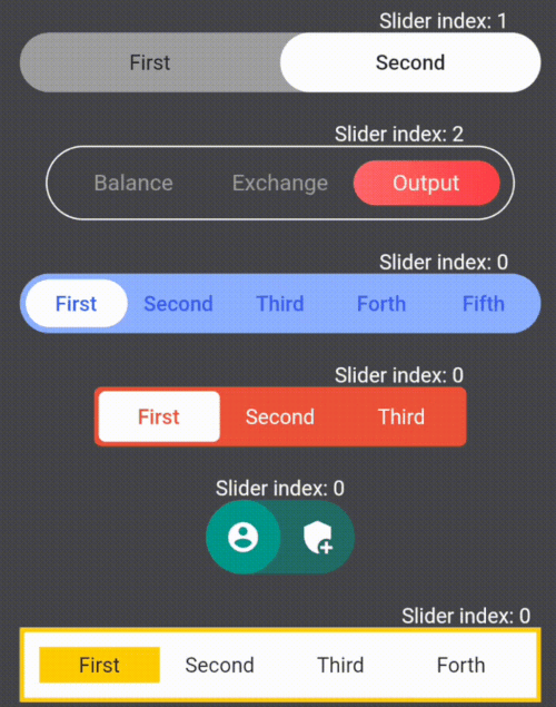
Orientação gerada a partir de informações públicas. Apenas para referência.
Um pacote Flutter para criar widgets de interruptor deslizante personalizáveis, oferecendo controle extenso sobre aparência e comportamento. Permite que desenvolvedores criem interruptores alternados interativos com animações suaves, cores, formas e tamanhos personalizados. Ideal para painéis de configuração, alternadores de tema ou qualquer interface que exija uma mudança visual de estado ligado/desligado. O pacote suporta todas as principais plataformas, incluindo móvel, web e desktop, garantindo experiências consistentes em múltiplas plataformas. Com opções de configuração intuitivas, simplifica a implementação de interfaces modernas e responsivas de alternância.
Casos de uso
Alternadores de tema
Painéis de configurações
Controles de ligar/desligar
Entradas de formulário
Seleção de preferência do usuário
Principais recursos
Cores personalizáveis
Animações suaves
Várias opções de tamanho
Suporte multiplataforma
Faixa e polegar configuráveis
Persistência de estado
Indicado para
Desenvolvedores construindo interfaces de configurações
Designers que precisam de interruptores interativos
Aplicativos com modo escuro/claro
Aplicativos multiplataforma
Componentes de formulário personalizados
Considerações
Requer entendimento da árvore de widgets do Flutter
Pode ser necessário estilização adicional para layouts complexos
Impacto no desempenho com muitas instâncias
Recursos limitados de acessibilidade embutidos
Não otimizado para mudanças de estado de alta frequência
README original
Snapshot do README original do repositório-fonte vinculado. Consulte o repositório para o conteúdo mais recente.
Library for creating and customizing sliders
Widget customization variations
Here are some examples of the library's features:
First I suggest you get familiar with what container and sliders are in the library
The library lets you change the style of containers and sliders using the fields in the table below
List and description of the functionality:
Fields
Description
children
Widgets that placed inside sliders / required
onSelect
The function takes an index variable that changes depending on the index of the current slider / required
containerHeight
Container height / required
containerWight
Container width / required
slidersColors
The color of each slider. A single color in the array will fill all sliders / white by default
slidersGradients
The gradient of each slider. A single gradient in the array will fill all sliders
containerBorder
Container border widget
slidersBorder
Slider border widget
containerBorderRadius
Container corner rounding radius
containerColor
Container fill color / grey by default
indents
Indents between the container and sliders (the same on all sides) / 0 by default
direction
Defining the direction of the slider swipe / horizontal by default
isAllContainerTap
A shadow cast by a box
containerBoxShadow
Ability to tap on the current slider and change its index to the opposite (available only for 2 children) / false by default
initialIndex
Initial index of the slider, which is rendering for the first time
Creating your own SlideSwitcher
SlideSwitcher is an ordinary widget. In order to create it you have to specify the obligatory parameters:
"children" - texts, icons, pictures and any other widgets that will be stored in the sliders;
"onSelect" - the function which will be executed during the change of the focused slider;
"containerHeight" - container height; "containerWight" - container width. To customize the widget
you should use the optional parameters from the table above.
To change the state of the screen it is recommended to create a variable storing the index of the current slider and call its setState
in the "onSelect" function
List of exceptions for cases that are not supported by the library:
List of exceptions
All widgets from the list of "children" do not fit into the given container size
The "isAllContainerTap" parameter can be "true" only when "children" length is 2
The first error from the table occurs when the smallest side of the container(determined by the direction of the swipe)multiplied by the length of the "children" by half is greater than the largest side of the container.Only occurs when the borders of the container are maximum rounded
NEW
Vertical Switchers.
The direction parameter of this library is responsible for the direction of the switch's movement.
Just add direction: Axis.vertical to your widget:
If you need a switch with two children to determine whether to turn something on or off, then
add empty containers to children parameters and parameter isAllContainerTap: true: