Buscar pacotes, repositórios e categorias de apps

Capa de slide_to_confirm
Detalhes do pacotev1.1.0

slide_to_confirm

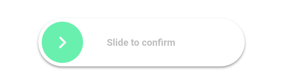
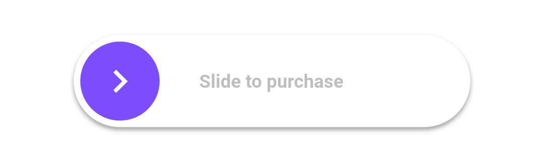
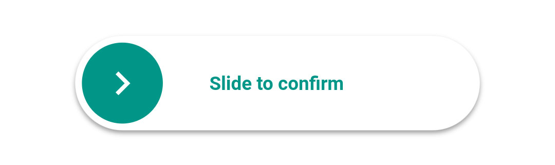
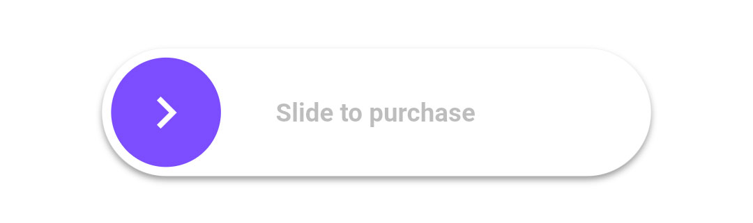
Um controle deslizante que ativará uma função de retorno quando o usuário deslizar até 100%.

AndroidiOSWebmacOSWindowsLinux
Downloads em 30 dias
4,6 mil
Curtidas
150
Pontos Pub
140

Instalar pacote

flutter pub add slide_to_confirm

Visão geral do pacote

Orientação gerada a partir de informações públicas. Apenas para referência.

Um pacote Flutter que fornece um widget de controle deslizante personalizável projetado para acionar uma função de retorno assim que o usuário deslizar completamente até 100%. Ele melhora a interação do usuário exigindo um gesto deliberado, comumente usado para confirmar ações como excluir itens ou enviar formulários. O controle deslizante suporta animações suaves e pode ser estilizado com cores, tamanhos e rótulos personalizados. Funciona em todas as principais plataformas, incluindo Android, iOS, Web, macOS, Windows e Linux.

Casos de uso

  • Confirmando ações destrutivas
  • Verificação do usuário antes da submissão
  • Melhorando interações de formulário
  • Evitando toques acidentais
  • Adicionando feedback interativo
  • Gestos de confirmação personalizados

Principais recursos

  • Ativação completa de 100% deslizamento
  • Cores e tamanho configuráveis
  • Callback na conclusão
  • Animação suave
  • Suporte multiplataforma
  • Texto de rótulo personalizável

Indicado para

  • Confirmações de formulário
  • Prompts de ação de exclusão
  • Elementos de interface do usuário interativos
  • Recursos de engajamento do usuário
  • controles aprimorados para acessibilidade
  • Entradas de gestos simples e eficazes

Considerações

  • Requer atenção do usuário para concluir
  • Pode ser necessário ajustes de acessibilidade
  • Limitado a deslizamento em uma única direção
  • Não adequado para entrada rápida
  • O feedback visual deve ser claro
  • Impacto no desempenho em layouts complexos
README original

Snapshot do README original do repositório-fonte vinculado. Consulte o repositório para o conteúdo mais recente.

slide_to_confirm

A customizable slider that will activate a callback when the user slides it to 100%.

Installation

In the dependencies: section of your pubspec.yaml, add the following line:

slide_to_confirm: <latest_version>

Usage

import 'package:slide_to_confirm/slide_to_confirm.dart';

class MyWidget extends StatelessWidget {

    void confirmed(){
        print('Slider confirmed!');
    }

    Widget build(BuildContext context) {
        return ConfirmationSlider(
            onConfirmation: () => confirmed(),
        );
    }
}

Properties

  • height double: Height of the slider. Defaults to 70.
  • width double: Width of the slider. Defaults to 300.
  • backgroundColor Color: The color of the background of the slider. Defaults to Colors.white.
  • backgroundColorEnd Color: The color of the background of the slider when it has been slide to the end. By giving a value here, the background color will gradually change from backgroundColor to backgroundColorEnd when the user slides. Is not used by default.
  • foregroundColor Color: The color of the moving element of the slider. Defaults to Colors.blueAccent.
  • iconColor Color: The color of the icon on the moving element if icon is IconData. Defaults to Colors.white.
  • sliderButtonContent Widget or : The icon widget used on the moving element of the slider. Defaults to Icon(Icons.chevron_right).
  • shadow BoxShadow: The shadow below the slider. Defaults to BoxShadow(color: Colors.black38, offset: Offset(0, 2),blurRadius: 2,spreadRadius: 0,).
  • text String: The text showed below the foreground. Used to specify the functionality to the user. Defaults to "Slide to confirm".
  • textStyle TextStyle: The style of the text. Defaults to TextStyle(color: Colors.black26, fontWeight: FontWeight.bold,).
  • onConfirmation VoidCallback: The callback when slider is completed. This is the only required field.
  • onTapDown VoidCallback: The callback when slider is pressed.
  • onTapUp VoidCallback: The callback when slider is release.
  • foregroundShape BorderRadius: The shape of the foreground (the moving element of the slider). Defaults to a circular border radius.
  • backgroundShape BorderRadius: The shape of the background of the slider. Defaults to a circular border radius.
  • stickToEnd bool: Bool that indicates if stick or not the cursor at end of slide

Example

View the Flutter app in the example directory to see a working example of how to use and implement the slider.

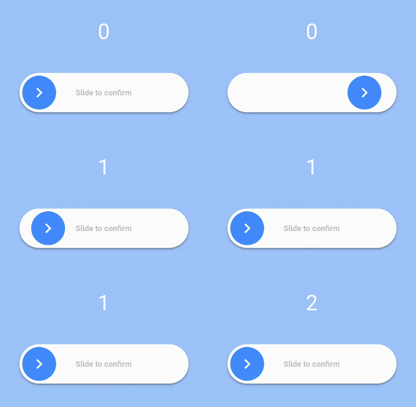
Screenshots

Slider Gif

Slider Gif

Slider Gif

Slider Gif

Slider Gif

Categorias

Repositório-fonte

Projetos que usam este pacote

Ainda não há dados.