Orientação gerada a partir de informações públicas. Apenas para referência.
Um widget de botão deslizante personalizável projetado para ativar ou desativar eventos com um gesto suave de deslize. Construído com Flutter, oferece uma interface limpa e interativa adequada para alternar configurações, habilitar funcionalidades ou confirmar ações. O widget suporta estilização personalizada, animações e comportamento responsivo em várias plataformas. É leve e fácil de integrar em aplicativos existentes do Flutter. Ideal para formulários, preferências e fluxos de introdução onde a interação intuitiva do usuário é essencial.
Casos de uso
Alternar configurações do aplicativo
Ativar/desativar recursos
Confirmação de onboarding do usuário
Ativação de entrada de formulário
Interruptores de preferência
Principais recursos
Aparência personalizável
Animação de deslizamento suave
Feedback de toque responsivo
Integração fácil
Compatibilidade multiplataforma
Indicado para
Interfaces de alternância simples
Painéis de configuração
Telas de onboarding
Desenvolvedores de aplicativos móveis
Projetos voltados para a interface do usuário
Considerações
Limitado à funcionalidade básica de alternância
Requer manipulação manual do estado
Não adequado para interações complexas
Recursos de acessibilidade embutidos mínimos
Sem suporte a modo escuro por padrão
README original
Snapshot do README original do repositório-fonte vinculado. Consulte o repositório para o conteúdo mais recente.
Slider Button v3.1.0
This package provides an easy implementation of a Slider Button to cancel current transaction or screen.
Highly customizable iphone alike looking widget.
Null safety supported
Features
Circle or rectangle — Use radius to switch between circular and rectangular slider.
Shimmer label — Optional shimmer effect on the label (customizable colors).
Vibration — Optional haptic feedback on successful slide (vibrationFlag).
Customizable size — buttonSize, buttonWidth, height, width for full control.
Disabled state — Use disable: true to grey out and prevent sliding (with tooltip).
RTL support — Use rightToLeftLocale: true for right-to-left slide direction.
Dismiss threshold — Control how far the user must slide to confirm (dismissThresholds).
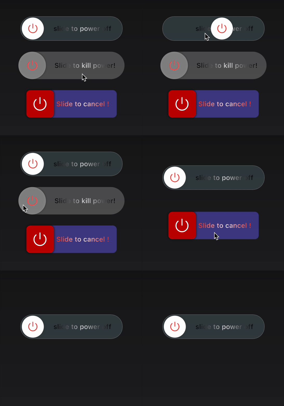
Glass effect — Frosted glass track with blur and optional white border (useGlassEffect, glassBlurSigma, glassBorderColor, glassBorderWidth).
How to use
Type 1
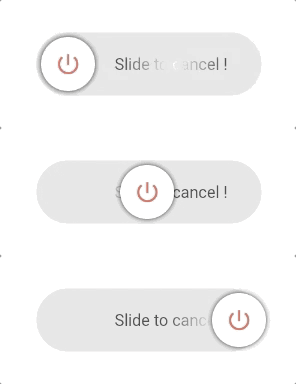
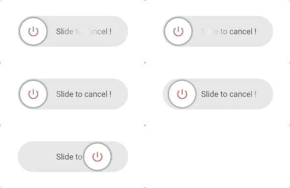
This is a Circle type widget.
You just need to define the border radius to swap between rectangle and circle type widget.
Type 2
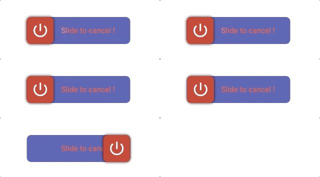
This is a Rectangle type widget.
import'package:slider_button/slider_button.dart';
SliderButton(
action: () async{
///Do something here OnSlidereturntrue; //return false if you want to avoid dismissing the widget in the tree.
},
///Put label over here
label: Text(
"Slide to cancel !",
style: TextStyle(
color: Color(0xff4a4a4a),
fontWeight: FontWeight.w500,
fontSize: 17),
),
icon: Center(
child: Icon(
Icons.power_settings_new,
color: Colors.white,
size: 40.0,
semanticLabel: 'Text to announce in accessibility modes',
)),
///Change All the color and size from here.
width: 230,
radius: 10,
buttonColor: Color(0xffd60000),
backgroundColor: Color(0xff534bae),
highlightedColor: Colors.white,
baseColor: Colors.red,
);
Custom Usage
There are several options that allow for more control:
Properties
Default
Description
action
—
(required) Define an action after sliding; return true to dismiss, false to keep.
buttonKey
null
Custom key for the button. Useful for dynamic labels.
child
null
Your own widget for a fully customizable slider button.
vibrationFlag
false
Enable haptic vibration on successful slide.
height
70
Height of the widget.
width
270
Width of the widget.
buttonSize
null (→ 60)
Size of the sliding button (square). Must be ≤ height.
buttonWidth
null
Width of the button when not squared (e.g. wide sliders).
backgroundColor
Color(0xffe0e0e0)
Background color of the track.
baseColor
Colors.black87
Shimmer base color for the label.
highlightedColor
Colors.white
Shimmer highlight color for the label.
buttonColor
Colors.white
Color of the sliding button.
label
null
Widget used as the label (e.g. Text).
alignLabel
Alignment(0.6, 0)
Alignment of the label.
boxShadow
null
Shadow for the sliding button.
icon
null
Widget shown on the sliding button (e.g. icon or text).
shimmer
true
Enable or disable shimmer effect on the label.
dismissThresholds
0.75
Drag threshold (0.0–1.0); e.g. 0.75 = 75% of width to dismiss.
disable
false
When true, disables sliding and shows disabled state with tooltip.
rightToLeftLocale
false
When true, slide direction is right-to-left (for RTL locales).
useGlassEffect
false
When true, track uses frosted glass (blur + translucency).
glassBlurSigma
20
Blur strength for the glass track when useGlassEffect is true.
glassBorderColor
null
Border color for the glass track (e.g. white); null = no border.
glassBorderWidth
1.0
Border width for the glass track when glassBorderColor is set.
👍 Contribution
Fork it
Create your feature branch (git checkout -b my-new-feature)
Commit your changes (git commit -m 'Add some feature')
Push to the branch (git push origin my-new-feature)