Orientação gerada a partir de informações públicas. Apenas para referência.
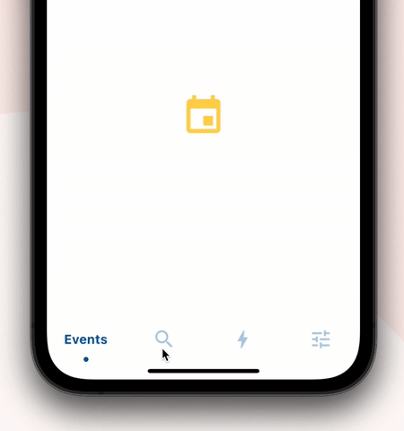
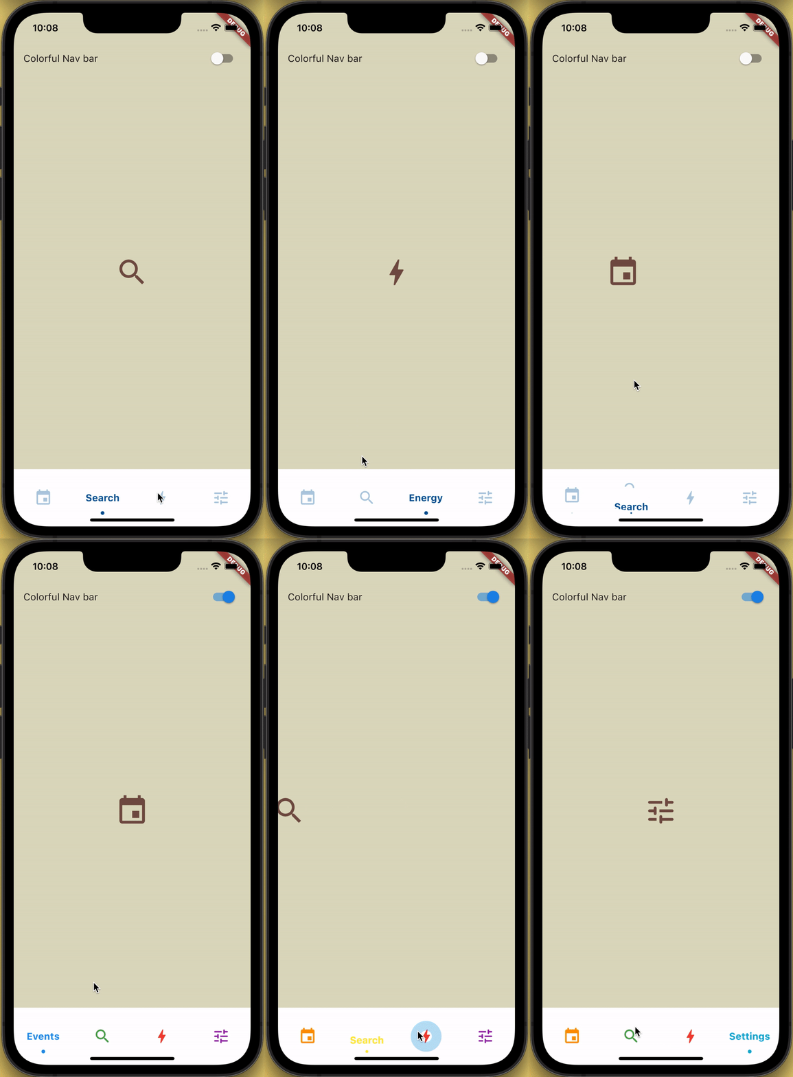
Uma barra de navegação inferior personalizável com animação deslizante para ícones e rótulos, aprimorada com um efeito de recorte e feedback de ondulação ao toque. Projetada para interfaces modernas e interativas, suporta múltiplas plataformas, incluindo Android, iOS, Web, macOS, Windows e Linux. O pacote oferece transições suaves e acabamento visual refinado, ideal para aplicativos que exigem navegação intuitiva com feedback dinâmico. Integra-se perfeitamente em projetos Flutter por meio do pub.dev.
Casos de uso
Navegação de aplicativo móvel
Interfaces de aplicativos web
Design de interface do usuário multiplataforma
Barras inferiores interativas
Estética moderna de aplicativos
Principais recursos
Animação de ícone e texto deslizante
Efeito de recorte para profundidade visual
Efeito de ondulação ao toque
Compatibilidade multiplataforma
Aparência personalizável
Animações de transição suave
Indicado para
Desenvolvedores Flutter procurando por navegação inferior animada
Aplicações focadas no design
Aplicativos com alta interação do usuário
Desenvolvedores direcionados para múltiplas plataformas
Projetos de melhoria de UI/UX
Considerações
Pode exigir ajuste de desempenho em dispositivos mais antigos
Personalização limitada além das funcionalidades principais
Conflitos potenciais de layout em widgets complexos
Não otimizado para conjuntos de navegação muito grandes
Depende do pipeline de renderização do Flutter
README original
Snapshot do README original do repositório-fonte vinculado. Consulte o repositório para o conteúdo mais recente.
How to use?
Add sliding_clipped_nav_bar: to your pubspec.yaml dependencies then run flutter pub get
Add SlidingClippedNavBar() to bottomNavigationBar property of Scaffold() and add PageView() to body with NeverScrollableScrollPhysics() don't try to upate the seleted index from onPageChanged or will see some weird behaviour. You can use Stack() or AnimatedSwitcher() for custom page transition animation.
API reference
barItems → List<BarItem>
List of bar items that shows horizontally, Minimum 2 and maximum 4 items. required
selectedIndex → int
Selected index of the bar items. required
iconSize → double
Size of all icons (inactive items), don't make it too big or will be clipped. optional [30]
fontSize → double
FontSize of the text. optional [16]
fontWeight → FontWeight
FontWeight of the text. optional [FontWeight.bold]
fontStyle → FontStyle
FontStyle of the text. optional [null]
activeColor → Color
Color of the selected item which indicate selected. required
inactiveColor → Color?
Inactive color of item, which actually color icons. nullable
onButtonPressed → OnButtonPressCallback
Callback when item is pressed. required
backgroundColor → Color
background color of the bar. optional [Colors.white]
The height must be constant because the animation is in vertical direction. According to me 60 is perfect. But if you think needs to be reduced then please create an issue with a screenshot. I will see if I can do something.
How do I add drop shadow?
Wrap SlidingClippedNavBar with DecoratedBox or Container and pass BoxDecoration to decoration property. BoxDecoration takes list of boxShadow there you can pass your drop shadow.