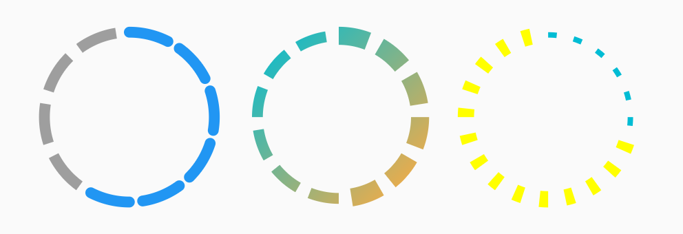
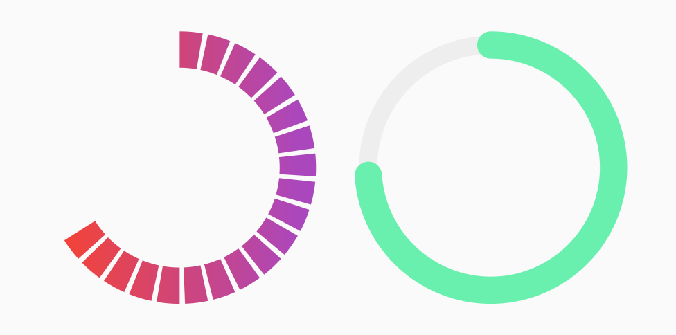
Orientação gerada a partir de informações públicas. Apenas para referência.
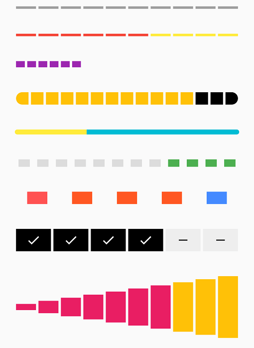
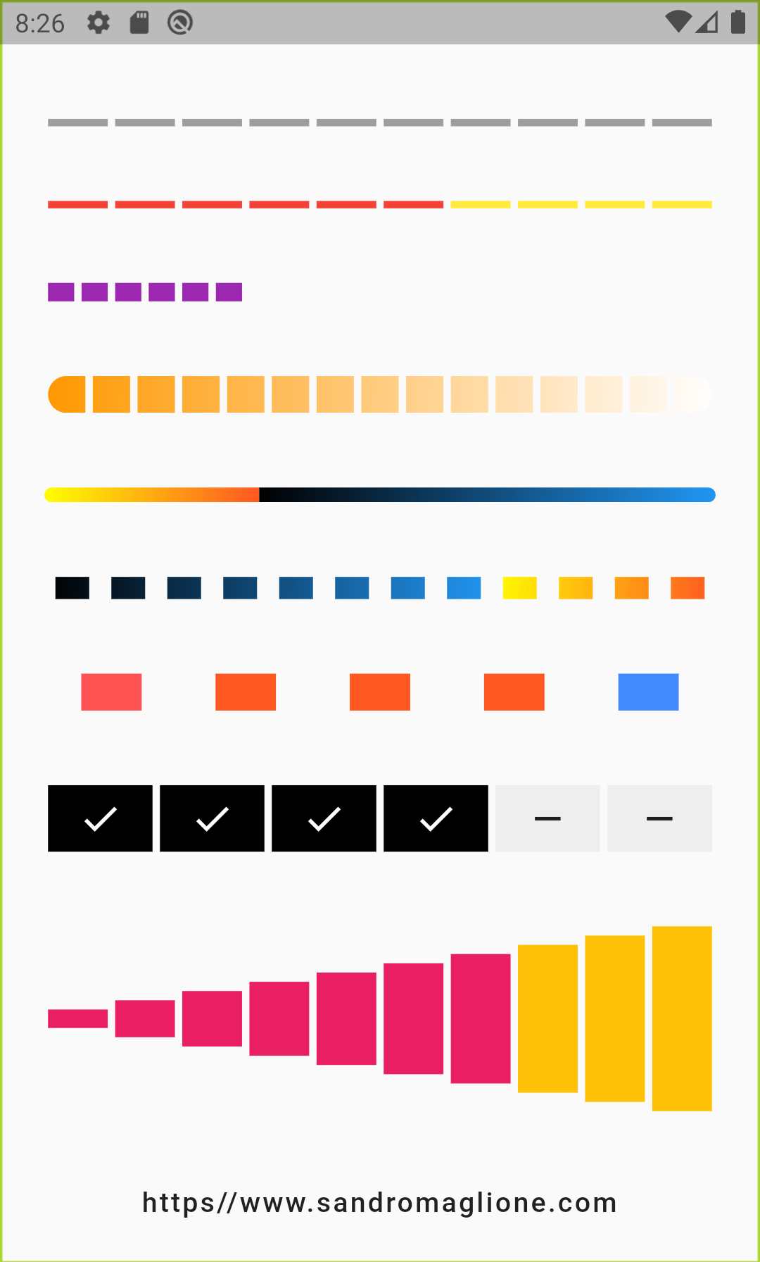
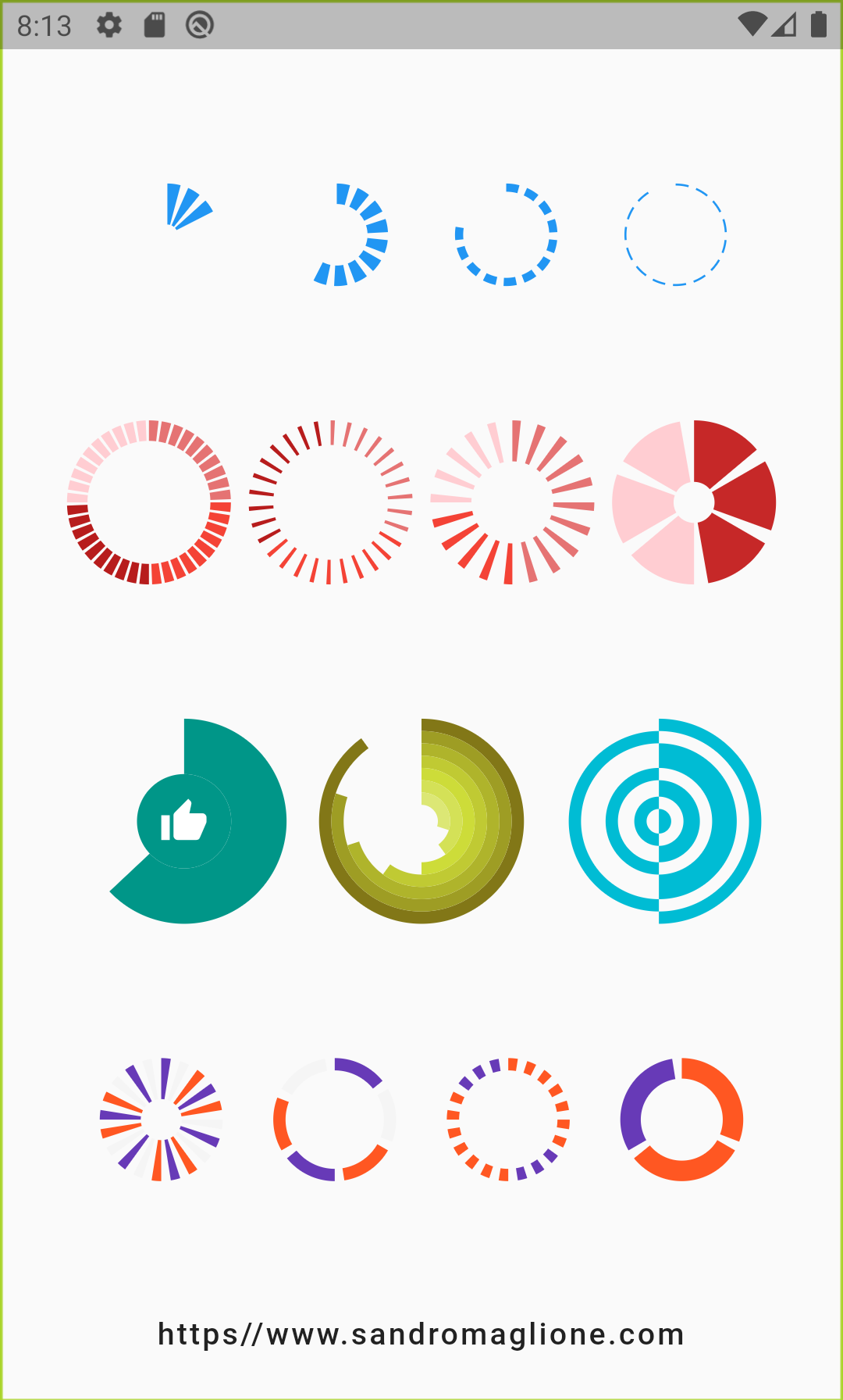
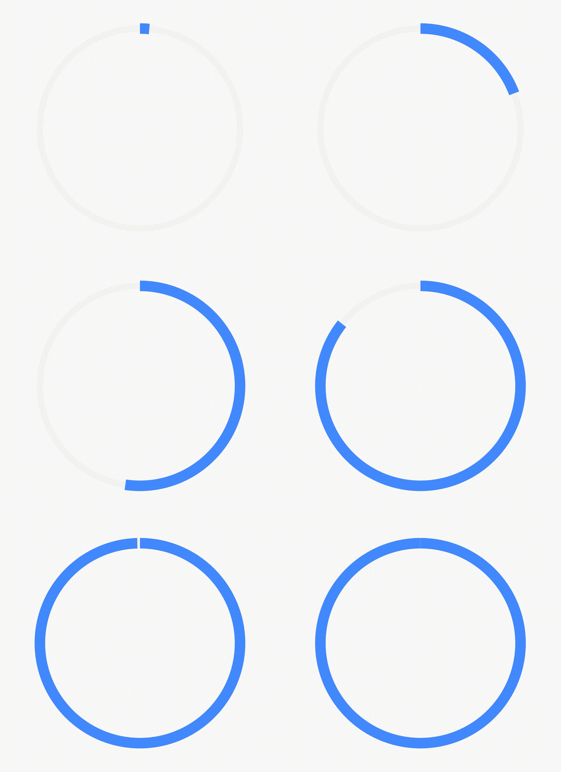
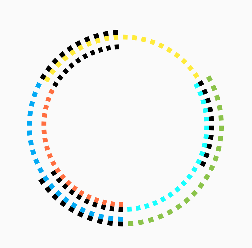
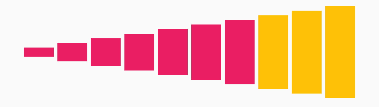
Um pacote Flutter que fornece uma barra de progresso personalizável em etapas, representando visualmente o progresso por uma série de etapas. Cada etapa pode ser marcada como selecionada ou não selecionada, tornando-o ideal para guiar os usuários por processos com múltiplas fases, como formulários, fluxos de boas-vindas ou finalização de compras. O indicador suporta animações suaves e é altamente configurável com opções para cores, tamanhos e espaçamento entre as etapas. Funciona em todas as principais plataformas, incluindo Android, iOS, Web, macOS, Windows e Linux.
Casos de uso
Wizards de onboarding
formulários em múltiplos passos
Rastreamento do processo de checkout
fluxos de trabalho de conclusão de tarefas
indicadores de progresso do tutorial
Principais recursos
Aparência personalizável do passo
Transições animadas entre etapas
Suporte para múltiplas plataformas
Cores e tamanhos configuráveis
design responsivo
Integração fácil com a interface existente
Indicado para
Desenvolvedores de aplicativos construindo jornadas guiadas do usuário
Designers que precisam de feedback visual de progresso
Projetos que exigem consistência entre plataformas
Aplicações voltadas para UX com tarefas sequenciais
Visualização de progresso simples, mas elegante
Considerações
Limitado à progressão linear de etapas
Sem suporte embutido para adição/remoção dinâmica de etapas
Requer gerenciamento manual do estado para atualizações de etapa
Não adequado para fluxos de trabalho não lineares
Pode ser necessário estilos adicionais para temas complexos
README original
Snapshot do README original do repositório-fonte vinculado. Consulte o repositório para o conteúdo mais recente.
Step Progress Indicator
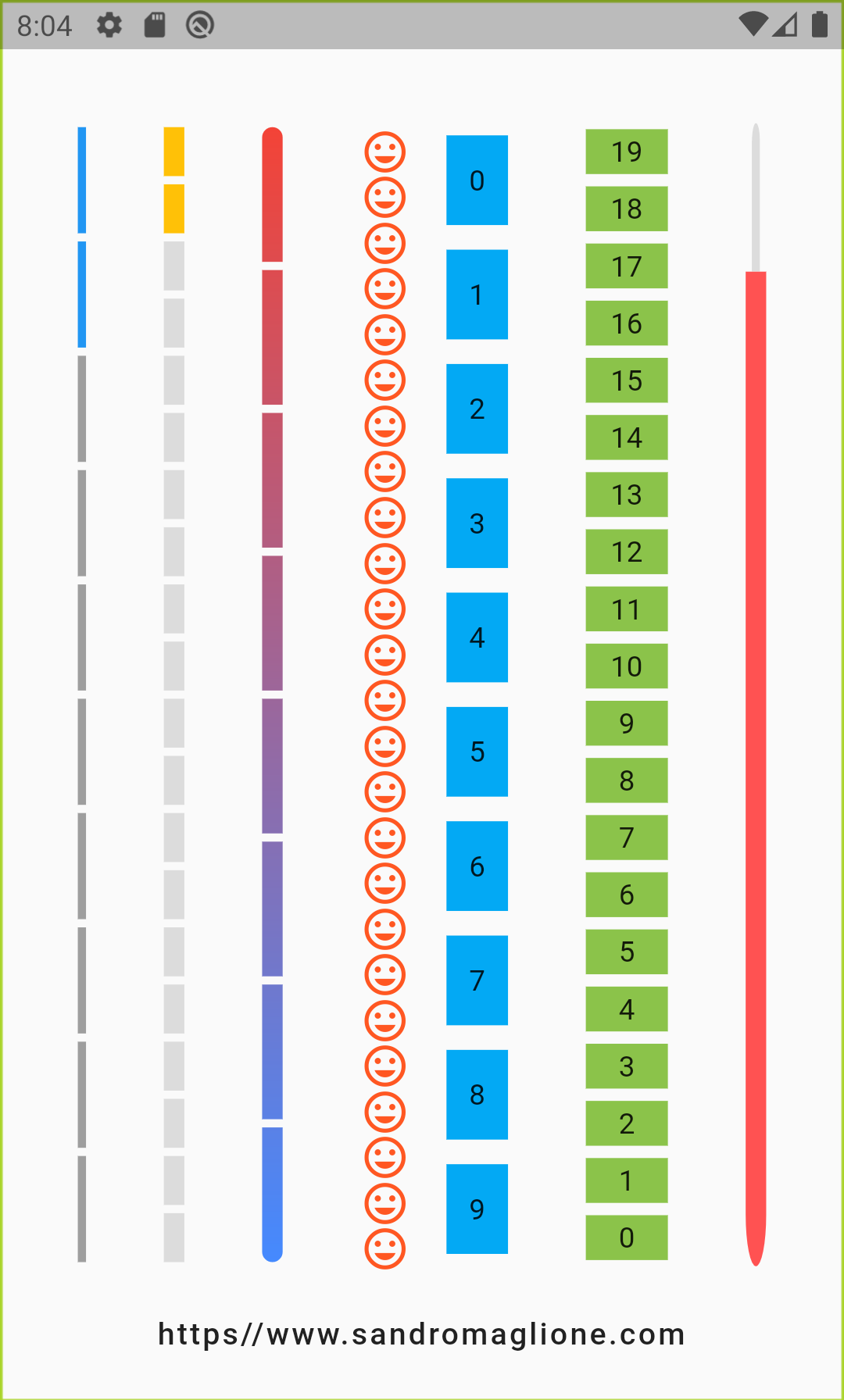
Open source Flutter package, bar indicator made of a series of selected and unselected steps.
Made by Sandro Maglione, check out his personal official website sandromaglione.com
Number of steps to underline, all the steps with index <= currentStep will have Color equal to selectedColor.
0
customStep(int, Color, double)
Widget
Defines a custom Widget to display at each step, given the current step index, the Color, which could be defined with selectedColor and unselectedColor or using customColor, and its size, which could be defined using size, selectedSize, unselectedSize, or customSize.
-
onTap(int)
void Function()
Defines onTap function given index of the pressed step.
-
customColor(int)
Color
Assign a custom Color for each step.
-
customSize(int)
double
Assign a custom size for each step.
-
selectedColor
Color
Color of the selected steps.
Colors.blue
unselectedColor
Color
Color of the unselected steps.
Colors.grey
gradientColor
Gradient
Apply gradient color to the indicator.
-
selectedGradientColor
Gradient
Apply gradient color to the selected steps of the indicator.
-
unselectedGradientColor
Gradient
Apply gradient color to the unselected steps of the indicator.
-
blendMode
BlendMode
Apply BlendMode to ShaderMask when gradientColor, selectedGradientColor, or unselectedGradientColor defined.
-
direction
Axis
Defines if indicator is horizontal or vertical.
Axis.horizontal
progressDirection
TextDirection
Defines if steps grow from left-to-right / top-to-bottom TextDirection.ltr or right-to-left / bottom-to-top TextDirection.rtl.
TextDirection.ltr
size
double
Size of the indicator (height if direction is Axis.horizontal, width if Axis.vertical).
4.0
padding
double
Spacing, left-right if horizontal, top-bottom if vertical, of each step.
2.0
fallbackLength
double
Length of the progress indicator in case the main axis (based on direction attribute) has no size limit i.e. double.infinity.
100.0
selectedSize
double
Specify a custom size for selected steps.
-
unselectedSize
double
Specify a custom size for unselected steps.
-
roundedEdges
Radius
Add rounded edge corners to first and last step.
-
mainAxisAlignment
MainAxisAlignment
Assign alignment MainAxisAlignment for indicator's container.
MainAxisAlignment.center
crossAxisAlignment
CrossAxisAlignment
Assign alignment CrossAxisAlignment for indicator's container.
CrossAxisAlignment.center
stepMainAxisAlignment
MainAxisAlignment
Assign alignment MainAxisAlignment for a single step.
MainAxisAlignment.center
stepCrossAxisAlignment
CrossAxisAlignment
Assign alignment CrossAxisAlignment for a single step.
CrossAxisAlignment.center
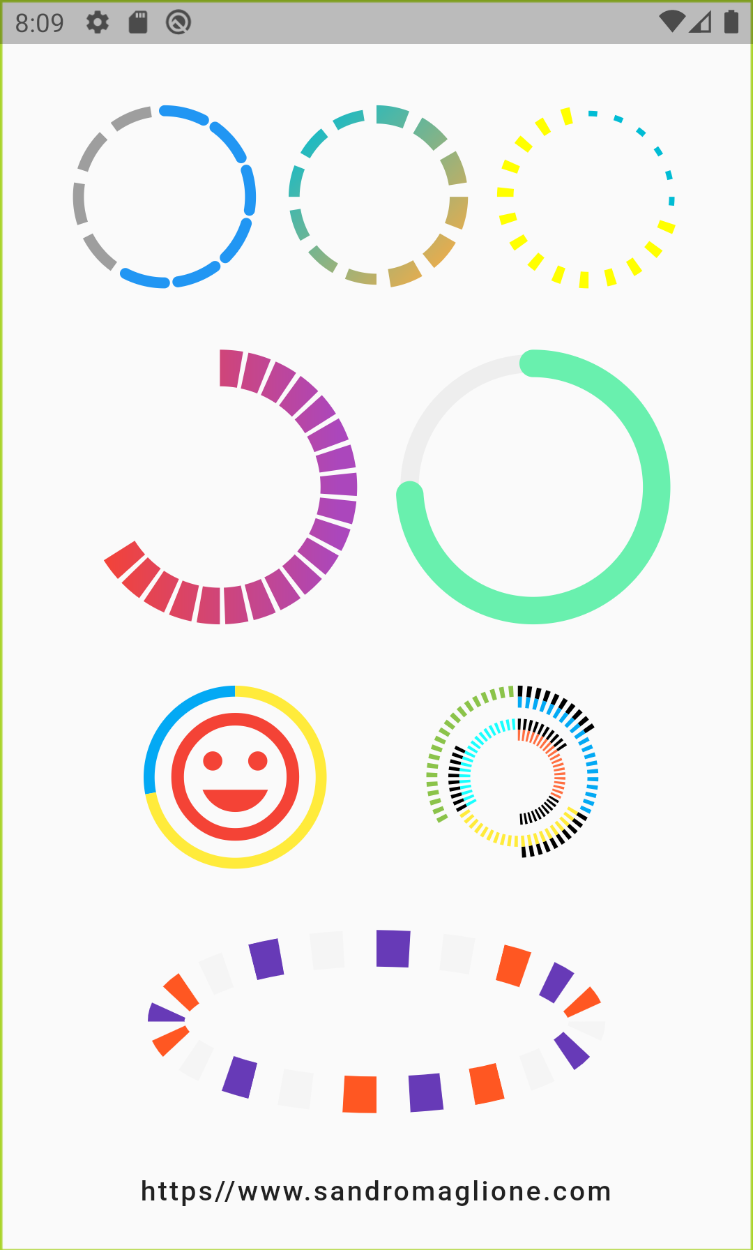
CircularStepProgressIndicator Parameters
Parameter
Type
Description
Default
totalSteps
int
Total number of step of the complete indicator.
@required
currentStep
int
Number of steps to underline, all the steps with index <= currentStep will have Color equal to selectedColor.
0
child
Widget
Widget child contained inside the indicator.
-
selectedColor
Color
Color of the selected steps.
Colors.blue
unselectedColor
Color
Color of the unselected steps.
Colors.grey
customColor(int)
Color
Assign a custom Color for each step.
-
gradientColor
Gradient
Apply a gradient color to the indicator.
-
customStepSize(int, bool)
double
Assign a custom size for each step.
-
selectedStepSize
double
Specify a custom size for selected steps.
-
unselectedStepSize
double
Specify a custom size for unselected steps.
-
circularDirection
CircularDirection
Defines if steps grow clockwise (CircularDirection.clockwise) or counterclockwise (CircularDirection.counterclockwise)
CircularDirection.clockwise
stepSize
double
Size of the each step of the indicator.
6.0
height
double
Height of the indicator's container.
-
width
double
Width of the indicator's container.
-
padding
double
Spacing between each step.
math.pi / 20
startingAngle
double
Angle in which is placed the starting point of the indicator.
0
roundedCap(int, bool)
bool
Adds rounded edges at the beginning and at the end of the circular indicator given int index of each step and a bool telling if the step is selected.
(_, __) => false
removeRoundedCapExtraAngle
bool
Removes extra angle caused by StrokeCap.butt when roundedCap is applied #20.
false
arcSize
double
Angle in radiants which represents the size of the arc used to display the indicator.
math.pi * 2
fallbackHeight
double
Height of the indicator's container in case the parent height has no size limit i.e. double.infinity.
100.0
fallbackWidth
double
Width of the indicator's container in case the parent width has no size limit i.e. double.infinity.
100.0
Roadmap
I am always open for suggestions and ideas for possible improvements or fixes.
Feel free to open a Pull Request if you would like to contribute to the project.
If you would like to have a new feature implemented, just write a new issue.
Versioning
v1.0.2 - 2 January 2022
v1.0.1 - 16 June 2021
v1.0.0 - 10 May 2021
v0.2.5+8 - 01 December 2020
v0.2.4+7 - 25 August 2020
v0.2.3+6 - 20 May 2020
v0.2.2+5 - 26 April 2020
v0.2.1+4 - 25 February 2020
v0.2.0+3 - 24 February 2020
v0.1.1+2 - 24 January 2020
v0.1.0+1 - 23 January 2020
Support
If you would like to support my work, why don't you buy me a coffee?