Orientação gerada a partir de informações públicas. Apenas para referência.
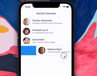
SwipeableTile é um pacote Flutter que permite o descarte animado de tiles com efeitos de fundo personalizáveis. Ele suporta gestos de deslizar para descartar, bem como gestos de deslizar para acionar ações sem descartar o tile. Ideal para implementar itens de lista interativos com feedback visual, funciona em todas as principais plataformas, incluindo Android, iOS, Web, macOS, Windows e Linux. O pacote melhora a experiência do usuário ao fornecer animações suaves e manipulação flexível de gestos para interfaces baseadas em listas.
Casos de uso
Implementando funcionalidade de deslize para descartar em listas
Criando itens de lista interativos com gatilhos de ação
Construindo interfaces intuitivas para aplicativos de gerenciamento de tarefas
Adicionando feedback animado às interações de itens da lista
Designando layouts baseados em cartões responsivos
Melhorando o engajamento do usuário com gestos de deslize
Principais recursos
Fundo animado durante o deslize
Suporte para deslizes de descarte e acionamento de ação
Compatibilidade multiplataforma
Limites de deslize personalizáveis
Transições de animação suaves
Configuração flexível para comportamento de deslize
Indicado para
Desenvolvedores construindo interfaces de lista interativas
Aplicativos que exigem interações baseadas em deslize
Designers de UI focados em experiências baseadas em gestos
Projetos direcionados para múltiplas plataformas
Equipes que desejam soluções leves de gestos
Aplicações com foco em dispositivos móveis e feedback tátil rico
Considerações
Pode exigir estilos adicionais para fundos complexos
Impacto no desempenho com listas grandes
Personalização interna limitada para curvas de animação
Não otimizado para eventos de deslize de alta frequência
Requer manipulação cuidadosa do estado durante ações de deslize
Mais adequado para listas de tamanho moderado para manter a responsividade
README original
Snapshot do README original do repositório-fonte vinculado. Consulte o repositório para o conteúdo mais recente.
Features
Animated tile and backgound while swiping. Add padding to tile. Swipe to trigger action.
The package is fork of Dismissible. Without any vertical, up and down swipe.
Problems with dismissible
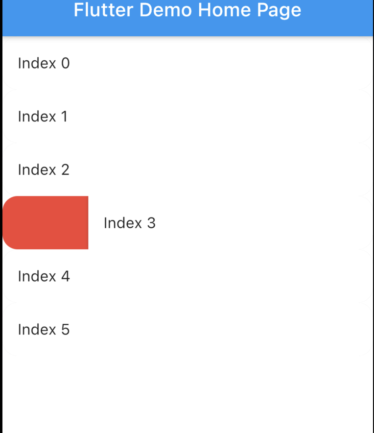
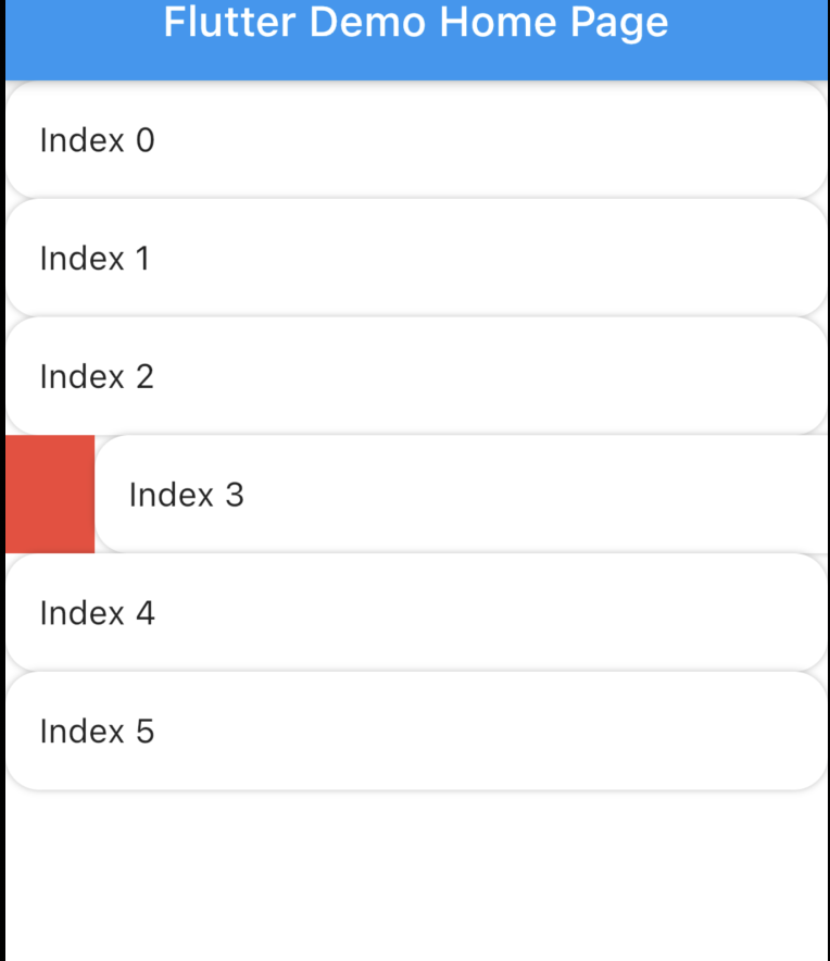
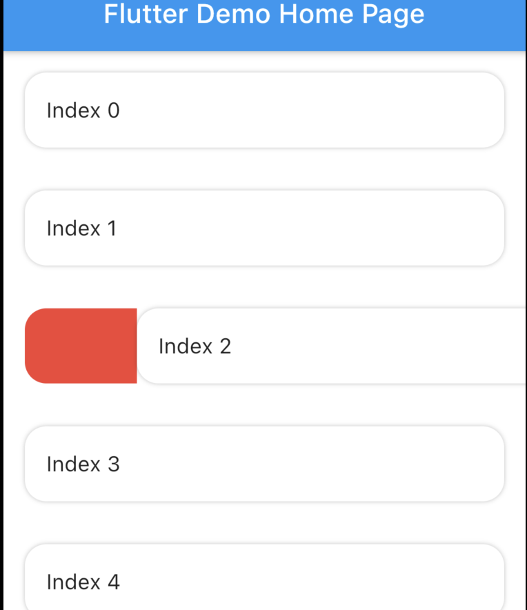
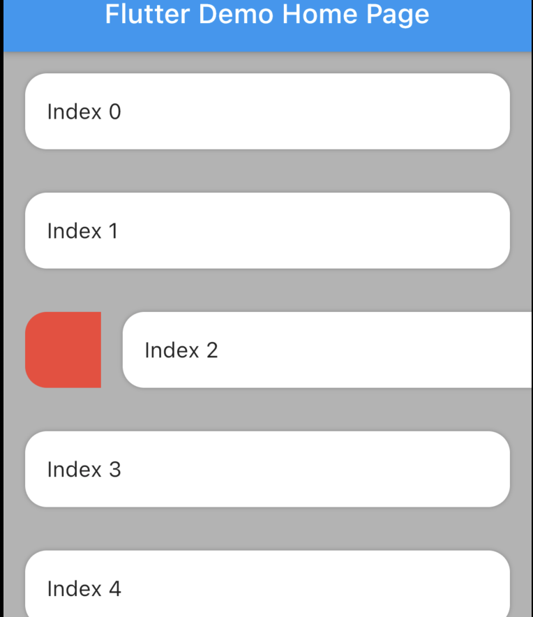
Dismissible doesn't allow animated rounded corner and elevation similar to google Gmail, Telegram, Messages (these are android apps) if you swipe you will notice. Here is the result with Dismissible.
Dismissible can't make rounded Card there is always some UI issue. Here is the result with Dismissible.
It's not possible to animated the background while swiping.
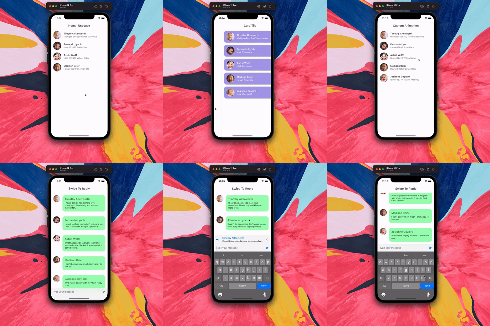
Swipe to trigger action function. Similar to telegram or instagram DM message reply.
How to use?
Installation
Add swipeable_tile to your pubspec.yaml dependencies then run flutter pub get
Set the Scaffold's (or whatever background widget you are using) backgroundColor and SwipeableTile or SwipeableTile.swipeToTrigger's color same.
There are four named constructors:
SwipeableTile When the tile is swiped there will be an elevation (remove elevation by setting isElevated to false) and rounded corner to the tile (set borderRadius to 0 if you don't want rounded corner).
SwipeableTile(
color: Colors.white,
swipeThreshold: 0.2,
direction: SwipeDirection.horizontal,
onSwiped: (direction) {// Here call setState to update state
},
backgroundBuilder: (context, direction, progress) {
if (direction == SwipeDirection.endToStart) {
// return your widget
} elseif (direction == SwipeDirection.startToEnd) {
// return your widget
}
returnContainer();
},
key: UniqueKey(),
child: // Here Tile which will be shown at the top
),
SwipeableTile.card This will make the tile look like card with constant rounded corner, unlike SwipeableTile. You also have to set the padding which will wrap around the tile as well background.
SwipeableTile.card(
color: Color(0xFFab9ee8),
shadow: BoxShadow(
color: Colors.black.withOpacity(0.35),
blurRadius: 4,
offset: Offset(2, 2),
),
horizontalPadding: 16,
verticalPadding: 8,
direction: SwipeDirection.horizontal,
onSwiped: (direction) {
// Here call setState to update state
},
backgroundBuilder: (context, direction, progress) {
// You can animate background using the progressreturnAnimatedBuilder(
animation: progress,
builder: (context, child) {
returnAnimatedContainer(
duration: constDuration(milliseconds: 400),
color: progress.value > 0.4
? Color(0xFFed7474)
: Color(0xFFeded98),
);
},
);
},
key: UniqueKey(),
child: Padding(
padding: constEdgeInsets.symmetric(vertical: 4.0),
child: // Here Tile which will be shown at the top
),
),
SwipeableTile.swipeToTrigger This is exactly the same as SwipeableTile but instead of dismiss it, it will trigger an action. The tile will return back to initial position when maximum drag reaches swipeThreshold
SwipeableTile.swipeToTriggerCard This is exactly the same as SwipeableTile.card but instead of dismiss it, it will trigger an action. The tile will return back to initial position when maximum drag reaches swipeThreshold
You can build the background dynamically and animate them using backgroundBuilder. Use direction parameter to check swipe direction and show different widget.
The progress is basically the same animation controller responsible for tile slide animation. You can use this controller to animate the background.
To trigger vibration you have to check when tile is dragged certain animation controller value. And I used vibration package for vibration and worked batter than HapticFeedback
swipeThreshold defines how far you can drag and will consider as dismiss. In case of swipe to trigger this will define maximun drag limit.
How to swipe to trigger action?
It's possible to do from backgroundBuilder using progress parameter but to select exact message (or tile) requires calling setState() which is not possible from backgroundBuilder however you can call setState() from onSwiped callback which will invoke when the tile return to initial position.
Vibrate & animate the icon when it's dragged maximum by checking progress.isCompleted or you can check animation value. Then call setState() from onSwiped User will not notice unless you set movementDuration to longer time and swipeThreshold to 0.4 (which is default). Check the example app how it's implemented.