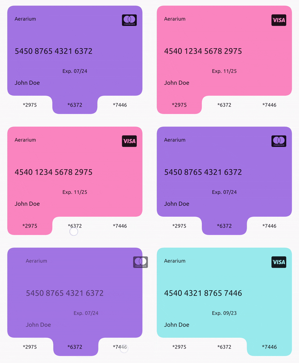
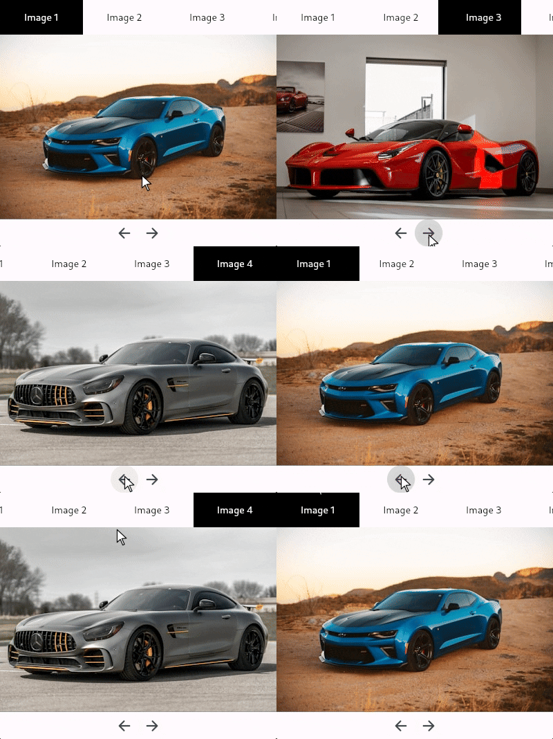
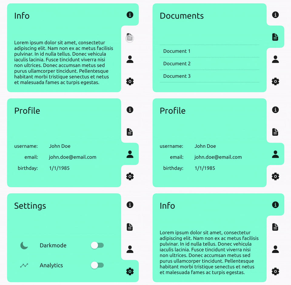
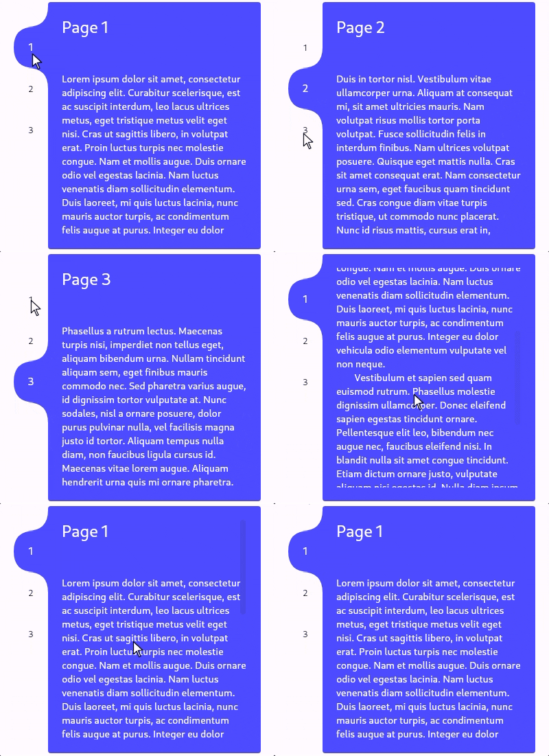
Visualização de guias personalizável/carrossel com indicador animado. Basta passar os filhos e as guias, ou usar um TabController, alterar o lado da guia, adicionar cor(es), e mais.
Orientação gerada a partir de informações públicas. Apenas para referência.
TabContainer é um widget de visualização de abas e carrossel personalizável para Flutter, com um indicador animado que transita suavemente entre as abas. Ele oferece suporte tanto para alternância manual de abas por meio de um TabController quanto para navegação direta baseada em filhos. Os usuários podem personalizar a posição das abas (topo, fundo, esquerda, direita), aplicar cores e adaptar o estilo visual para combinar com o design do seu aplicativo. Ideal para criar interfaces dinâmicas e interativas com várias seções de conteúdo.
Casos de uso
Criando interfaces com guias deslizáveis
Criando carrosséis de guias personalizados
Implementando indicadores de guia animados
Projetando layouts responsivos com múltiplas visualizações
Adicionando navegação interativa em formulários ou painéis
Principais recursos
Indicador de guia animado
Suporte para TabController
Posição da guia personalizável
Personalização de cor
Composição infantil flexível
Compatibilidade multiplataforma
Indicado para
Desenvolvedores construindo interfaces com guias
Designers que precisam de transições animadas
Aplicativos que exigem layouts de guias responsivos
Projetos com navegação multi-visão
Aplicativos Flutter destinados ao Android, iOS, Web, macOS, Windows e Linux
Considerações
Requer entendimento do TabController para uso avançado
Pode ser necessário estilos adicionais para temas complexos
Impacto no desempenho com grandes números de guias
Recursos de acessibilidade embutidos limitados
Não otimizado para listas de guias extremamente longas
README original
Snapshot do README original do repositório-fonte vinculado. Consulte o repositório para o conteúdo mais recente.
Tab view/carousel widget with a beautifully animated indicator and simple usage.
Just pass in a list of children and a list of tabs and it will handle the rest, or you can customise
by using a TabController, changing the tab side, adding color(s), and much more.
TabContainer intentionally has no built-in focus implementation. Create your own or,
to add one that maps arrow keys to the index, you can wrap your TabContainer with TabContainerFocus:
By default, TabContainer will no longer impose any additional semantic information onto the tabs or children.
It will just describe its own semantics configuration using onIncrease and onDecrease to change the tab index.
You can completely override this by supplying your own SemanticsConfiguration in the semanticsConfiguration: property.
If you want to prevent accessibility tools from getting stuck in your tab bar, you can wrap each tab in ExcludeSemantics or,
if you do want them to be accessed, you can wrap each one similarly to below:
classTabContainerextendsStatefulWidget{
constTabContainer({
super.key,
this.duration = constDuration(milliseconds: 300),
this.curve = Curves.easeInOut,
this.controller,
this.children,
this.child,
requiredthis.tabs,
this.childPadding = EdgeInsets.zero,
this.borderRadius = constBorderRadius.all(Radius.circular(12.0)),
this.tabBorderRadius = constBorderRadius.all(Radius.circular(12.0)),
this.tabExtent = 50.0,
this.tabEdge = TabEdge.top,
this.tabsStart = 0.0,
this.tabsEnd = 1.0,
this.tabMinLength = 0.0,
this.tabMaxLength = double.infinity,
this.color,
this.colors,
this.transitionBuilder,
this.semanticsConfiguration,
this.overrideTextProperties = false,
this.selectedTextStyle,
this.unselectedTextStyle,
this.textDirection,
this.enabled = true,
this.enableFeedback = true,
this.childDuration,
this.childCurve,
}) : assert((children == null) != (child == null)),
assert((children != null) ? children.length == tabs.length : true),
assert(controller == null ? true : controller.length == tabs.length),
assert(!(color != null && colors != null)),
assert((colors ?? tabs).length == tabs.length),
assert(tabExtent >= 0),
assert(0.0 <= tabsStart && tabsStart < tabsEnd && tabsEnd <= 1.0),
assert(tabMinLength >= 0),
assert(tabMaxLength >= tabMinLength),
assert((selectedTextStyle == null) == (unselectedTextStyle == null));
/// Changes tab selection from elsewhere in your app.////// If you provide one, you must dispose of it.finalTabController? controller;
/// The list of children you want to tab through, in order.////// Must be equal in length to [tabs] and [colors] (if provided)./// Must be null if [child] is supplied.finalList<Widget>? children;
/// Supply this if you want to control the child view yourself using [TabController].////// Must be equal in length to [tabs] and [colors] (if provided)./// Must be null if [children] is supplied;finalWidget? child;
/// What will be displayed in each tab, in order.////// Must be equal in length to [children] and [colors] (if provided).finalList<Widget> tabs;
/// Sets the border radius surrounding the children////// Defaults to [BorderRadius.all(Radius.circular(12.0))]finalBorderRadius borderRadius;
/// Sets the border radius surrounding each tab////// Defaults to [BorderRadius.all(Radius.circular(12.0))]finalBorderRadius tabBorderRadius;
/// Sets the padding to be applied around all [children].////// Defaults to [EdgeInsets.zero].finalEdgeInsets childPadding;
/// Height of the tabs perpendicular to the [TabEdge].////// If the [tabs] are on the left/right then this will be the their visual width, otherwise it will be their visual height./// Defaults to 50.0.finaldouble tabExtent;
/// Determines which side the [tabs] will be on.////// Defaults to [TabEdge.top].finalTabEdge tabEdge;
/// Fraction of the way down the [TabEdge] that the first tab should begin.////// Defaults to 0.0.finaldouble tabsStart;
/// Fraction of the way down the [TabEdge] that the last tab should end.////// Defaults to 1.0.finaldouble tabsEnd;
/// Minimum width of each tab parallel to the [TabEdge].////// Defaults to 0.0finaldouble tabMinLength;
/// Maximum width of each tab parallel to the [TabEdge].////// Defaults to [double.infinity].finaldouble tabMaxLength;
/// The background color of this widget.////// Must not be set if [colors] is provided.finalColor? color;
/// The list of colors used for each tab, in order.////// The first color in the list will be the background color when tab 1 is selected and so on./// Must not be set if [color] is provided.finalList<Color>? colors;
/// Duration used by [controller] to animate tab changes.////// Defaults to Duration(milliseconds: 300).finalDuration duration;
/// Curve used by [controller] to animate tab changes.////// Defaults to Curves.easeInOut.finalCurve curve;
/// Duration of the child transition animation when the tab selection changes.////// Defaults to [duration]./// Not used if [child] is supplied.finalDuration? childDuration;
/// The curve of the child transition animation when the tab selection changes.////// Defaults to [curve]./// Not used if [child] is supplied.finalCurve? childCurve;
/// Sets the child transition animation when the tab selection changes.////// Defaults to [AnimatedSwitcher.defaultTransitionBuilder]./// Not used if [child] is supplied.finalWidgetFunction(Widget, Animation<double>)? transitionBuilder;
/// The [SemanticsConfiguration] for the [RenderObject] of [TabContainer] itself, not its children or tabs./// You can completely control the accessibility behaviour by supplying this and wrapping your child and tabs in their own semantics.////// If non-null, this will be used instead of the default implementation.finalSemanticsConfiguration? semanticsConfiguration;
/// Set to true if each [Text] tabs given properties should be used instead of the implicitly animated ones.////// Defaults to false.finalbool overrideTextProperties;
/// The [TextStyle] applied to the text of the currently selected tab.////// Must specify values for the same properties as [unselectedTextStyle]./// Defaults to Theme.of(context).textTheme.bodyMedium.finalTextStyle? selectedTextStyle;
/// The [TextStyle] applied to the text of currently unselected tabs.////// Must specify values for the same properties as [selectedTextStyle]./// Defaults to Theme.of(context).textTheme.bodyMedium.finalTextStyle? unselectedTextStyle;
/// The [TextDirection] for tabs and semantics.////// Defaults to Directionality.of(context).finalTextDirection? textDirection;
/// Whether tab selection changes on tap.////// Defaults to true.finalbool enabled;
/// Whether detected gestures on tabs should provide acoustic and/or haptic feedback.////// Defaults to true.finalbool enableFeedback;
}