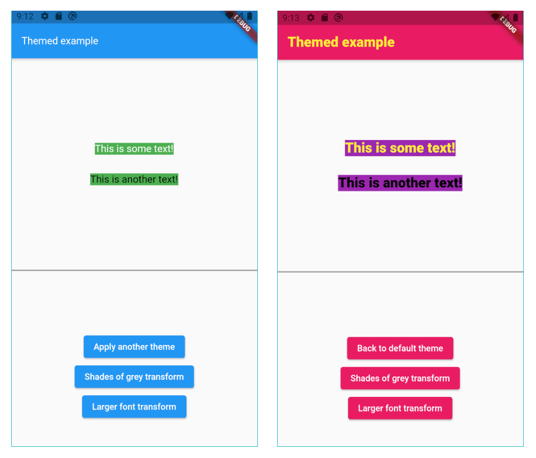
O pacote themed permite que você defina um tema com valores const, e depois, usando algum truque escuro do Dart, altere-os dinamicamente de qualquer maneira.
Orientação gerada a partir de informações públicas. Apenas para referência.
O pacote temático permite que desenvolvedores definam temas usando valores const, oferecendo uma maneira flexível de gerenciar a aparência da interface em aplicativos. Apesar de usar constantes imutáveis, ele aproveita os recursos do Dart para permitir alterações dinâmicas de tema em tempo de execução. Isso o torna ideal para aplicações que exigem transições suaves entre modos claro e escuro ou variações personalizadas de tema sem sacrificar desempenho ou segurança de tipo. O pacote é leve e se integra perfeitamente aos projetos Flutter.
Casos de uso
Alternância dinâmica de temas
Suporte a modo claro e escuro
Variantes de tema personalizadas
Atualizações de tema em tempo de execução
Consistência da interface do usuário entre plataformas
Gerenciamento de temas em aplicativos grandes
Principais recursos
Definições de tema baseadas em constantes
Modificação de tema em tempo de execução
Mínimo boilerplate
Compatibilidade multiplataforma
Gerenciamento de tema seguro por tipo
Re-renderização eficiente
Indicado para
Aplicativos Flutter com tema precisa
Desenvolvedores procurando gerenciamento simples de tema
Aplicativos com suporte a modo escuro
Projetos com prioridade de desempenho
Equipes que desejam tematização consistente
Aplicativos direcionados para múltiplas plataformas
Considerações
Limitado às propriedades básicas do tema
Requer entendimento sobre as semânticas const do Dart
Nenhuma persistência de tema embutida
Não adequado para hierarquias de temas complexas
Manipulação manual do estado do tema
Depende de gerenciamento externo de estado
README original
Snapshot do README original do repositório-fonte vinculado. Consulte o repositório para o conteúdo mais recente.
Sponsor
themed
The Themed package:
Lets you define a theme with const values, but change them dynamically anyway.
ChangeColors widget to change the brightness, saturation and hue of widgets or images.
Color extension methods like decolorize, addOpacity, removeOpacity,
darker, lighter, average and more.
Static methods ColorUtil.rgbaToArgb and ColorUtil.abgrToArgb.
TextStyle extension methods: var myStyle = TextStyle(fontSize: 15) + Colors.blue and
more.
Const values that you can change
As we all know, using const variables is the easiest way to create and use themes:
The Themed package is a competitor to writing Theme.of(context).xxx in your build
methods, but it’s NOT a competitor to Flutter’s native theme system and the Theme
widget. It’s there to solve a different problem, and it’s usually used together with
the Theme widget. For example, if you want to set a global default color for all
buttons, you’ll use the Theme widget. You may use it together with the Themed
package however, meaning that Themed colors and styles may be used inside
a ThemeData widget:
Each theme should be a Map<ThemeRef, Object>, where the keys are your ColorRef
and TextStyleRef const values, and the values are the colors and styles you want to
use on that theme. For example:
At any point in your app you can just change the current theme by doing:
// Setting a theme:Themed.currentTheme = theme1;
// Setting another theme:Themed.currentTheme = theme2;
// Removing the current theme (and falling back to the default theme):Themed.clearCurrentTheme();
// This would also remove the current theme:Themed.currentTheme = null;
Resetting
Calling the static method Themed.reset() will remove the entire widget tree inside
the Themed widget for one frame, and then restore it, rebuilding everything. This can
be helpful when some widgets are not responding to theme changes. Usage of this method
is not usually necessary. A side effect is that the all stateful widgets below Themed
will be recreated, and you'll need to have mechanisms to recover their state, like for
example having the state come from above Themed widget, or using a proper state
management solution.
The lighter method makes the color lighter (more white). Example:
// 20% more white.Colors.blue.lighter(0.2);
The darker method makes the color darker (more black). Example:
// 20% more black.Colors.blue.darker(0.2);
The average method makes the current color more similar to the given color. Example:
// 50% blue and 50% red.Colors.blue.average(Colors.red);
// 20% blue and 80% red.Colors.blue.average(Colors.red, 0.8);
The decolorize method makes the current color more grey. Example:
// Grey, with luminance similar to the original blue.Colors.blue.decolorize();
// Blue with 20% less color.Colors.blue.decolorize(0.2);
The addOpacity method makes the current color more transparent than it already is, by
the given amount. The removeOpacity method makes the current color less transparent than
it already is, by the given amount. This is different from the withOpacity method,
as you can see below.
// 50% transparent blue.Colors.blue.addOpacity(0.5);
// 80% transparent black.Colors.transparent.removeOpacity(0.2);
// Also 50% transparent blue.Colors.withOpacity(0.5);
// 75% transparent blue, because we add 50% and then more 50%.Colors.blue.addOpacity(0.5).addOpacity(0.5);
// This is 50% transparent blue, because the opacity is replaced, not added.Colors.withOpacity(0.5).withOpacity(0.5);
There are also two static methods for advanced color representation conversion:
The ColorUtil.rgbaToArgb method converts the RGBA color representation to ARGB.
The ColorUtil.abgrToArgb method converts the ABGR color representation to ARGB.
TextStyle transform
You can also create a style transformation. For example, this will make your fonts
larger:
staticTextStylelargerText(TextStyle textStyle) =>
textStyle.copyWith(fontSize: textStyle.fontSize! * 1.5);
// Turn it on:Themed.transformTextStyle = largerText;
// Then, later, turn it off:Themed.clearTransformTextStyle();
TextStyle extension
With the provided extension, you can make your code more clean-code by creating new text
styles by adding colors and other values to a TextStyle. For example:
const myStyle = TextStyle(...);
// Using some style:Text('Hello', style: myStyle);
// Making text black:Text('Hello', style: myStyle + Colors.black);
// Changing some other stuff:Text('Hello', style: myStyle + FontWeight.w900 + FontSize(20.0) + TextHeight(1.2));
Beware not to define the same constant
Please remember Dart constants point to the same memory space.
In this example, colorA, colorB and colorC represent the same variable:
If you later change the color of colorA, you are also automatically changing the color
of colorB and colorB.
If you want to create 3 independent colors, and be able to change them independently, you
have to create different constants. You can provide an id string, just to
differentiate them. For example:
The defaultTheme and currentTheme are both optional. They are simply theme maps, as
explained below.
When a color/style is used, it will first search it inside the currentTheme.
If it's not found there, it searches inside of defaultTheme.
If it's still not found there, it uses the default color/style which was defined in the
constructor. For example, here the default color is white: ColorRef(Colors.white).
Please note: If you define all your colors in the defaultTheme, then you don't need to
provide default values in the constructor. You can then use the fromId constructor:
You can save themes with keys, and then later use the keys to set the theme. The keys can
be anything (Strings, enums etc.):
// Save some themes using keys.enumKeys {light, dark};
Themed.save(key: Keys.light, theme: { ... })
Themed.save(key: Keys.dark, theme: { ... })
// Then set the theme.Themed.setThemeByKey(Keys.light);
It also works the other way around:
If you use the key first, and only save a theme with that key later:
// Set the theme with a key, even before saving the theme.Themed.setThemeByKey(Keys.light);
// The theme will change as soon as you save a theme with that key.Themed.save(key: Keys.light, theme: { ... })
Note: You can also use the methods saveAll to save many themes by key at the same time,
and clearSavedThemeByKey to remove saved themes.
Important: When I say "save" above, I mean it's saved in memory, not in the device disk.
Copyright
This package is copyrighted and brought to you
by
Parkside Technologies, a company which is simplifying global access to US stocks.
This package is published here with permission.
Please, see the license page for more information.