Orientação gerada a partir de informações públicas. Apenas para referência.
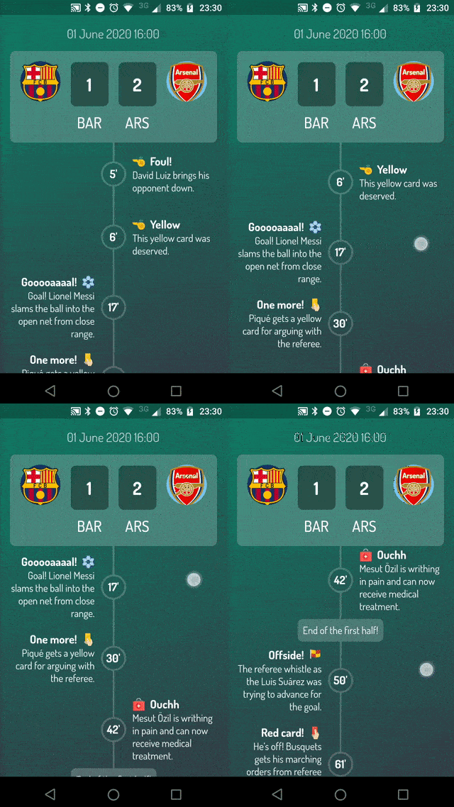
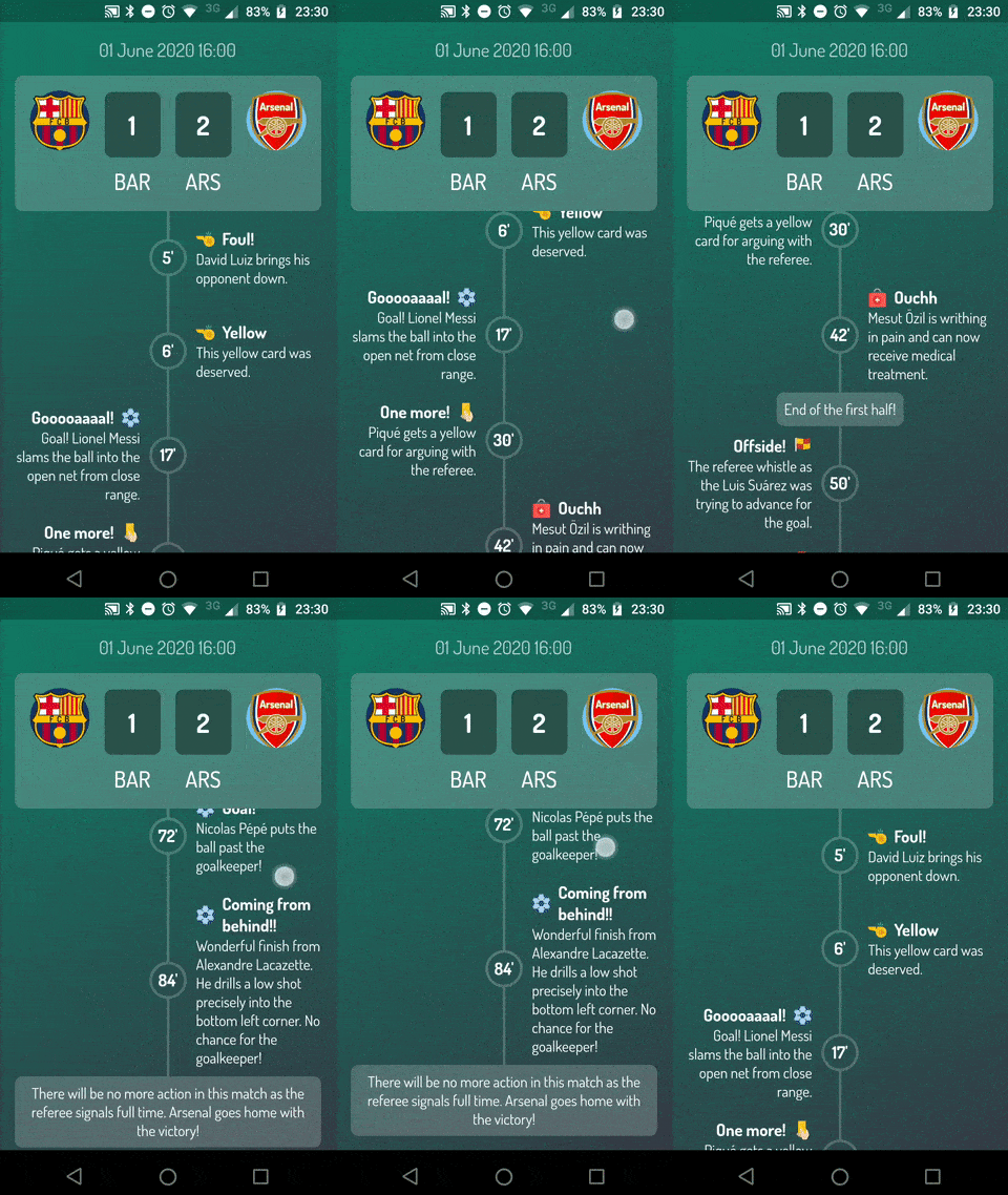
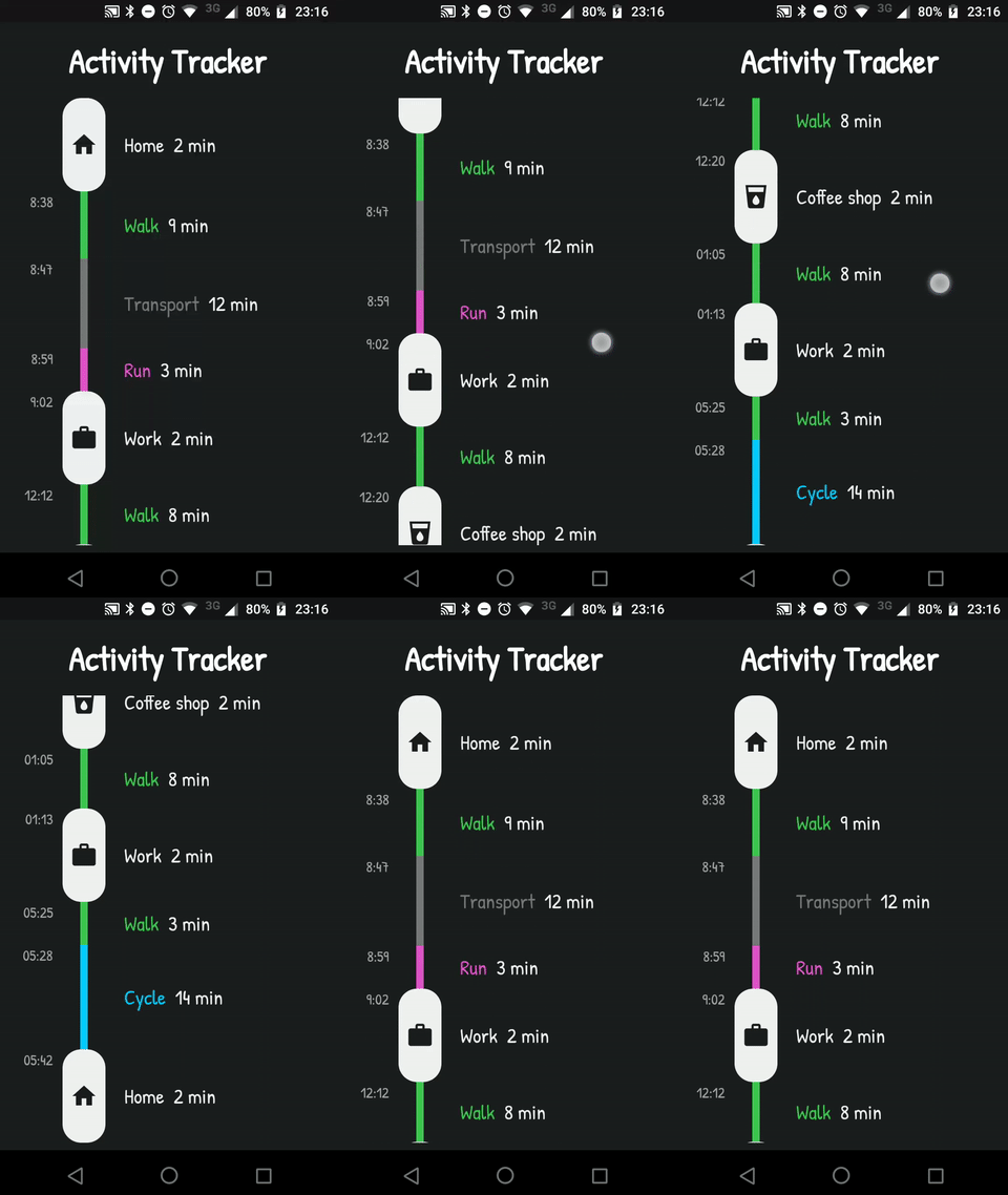
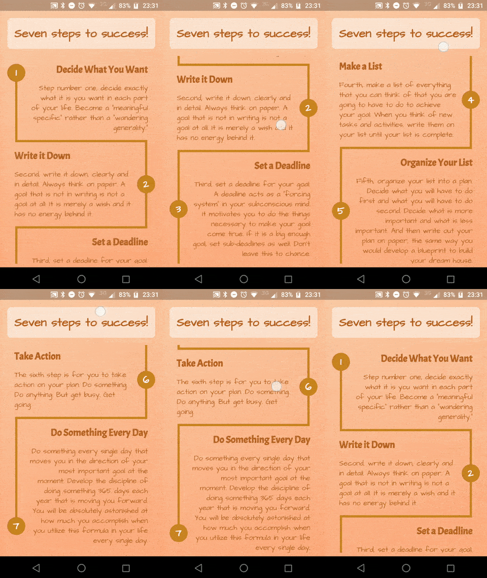
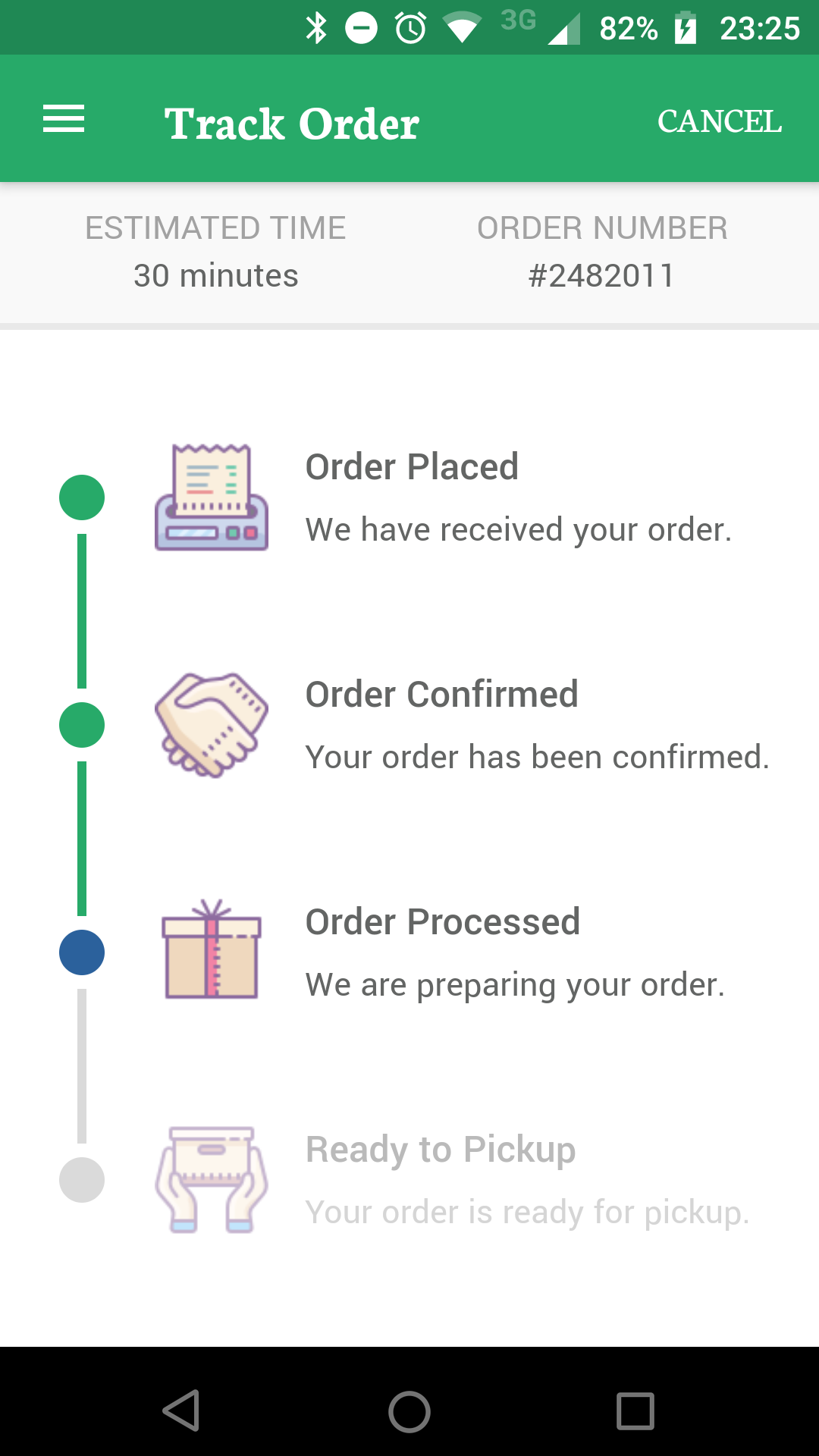
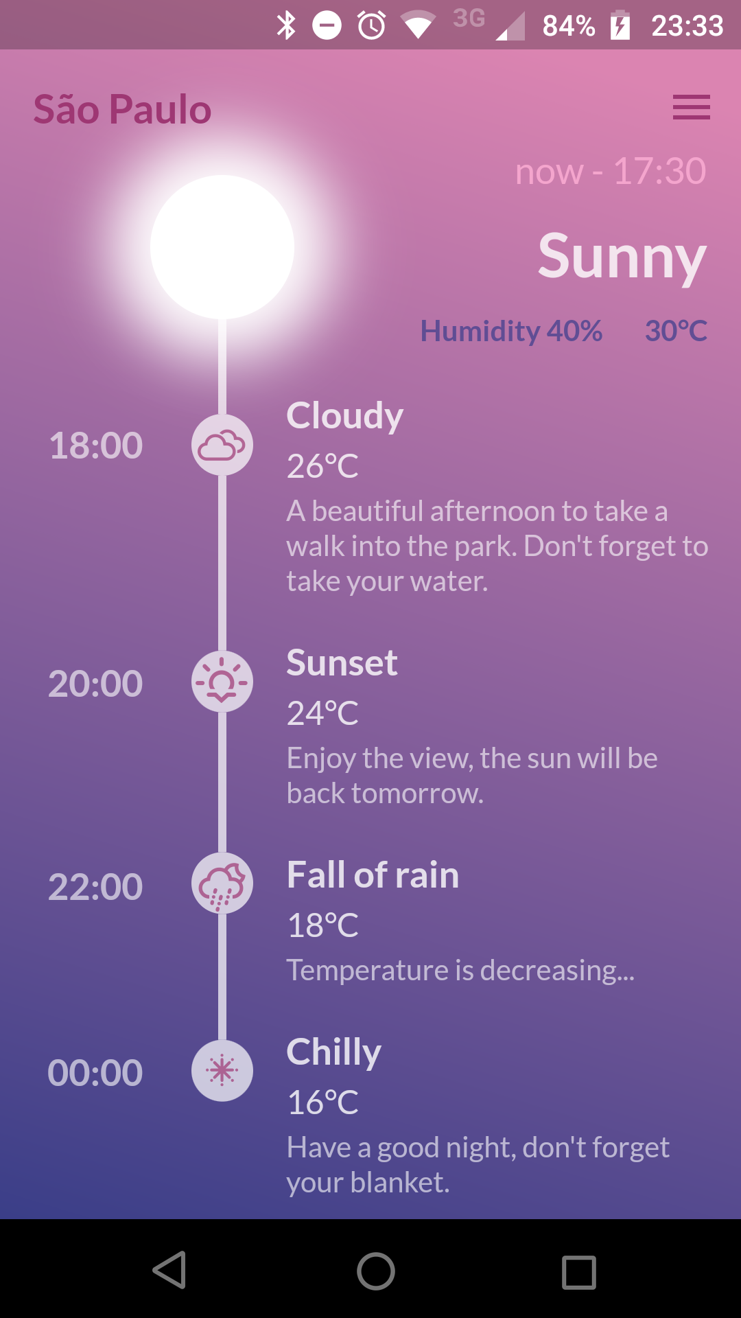
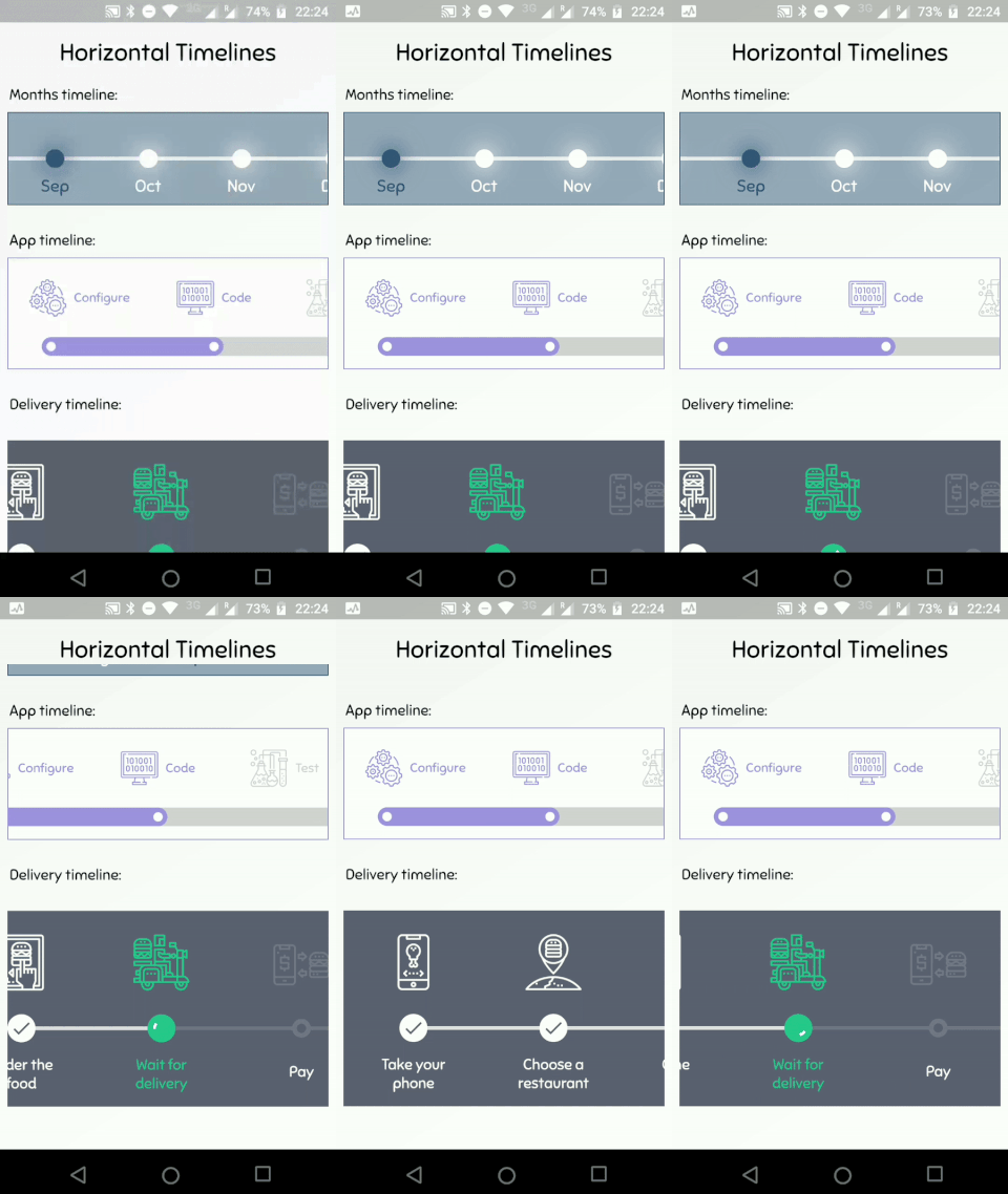
timeline_tile é um pacote Flutter projetado para criar cronogramas altamente personalizáveis com facilidade. Ele fornece widgets flexíveis para construir cronogramas verticais ou horizontais, suportando diversos estilos, cores e layouts de conteúdo. Os desenvolvedores podem personalizar a aparência dos indicadores de linha do tempo, conectores e tiles para combinar com o design do seu aplicativo. O pacote é leve e se integra perfeitamente em projetos Flutter existentes, tornando-o ideal para exibir históricos de eventos, andamento de projetos ou dados cronológicos de forma envolvente.
Casos de uso
Exibindo históricos de eventos
Mostrando marcos do projeto
Visualizando processos passo a passo
Criando cronologias interativas
Apresentando dados históricos
Melhorando os fluxos de onboarding
Principais recursos
Design de linha do tempo altamente personalizável
Suporte para layouts vertical e horizontal
indicadores e conectores configuráveis
Posicionamento flexível do conteúdo do tile
Leve e fácil integração
Estrutura de widget extensível
Indicado para
Desenvolvedores construindo interfaces do usuário cronológicas
Aplicativos que exigem rastreamento visual de progresso
Interfaces educacionais ou de introdução
Ferramentas de gerenciamento de projetos
aplicações ricas em conteúdo
Considerações
Requer configuração manual de layout para designs complexos
animações internas limitadas
Mais adequado para cronogramas estáticos ou simplesmente dinâmicos
Pode ser necessário estilização adicional para comportamento responsivo
Não otimizado para cronogramas muito longos sem ajuste de desempenho
README original
Snapshot do README original do repositório-fonte vinculado. Consulte o repositório para o conteúdo mais recente.
TimelineTile
A package to help build customisable timelines in Flutter.
Example
You can access the example project for a Timeline Showcase.
A Timeline consists in a group of TimelineTiles. To build a tile you can simply use:
TimelineTile()
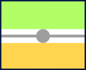
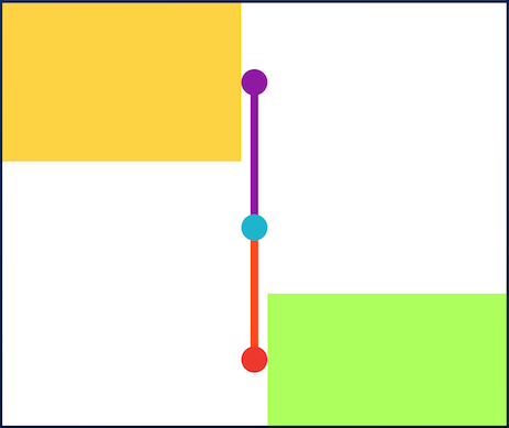
Which will build a default tile with a vertical axis, that aligns to the start, with a height of 100:
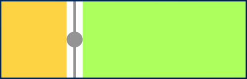
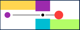
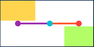
The axis can be switched to render an horizontal tile, aligned to the start, with a default width of 100:
TimelineTile(axis: TimelineAxis.horizontal)
There are 4 types of alignment.
TimelineAlign.start
TimelineAlign.end
TimelineAlign.center
TimelineAlign.manual
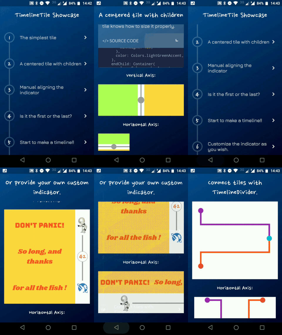
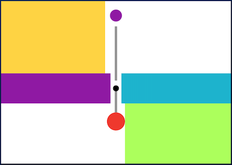
The start and end alignment allows a child in their opposite sides. On the other hand, both center and manual allows children on both sides. For example, one tile with alignment to the center:
When providing children to the vertical tile, the height will be as minimum as possible, so you can control it with a height constraint (at least minHeight). This way the tile knows how to size it properly.
If the axis is horizontal, the things are the opposite. The width will be as minimum as possible, so you can control it with a width constraint (at least minWidth). This way the tile knows how to size it properly.
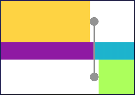
With TimelineAlign.manual you can provide the lineXY, which allows you to specify a value from 0.0 to 1.0, that represents a size percentage. For example, aligning at 30% of the width or height:
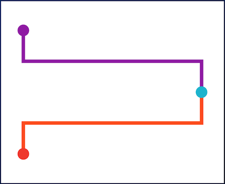
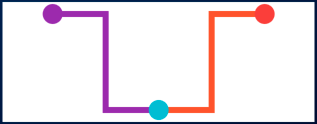
You can finally start to combine some tiles to make a Timeline. The flag hasIndicator can control whether an indicator should or shouldn't be rendered.
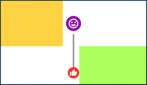
The default indicator is a circle, and you can customize it as you wish. With IndicatorStyle you can change the color, the X/Y position based on values from 0.0 to 1.0 or give it a padding. You must explicitly provide its width (vertical) or height (horizontal) though.
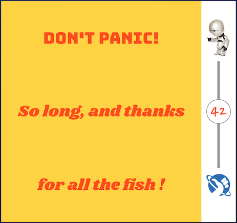
With the indicator parameter you can customize the tile with your own indicator. However, you must control its size through both width and height parameters.