Buscar pacotes, repositórios e categorias de apps

Capa de titled_navigation_bar
Detalhes do pacotev4.1.0

titled_navigation_bar

Uma barra de navegação inferior bonita, limpa e simples com animação suave ao clicar. Este pacote é altamente personalizável, leia abaixo para mais detalhes.

Downloads em 30 dias
193
Curtidas
142
Pontos Pub
40

Instalar pacote

flutter pub add titled_navigation_bar

Visão geral do pacote

Orientação gerada a partir de informações públicas. Apenas para referência.

Uma barra de navegação inferior visualmente atraente e minimalista para Flutter com transições suaves e animadas ao selecionar. Altamente personalizável, permite que desenvolvedores ajustem aparência e comportamento para combinar com o design do aplicativo. O pacote se concentra em estética limpa e interação intuitiva do usuário, tornando-o ideal para aplicativos que priorizam uma interface moderna e polida. Oferece integração fácil por meio de um simples comando pub e é mantido com foco em desempenho e usabilidade.

Casos de uso

  • Aplicativos móveis que exigem uma barra de navegação inferior elegante
  • Experiências de navegação personalizáveis
  • Aplicativos focados em polimento visual e experiência do usuário
  • Componentes de interface simples, mas elegantes
  • Barras de navegação com mudanças de estado animadas

Principais recursos

  • Animações suaves de clique
  • Design altamente personalizável
  • Estética minimalista e limpa
  • Integração fácil com o Flutter
  • Suporta estilização dinâmica de rótulos

Indicado para

  • Desenvolvedores Flutter procurando interface de navegação moderna
  • Projetos que enfatizam a consistência do design
  • Aplicativos com múltiplas guias ou seções
  • Desenvolvedores que querem soluções leves de navegação
  • Aplicativos móveis focados no design

Considerações

  • Personalização específica de plataforma limitada
  • Sem suporte a ícones embutidos (requer configuração manual)
  • Mais adequado para padrões de navegação simples
  • Pode exigir estilos adicionais para layouts complexos
  • Não otimizado para conjuntos de navegação muito grandes

README original

Snapshot do README original do repositório-fonte vinculado. Consulte o repositório para o conteúdo mais recente.

Pub Awesome Flutter

Titled Bottom Navigation Bar

A beautiful, clean and simple bottom navigation bar with smooth animation on click. This package is high customizable, read more bellow for more details.

You can see the source code of this lib inside the /lib folder.

Show some :heart: and star the repo to support this project

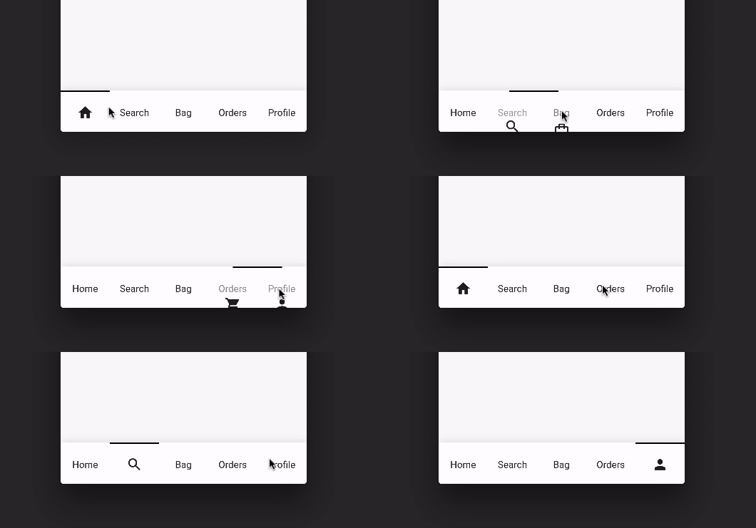
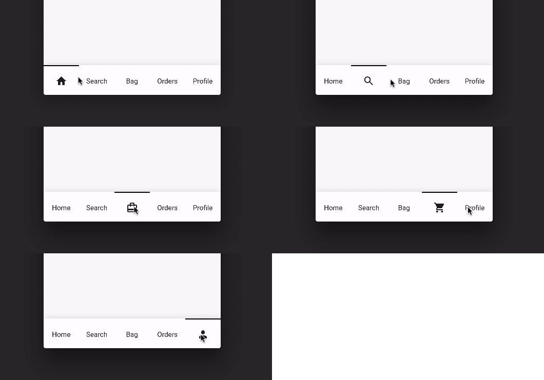
Preview (default mode)

Default Mode Gif

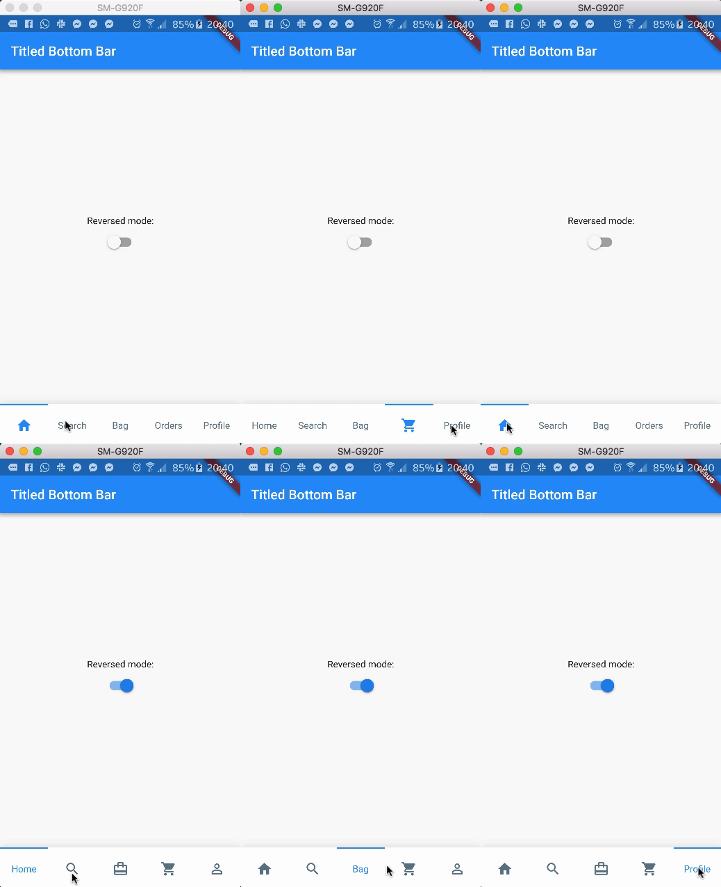
Preview (with reverse mode)

Reversed Mode Gif

Package overview

  • [x] Custom icon color
  • [x] Custom indicator color
  • [x] Support from two to five items
  • [x] Reverse mode (show selected item as icon or title)
  • [x] Option to define custom item background color
  • [x] Use currentIndex property to update the Bar giving a tab position
  • [x] No need setState(...) to update the current index
  • [x] Support RTL TextDirection (thanks to Victor Uvarov)

Getting Started

Follow these steps to use this library

Add the plugin:
dependencies:
  ...
  titled_navigation_bar: ^5.0.0-nullsafety.0
Import the package
import 'package:titled_navigation_bar/titled_navigation_bar.dart';
Adding the widget
bottomNavigationBar: TitledBottomNavigationBar(
  currentIndex: 2, // Use this to update the Bar giving a position
  onTap: (index){
    print("Selected Index: $index");
  },
  items: [
      TitledNavigationBarItem(title: Text('Home'), icon: Icons.home),
      TitledNavigationBarItem(title: Text('Search'), icon: Icons.search),
      TitledNavigationBarItem(title: Text('Bag'), icon: Icons.card_travel),
      TitledNavigationBarItem(title: Text('Orders'), icon: Icons.shopping_cart),
      TitledNavigationBarItem(title: Text('Profile'), icon: Icons.person_outline),
  ]
)

Customization (Optional)

TitledBottomNavigationBar

onTap - Use this to get notified when an item is clicked, you can retrieve the current item's index on this function. Should not be null!
items - The items of your bottom navigation bar. Use the TitledNavigationBarItem class to add items. Should not be null!
curve - Use this to define your custom curve animation. Should not be null!
reverse - If true, the visible widget of the selected item will be the Text (with the title of the item). If false, the visible widget of the selected item will be the icon. Default to false
activeColor - The active Text/Icon color. The default color is the indicatorColor of your app Theme.
inactiveColor - The inactive Text/Icon color. The default is the black color.
indicatorColor - The indicator color. The default color is the indicatorColor of your app Theme.
currentIndex - Use this to update the Bar giving a position.
enableShadow - Use this to remove the NavigationBar's shadow

TitledNavigationBarItem

icon -The icon of this item. This will be used as default state if reverse mode is disabled
title - The title of this item. This will be used as default state if reverse mode is enabled

Categorias

Repositório-fonte

Projetos que usam este pacote