Buscar pacotes, repositórios e categorias de apps

Capa de toggle_switch
Detalhes do pacotev2.3.0

toggle_switch

Interruptor de alternância - Um widget de interruptor de alternância simples. Pode ser totalmente personalizado com ícones desejados, largura, cores, texto, raio de borda, etc. Também mantém o estado de seleção.

AndroidiOSWebmacOSWindowsLinux
Downloads em 30 dias
217 mil
Curtidas
1,6 mil
Pontos Pub
160

Instalar pacote

flutter pub add toggle_switch

Visão geral do pacote

Orientação gerada a partir de informações públicas. Apenas para referência.

Um widget de interruptor personalizável para o Flutter que suporta personalização total da aparência e comportamento. Os usuários podem ajustar largura, cores, ícones, texto, raio de borda e muito mais. Mantém o estado de seleção durante os rebuilds e é adequado para diversas necessidades de interface com usuário que exigem alternância liga/desliga. O pacote é leve e compatível com todas as principais plataformas, incluindo móvel, web e desktop.

Casos de uso

  • Configurações de preferência do usuário
  • Alternadores de recurso ligado/desligado
  • Controles de entrada de formulário
  • Alternadores de modo escuro
  • Painéis de configuração de perfil

Principais recursos

  • Design totalmente personalizável
  • Mantém o estado de seleção
  • Suporta ícones e texto
  • Compatibilidade multiplataforma
  • Tamanho e estilo ajustáveis
  • Integração simples da API

Indicado para

  • Desenvolvedores construindo interfaces responsivas
  • Aplicativos que precisam de entradas baseadas em alternância
  • Componentes de formulário personalizáveis
  • Projetos multiplataforma do Flutter

Considerações

  • Requer manutenção manual do estado em alguns casos
  • animações internas limitadas
  • Mais adequado para lógica de alternância simples
  • Não ideal para widgets interativos complexos

README original

Snapshot do README original do repositório-fonte vinculado. Consulte o repositório para o conteúdo mais recente.

Toggle Switch

A simple toggle switch widget. It can be fully customized with desired icons, width, colors, text, corner radius, animation etc. It also maintains selection state.

Getting Started

In the pubspec.yaml of your flutter project, add the following dependency:

dependencies:
  ...
  toggle_switch: ^2.3.0

Import it:

import 'package:toggle_switch/toggle_switch.dart';

Usage Examples

Basic toggle switch
// Here, default theme colors are used for activeBgColor, activeFgColor, inactiveBgColor and inactiveFgColor
ToggleSwitch(
  initialLabelIndex: 0,
  totalSwitches: 3,
  labels: ['America', 'Canada', 'Mexico'],
  onToggle: (index) {
    print('switched to: $index');
  },
),

Basic toggle switch

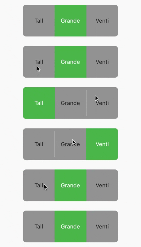
Basic toggle switch with custom height and font size
ToggleSwitch(
  minWidth: 90.0,
  minHeight: 90.0,
  fontSize: 16.0,
  initialLabelIndex: 1,
  activeBgColor: [Colors.green],
  activeFgColor: Colors.white,
  inactiveBgColor: Colors.grey,
  inactiveFgColor: Colors.grey[900],
  totalSwitches: 3,
  labels: ['Tall', 'Grande', 'Venti'],
  onToggle: (index) {
    print('switched to: $index');
  },
),

Basic toggle switch with custom height and font size

With text or icon and custom widths
ToggleSwitch(
  customWidths: [90.0, 50.0],
  cornerRadius: 20.0,
  activeBgColors: [[Colors.cyan], [Colors.redAccent]],
  activeFgColor: Colors.white,
  inactiveBgColor: Colors.grey,
  inactiveFgColor: Colors.white,
  totalSwitches: 2,
  labels: ['YES', ''],
  icons: [null, FontAwesomeIcons.times],
  onToggle: (index) {
    print('switched to: $index');
  },
),

With text or icon and custom widths

With icons, text and different active background colors
ToggleSwitch(
  minWidth: 90.0,
  initialLabelIndex: 1,
  cornerRadius: 20.0,
  activeFgColor: Colors.white,
  inactiveBgColor: Colors.grey,
  inactiveFgColor: Colors.white,
  totalSwitches: 2,
  labels: ['Male', 'Female'],
  icons: [FontAwesomeIcons.mars, FontAwesomeIcons.venus],
  activeBgColors: [[Colors.blue],[Colors.pink]],
  onToggle: (index) {
    print('switched to: $index');
  },
),

With icons, text and different active background colors

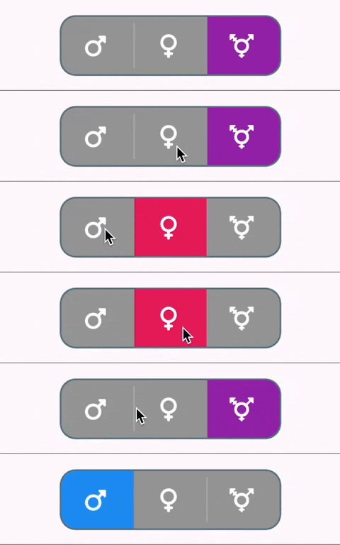
With border color, border width, icons, custom height and different active background colors
ToggleSwitch(
  minWidth: 90.0,
  minHeight: 70.0,
  initialLabelIndex: 2,
  cornerRadius: 20.0,
  activeFgColor: Colors.white,
  inactiveBgColor: Colors.grey,
  inactiveFgColor: Colors.white,
  totalSwitches: 3,
  icons: [
    FontAwesomeIcons.mars,
    FontAwesomeIcons.venus,
    FontAwesomeIcons.transgender
  ],
  iconSize: 30.0,
  borderWidth: 2.0,
  borderColor: [Colors.blueGrey],
  activeBgColors: [[Colors.blue], [Colors.pink], [Colors.purple]],
  onToggle: (index) {
    print('switched to: $index');
  },
),

With border color, border width, icons, custom height and different active background colors

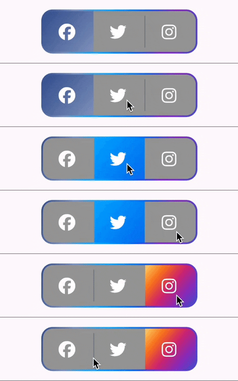
With gradient border color, divider color and gradient active background colors
ToggleSwitch(
  minWidth: 90.0,
  minHeight: 70.0,
  initialLabelIndex: 0,
  cornerRadius: 20.0,
  activeFgColor: Colors.white,
  inactiveBgColor: Colors.grey,
  inactiveFgColor: Colors.white,
  totalSwitches: 3,
  icons: [
    FontAwesomeIcons.facebook,
    FontAwesomeIcons.twitter,
    FontAwesomeIcons.instagram
  ],
  iconSize: 30.0,
  borderColor: [Color(0xff3b5998), Color(0xff8b9dc3), Color(0xff00aeff), Color(0xff0077f2), Color(0xff962fbf), Color(0xff4f5bd5)],
  dividerColor: Colors.blueGrey,
  activeBgColors: [[Color(0xff3b5998), Color(0xff8b9dc3)], [Color(0xff00aeff), Color(0xff0077f2)], [Color(0xfffeda75), Color(0xfffa7e1e), Color(0xffd62976), Color(0xff962fbf), Color(0xff4f5bd5)]],
  onToggle: (index) {
    print('switched to: $index');
  },
),

With gradient border color, divider color and gradient active background colors

With bounceInOut animation
ToggleSwitch(
  minWidth: 90.0,
  minHeight: 70.0,
  initialLabelIndex: 0,
  cornerRadius: 20.0,
  activeFgColor: Colors.white,
  inactiveBgColor: Colors.grey,
  inactiveFgColor: Colors.white,
  totalSwitches: 2,
  icons: [
    FontAwesomeIcons.lightbulb,
    FontAwesomeIcons.solidLightbulb,
  ],
  iconSize: 30.0,
  activeBgColors: [[Colors.black45, Colors.black26], [Colors.yellow, Colors.orange]],
  animate: true, // with just animate set to true, default curve = Curves.easeIn
  curve: Curves.bounceInOut, // animate must be set to true when using custom curve
  onToggle: (index) {
    print('switched to: $index');
  },
),

With bounceInOut animation

With radius style
ToggleSwitch(
  minWidth: 90.0,
  cornerRadius: 20.0,
  activeBgColors: [[Colors.green[800]!], [Colors.red[800]!]],
  activeFgColor: Colors.white,
  inactiveBgColor: Colors.grey,
  inactiveFgColor: Colors.white,
  initialLabelIndex: 1,
  totalSwitches: 2,
  labels: ['True', 'False'],
  radiusStyle: true,
  onToggle: (index) {
    print('switched to: $index');
  },
),

With radius style

With custom text styles, null initial label, double tap to de-activate
ToggleSwitch(
  minWidth: 90.0,
  cornerRadius: 20.0,
  inactiveFgColor: Colors.white,
  initialLabelIndex: null,
  doubleTapDisable: true, // re-tap active widget to de-activate
  totalSwitches: 3,
  labels: ['Normal', 'Bold', 'Italic'],
  customTextStyles: [
    null,
    TextStyle(
        color: Colors.brown,
        fontSize: 18.0,
        fontWeight: FontWeight.w900),
    TextStyle(
        color: Colors.black,
        fontSize: 16.0,
        fontStyle: FontStyle.italic)
  ],
  onToggle: (index) {
    print('switched to: $index');
  },
),

With custom text styles, null initial label, double tap to de-activate

With custom icons
ToggleSwitch(
  minWidth: 90.0,
  minHeight: 90.0,
  cornerRadius: 20.0,
  activeBgColors: [
    [Color(0xfffdbb0a)],
    [Colors.black54],
    [Colors.white54]
  ],
  inactiveFgColor: Colors.white,
  initialLabelIndex: 2,
  totalSwitches: 3,
  customIcons: [
    Icon(
      FontAwesomeIcons.ccVisa,
      color: Color(0xff1a1f71),
      size: 55.0,
    ),
    Icon(
      FontAwesomeIcons.ccMastercard,
      color: Color(0xffF79E1B),
      size: 55.0,
    ),
    Icon(
      FontAwesomeIcons.ccAmex,
      color: Color(0xff27AEE3),
      size: 55.0,
    )
  ],
  onToggle: (index) {
    print('switched to: $index');
  },
),

With custom icons

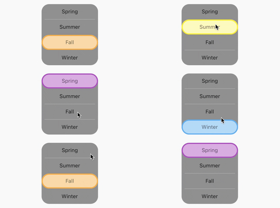
Vertical toggle switch with active border
ToggleSwitch(
  activeBorders: [
    Border.all(
      color: Colors.purple,
      width: 3.0,
    ),
    Border.all(
      color: Colors.yellow.shade700,
      width: 3.0,
    ),
    Border.all(
      color: Colors.deepOrangeAccent,
      width: 3.0,
    ),
    Border.all(
      color: Colors.blue.shade500,
      width: 3.0,
    ),
  ],
  activeFgColor: Colors.black54,
  isVertical: true,
  minWidth: 150.0,
  radiusStyle: true,
  cornerRadius: 20.0,
  initialLabelIndex: 2,
  activeBgColors: [
    [Colors.purpleAccent],
    [Colors.yellow],
    [Colors.orange],
    [Colors.lightBlueAccent]
  ],
  labels: ['Spring', 'Summer', 'Fall', 'Winter'],
  onToggle: (index) {
    print('switched to: $index');
  },
),

Vertical toggle switch with active border

Custom widths greater than device width
SingleChildScrollView(
  scrollDirection: Axis.horizontal,
  child: Scrollbar(
    child: Padding(
      padding: const EdgeInsets.symmetric(horizontal: 10.0),
      child: ToggleSwitch(
        customWidths: [300.0, 100.0, 100.0],
        cornerRadius: 20.0,
        activeBgColors: [
          [Colors.green],
          [Colors.redAccent],
          [Colors.blue]
        ],
        activeFgColor: Colors.white,
        inactiveBgColor: Colors.grey,
        inactiveFgColor: Colors.white,
        labels: ['Yes, the statement above is true', 'False', 'Other'],
        onToggle: (index) {
          print('switched to: $index');
        },
      ),
    ),
  ),
),

Custom widths greater than device width

Multi-line text with custom text style inheriting activeFgColor and inactiveFgColor
ToggleSwitch(
  initialLabelIndex: 0,
  minHeight: 100.0,
  minWidth: 100.0,
  activeBgColor: [Colors.blueAccent.shade200],
  activeFgColor: Colors.yellow,
  customTextStyles: [
    TextStyle(
      fontSize: 15.0
    )
  ],
  multiLineText: true,
  centerText: true,
  totalSwitches: 2,
  labels: ['This is multi-line text.', 'One line'],
  onToggle: (index) {
    print('switched to: $index');
  },
),

Multi-line text with custom text style inheriting activeFgColor and inactiveFgColor

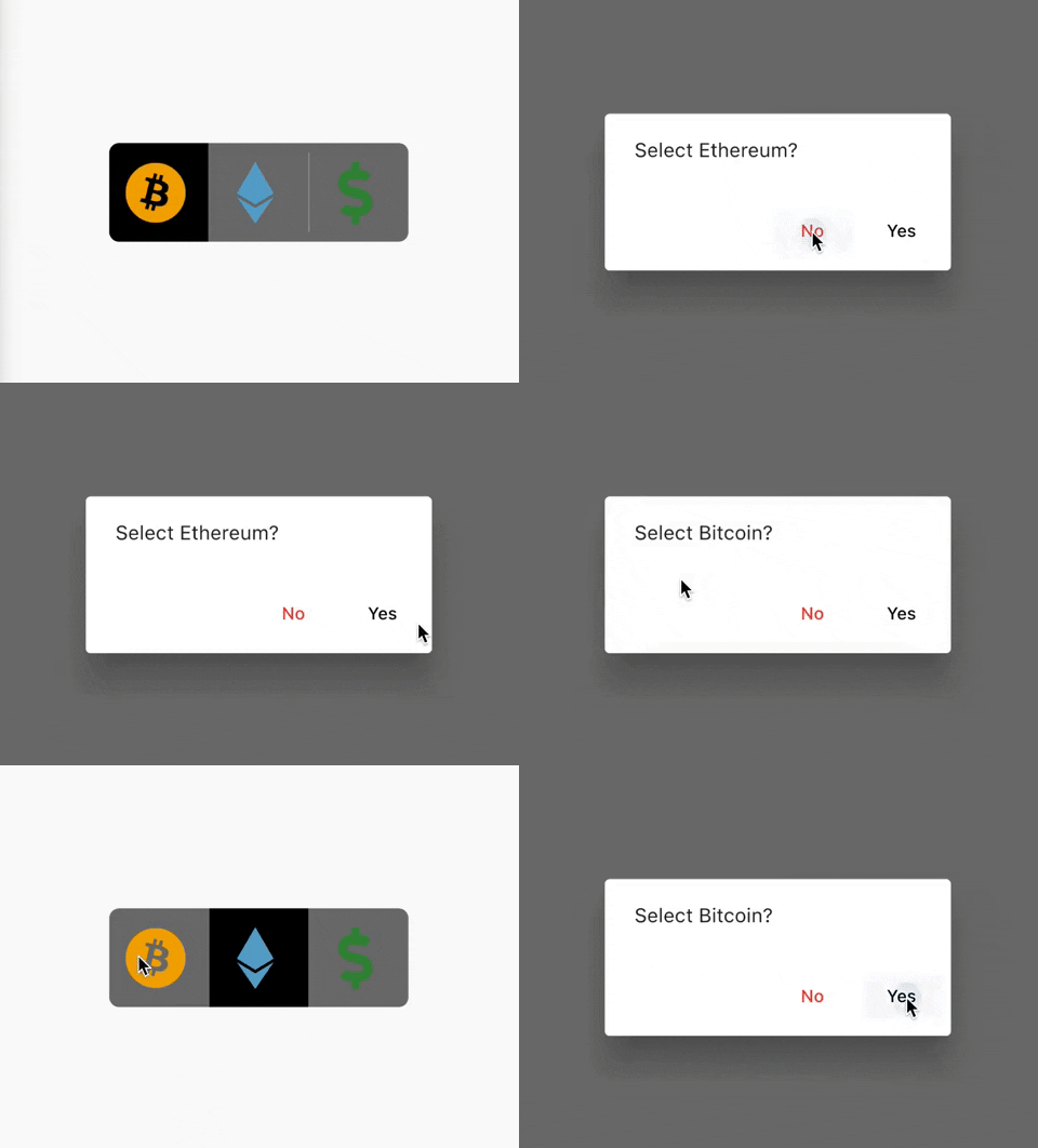
Cancel toggle
ToggleSwitch(
  initialLabelIndex: 0,
  inactiveBgColor: Colors.black54,
  activeBgColor: [Colors.black],
  totalSwitches: 3,
  minHeight: 80.0,
  minWidth: 80.0,
  customIcons: [
    Icon(
      FontAwesomeIcons.bitcoin,
      color: Color(0xFFF2A900),
      size: 50.0,
    ),
    Icon(
      FontAwesomeIcons.ethereum,
      color: Color(0xFF5ca6ce),
      size: 50.0,
    ),
    Icon(
      FontAwesomeIcons.dollarSign,
      color: Colors.green.shade700,
      size: 50.0,
    )
  ],
  onToggle: (index) {
    print('switched to: $index');
  },
  cancelToggle: (index) async {
    String selection = index == 0
        ? 'Bitcoin'
        : index == 1
            ? 'Ethereum'
            : 'Fiat';
    return await showDialog(
      context: context,
      builder: (dialogContext) => AlertDialog(
        content: Text("Select $selection?"),
        actions: [
          TextButton(
              child: Text("No",
                  style: TextStyle(color: Colors.red)),
              onPressed: () {
                Navigator.pop(dialogContext, true);
              }),
          TextButton(
              child: Text("Yes",
                  style: TextStyle(color: Colors.black)),
              onPressed: () {
                Navigator.pop(dialogContext, false);
              })
        ],
      ),
    );
  },
),

Cancel toggle

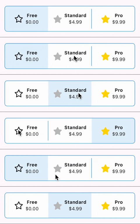
Custom widgets
ToggleSwitch(
  initialLabelIndex: 0,
  minHeight: 75.0,
  minWidth: double.maxFinite,
  activeBgColor: [Colors.blue.shade50],
  inactiveBgColor: Colors.white,
  dividerColor: Colors.blue,
  borderColor: [Colors.blue],
  borderWidth: 1.0,
  customWidgets: [
    // Overrides default widgets, foreground colors
    Row(
      mainAxisAlignment: MainAxisAlignment.center,
      children: [
        Icon(
          FontAwesomeIcons.star,
        ),
        const SizedBox(width: 10.0),
        Column(
          mainAxisAlignment: MainAxisAlignment.center,
          children: [
            Text(
              'Free',
              style: TextStyle(
                fontWeight: FontWeight.bold,
              ),
              maxLines: 1,
              overflow: TextOverflow.ellipsis,
            ),
            Text(
              '\$0.00',
              maxLines: 1,
              overflow: TextOverflow.ellipsis,
            ),
          ],
        ),
      ],
    ),
    Row(
      mainAxisAlignment: MainAxisAlignment.center,
      children: [
        Icon(
          FontAwesomeIcons.solidStar,
          color: Color(0xffC0C0C0),
        ),
        const SizedBox(width: 10.0),
        Column(
          mainAxisAlignment: MainAxisAlignment.center,
          children: [
            Text(
              'Standard',
              style: TextStyle(
                fontWeight: FontWeight.bold,
              ),
              maxLines: 1,
              overflow: TextOverflow.ellipsis,
            ),
            Text(
              '\$4.99',
              maxLines: 1,
              overflow: TextOverflow.ellipsis,
            ),
          ],
        ),
      ],
    ),
    Row(
      mainAxisAlignment: MainAxisAlignment.center,
      children: [
        Icon(
          FontAwesomeIcons.solidStar,
          color: Color(0xffFFD700),
        ),
        const SizedBox(width: 10.0),
        Column(
          mainAxisAlignment: MainAxisAlignment.center,
          children: [
            Text(
              'Pro',
              style: TextStyle(
                fontWeight: FontWeight.bold,
              ),
              maxLines: 1,
              overflow: TextOverflow.ellipsis,
            ),
            Text(
              '\$9.99',
              maxLines: 1,
              overflow: TextOverflow.ellipsis,
            ),
          ],
        ),
      ],
    ),
  ],
  onToggle: (index) {
    print('switched to: $index');
  },
),

Custom widgets

TextDirection.rtl and corner radius
// When ToggleSwitch is used with Directionality widget and textDirection is set to TextDirection.rtl (right-to-left), 
// switches are displayed right to left along with their respective index values. In this case, corner radius of switches aren't set correctly. 
// To fix this, please use textDirectionRTL parameter and set it to true as shown in the example below. 
Directionality(
  textDirection: TextDirection.rtl,
  child: ToggleSwitch(
    initialLabelIndex: 0,
    cornerRadius: 12.0,
    textDirectionRTL: true,
    activeFgColor: Colors.white,
    totalSwitches: 2,
    labels: ['left', 'right'],
    onToggle: (index) {
      print('switched to: $index');
    },
  ),
),
setState() inside onToggle

Example code with explanation

Code Contributors

Categorias

Repositório-fonte

Projetos que usam este pacote

Rankings