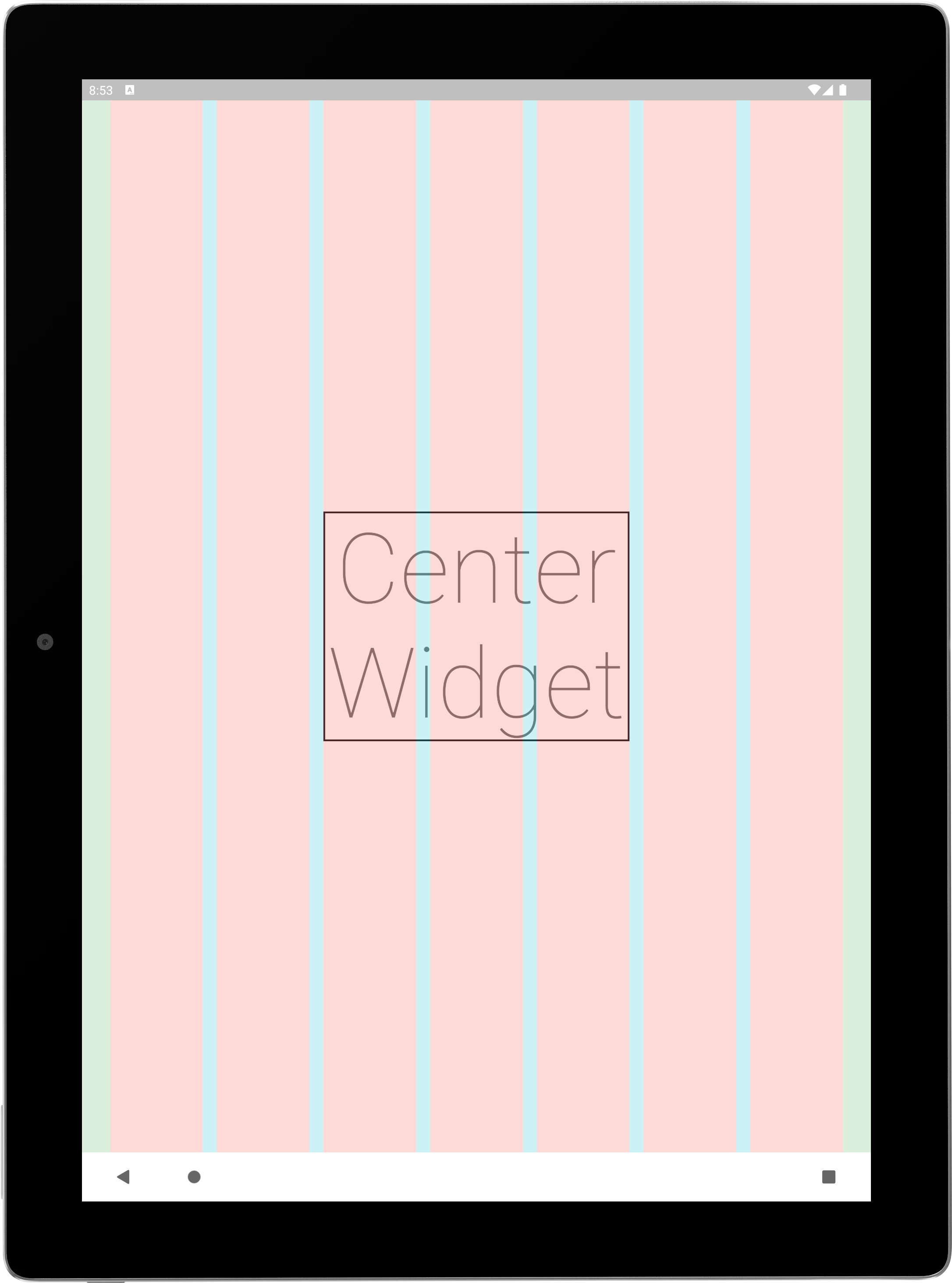
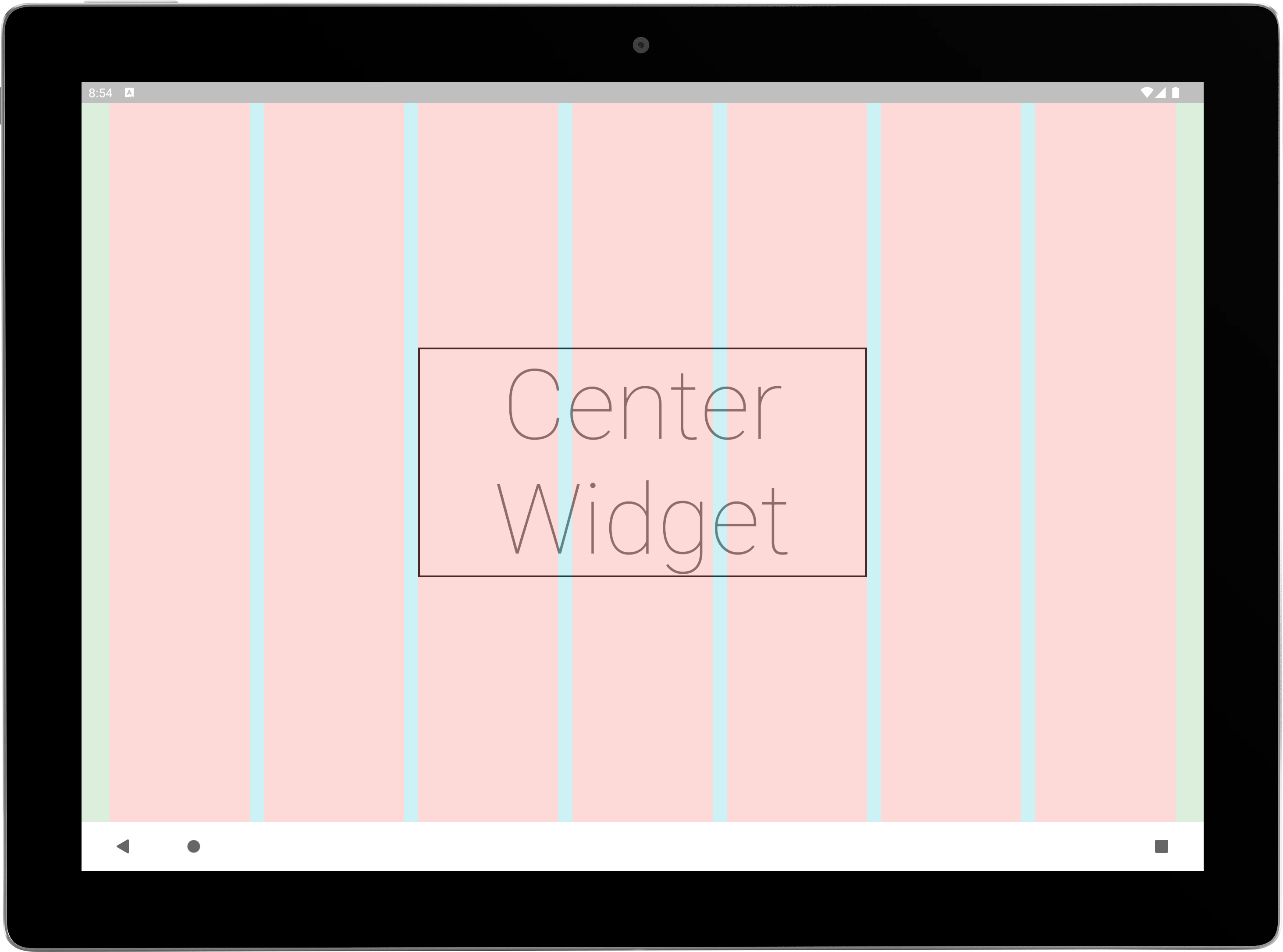
A biblioteca Wolt Responsive Layout Grid ajuda você a criar layouts de grade dinâmicos e adaptativos que se ajustam suavemente a vários tamanhos de tela.
Orientação gerada a partir de informações públicas. Apenas para referência.
O Wolt Responsive Layout Grid é um pacote Flutter projetado para simplificar a criação de layouts em grade dinâmicos e adaptáveis que se ajustam automaticamente a diferentes tamanhos de tela em múltiplas plataformas. Ele permite que desenvolvedores construam interfaces do usuário responsivas com espaçamento e alinhamento consistentes, garantindo uma apresentação visual ideal no Android, iOS, Web, macOS, Windows e Linux. A biblioteca fornece APIs intuitivas para definir estruturas de grade flexíveis com base em pontos de quebra e restrições, reduzindo o gerenciamento manual de layout. Ideal para interfaces complexas que exigem responsividade fluida, ele aumenta a eficiência no desenvolvimento mantendo a consistência do design.
Casos de uso
Construindo painéis responsivos
Criando malhas de produtos adaptativas
Designando layouts multiplataforma
Implementando arranjos de cartão fluidos
Desenvolvendo painéis administrativos escaláveis
Principais recursos
Adaptação automática do tamanho da tela
definições de grade flexíveis
Alterações de layout baseadas em pontos de quebra
Suporte multiplataforma
Espaçamento e alinhamento consistentes
Integração simples da API
Indicado para
Desenvolvedores de UI focados na responsividade
Equipes construindo aplicativos multiplataforma
Projetos que exigem layouts de grade dinâmicos
Sistemas de design com componentes adaptativos
Interfaces complexas de painel ou catálogo
Considerações
Requer compreensão dos princípios de design responsivo
Pode ser necessário personalizar para layouts altamente específicos
Melhor usado em conjunto com os widgets de layout do Flutter
Impacto no desempenho em grades muito grandes
Documentação limitada além dos exemplos básicos
README original
Snapshot do README original do repositório-fonte vinculado. Consulte o repositório para o conteúdo mais recente.
WoltResponsiveLayoutGrid
Creating responsive grid layouts in Flutter applications can be a challenging task. Developers often struggle with achieving consistent and adaptive designs across various screen sizes and orientations. With the Wolt Responsive Layout Grid library, building responsive grid layouts becomes much simpler.
Wolt Responsive Layout Grid library introduces the Flutter implementation of Material Design's responsive layout grid. It provides a unified, multi-platform grid system that ensures consistency and visual integrity regardless of the device or operating system being used.
Features
The Wolt Responsive Layout Grid library offers the following key features:
Responsive Grid Layout: The WoltResponsiveLayoutGrid widget enables the creation of responsive grid layouts that adapt to different screen sizes and orientations.
Material Design Adaptation: The library implements Material Design's responsive layout grid, guaranteeing consistency and adhering to established design principles.
Customizable Spacing: By adjusting the gutter and margin properties of the WoltResponsiveLayoutGrid widget, developers have full control over the spacing, allowing developers to create layouts that match the design requirements.
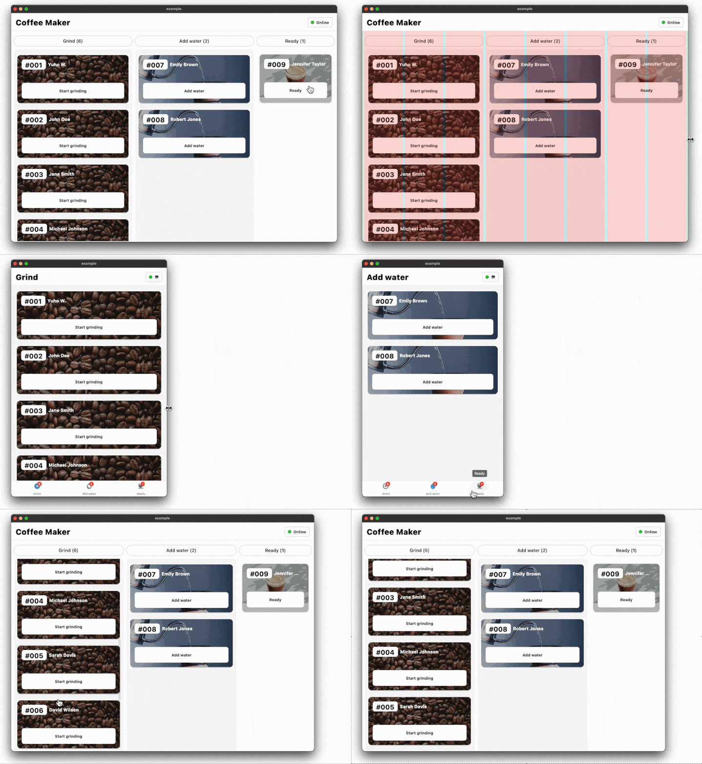
Screen Width Adaptation: The WoltScreenWidthAdaptiveWidget allows developers to adapt the child widget based on the screen width, dynamically adjusting the layout and content presentation. By providing different child widgets for small and large screens, the WoltScreenWidthAdaptiveWidget automatically switches between them based on the screen width, ensuring a seamless user experience across various devices.
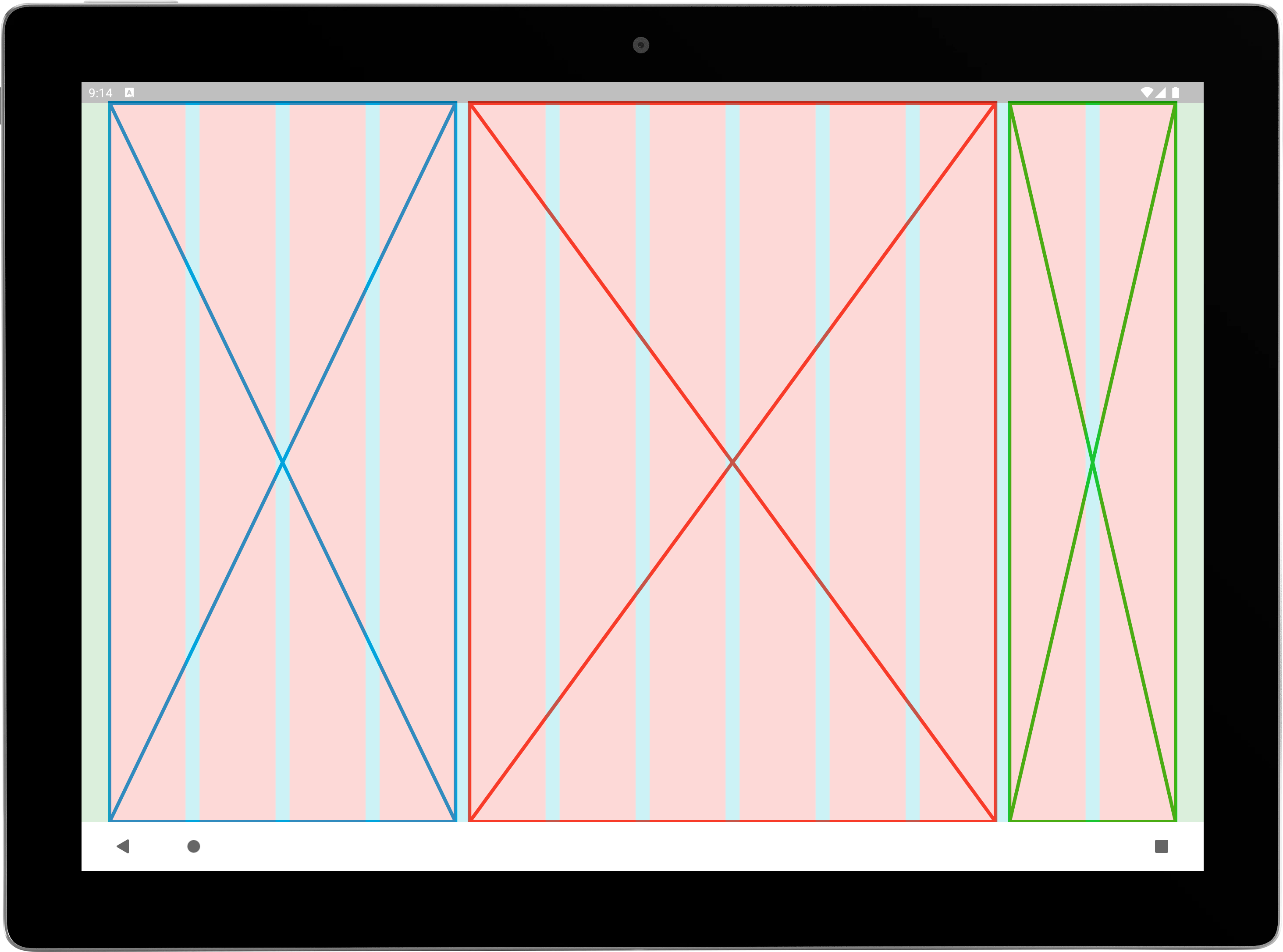
Overlay for Visual Debugging: During development, it's often helpful to have a visual representation of the grid layout to fine-tune and verify its structure. The Wolt Responsive Layout Grid library includes an overlay feature that enables you to visualize the grid layout. This overlay renders colored boxes for each column and gutter, making it easier to debug and ensure proper alignment. The overlay can be enabled or disabled based on debugging needs.
Getting started
To use this plugin, add wolt_responsive_layout_grid as a dependency in your pubspec.yaml file.
Usage
WoltResponsiveLayoutGrid
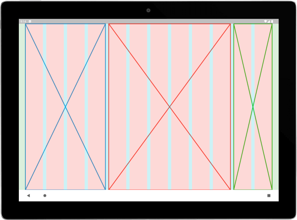
The WoltResponsiveLayoutGrid widget is the centerpiece of the library. By utilizing a list of WoltColumnSpanCell objects, you can define the content and column spans for each cell. This allows for the grouping of one or more columns to create sections or content within the available space.
WoltResponsiveLayoutGrid widget provides a factory constructor centered that simplifies the creation of centered layouts with a child widget and specified column counts. This constructor takes the following parameters:
child: The child widget to be centered within the grid layout.
centerWidgetColumnCount: The number of columns that the child widget should occupy.
paddedColumnCountPerSide: The number of padded columns to be added on each side of the child widget. These padded columns create empty spaces around the centered widget, resulting in a visually balanced and appealing layout.
The WoltScreenWidthAdaptiveWidget is designed to provide adaptive rendering based on the screen width. It allows developers to define two child widgets: one for small screens and another for large screens. The widget automatically switches between the child widgets based on the screen width, ensuring that the interface adapts seamlessly to different device sizes.



 \