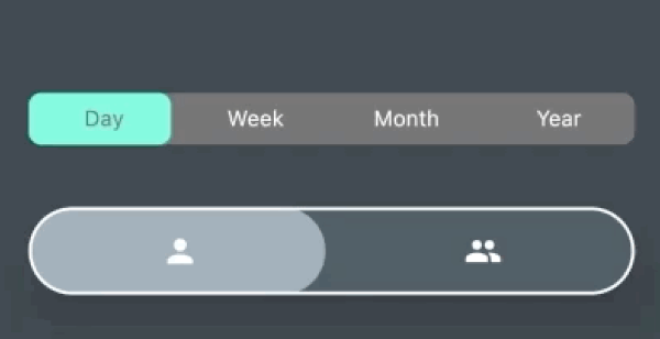
animated_button_bar
AnimatedButtonBar is a flutter library that allows you to create a row of buttons with an animation on selection.
Getting started
Add this to your app's pubspec.yaml file:
dependencies:
  animated_button_bar: ^0.0.2
Usage
Then you have to import the package with:
import 'package:animated_button_bar/animated_button_bar.dart';
And use an AnimatedBarButton like this:
Column(
mainAxisAlignment: MainAxisAlignment.center,
children: [
AnimatedButtonBar(
radius: 8.0,
padding: const EdgeInsets.all(16.0),
invertedSelection: true,
children: [
ButtonBarEntry(onTap: () => print('First item tapped'), child: Text('Day')),
ButtonBarEntry(onTap: () => print('Second item tapped'), child: Text('Week')),
ButtonBarEntry(onTap: () => print('Third item tapped'), child: Text('Month')),
ButtonBarEntry(onTap: () => print('Fourth item tapped'), child: Text('Year'))
],
),
AnimatedButtonBar(
radius: 32.0,
padding: const EdgeInsets.all(16.0),
backgroundColor: Colors.blueGrey.shade800,
foregroundColor: Colors.blueGrey.shade300,
elevation: 24,
borderColor: Colors.white,
borderWidth: 2,
innerVerticalPadding: 16,
children: [
ButtonBarEntry(onTap: () => print('First item tapped'), child: Icon(Icons.person)),
ButtonBarEntry(onTap: () => print('Second item tapped'), child: Icon(Icons.people)),
],
),
],
),
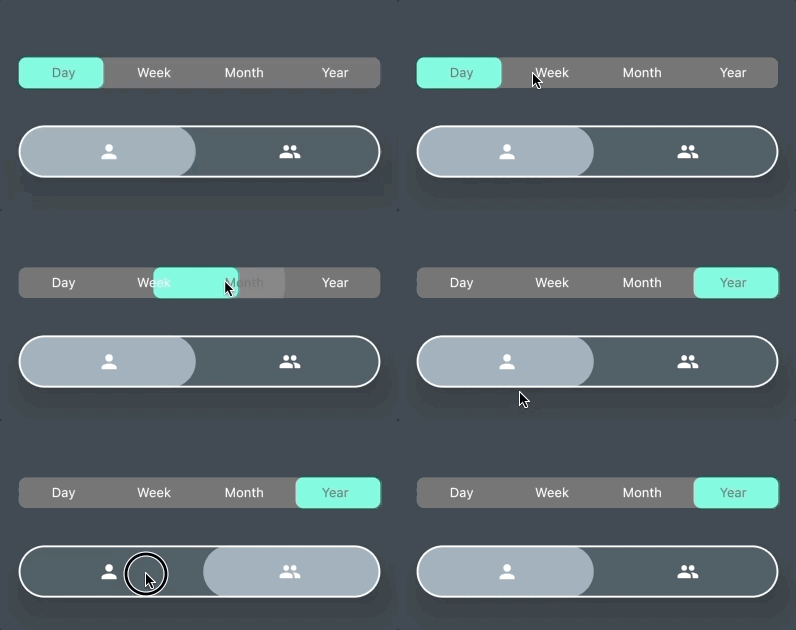
Result
parameters
| parameter |
description |
default |
| animationDuration |
animation duration when tap |
const Duration(milliseconds: 200) |
| backgroundColor |
main color of the widget |
Theme.of(context).backgroundColor |
| borderColor |
color of the border |
null |
| borderWidth |
width of the border |
borderColor != null ? 1.0 : 0.0; |
| children |
A list of ButtonBarEntry to display |
required |
| curve |
the curve for the animation |
Curves.fastOutSlowIn |
| elevation |
double |
0 |
| foregroundColor |
color for the selection |
Theme.of(context).accentColor |
| invertedSelection |
bool |
false |
| radius |
double |
0.0 |
| verticalPadding |
double |
8.0 |