搜尋套件、儲存庫與 APP 分類

custom_date_range_picker 封面
套件詳情v1.2.0

custom_date_range_picker

一個適用於 Android 和 iOS 的 Flutter 套件,提供可自訂的日期範圍選擇器,擁有美觀的使用者介面與流暢的動畫效果。

AndroidiOSWebmacOSWindowsLinux
近 30 天下載
3970
喜歡數
85
Pub 分數
160

安裝套件

flutter pub add custom_date_range_picker

套件介紹

根據套件公開資料產生的選型評估,僅供參考。

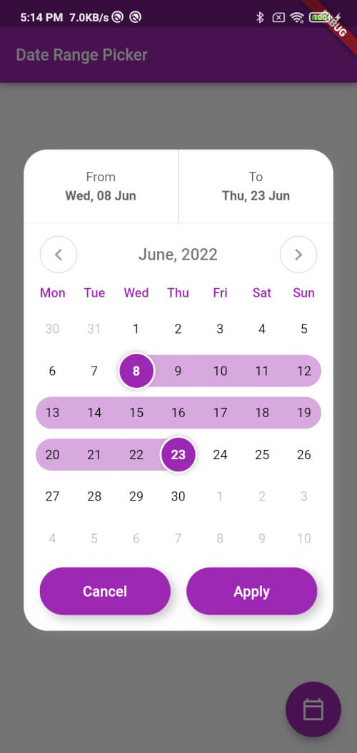
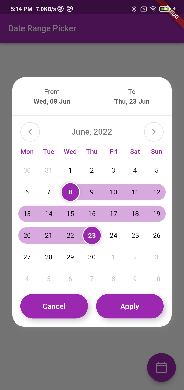
一個 Flutter 套件,為 Android、iOS、Web、macOS、Windows 和 Linux 提供高度可自訂的日程範圍選擇器。它具備優雅的使用者介面與流暢的動畫效果,讓開發者能根據應用程式設計來自訂選擇器的外觀與行為。該選擇器支援直覺式的日期選擇並提供視覺反饋,非常適合用於預約系統、排程應用與資料篩選介面。此元件以跨平台相容性為設計重點,確保在各類裝置上提供一致的使用者體驗。

適用情境

  • 預訂和預訂系統
  • 按日期範圍篩選資料
  • 事件調度應用
  • 旅行規劃工具
  • 自訂日曆整合

主要特色

  • 跨平台支援
  • 流暢的動畫
  • 高度可自訂的使用者介面
  • 直覺式的日期選擇
  • 所選範圍的視覺反饋

適合對象

  • 開發旅遊或預訂應用的開發者
  • 需要在跨平台環境中保持一致日期選擇器的團隊
  • 需要自定義日曆設計的應用程式
  • 專注於使用者體驗和美學的專案

使用建議

  • 需要與現有的日期處理邏輯進行整合
  • 可能需要額外的樣式來支援複雜主題
  • 僅限日期範圍選擇(無時間組件)
  • 依賴 Flutter SDK 版本相容性

原始 README

以下為關聯原始碼儲存庫的 README 原文快照,最新內容請造訪原始碼儲存庫。

custom_date_range_picker

custom_date_range_picker

Usage

...
  floatingActionButton: FloatingActionButton(
        onPressed: () {
          showCustomDateRangePicker(
            context,
            dismissible: true,
            minimumDate: DateTime.now().subtract(const Duration(days: 30)),
            maximumDate: DateTime.now().add(const Duration(days: 30)),
            endDate: endDate,
            startDate: startDate,
            backgroundColor: Colors.white,
            primaryColor: Colors.green,
            onApplyClick: (start, end) {
              setState(() {
                endDate = end;
                startDate = start;
              });
            },
            onCancelClick: () {
              setState(() {
                endDate = null;
                startDate = null;
              });
            },
          );
        },
        tooltip: 'choose date Range',
        child: const Icon(Icons.calendar_today_outlined, color: Colors.white),
      ),

Function: showCustomDateRangePicker

This function displays a custom date range picker dialog box.

Parameters

  • context (required): The context in which to show the dialog.
  • dismissible (required): A boolean value indicating whether the dialog can be dismissed by tapping outside of it.
  • minimumDate (required): A DateTime object representing the minimum allowable date that can be selected in the date range picker.
  • maximumDate (required): A DateTime object representing the maximum allowable date that can be selected in the date range picker.
  • startDate (optional): A nullable DateTime object representing the initial start date of the date range selection.
  • endDate (optional): A nullable DateTime object representing the initial end date of the date range selection.
  • onApplyClick (required): A function that takes two DateTime parameters representing the selected start and end dates, respectively, and is called when the user taps the "Apply" button.
  • onCancelClick (required): A function that is called when the user taps the "Cancel" button.
  • backgroundColor (required): The background color of the dialog.
  • primaryColor (required): The primary color of the dialog.
  • fontFamily (optional): The font family to use for the text in the dialog.

Usage

Inside the function, a FocusNode is requested to take focus away from any input field that might be in focus. A showDialog function is then called to show the CustomDateRangePicker dialog box. The CustomDateRangePicker widget is built with the parameters passed to showCustomDateRangePicker, and then passed as the builder parameter of the showDialog function.

When the user interacts with the CustomDateRangePicker dialog box, the onApplyClick and onCancelClick functions are called accordingly.

Many Thanks to the creator of this Repo https://github.com/mitesh77/Best-Flutter-UI-Templates

Getting Started

For help getting started with Flutter, view our online documentation.

For help on editing package code, view the documentation.

所屬分類

依賴

依賴清單 1 項

原始碼儲存庫

使用此套件的專案