搜尋套件、儲存庫與 APP 分類

day_picker 封面
套件詳情v2.3.0

day_picker

一個 Flutter 小部件庫,幫助我們選擇一週中的某一天。

AndroidiOSWebmacOSWindowsLinux
近 30 天下載
705
喜歡數
42
Pub 分數
160

安裝套件

flutter pub add day_picker

套件介紹

根據套件公開資料產生的選型評估,僅供參考。

day_picker 套件是一個 Flutter 庫,旨在簡化一周內日期的選擇。它提供了一個乾淨且可自訂的組件,讓使用者能夠輕鬆選取特定的工作日,非常適合用於排程、規劃或重複事件的設定。該套件支援 Android、iOS、Web、macOS、Windows 和 Linux 多個平台,確保在各種裝置上行為一致。透過直覺式的 UI 元件和透過 pub 的簡單整合,它提升了 Flutter 應用中的日期互動體驗。

適用情境

  • 安排重複事件
  • 規劃每週例行事項
  • 設定預約日曆
  • 設定使用者偏好
  • 建構任務管理工具

主要特色

  • 星期選擇介面
  • 跨平台相容性
  • 可自訂的 UI
  • 與 pub 的輕鬆整合
  • 支援所有主要的Flutter平台

適合對象

  • 應用開發者建構日曆功能
  • 創建生產力或規劃類應用的團隊
  • 需要簡單工作日選擇器的開發人員
  • Flutter 初學者探索日期選擇器

使用建議

  • 僅限工作日選擇
  • 不支援日期範圍
  • 不包含月份/年份導航
  • 最適合每周重點的工作流程
  • 需要手動處理所選日期邏輯

原始 README

以下為關聯原始碼儲存庫的 README 原文快照,最新內容請造訪原始碼儲存庫。

Day Picker

A Flutter widget library which helps us to select days in a week.

Test, Build and deploy Build Status likes popularity pub points

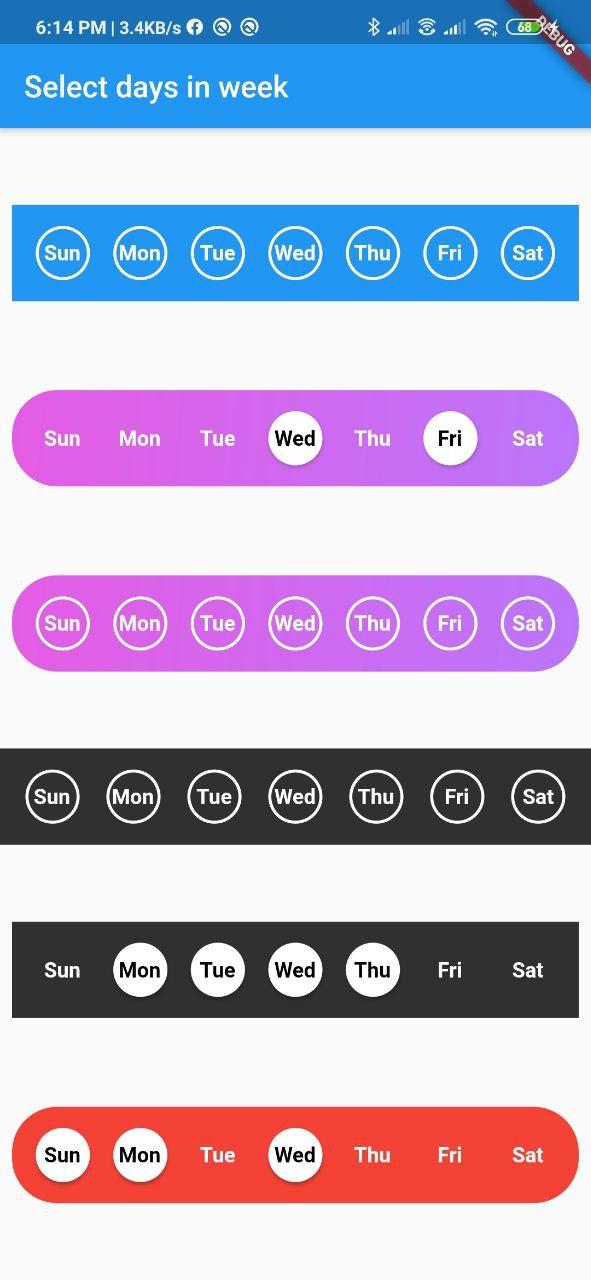
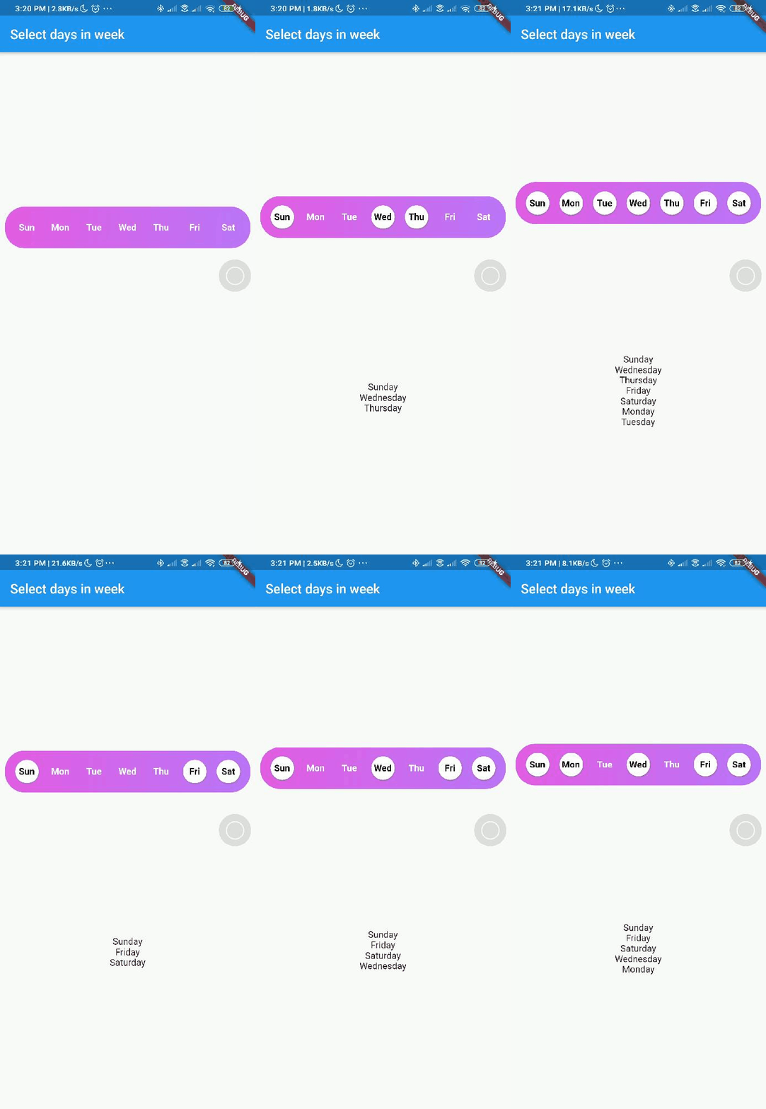
Screenshot

Screenshot week day picker Screenshot week day picker

Usage

Add day_picker to your pubspec.yaml file.

    flutter:
      sdk: flutter
    day_picker: 2.3.0

import the package:

import 'package:day_picker/day_picker.dart';

Constructor for the day_picker is given below.

      const SelectWeekDays({
        required this.onSelect,
        required this.days,
        this.backgroundColor,
        this.fontWeight,
        this.fontSize,
        this.selectedDaysFillColor,
        this.unselectedDaysFillColor,
        this.selectedDaysBorderColor,
        this.unselectedDaysBorderColor,
        this.selectedDayTextColor,
        this.unSelectedDayTextColor,
        this.border = true,
        this.boxDecoration,
        this.padding = 8.0,
        this.width,
        this.borderWidth,
        this.elevation = 2.0,
        super.key,
      });

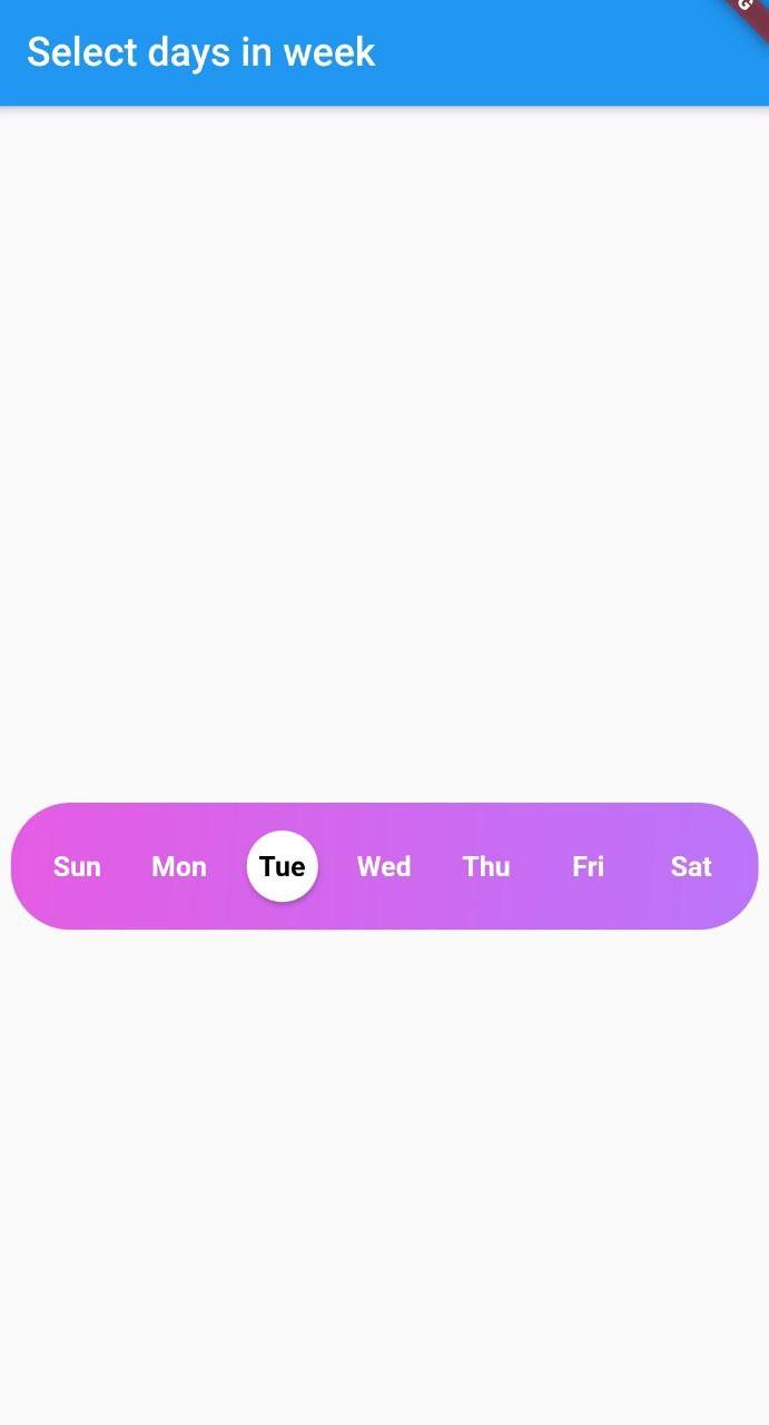
Example here creates a day_picker with below style [with Gradient and no borders].

Screenshot week day picker

  final List<DayInWeek> _days = [
    DayInWeek("Zo", dayKey: "monday"),
    DayInWeek("Ma", dayKey: "tuesday"),
    DayInWeek("Di", dayKey: "wednesday"),
    DayInWeek("Wo", dayKey: "thursday"),
    DayInWeek("Do", dayKey: "friday"),
    DayInWeek("Vr", dayKey: "saturday", isSelected: true),
    DayInWeek("Za", dayKey: "sunday", isSelected: true),
  ];

  @override
  Widget build(BuildContext context) {
    return Scaffold(
      appBar: AppBar(
        title: Text("Select days in week"),
      ),
      body: Center(
        child: Padding(
          padding: const EdgeInsets.all(8.0),
          child: SelectWeekDays(
            key: customWidgetKey,
            fontSize: 14,
            fontWeight: FontWeight.w500,
            days: _days,
            border: false,
            width: MediaQuery.of(context).size.width / 1.4,
            boxDecoration: BoxDecoration(
              color: Colors.red,
              borderRadius: BorderRadius.circular(30.0),
            ),
            onSelect: (values) {
              print(values);
            },
          ),
        ),
      ),
    );
  }

Pass a callback to the onSelect property with parameter of type List<String>.


Pass a list of days of type DayInWeek into days property

class DayInWeek {
  DayInWeek(
      this.dayName, {
        required this.dayKey,
        this.isSelected = false,
      });

  String dayName;
  String dayKey;
  bool isSelected = false;
}

DayInWeek consist of three Properties [dayName], [dayKey] and [isSelected]. By default [isSelected] value will be false


Example:

void handleOnSelect(List<String> days){
    //TODO: Manipulate the List of days selected
    print(days);
}

Customization

Property Type Description
onSelect List<String> Callback invoked when days are selected
days List<DayInWeek> List of days that need to be passed
padding double Padding between container and the buttons [by default it is 8.0]
boxdecoration BoxDecoration provides variety of ways to style the background container[gradient, color, border radius]
backgroundColor Color Property to change the color of the container
fontSize double Property to change size of font
fontWeight FontWeight Property to change the font weight of text
daysFillColor Color Property to change the color of rounded buttons when the days are selected
daysBorderColor Color Property to change the border color of rounded button
selectedDayTextColor Color property to change the text color of the selected days
unSelectedDayTextColor Color property to change the text color when the days are not selected
border bool Set this property to false if border is not needed around the rounded buttons[by default this property will be true]

With the implementation of the setDaysState method, developers can dynamically modify which days are selected within their application's code, even after the SelectWeekDays widget has already been constructed. By utilizing the Global Key that is passed into the widget, one can easily update the selected dates as desired.

Contributions

Contributions of any kind are more than welcome😊! Feel free to fork and improve day_picker or open an issue.

所屬分類

原始碼儲存庫

使用此套件的專案