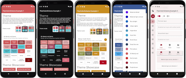
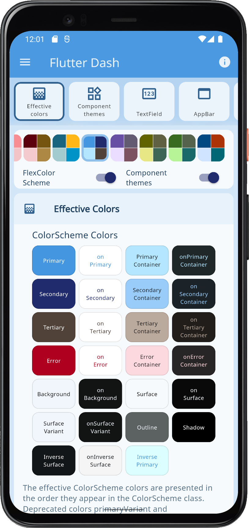
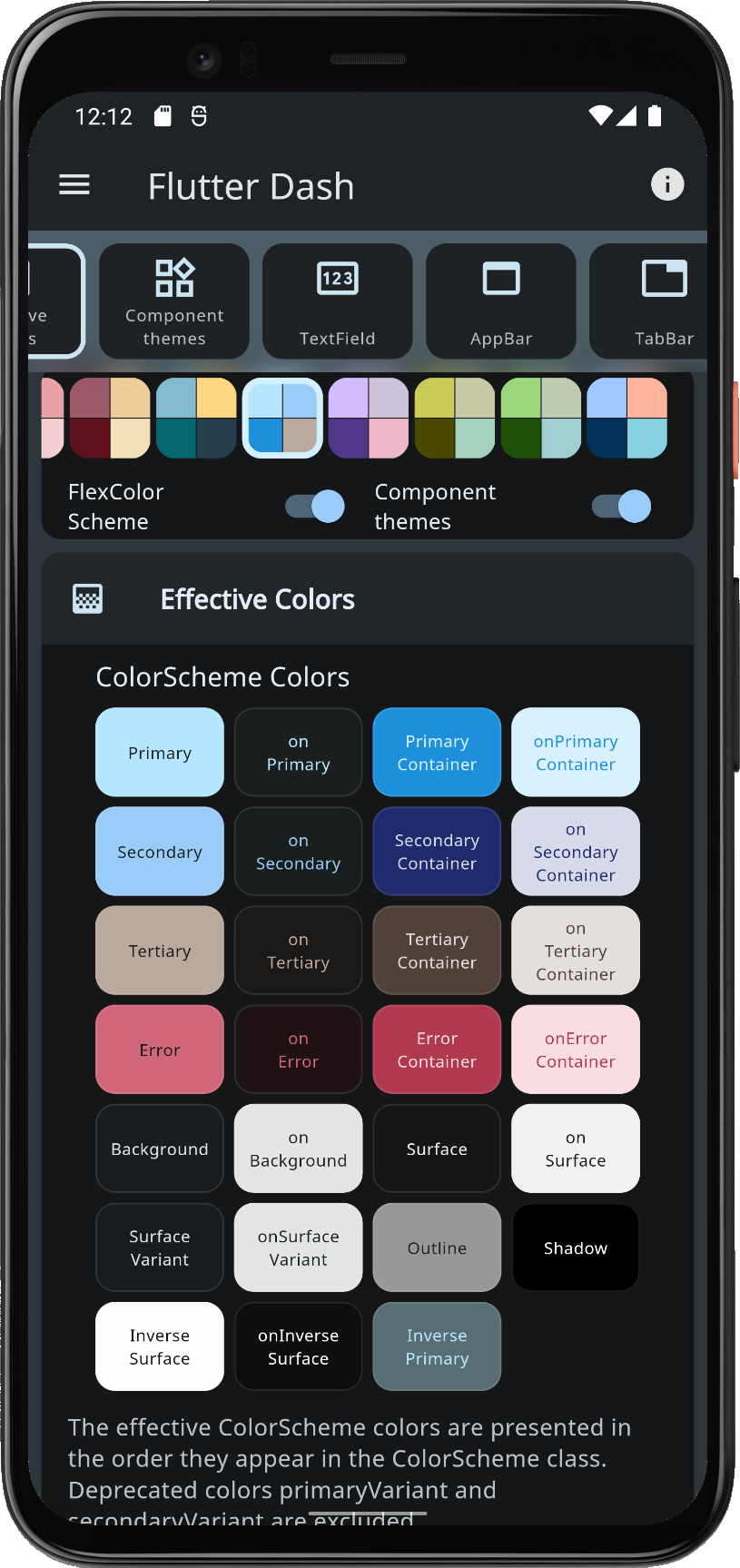
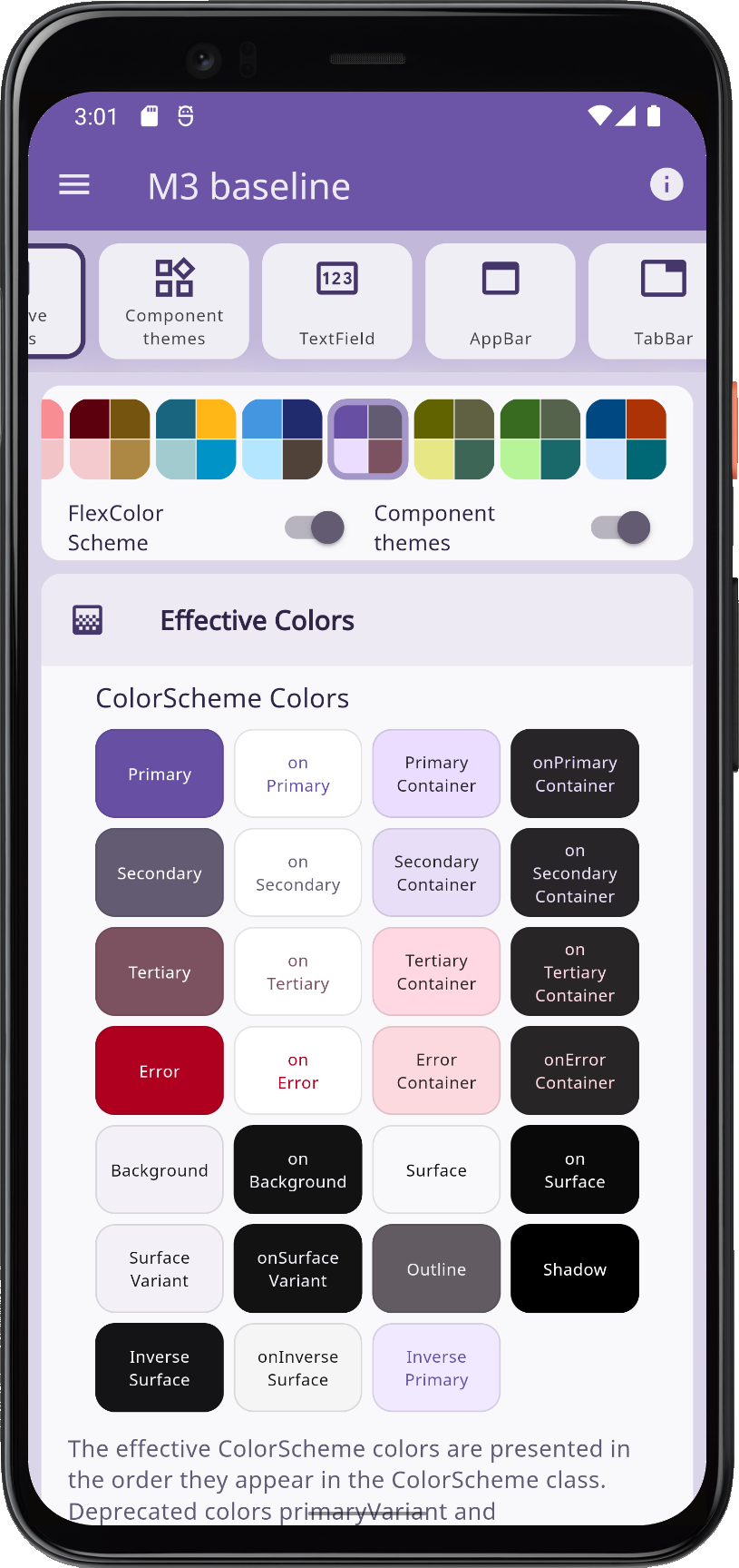
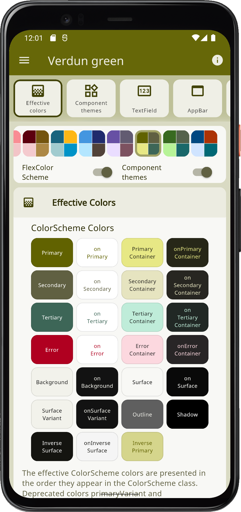
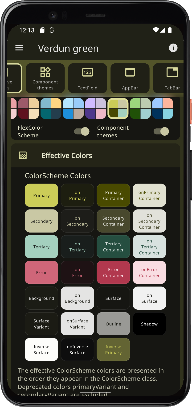
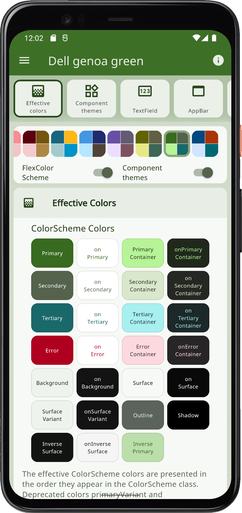
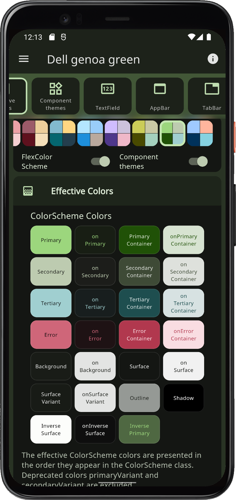
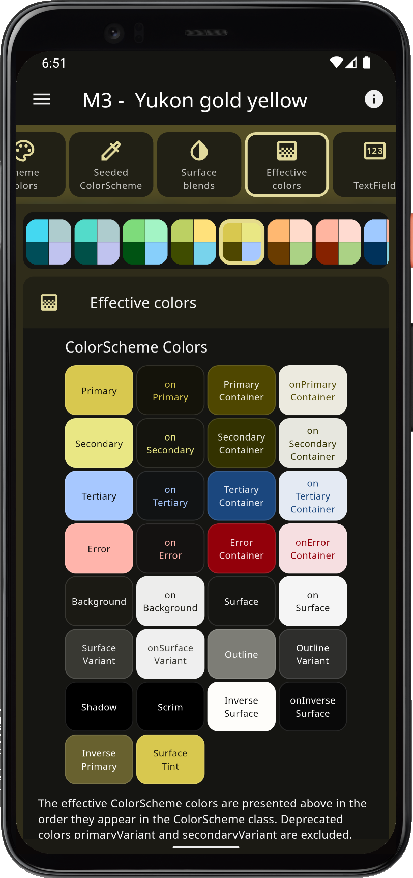
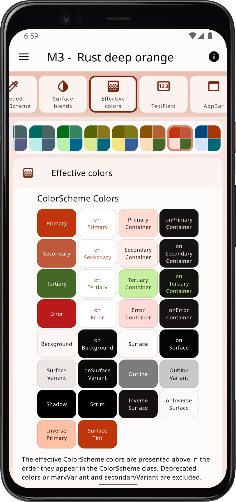
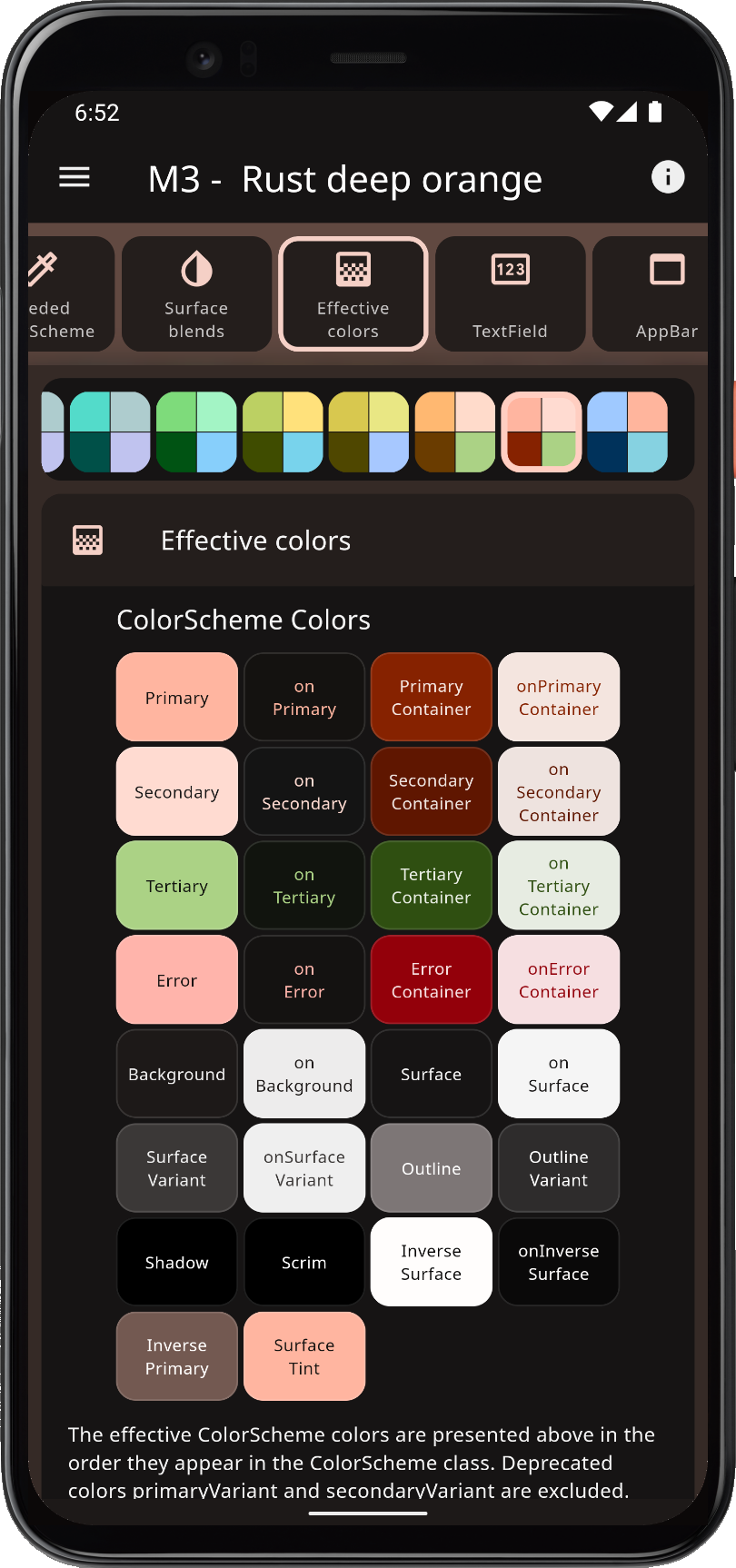
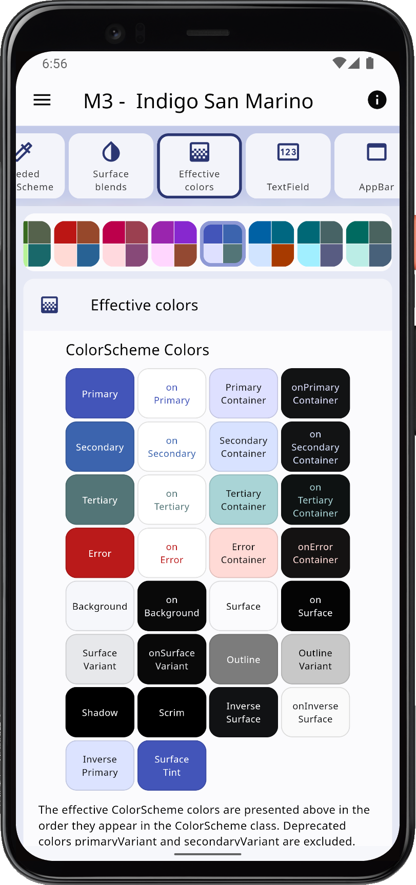
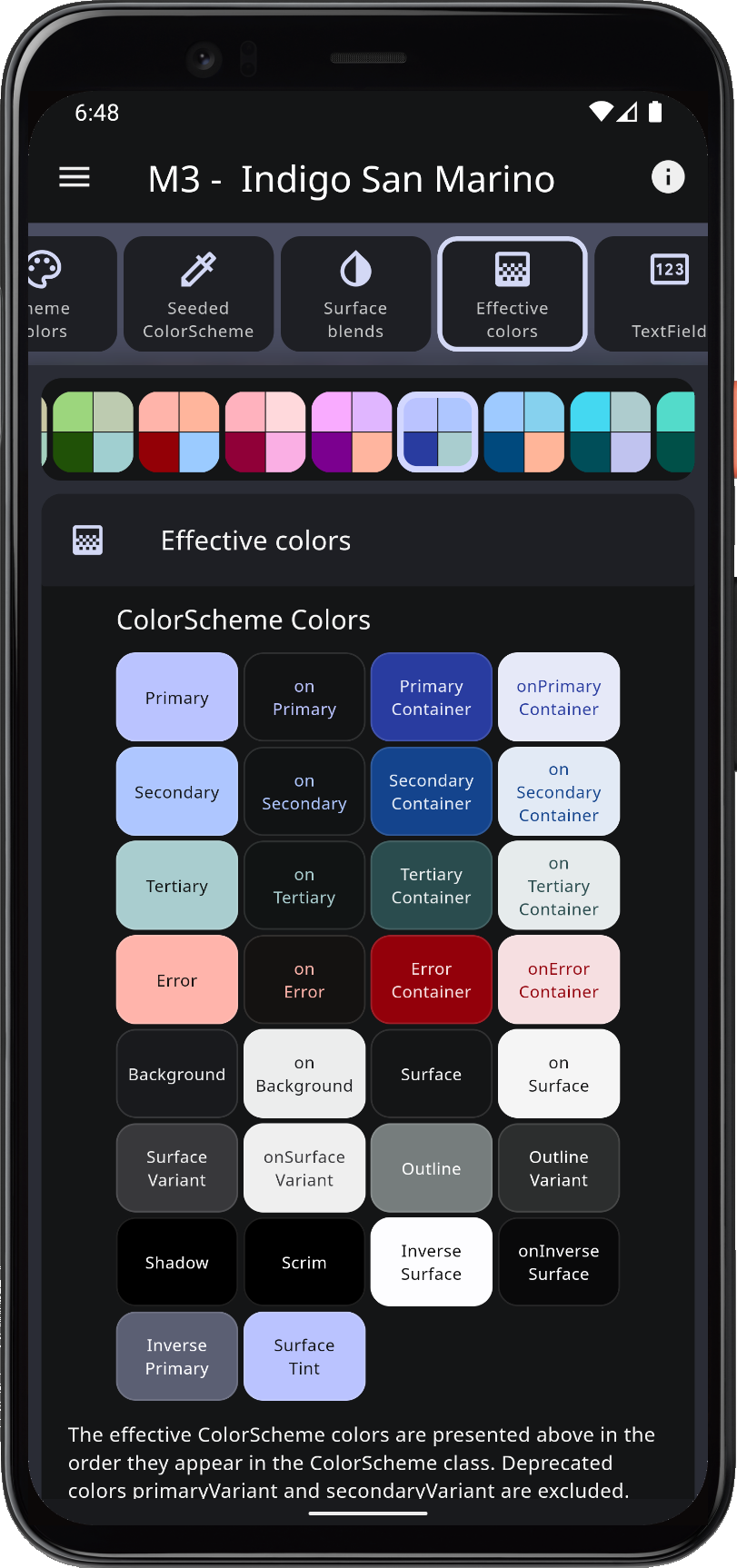
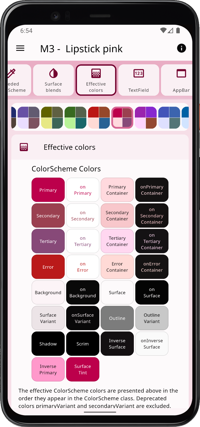
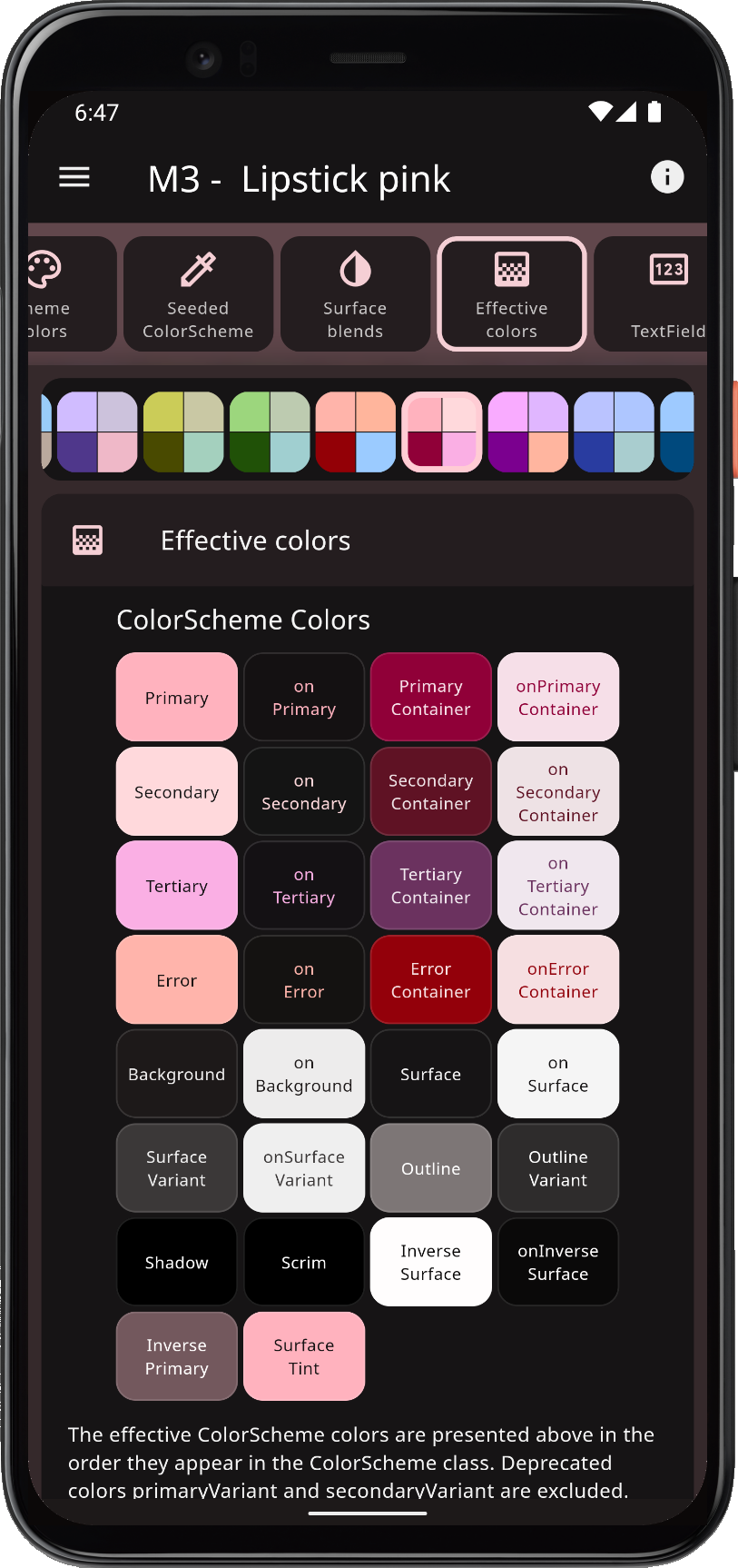
Flex Color Scheme 是一個 Flutter 套件,旨在簡化基於 Material Design 的美觀主題的建立與應用。它提供靈活的色彩方案管理,支援明亮與黑暗模式,讓開發者能輕鬆自訂主要、次要及強調色彩等視覺元素。此套件提供預設的主題範本,並允許深度自訂,同時在各平台間維持設計一致性。非常適合需要動態主題與現代美學的應用。
適用情境
使用亮色和暗色模式創建響應式 UI
自訂 Material Design 主題
使用一致的配色方案建構應用
在Flutter應用中實現動態主題
設計視覺上吸引人的介面
支援多種平台設計
主要特色
內建亮色和暗色模式支援
廣泛的配色方案自訂
預定義主題範本
跨平台主題一致性
與 MaterialApp 的輕鬆整合
靈活的主题組合
適合對象
尋求現代 UI 的 Flutter 開發人員
需要主題切換的應用程式
與 Material Design 一起工作的設計師
需要一致品牌標識的項目
專注於使用者體驗的團隊
希望快速實現主題的開發者
使用建議
需要理解材質設計原則
可能會稍微增加應用大小
最佳與 Flutter 3.0+ 搭配使用
限於 Material Design 組件
複雜主題需要仔細規劃
取決於正確的設定以獲得最佳效果
原始 README
以下為關聯原始碼儲存庫的 README 原文快照,最新內容請造訪原始碼儲存庫。
FlexColorScheme
FlexColorScheme 9.x builds matched light and dark ThemeData for Flutter 3.47+, with full support for the SDK-decoupled material_ui and cupertino_ui packages.
Version 9.0 is a major release because Flutter's UI libraries left the SDK. Theming features are otherwise an easy step from 8.4. Breaking API and seed-tone details are in the changelog and at docs.flexcolorscheme.com.
Use it to make Material Design themes with optional surface blends, seed-generated ColorSchemes, and quick component settings. The result is standard ThemeData, with more complete ColorScheme wiring than Flutter's ThemeData.from / colorSchemeSeed factories.
Configure visually in the Themes Playground and copy the API setup into your app.
FlexColorScheme themes all Flutter SDK UI components from your ColorScheme and custom colors, including legacy ThemeData color properties, in Material 2 or Material 3 mode. Opt in on component themes to adjust shared styles, for example border radius on many widgets with one property.
Material 3
Material 3 is the default since FlexColorScheme v8, matching Flutter's ThemeData. Component theme defaults follow Material 3, including per-widget radii from the Material 3 Guide. Keep those defaults, set a shared global radius, or override radius per widget.
Surface alpha blends and seed-generated ColorSchemes go beyond Flutter's seed factory: multiple seed colors, custom minimum chroma, and custom tone mapping.
Component themes use simple flat properties. You can skip verbose SDK ShapeBorder and WidgetState theme objects for common cases.
Getting Started
Requires Flutter 3.47 or later. FlexColorScheme depends on material_ui and cupertino_ui; your app still needs a direct material_ui import for MaterialApp and widgets.
Version 9.0 allows any material_ui / cupertino_ui1.x (^1.0.0). It does not use APIs added after 1.0.0 of those packages. Later FlexColorScheme releases will raise that floor when they adopt new features from them.
Start with a built-in FlexScheme palette, or define your own colors. The package default example is a heavily commented guide. See Examples and the Tutorial.
FlexColorScheme Counter App
Create a new Flutter project and theme the default counter app with Oh Mandy red (FlexScheme.mandyRed). ThemeMode.system follows the device light/dark setting.
import'package:flex_color_scheme/flex_color_scheme.dart';
import'package:material_ui/material_ui.dart';
classMyAppextendsStatelessWidget{
constMyApp({super.key});
@overrideWidgetbuild(BuildContext context) {
returnMaterialApp(
title: 'Flutter Demo',
// The Mandy red, light theme.
theme: FlexThemeData.light(scheme: FlexScheme.mandyRed),
// The Mandy red, dark theme.
darkTheme: FlexThemeData.dark(scheme: FlexScheme.mandyRed),
// Use dark or light theme based on system setting.
themeMode: ThemeMode.system,
home: constMyHomePage(title: 'Flutter Demo Home Page'),
);
}
}
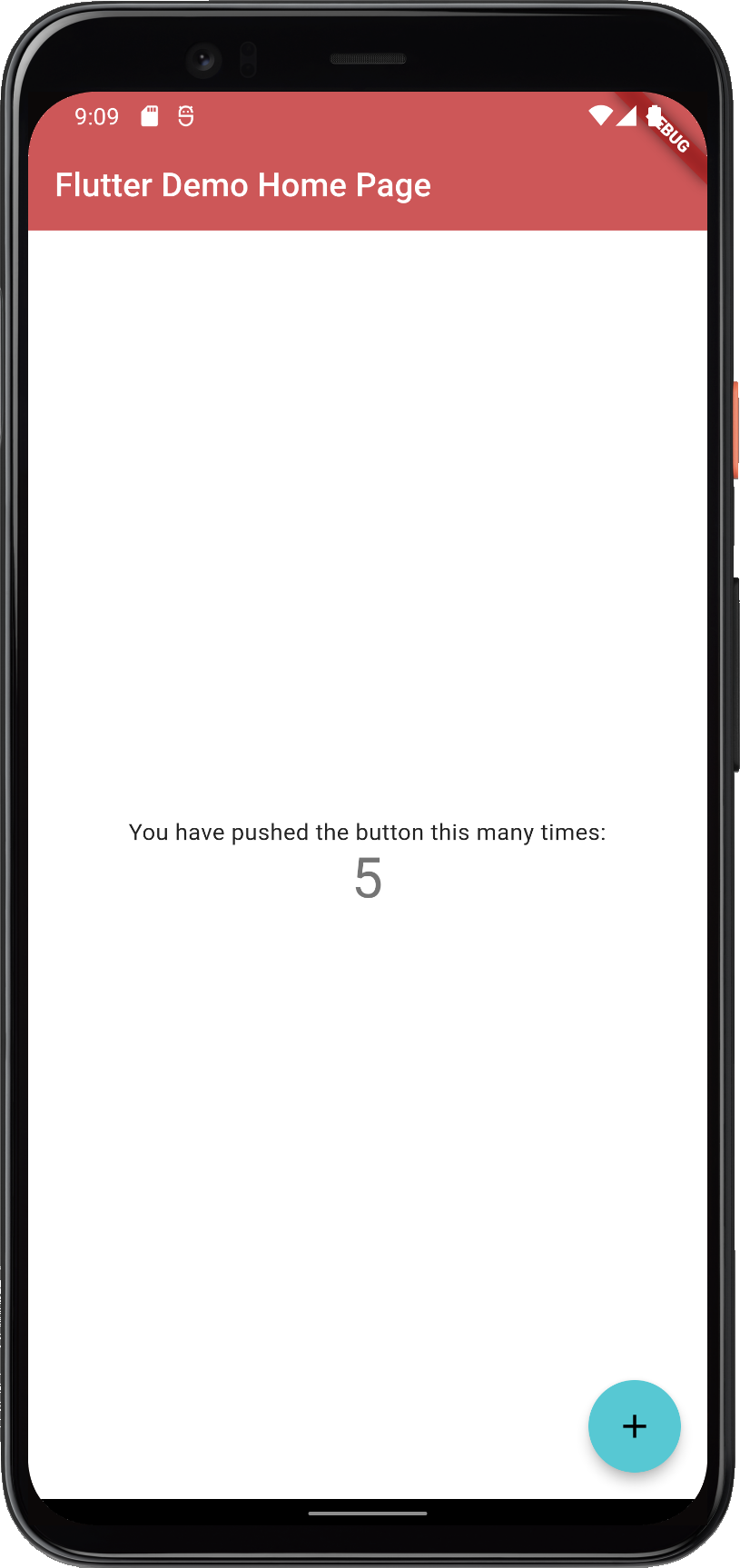
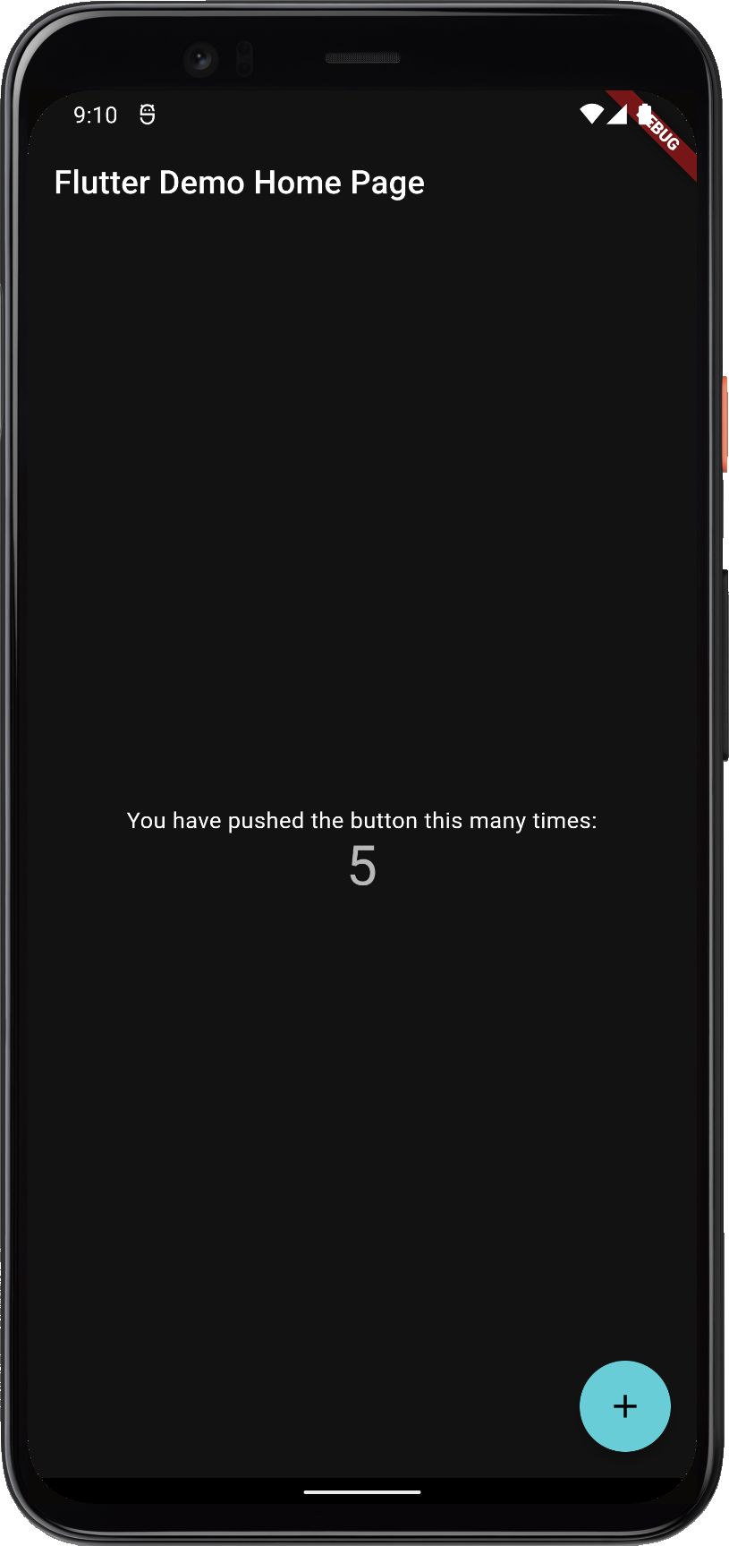
This gives a counter application that looks like this:
FlexColorScheme applied to the standard Flutter counter template
The counter app uses few widgets, so it does not show the theme well. The package examples use placeholder UI only to present results; that demo UI is not part of using FlexColorScheme.
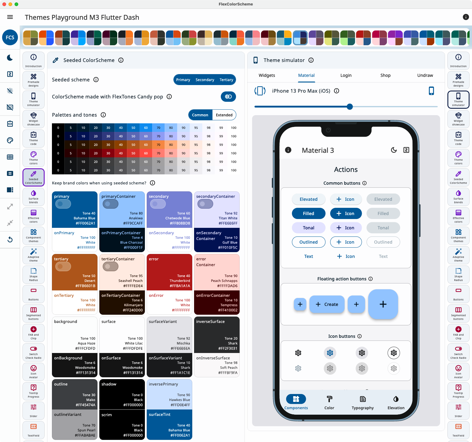
The Themes Playground is a web companion that generates FlexColorScheme setup code for the active theme. The app itself, and the demos in its theme simulator, show the result of that code. Settings persist; reset them if you get lost. It is bundled as example 5, the last tutorial step.
In Themes Playground you can visually configure your theme and copy its setup code.
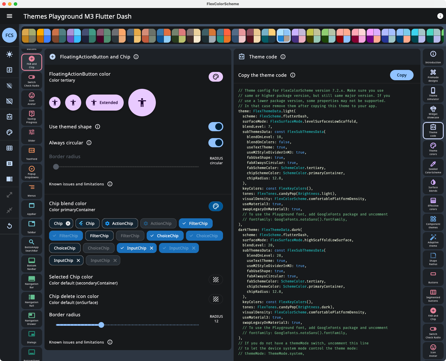
Open the code view beside the controls to watch the API update as you change settings.
Viewing API configuration and its updates as you change settings in Themes Playground.
Latest live build (WASM GC, with JS fallback): playground.flexcolorscheme.com. Usage notes: Playground chapter. Use the same major version of Themes Playground as your flex_color_scheme package, and for versions 7, 8, and 9 prefer matching the minor version too. GitHub Pages JS builds are in the table below.
NOTE! Older and newer web builds on this domain share browser storage. Loading a newer Playground, then an older one, can fail until you clear site data (Settings → Delete browsing data → Cookies and other site data). You lose saved config. Version 8.0.0 and later uses a different storage name, so it does not conflict with V7 and older.
Themes Playground as a Desktop App
A Windows, macOS, or Linux build of Example 5 is smoother than the web app. For an older package version, download a ZIP from the GitHub releases.