It also adds an .animate() extension method to all widgets, which wraps the
widget in Animate(). Each effect also adds a chainable extension method to
Animate to enable a shorthand syntax:
Text("Hello World!").animate().fade().scale()
NOTE: The shortform style is used in this README, but all functionality is
available in either format.
Delay, duration, curve
Effects have optional delay, duration, and curve parameters. Effects run
in parallel, but you can use a delay to run them sequentially:
Text("Hello").animate()
  .fade(duration: 500.ms)
  .scale(delay: 500.ms) // runs after fade.
Note that effects are "active" for the duration of the full animation, so for
example, two fade effects on the same target can have unexpected results
(SwapEffect detailed below, can help address this).
If not specified (or null), these values are inherited from the previous effect,
or from Animate.defaultDuration and Animate.defaultCurve if it is the first
effect:
Text("Hello World!").animate()
  .fadeIn() // uses `Animate.defaultDuration`
  .scale() // inherits duration from fadeIn
  .move(delay: 300.ms, duration: 600.ms) // runs after the above w/new duration
  .blurXY() // inherits the delay & duration from move
Animate has its own delay parameter, which defines a delay before the
animation begins playing. Unlike the delay on an Effect, it is only applied
once if the animation repeats.
Text("Hello").animate(
    delay: 1000.ms, // this delay only happens once at the very start
    onPlay: (controller) => controller.repeat(), // loop
  ).fadeIn(delay: 500.ms) // this delay happens at the start of each loop
Other Effect Parameters
Most effects include begin and end parameters, which specify the start/end
values. These are usually "smart" in the sense that if only one is specified
then the other will default to a "neutral" value (ie. no visual effect). If
both are unspecified the effect should use visually pleasing defaults.
// an opacity of 1 is "neutral"Text("Hello").animate().fade() // begin=0, end=1Text("Hello").animate().fade(begin: 0.5) // end=1Text("Hello").animate().fade(end: 0.5) // begin=1
Many effects have additional parameters that influence their behavior. These
should also use pleasant defaults if unspecified.
ThenEffect is a special convenience "effect" that makes it easier to sequence
effects. It does this by establishing a new baseline time equal to the previous
effect's end time and its own optional delay. All subsequent effect delays are
relative to this new baseline.
In the following example, the slide would run 200ms after the fade ended.
Because Effect instances are immutable, they can be reused. This makes it easy
to create a global collection of effects that are used throughout your app and
updated in one place. This is also useful for design systems.
It is easy to write new resuable effects by extending Effect, but you can also
easily create one-off custom effects by using CustomEffect, ToggleEffect,
and SwapEffect.
CustomEffect
CustomEffect lets you build custom animated effects. Simply specify a
builder function that accepts a context, value, and child. The child is
the target of the animation (which may already have been wrapped in other
effects).
For example, this would add a background behind the text and fade it from red to
blue:
Text("Hello World").animate().custom(
  duration: 300.ms,
  builder: (context, value, child) => Container(
    color: Color.lerp(Colors.red, Colors.blue, value),
    padding: EdgeInsets.all(8),
    child: child, // child is the Text widget being animated
  )
)
By default it provides a value from 0-1 (though some curves can generate
values outside this range), based on the current time, duration, and curve. You
can also specify begin and end values as demonstrated in the example below.
Animate can be created without a child, so you use CustomEffect as a
simplified builder. For example, this would build text counting down from 10,
and fading out:
ToggleEffect also provides builder functionality, but instead of a double,
it provides a boolean value equal to true before the end of the effect and
false after (ie. after its duration).
This can also be useful for creating sequential effects, by swapping the target
widget back in, effectively wiping all previous effects:
text.animate().fadeOut(300.ms) // fade out & then...// swap in original widget & fade back in via a new Animate:
.swap(builder: (_, child) => child.animate().fadeIn())
ShaderEffect
ShaderEffect makes it easy to apply animated GLSL fragment shaders to widgets.
See the docs for details.
myWidget.animate()
  .shader(duration: 2.seconds, shader: myShader)
  .fadeIn(duration: 300.ms) // shader can be combined with other effects
Events & callbacks
Animate includes the following callbacks:
onInit: the internal AnimationController has been initialized
onPlay: the animation has started playing after any Animate.delay
onComplete: the animation has finished
These callbacks return the AnimationController, which can be used to
manipulate the animation (ex. repeat, reverse, etc).
The above example works, because the listen effect inherits duration and curve
from the fade, and both use begin=0, end=1 by default.
Adapters and Controllers
By default, all animations are driven by an internal AnimationController, and
update based on elapsed time. For more control, you can specify your own
external controller, or use an adapter. You can also set autoPlay=false if
you want to start the animation manually.
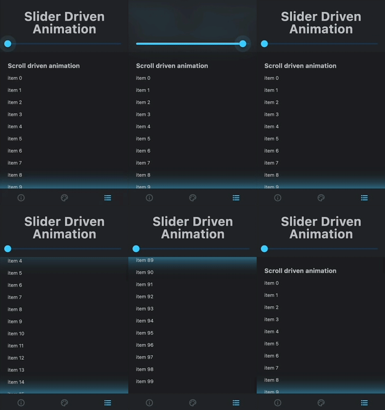
Adapters synchronize the AnimationController to an external source. For
example, the ScrollAdapter updates an animation based on a ScrollController
so you can run complex animations based on scroll interactions.
You still define animations using durations, but the external source must
provide a 0-1 value.
Flutter Animate ships with a collection of useful adapters. Check them out for
more information.
Reacting to State Changes
Animate can react to state changes similar to "Animated" widgets (ex.
AnimatedOpacity). Simply set up your animation normally, but set a target
value. When the value of target changes, it will automatically animate to the
new target position (where 0 is the beginning and 1 is the end).
For example, combined with logic that toggles _over via setState, this will
fade and scale the button on roll over:
You can also update the value property to jump to that position.
Testing Animations
When testing animations, you can set Animate.restartOnHotReload=true which
will cause all animations to automatically restart every time you hot reload
your app.