搜尋套件、儲存庫與 APP 分類

flutter_context_menu 封面
套件詳情v0.4.2

flutter_context_menu

在您的應用中建立並顯示可自訂的上下文選單。

AndroidiOSWebmacOSWindowsLinux
近 30 天下載
3.3萬
喜歡數
125
Pub 分數
160

安裝套件

flutter pub add flutter_context_menu

套件介紹

根據套件公開資料產生的選型評估,僅供參考。

一個 Flutter 套件,讓開發者能在多個平台建立並顯示可自訂的上下文選單。它提供了一致的方式來呈現使用者長按或右鍵點擊元件時的操作選項,提升應用程式中的使用者互動體驗。此套件支援所有主要平台,包含 Android、iOS、Web、macOS、Windows 與 Linux,確保廣泛的相容性。透過彈性的自訂選項,開發者可調整選單外觀與行為以符合應用程式設計。非常適合新增直覺且符合平台特性的上下文動作。

適用情境

  • 在桌面應用程式中新增右鍵功能表
  • 在移動設備上實現長按操作
  • 使用上下文選擇創建互動式 UI
  • 透過快速動作提升生產力工具
  • 支援多平台應用程式

主要特色

  • 跨平台支援
  • 可自定義菜單項目
  • 與現有小部件的輕鬆整合
  • 對長按和右鍵點擊有響應
  • 可設定的樣式和佈局

適合對象

  • 使用豐富互動功能開發桌面或行動應用的開發者
  • 針對多個平台的團隊
  • 需要上下文使用者動作的應用程式

使用建議

  • 需要仔細處理手勢衝突
  • 可能需要額外的樣式以保持一致性
  • 不適合用於簡單的單次動作

原始 README

以下為關聯原始碼儲存庫的 README 原文快照,最新內容請造訪原始碼儲存庫。

Logo

Flutter Context Menu

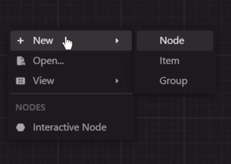
A Flutter library that provides a flexible and customizable solution for creating and displaying context menus in Flutter applications. It allows you to easily add context menus to your UI, providing users with a convenient way to access additional options and actions specific to the selected item or area.

View Example · Report Bug · Request Feature

GitHub Actions Workflow Status
Pub Version License GitHub Stars
Pub Likes Pub Points Pub Downloads
Stand With Palestine

Preview

zread

Features

  • ContextMenu: The package includes a highly customizable context menu system that can be easily integrated into your Flutter application. It provides a seamless and intuitive user experience, enhancing the usability of your app.

  • Hierarchical Structure: The context menu supports a hierarchical structure with submenu functionality. This enables you to create nested menus, providing a clear and organized representation of options and suboptions.

  • Selection Handling: The package includes built-in selection handling for context menu items. It allows you to define callback functions for individual menu items, enabling you to execute specific actions or logic when an item is selected.

  • Customization Options: Customize the appearance and behavior of the context menu to match your app's design and requirements. Modify the style, positioning, animation, and interaction of the menu to create a cohesive user interface.

  • Built-in Components: The package includes built-in components, such as MenuItem, MenuDivider, and MenuHeader, that can be used in your context menu.

  • Cross Platform Support: The package is compatible with multiple platforms, including Android, iOS, Web, and Desktop.

Getting Started

Installation
  • Method 1 (Recommended):

    run this command in your terminal:

    flutter pub add flutter_context_menu
    
  • Method 2:

    add this line to your pubspec.yaml dependencies:

    dependencies:
        flutter_context_menu:
    

    then, run this command in your terminal:

    flutter pub get
    

Usage

  1. First, import the package:

    import 'package:flutter_context_menu/flutter_context_menu.dart';
    
  2. Then, initialize a ContextMenu instance:

    // define your context menu entries
    final entries = <ContextMenuEntry>[
      const MenuHeader(text: "Context Menu"),
      MenuItem(
        label: const Text('Copy'),
        icon: const Icon(Icons.copy),
        onSelected: (value) {
          // implement copy
        },
      ),
      MenuItem(
        enabled: false, // disable this item
        label: const Text('Cut'),
        icon: const Icon(Icons.cut),
        onSelected: (value) {
          // implement cut
        },
      ),
      MenuItem(
        label: const Text('Paste'),
        icon: const Icon(Icons.paste),
        onSelected: (value) {
          // implement paste
        },
      ),
      const MenuDivider(),
      MenuItem.submenu(
        label: const Text('Edit'),
        icon: const Icon(Icons.edit),
        items: [
          MenuItem(
            label: const Text('Undo'),
            value: "Undo",
            icon: const Icon(Icons.undo),
            onSelected: (value) {
              // implement undo
            },
          ),
          MenuItem(
            label: const Text('Redo'),
            value: 'Redo',
            icon: const Icon(Icons.redo),
            onSelected: (value) {
              // implement redo
            },
          ),
        ],
      ),
    ];
    
    // initialize a context menu
    final menu = ContextMenu(
      entries: entries,
      position: const Offset(300, 300),
      padding: const EdgeInsets.all(8.0),
    );
    
  3. Finally, to show the context menu, there are two ways:

    • Method 1: Directly calling one of the show methods.

      This will show the context menu at the manually specified position.

      void showMenu() async {
        showContextMenu(context, contextMenu: menu);
        // or 
        final selectedValue = await menu.show(context);
        print(selectedValue);
      }
      
    • Method 2: Using the ContextMenuRegion widget to show the context menu when the user right-clicks or long-presses the region area.

      This will show the context menu where the user clicks when the position property is not specified in the ContextMenu constructor.

      @override
      Widget build(BuildContext context) {
        return Column(
          children: [
            ContextMenuRegion(
              contextMenu: contextMenu,
              onItemSelected: (value) {
                print(value);
              },
              child: Container(
                color: Colors.indigo,
                height: 300,
                width: 300,
                child: const Center(
                  child: Text(
                    'Right click or long press!',
                  ),
                ),
              ),
            )
          ],
        );
      }
      

Customization

Theme: By default, the context menu and its items uses the MaterialApp's theme data for styling. However, you can customize the appearance and behavior of the context menu by modifying the theme data. Or individually by specifying a BoxDecoration in the boxDecoration property of the ContextMenu.

Custom Entries: You can create your own context menu entries by subclassing the ContextMenuEntry class. This allows you to customize the appearance, behavior, and functionality of the context menu items.

Learn More

  • More info: Full documentation will be provided, inshallah 🙏
  • See: Full Example

Feedback and Contributions

If you have any suggestions or feedback, please open an issue or create a pull request.

If you like this package, please star it and follow me on X and GitHub.

License

This project is licensed under the BSD 3-Clause License.


Made with ❤️ in Egypt 🇪🇬

🇵🇸 Stand With Palestine 🇵🇸

所屬分類

原始碼儲存庫

使用此套件的專案