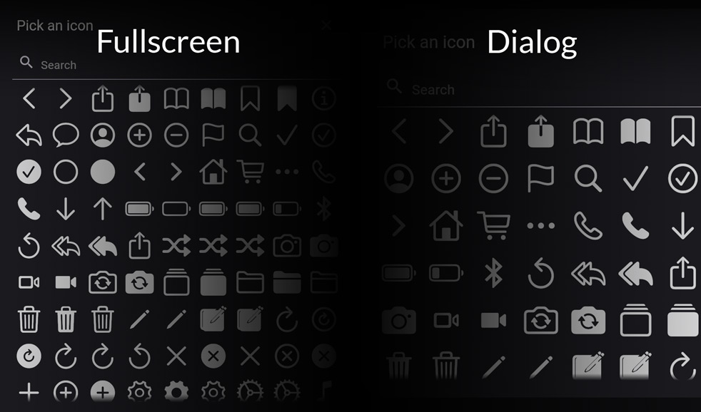
This package provides an IconPicker with supported (or custom provided) Icons which can be picked through an AlertDialog. All Icons are mapped with its names in the IconData. This is necessary to make it possible to search through the icons. Fulltextsearch including a note if no results where found.
Disclaimer (Important)
This package is maintained regularly, is stable and is used in production by many software solutions out there (Thank you all at this point 🙏).
However, it is not guaranteed that all icons are displayed correctly -> why? -> flutter framework is constantly changing codePoint's for example for Icons.camera. So if you develop an app which uses an older flutter version and flutter_iconpicker version, you're good to go, but if you want to update your app and flutter version, the codePoint's could be broken and not matching to Icons.camera for example anymore!
So what can we do?:
Simply use custom icons by providing a list of IconPickerIcon's to the IconPicker (with the correct codePoint's and NOT Icons.camera for the data parameter!)
IconPacks are very large in size and are generated on demand by you as the developer to always keep your app size as small as possible!
To generate the IconPacks you need, just execute following command:
dart run flutter_iconpicker:generate_packs --packs <material,cupertino,..>
Replace <material,cupertino,..> with the IconPack names you want! E.g. --packs material,cupertino (comma separated!)
For the complete list of available pack names see: Available IconPacks (only those with path!)
For more see:
dart run flutter_iconpicker:generate_packs --help
This dart cli program generates all IconPacks you need.
If you tend to change your IconPacks, you always have to re-run that command!
To make it easier you can setup this command easily as a pre-script running before launching your flutter app (For info on this if you use VSCode have a look at: https://code.visualstudio.com/docs/editor/tasks). This automates your development workcycle and for building release apps, just run that dart script before building.
Building
If you build your app it may fail because of this package. #TreeShakeIcons
To be able to build your app, add to your build command the flag: --no-tree-shake-icons and you should be good to go!
Builder Function to create your own Widget for each icon. WARNING: This builder provides you your own logic to handle onTap in Single and Multiple Pickers! So you as the developer are responsible for handling onTap! Also parameters like: showTooltips obviously has not effect if you create your own icon widget.
adaptiveDialog
bool
false
If true, IconPicker will adapt depending on the screen size. If false, IconPicker will show itself inside an AlertDialog.
barrierDismissible
bool
true
Defines if the user can dismiss the dialog by tapping on the outside barrier.
iconSize
double
40.0
Defines the size for the all icons, that can be picked.
iconColor
Color
Theme.of(context).iconTheme.color
Set the color for the all icons, that can be picked.
mainAxisSpacing
double
5.0
How much space to place between children in a run in the main axis.
crossAxisSpacing
double
5.0
How much space to place between children in a run in the cross axis.
You can select the wished IconPacks through the argument: iconPackModes. This defaults to const <IconPack>[IconPack.material].
For further usage have a look in the example.
You own Icons
If you don't want to use the default IconPacks, you can also provide your own IconPack by creating a Map<String, IconPickerIcon> with the names of your icons and the specific IconData. Just pass it to customIconPack and set the iconPackMode: IconPack.custom.
Result of IconPicker and further usage (saving and retreiving)
The picker is returning (as shown in the example method _pickIcon() underneeth) an IconPickerIcon which is nothing else then this class for example:
pack: holds the information about which icon pack this icon belongs to! This is very important for searching and serialization purpases
So if you plan to save the picked icon anywhere (sqflite, firebase, etc.), you can use the serialization methods:
Call this to convert the picked IconPickerIcon to a Map:
IconPickerIcon to Map
serializeIcon(iconPickerIcon)
List<IconPickerIcon> to JSON List
serializeIcons(icons)
You can retreive the IconPickerIcon by passing the mapped icon:
Map to IconPickerIcon
deserializeIcon(map)
JSON List to List<IconPickerIcon>
deserializeIcons(json)
Migration-Guide when updating to >= 3.6.0 (BREAKING CHANGE)
The IconPicker now supports IconPickerIcon? icon = await showIconPicker(... to select a single icon and List<IconPickerIcon>? icons = await showMultipleIconPicker(... to select multiple icons at once. If the multiple picker gets dismissed by any action (barrier tap or close button) the result will be the selected icons.
The parameters of your single or multiple pickers were moved to SinglePickerConfiguration for showIconPicker and MultiplePickerConfiguration for showMultipleIconPicker. Please use these configuration parameter to setup your picker now! For more see example below or have a look into the example folder.
Migration-Guide when updating to >= 3.3.1 (BREAKING CHANGE)
The IconPicker is now called via IconPickerIcon? icon = await showIconPicker(... and not anymore like: IconPickerIcon? icon = await showIconPicker(.... Please update your code accordingly!
Material icons are now separated into:
Default -> only normal icons (without Sharp, Rounded, Outlined)
All -> All Material Icons (including Sharp, Rounded, Outlined)
Sharp -> Only Sharp Material Icons
Rounded -> Only Rounded Material Icons
Outlined -> Only Outlined Material Icons
⚠ Use IconPack.allMaterial instead, if you still want to display all Material Icons. The old enum value was: IconPack.material ⚠
Example
If you're looking for a complete example with DB storage, jump in here: ExampleProject
This application cannot tree shake icons fonts. It has non-constant instances of IconData at the following locations:
  - file:///C:/Users/You/Development/FlutterIconPicker/lib/Serialization/iconDataSerialization.dart:127:16
Target web_release_bundle failed: Exception: Avoid non-constant invocations of IconData or try to build again with --no-tree-shake-icons.
Solution:
Add to your build command: --no-tree-shake-icons.
--
Problem:
My selected IconPacks are not displayed when I set the iconPackModes: [...]!
Solution:
IconPacks are very large in size and are generated on demand by you as the developer to always keep your app size as small as possible!
To generate the IconPacks you need, just execute following command:
dart run flutter_iconpicker:generate_packs --packs <material,cupertino,..>
Replace <material,cupertino,..> with the IconPack names you want! E.g. --packs material,cupertino (comma separated!)
For the complete list of available pack names see: Available IconPacks (only those with path!)
For more see:
dart run flutter_iconpicker:generate_packs --help
This dart cli program generates all IconPacks you need.
If you tend to change your IconPacks, you always have to re-run that command!
To make it easier you can setup this command easily as a pre-script running before launching your flutter app (For info on this if you use VSCode have a look at: https://code.visualstudio.com/docs/editor/tasks). This automates your development workcycle and for building release apps, just run that dart script before building.